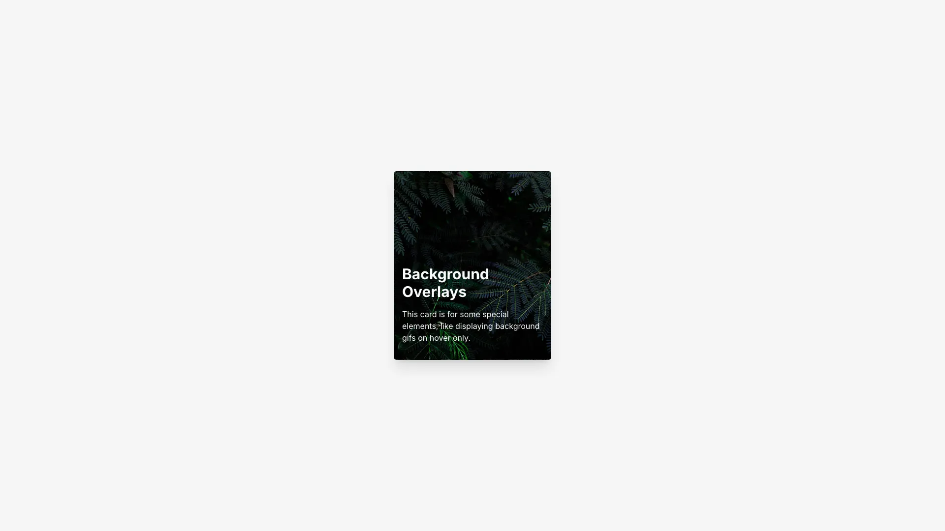
Background Overlay Card
A card with a static background image that swaps to an animated GIF on hover. Includes a dark overlay that appears during the hover state.
Pull in production-ready section blocks — heroes, features, pricing, testimonials, FAQs, and CTAs. Drop them into a project, reshape copy and layout in chat, and ship.
A card with a static background image that swaps to an animated GIF on hover. Includes a dark overlay that appears during the hover state.
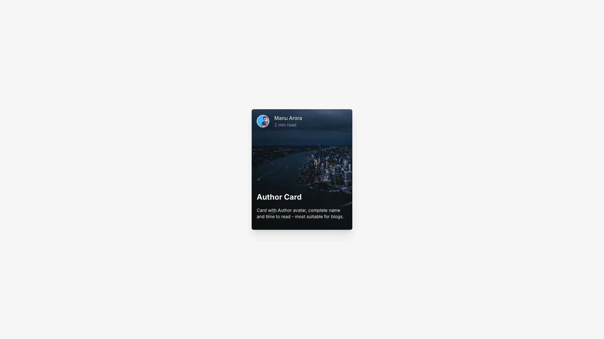
A blog-style card with author avatar, name, read time, and content overlaid on a background image. The overlay darkens on hover.
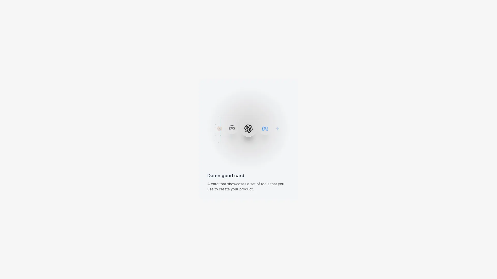
A card showcasing AI/ML tool logos with staggered bounce animations. Includes a glowing beam with sparkle particles that animates vertically.
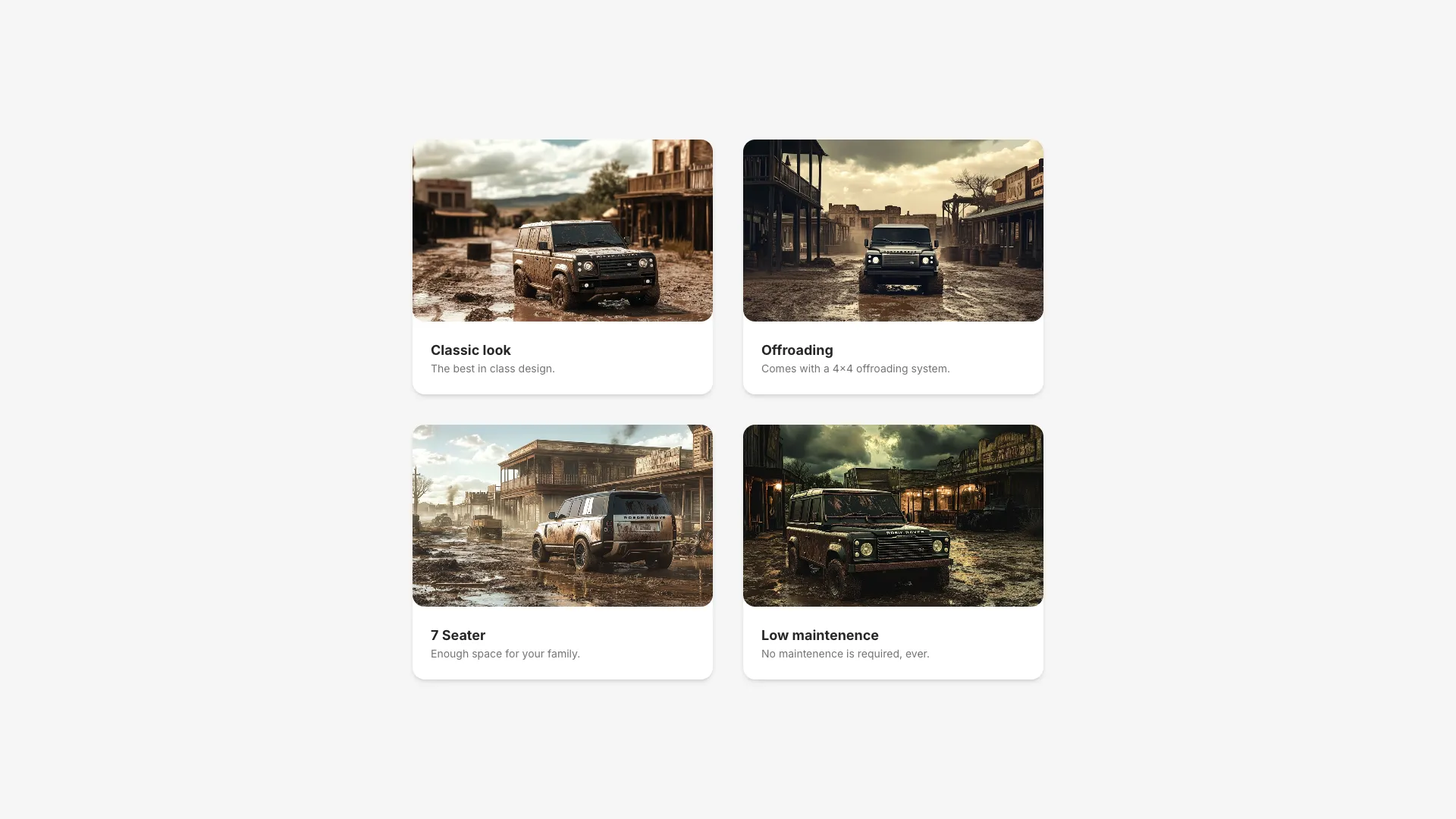
A grid of cards that expand into a modal overlay when clicked. Uses Framer Motion's layoutId for smooth shared element transitions.
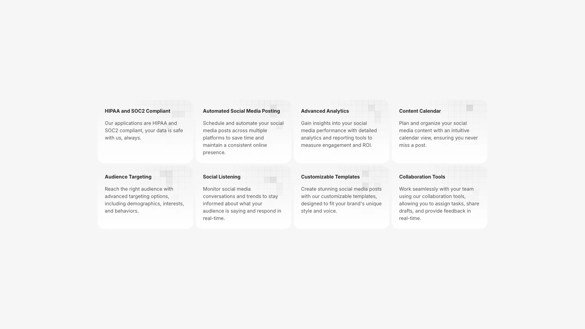
A responsive feature grid with eight cards. Each card has a gradient background and an SVG grid pattern with randomly positioned highlighted squares.
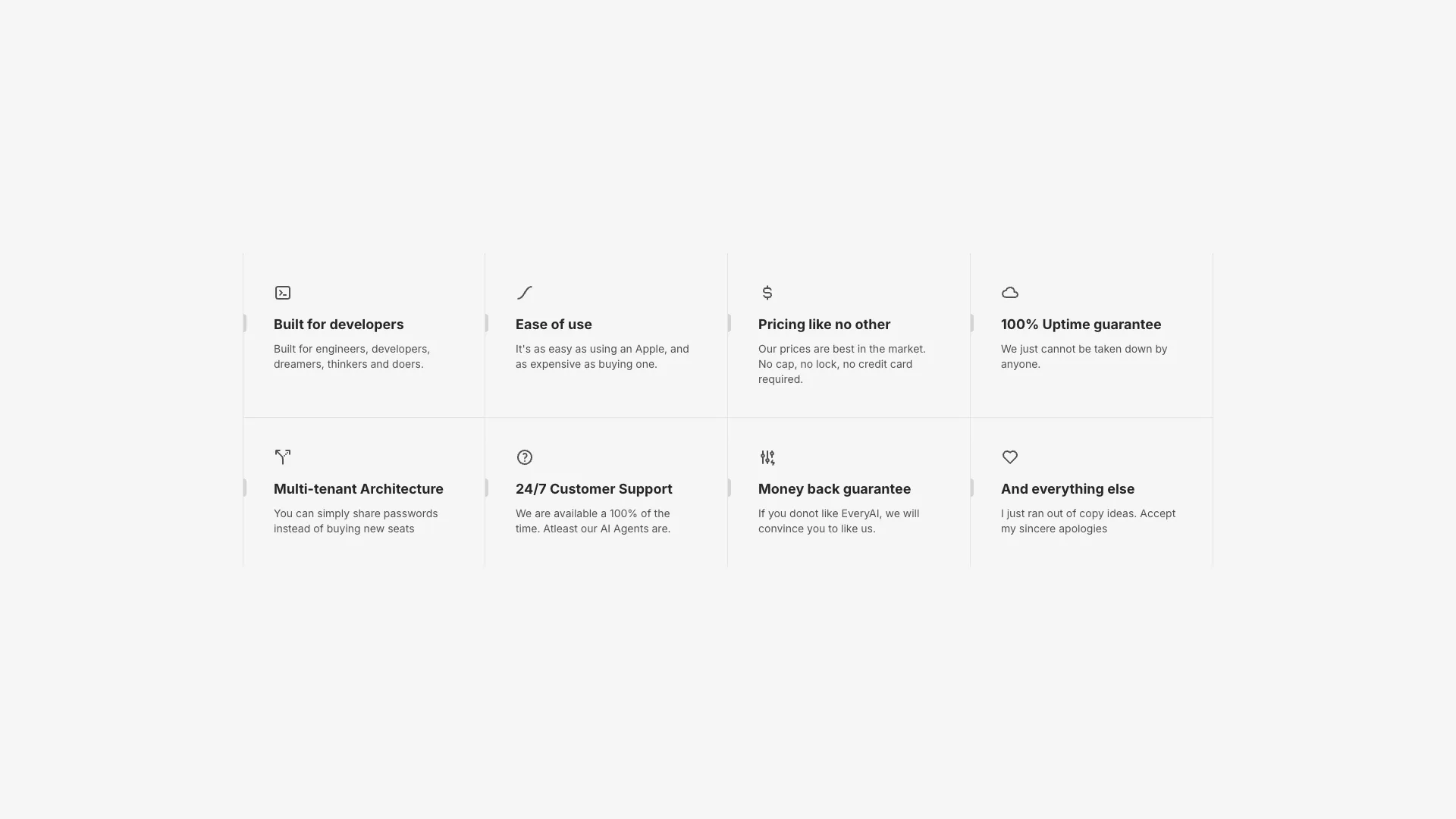
An eight-card feature grid with icons and animated hover states. A vertical accent bar and gradient overlay appear on hover.
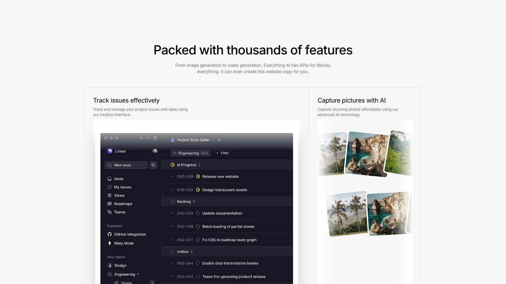
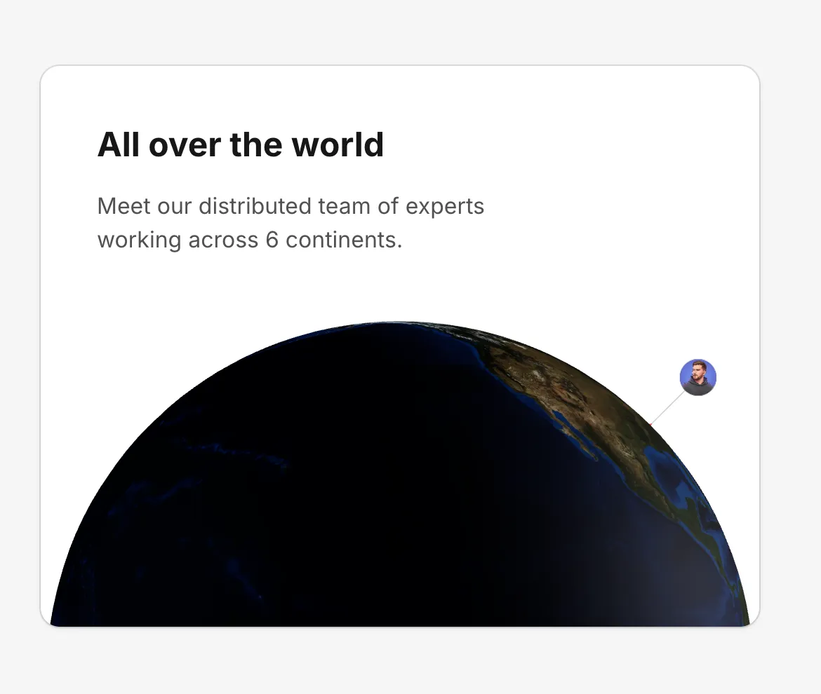
A four-panel bento grid layout with animated skeleton illustrations including a video embed, image gallery, and 3D globe visualization using Cobe.
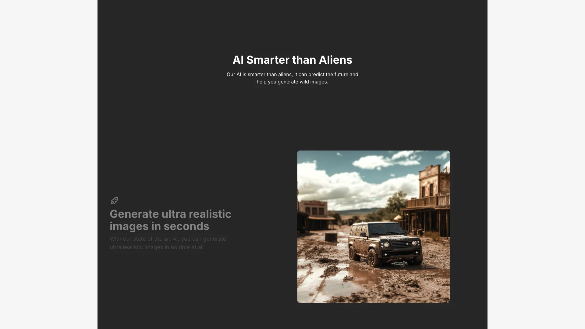
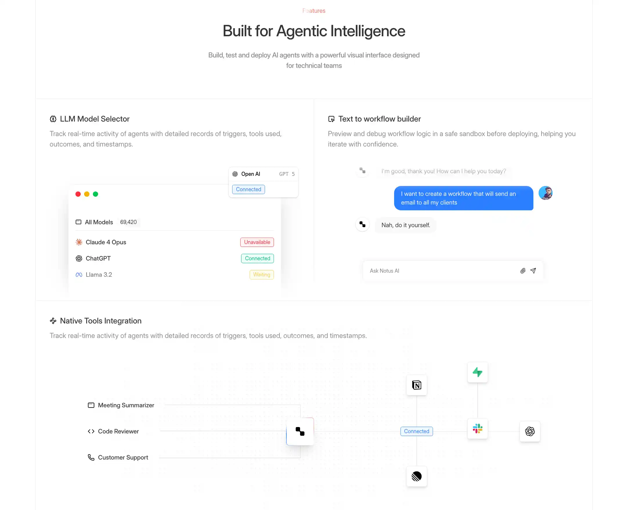
A scroll-driven feature section where content sticks to the viewport. The background color transitions between features as users scroll.
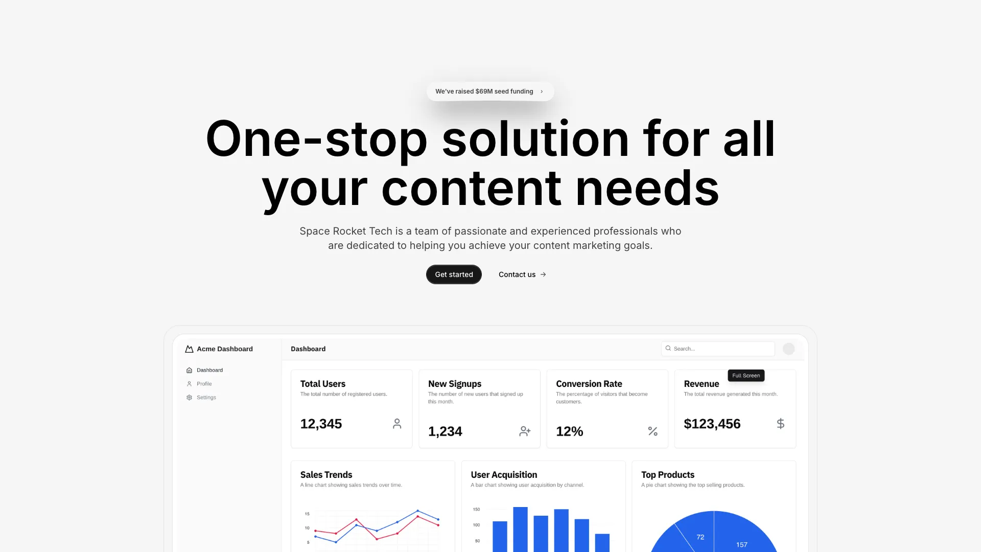
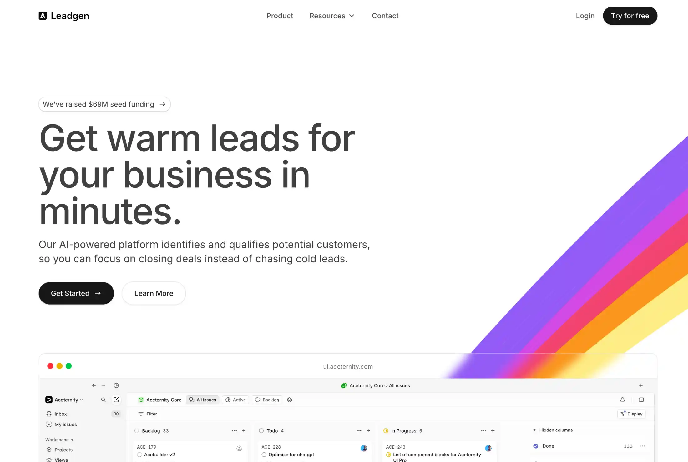
A stunning hero section with a large centered product image, bold headline, and dual call-to-action buttons. Perfect for SaaS landing pages, product launches, and startup websites that need a visual-first approach to capture attention above the fold.
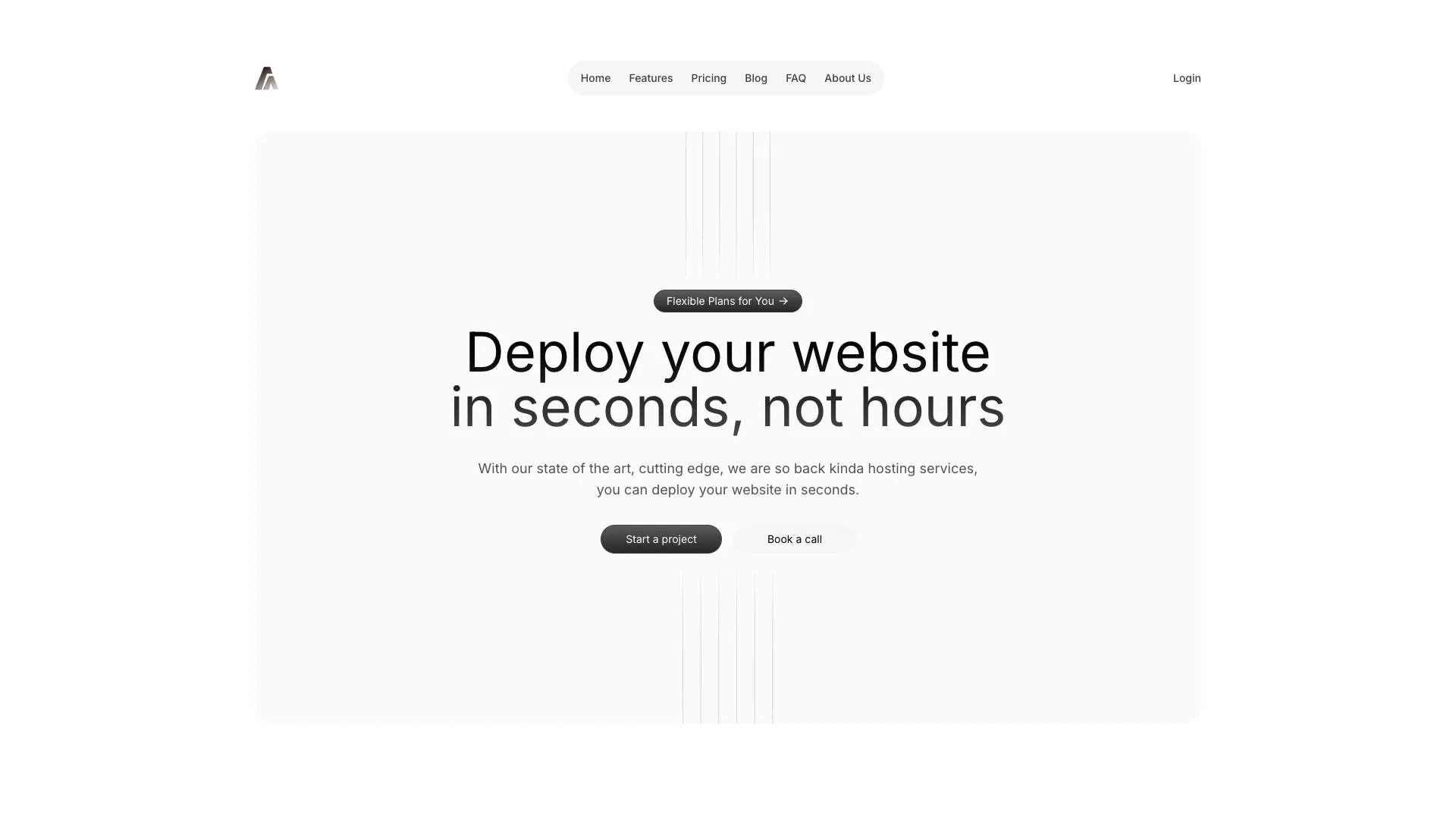
A visually striking hero section featuring layered gradient backgrounds, bold typography, and animated elements. Designed for modern SaaS websites, AI products, and tech startups that want to make a bold first impression with vibrant colors and depth.
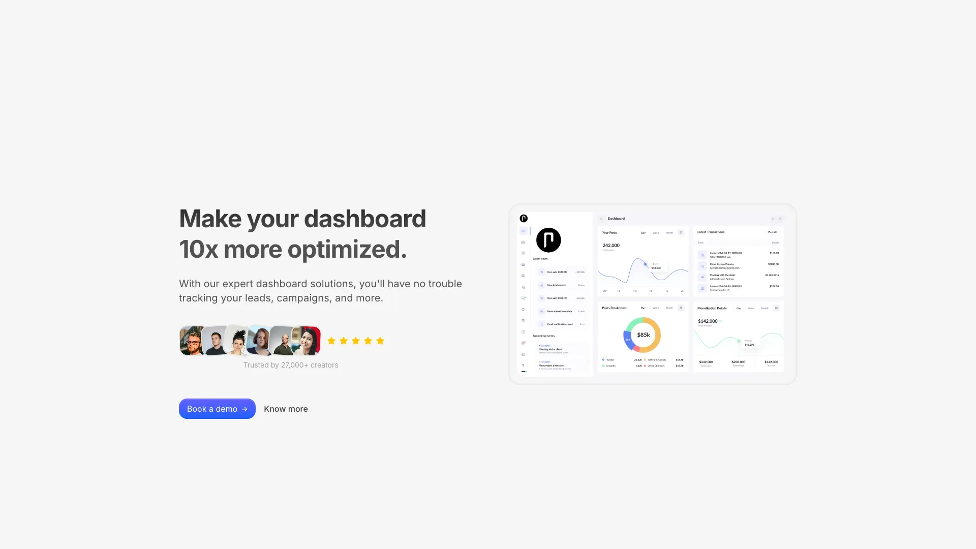
A classic two-column hero layout with compelling copy on one side and a high-impact image on the other. Ideal for product-led landing pages, marketing websites, and any page that needs to balance visual storytelling with persuasive text above the fold.

An immersive hero section with a full-bleed background image and overlaid text content. Creates a cinematic, high-impact first impression. Ideal for creative agencies, portfolio websites, event pages, and brands that want to lead with striking photography.
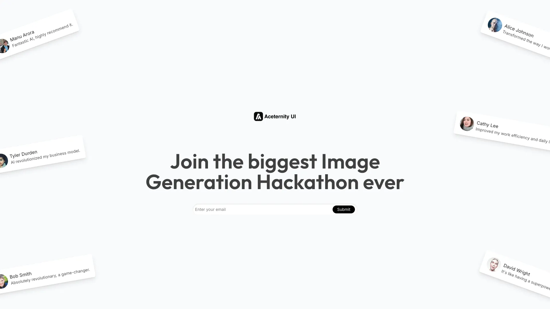
A unique hero section that places a customer testimonial front and center alongside your headline. Combines social proof with your value proposition for maximum trust and conversion. Perfect for established products, B2B SaaS, and service-based businesses.

A complete hero section featuring an integrated navigation bar and a dynamic images grid with marquee animation. Combines a full navigation experience with a visually rich image gallery. Ideal for creative portfolios, e-commerce storefronts, and media-rich landing pages.
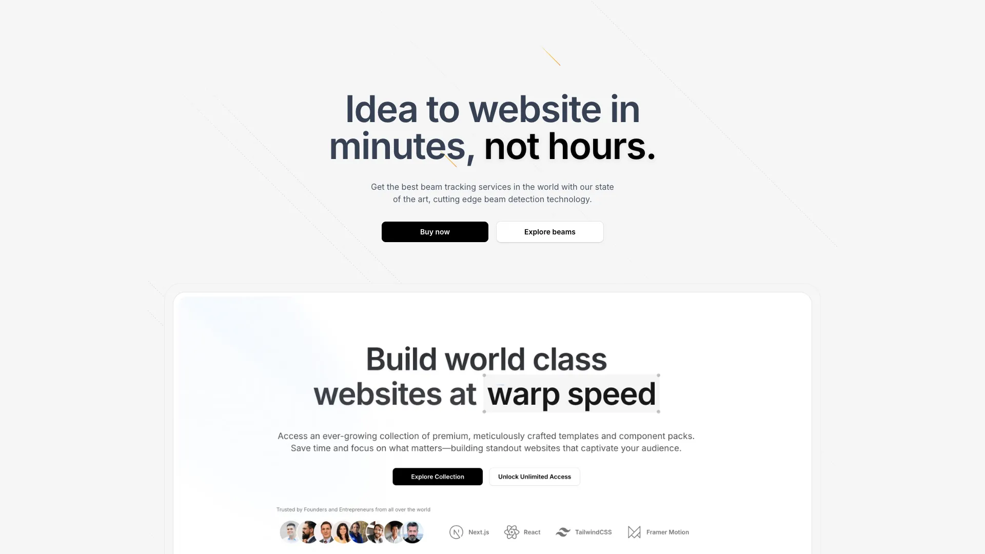
A mesmerizing hero section featuring animated light beams and a subtle grid pattern background. Creates an ethereal, high-tech atmosphere perfect for AI products, developer tools, and technology companies that want to convey innovation and sophistication.
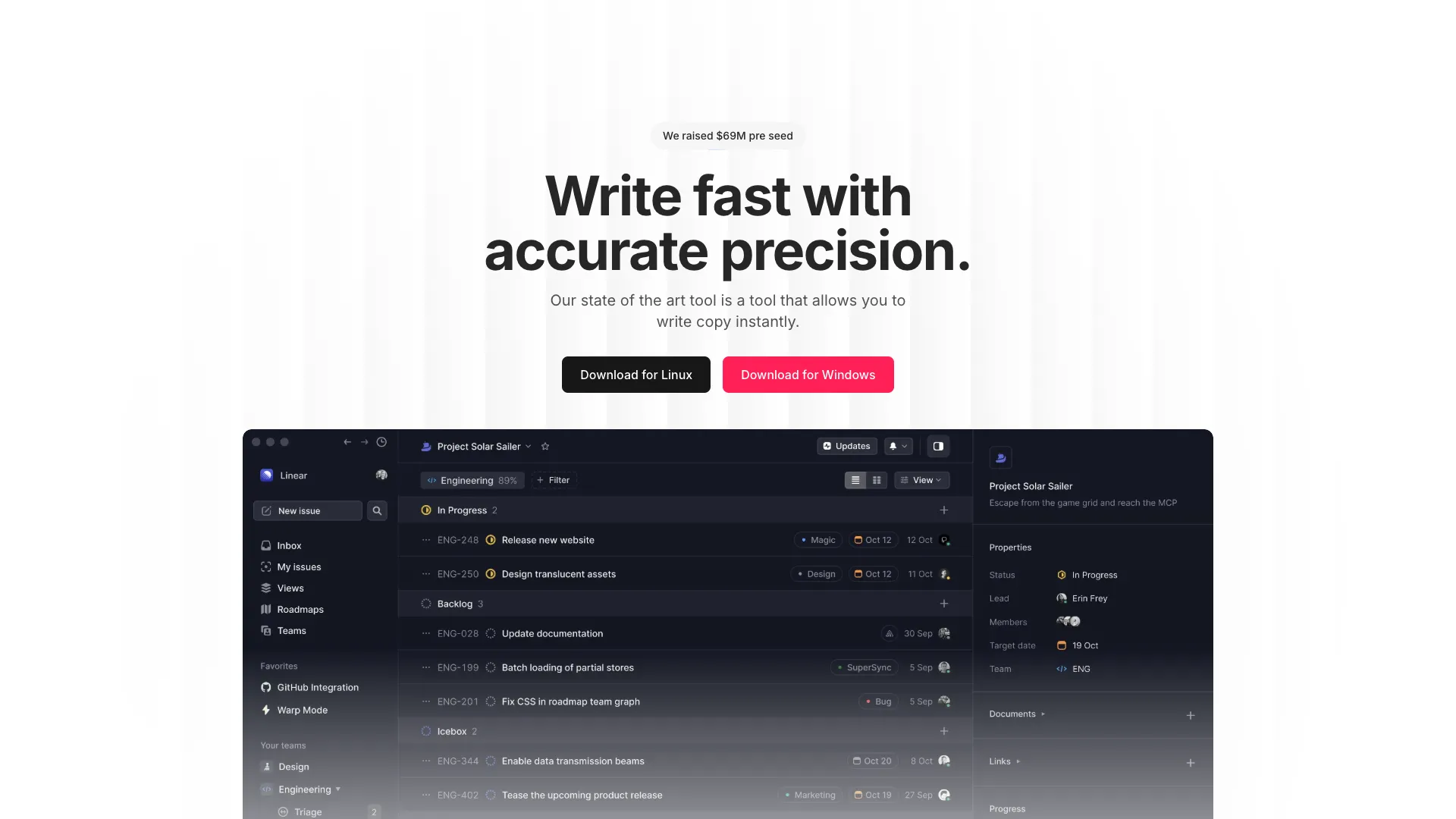
A textured hero section with a subtle noise overlay that adds depth and a tactile quality to your landing page. The grain texture creates a premium, editorial feel. Perfect for design agencies, creative studios, premium brands, and any website that values aesthetic refinement.
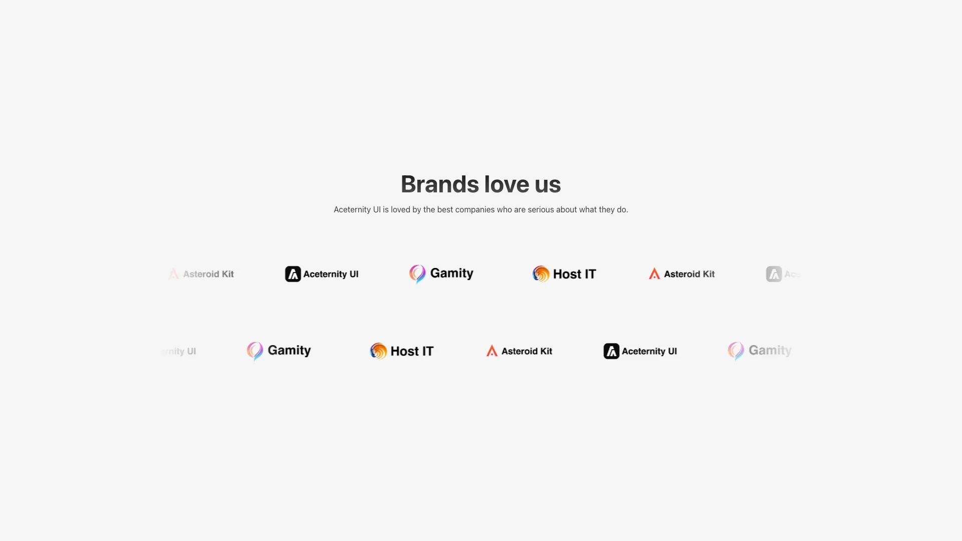
A dual-row marquee logo cloud with opposite scroll directions. Uses react-fast-marquee with pause-on-hover and edge fade masks.
An auto-rotating logo cloud where logos flip in with blur and fade animations. Logos cycle through sets on a 3-second interval.
A static grid of logos with an ambient color spotlight effect in the background. Radial gradients create a soft, glowing atmosphere.
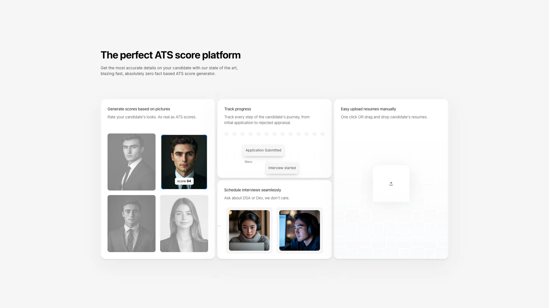
A responsive bento grid with animated skeletons including avatar scoring, progress tracking timelines, video interview previews, and drag-and-drop file upload.
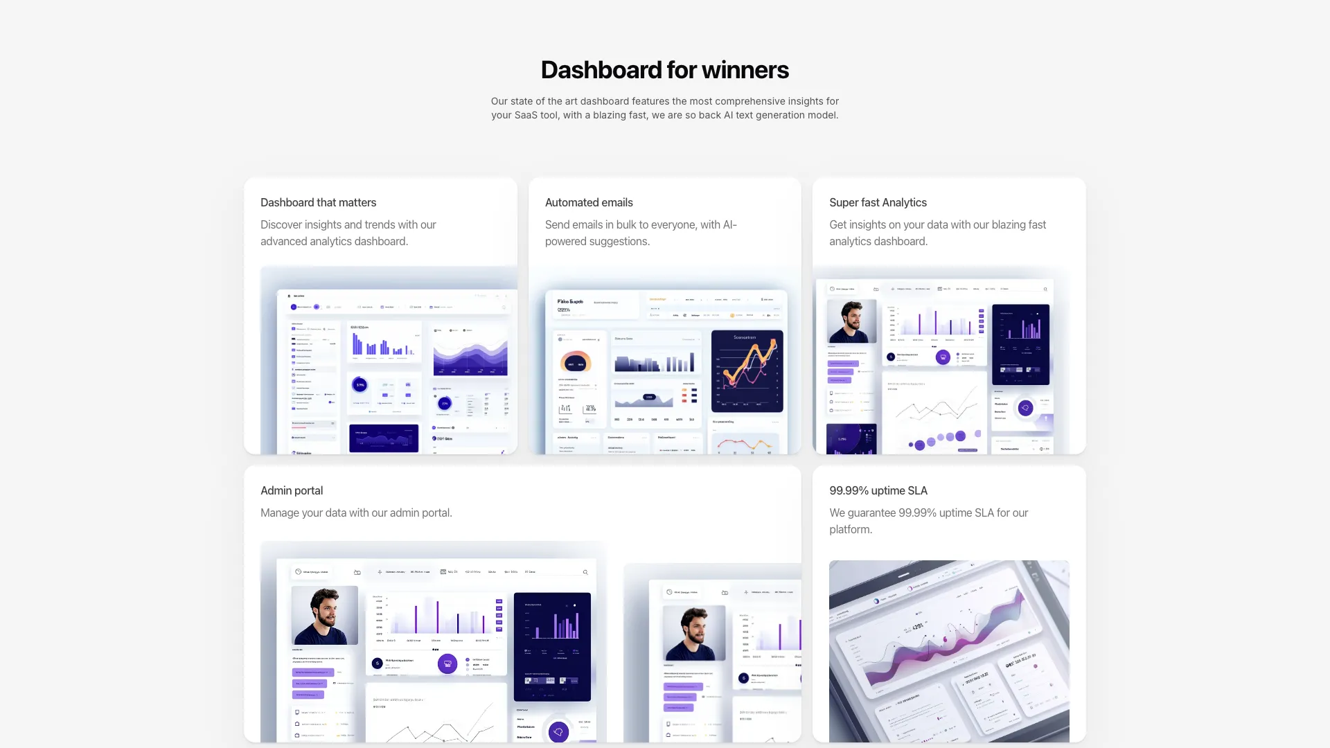
A five-card bento grid using product screenshots instead of animated skeletons. Cards animate on hover with title and description text shifting horizontally.
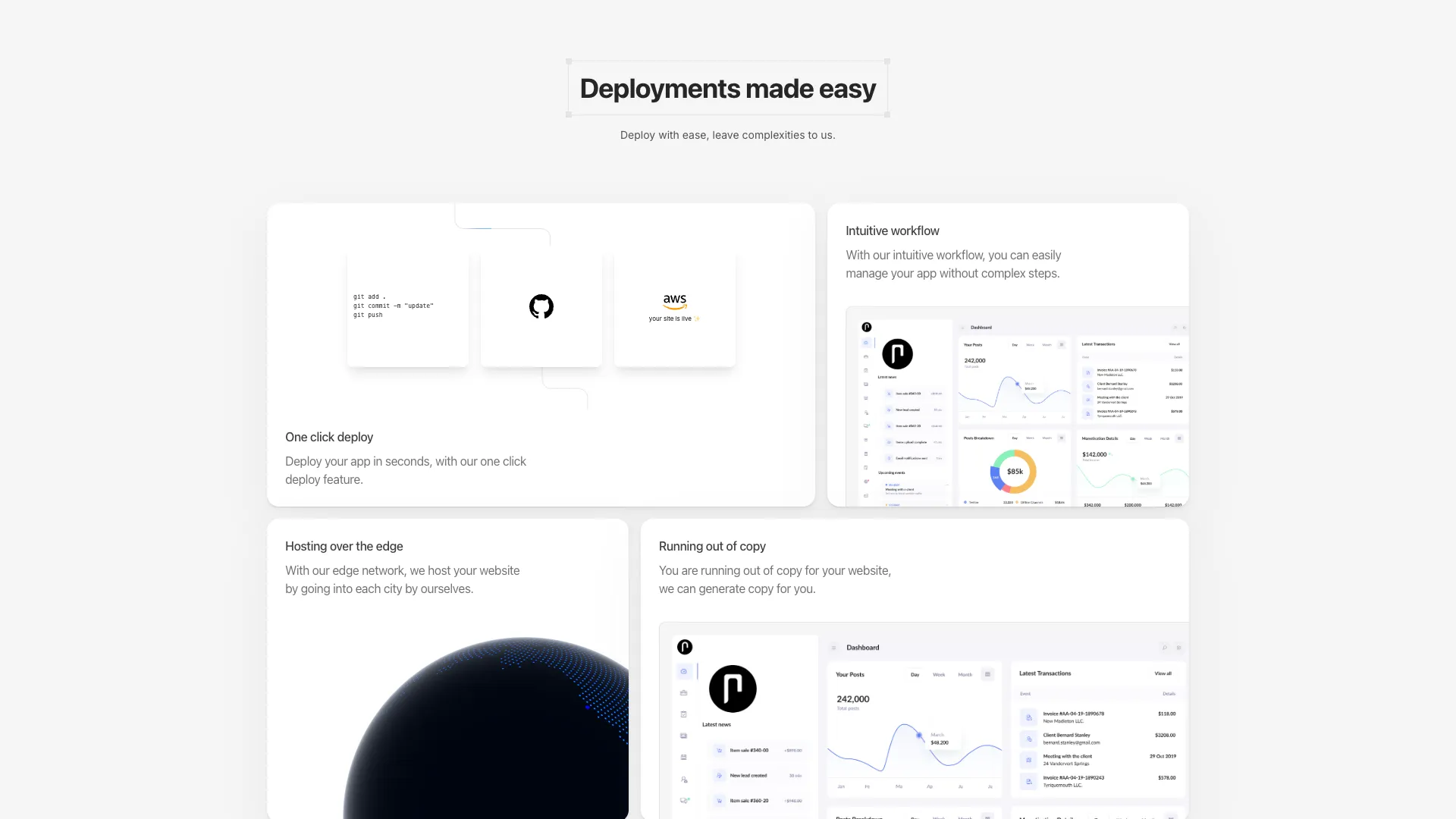
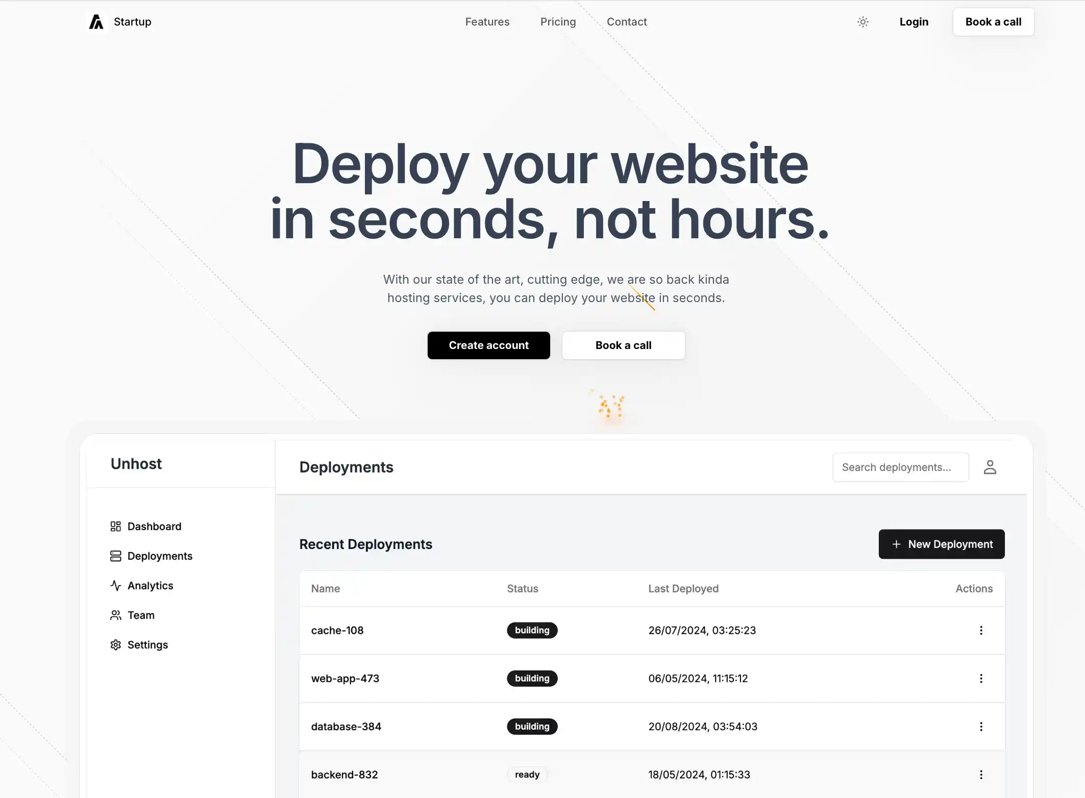
A five-card asymmetric bento layout with animated SVG connection paths, a rotating 3D globe using Cobe, and deployment workflow visualization.

A horizontal CTA section with overlapping user avatars, star ratings, and a call-to-action button. Avatars show tooltips on hover with spring-based animations.
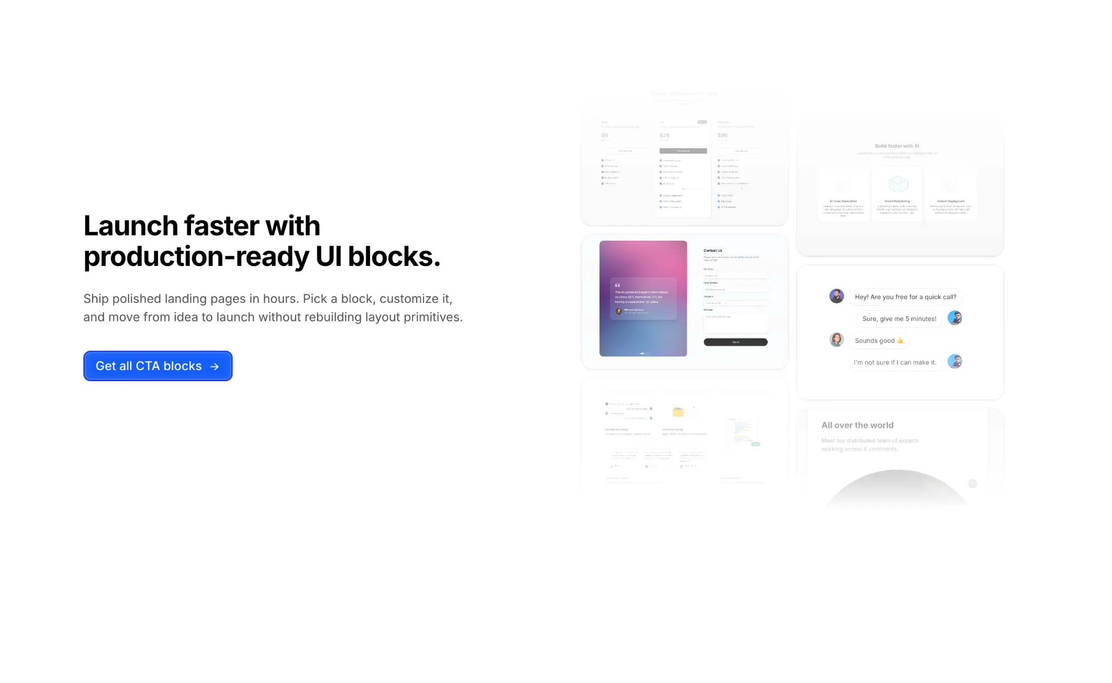
A two-column CTA section with headline, subtext, and a blue brand button on the left, paired with a two-column masonry image layout on the right.
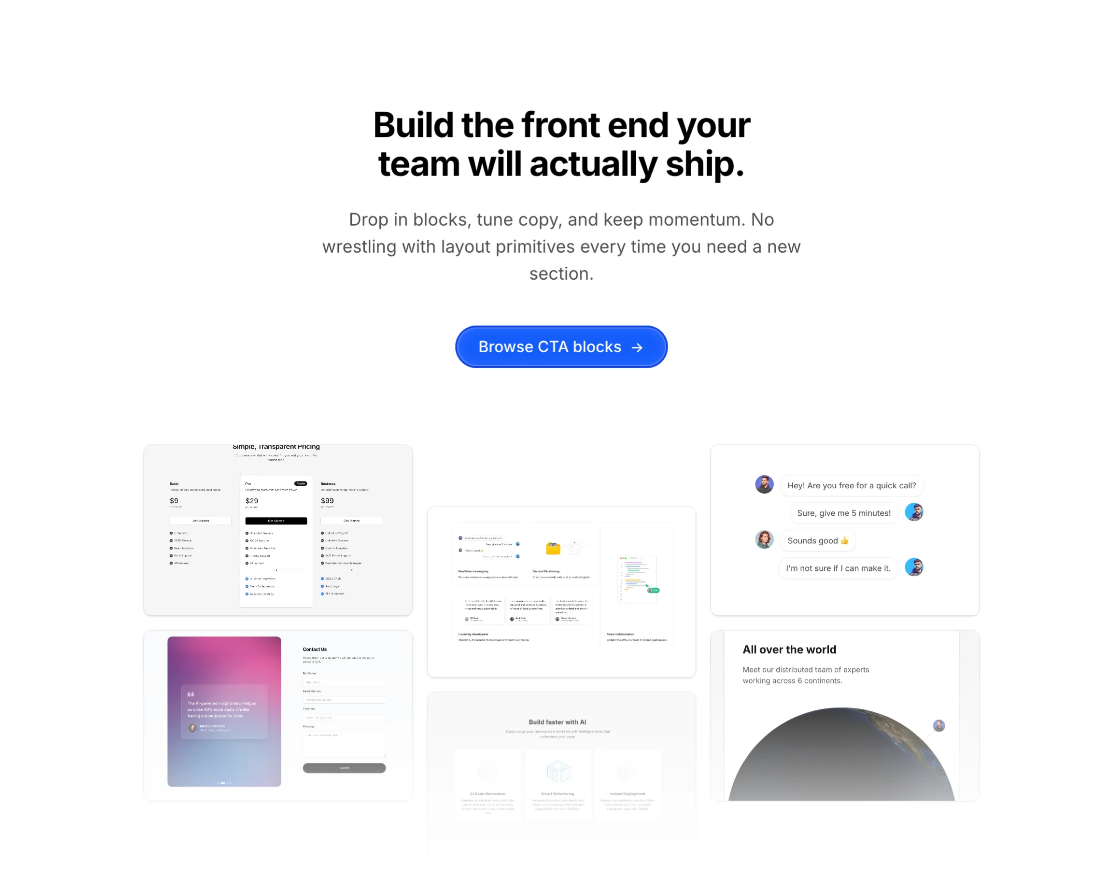
A centered call-to-action with headline, supporting text, and a primary button, plus a symmetric three-column masonry image gallery below.
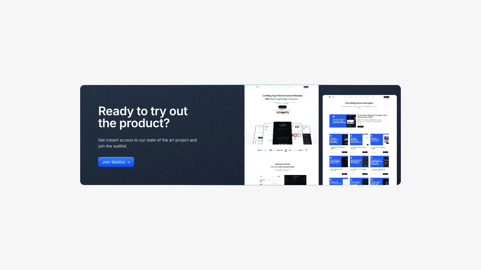
A dark two-column CTA section with noise texture overlay, gradient border lines, and product images. Ideal for high-contrast conversion sections.
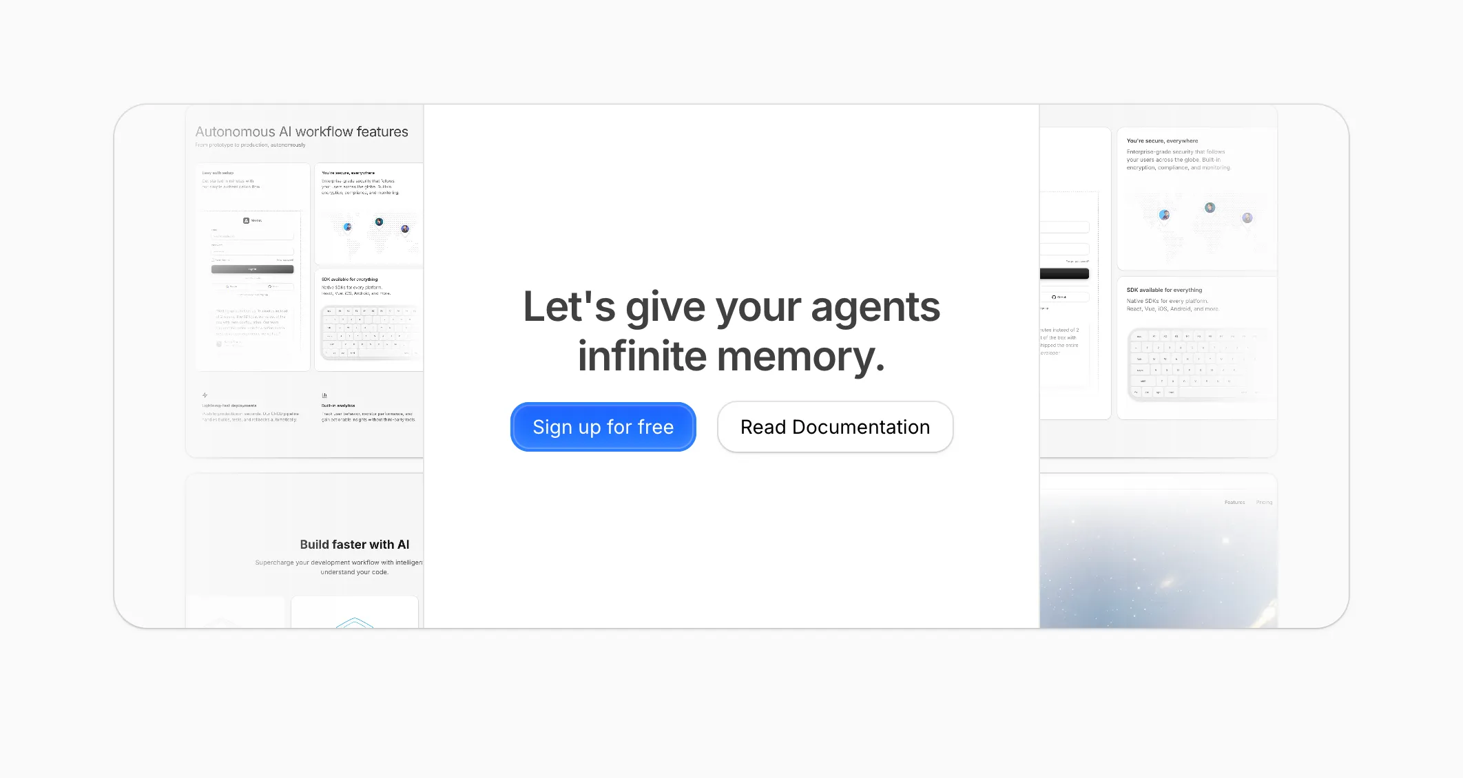
A rounded call-to-action with a tiled product-shot backdrop, side-faded edges, and a narrow centered column for the headline plus primary and outline buttons—suited to signups, docs links, or a quiet conversion band on AI or SaaS pages.
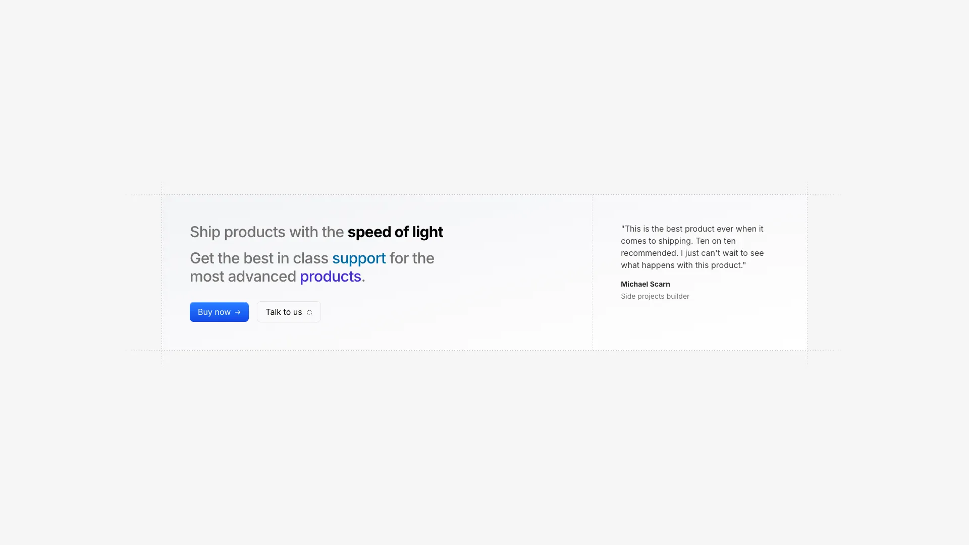
A three-column CTA layout with dashed border lines extending beyond the container edges. Includes a testimonial quote in the right column.
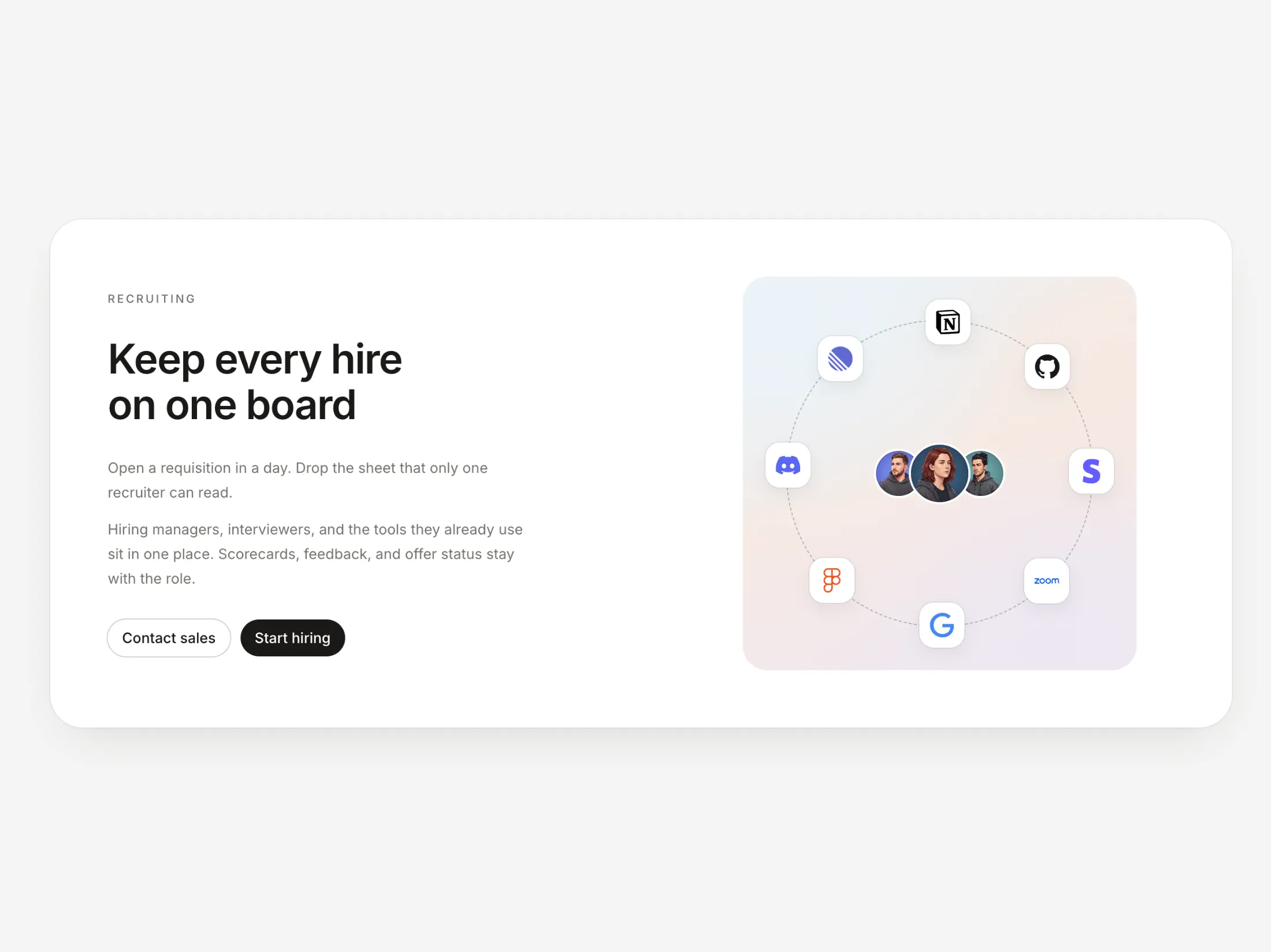
A two-column recruiting CTA with copy and pill buttons on the left, and a team sitting in a ring of tool logos on a pastel rounded square on the right.
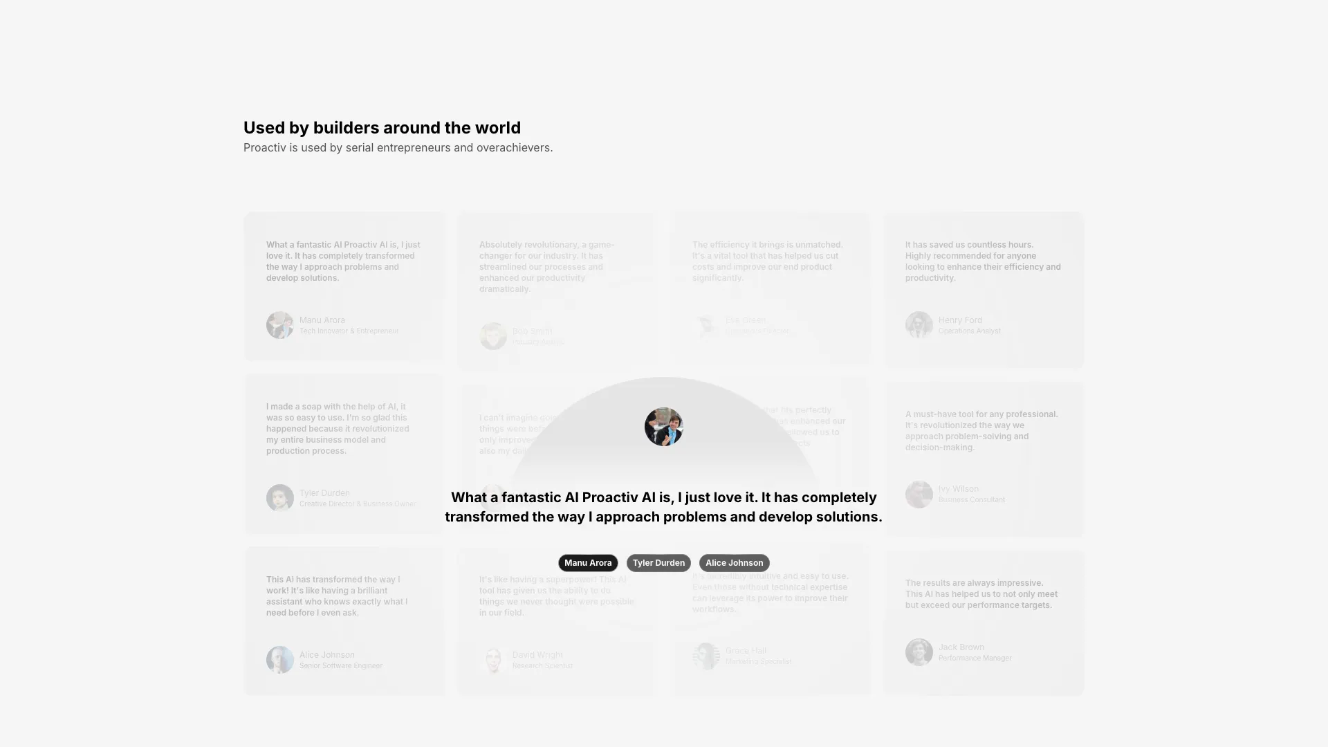
A testimonials section with a faded background grid and a centered carousel slider. The active testimonial displays prominently while others blur in the background.
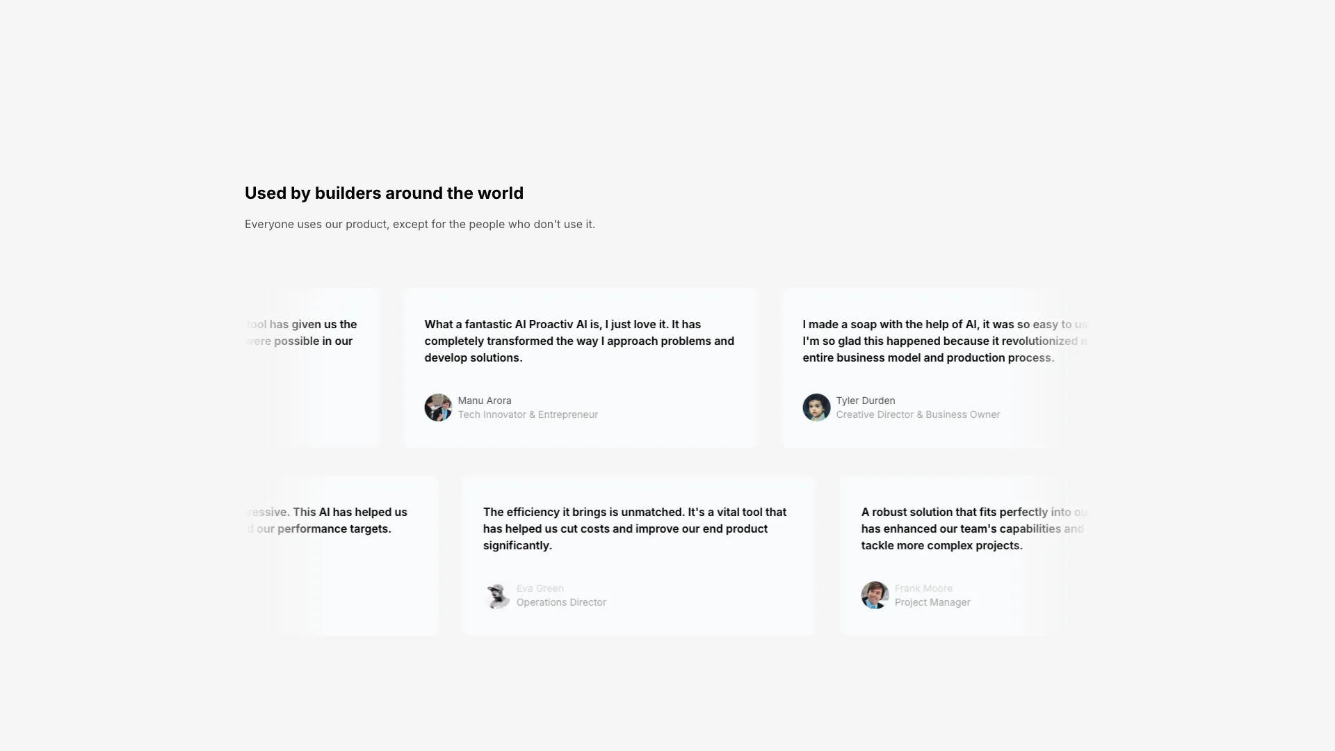
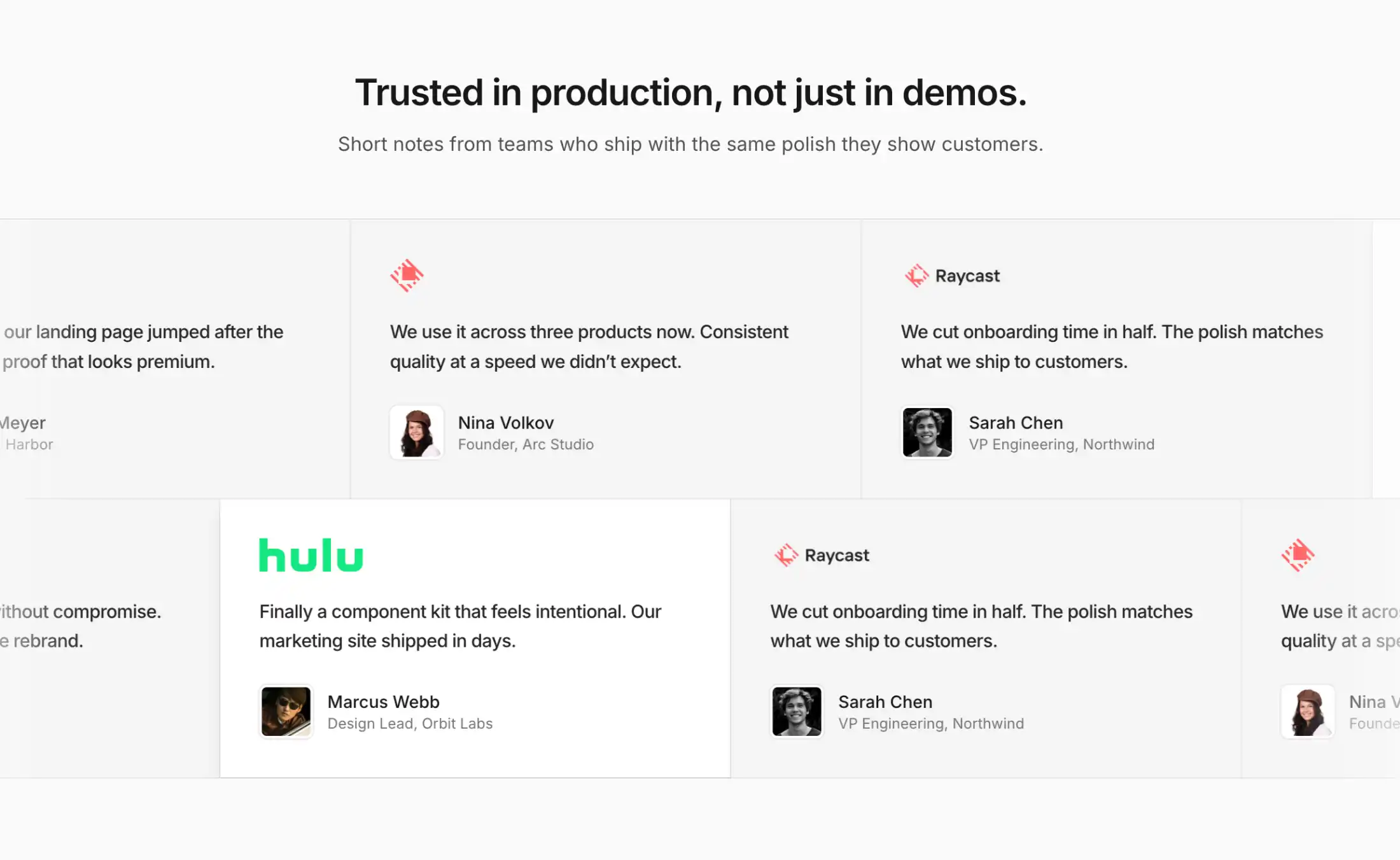
A two-row testimonials section with horizontal marquee scrolling. Cards scroll at different speeds with pause-on-hover interaction.
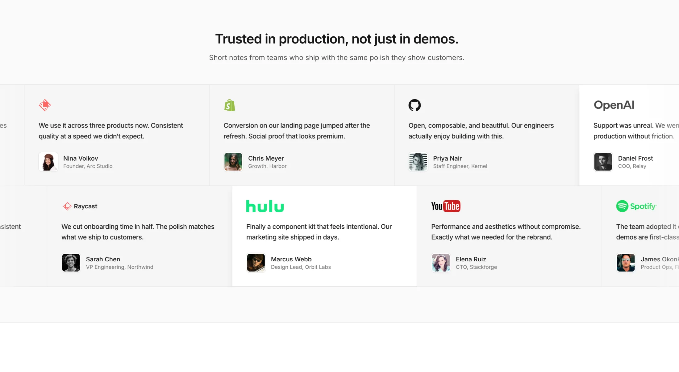
Two stacked rows of logo testimonials in horizontal marquees. Bordered cells, optional highlight cards, and a headline for landing-page social proof.
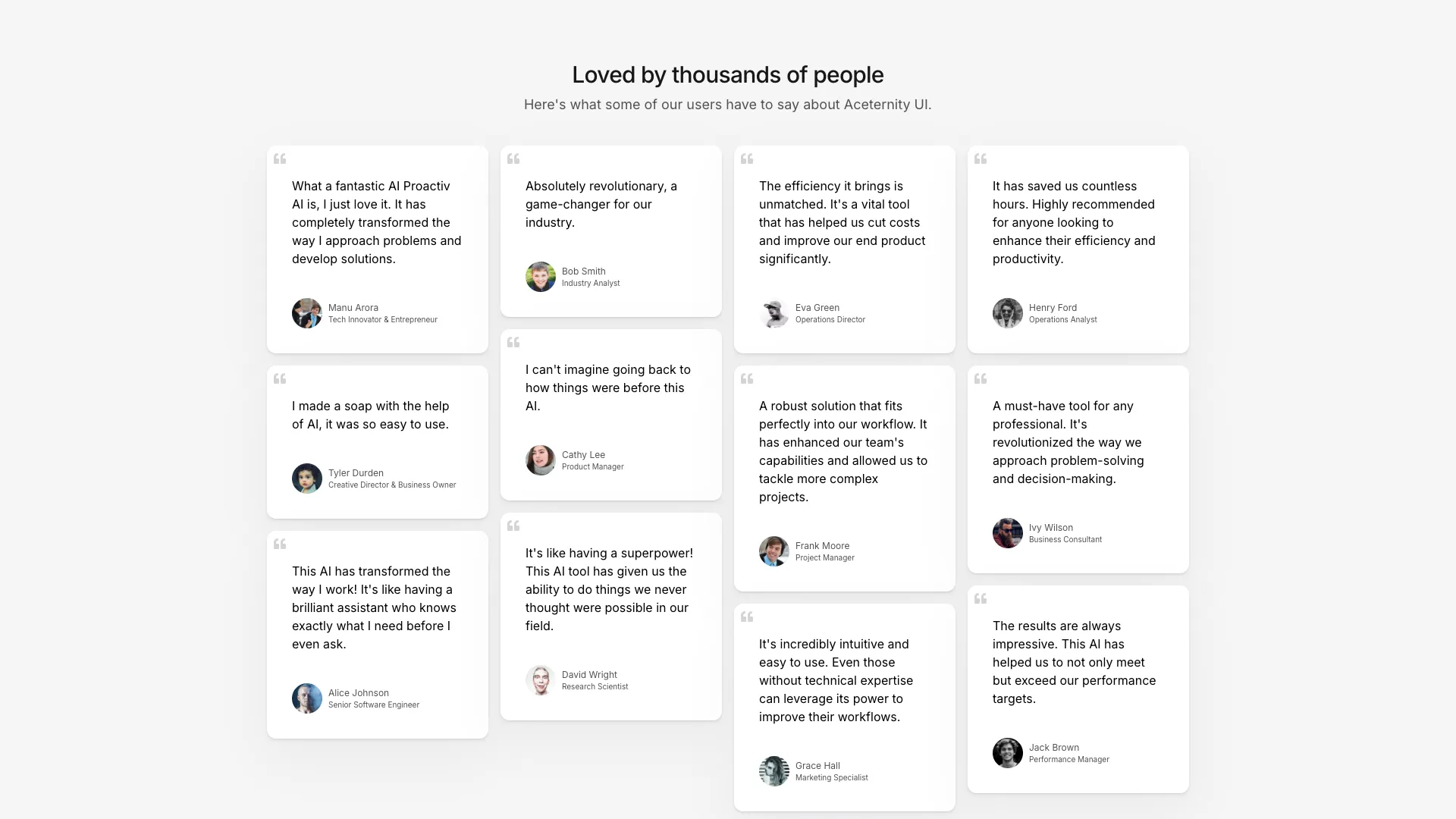
A four-column masonry layout of testimonial cards with quote icons. Cards have varying heights based on content length, creating a Pinterest-style layout.
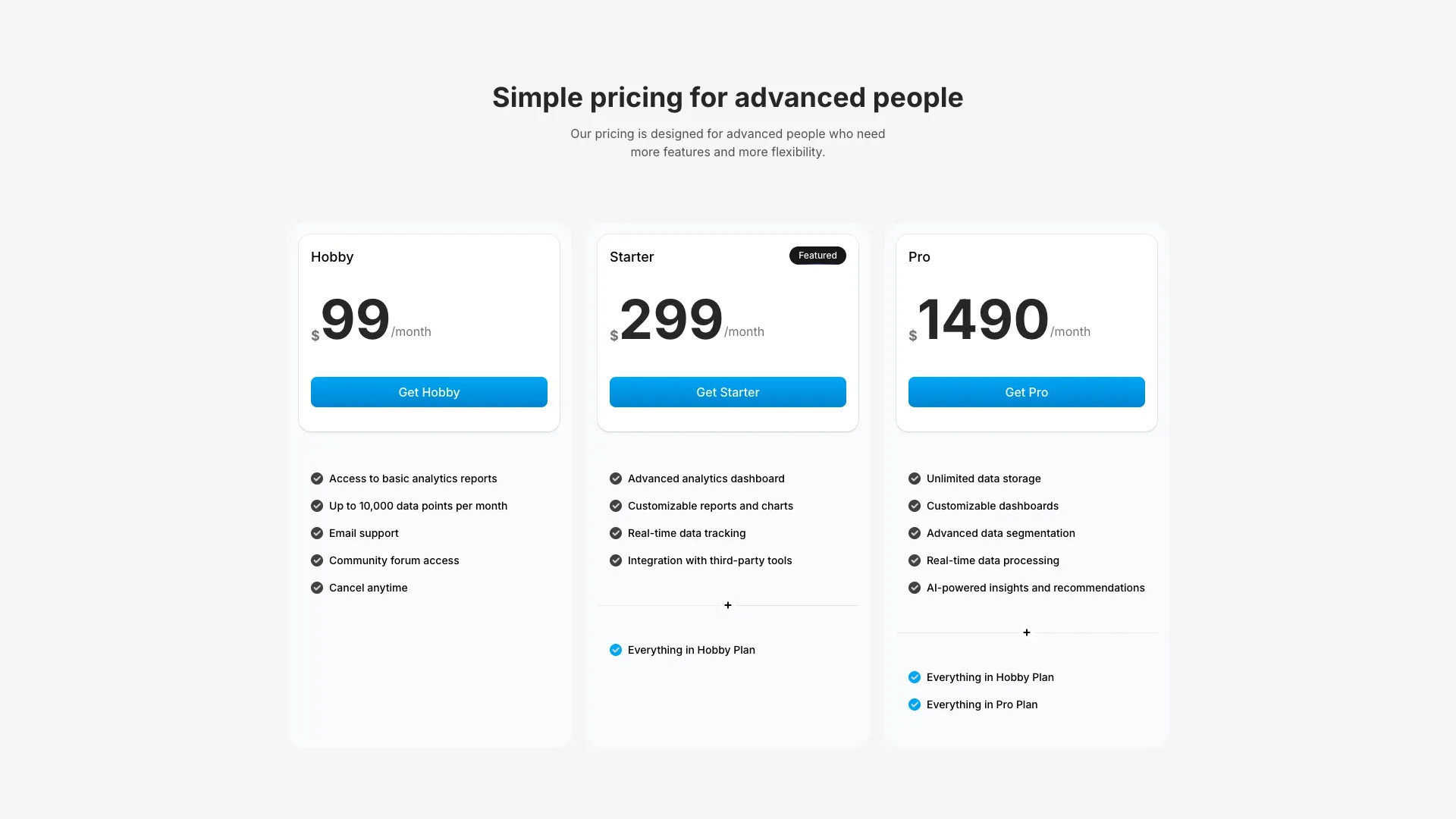
A clean three-column pricing section with feature lists and CTA buttons. The middle tier is highlighted as featured with enhanced styling.
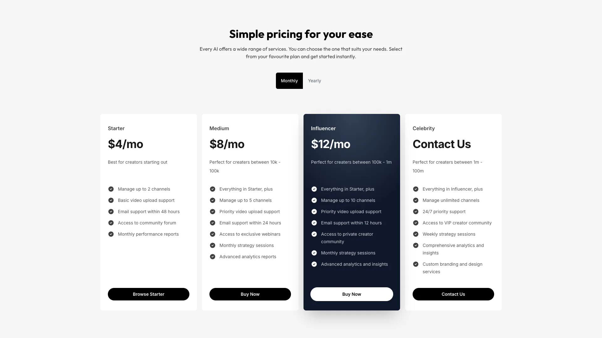
A four-tier pricing grid with an animated monthly/yearly toggle. Price values animate in with blur effects when switching billing periods.
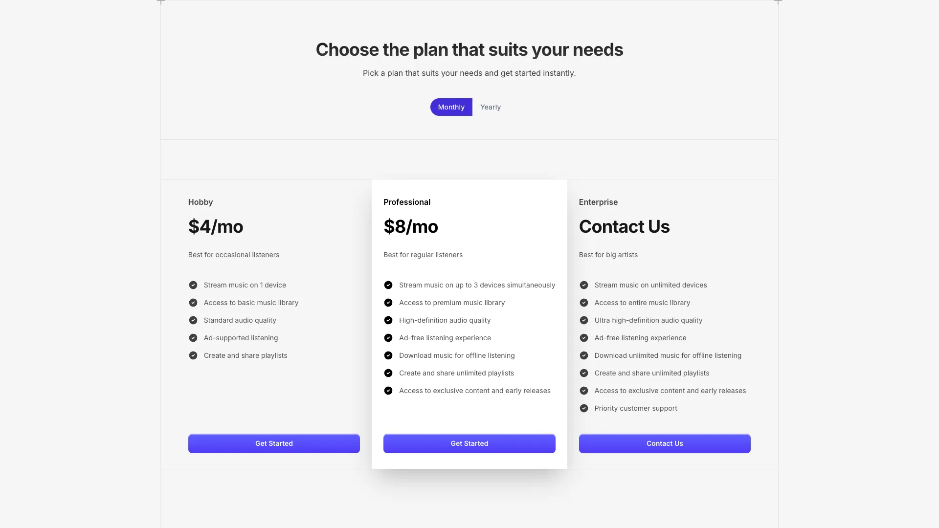
A pricing section with monthly/yearly toggle and add-on options. Features animated price changes and a three-tier layout with a featured plan.
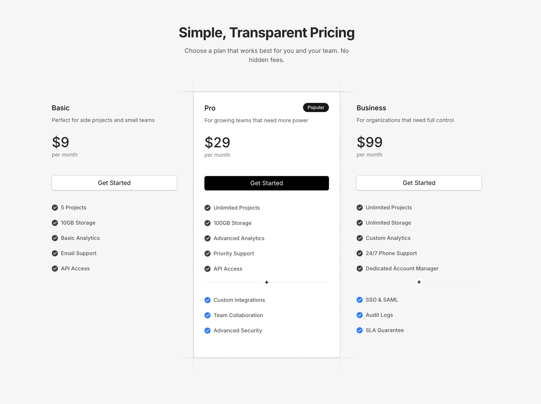
A clean minimal pricing component with three tiers, dashed grid line accents on the featured card, and additional features section with divider.
A rounded pill-style navbar with sliding background hover effects on nav items. Uses layoutId for smooth animated transitions between hovered states.
A navbar with dropdown menus that reveal on hover. Dropdowns can contain links, product cards with images, or nested navigation.
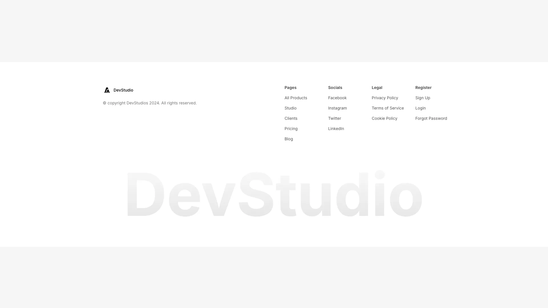
A clean footer layout with four link columns: pages, socials, legal, and account. Includes a logo, tagline, and copyright notice at the bottom.
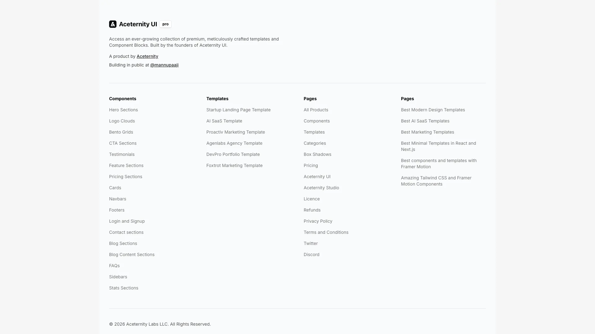
A comprehensive footer with logo section, four-column link grid, newsletter signup, and social icons. Built for sites with extensive navigation needs.
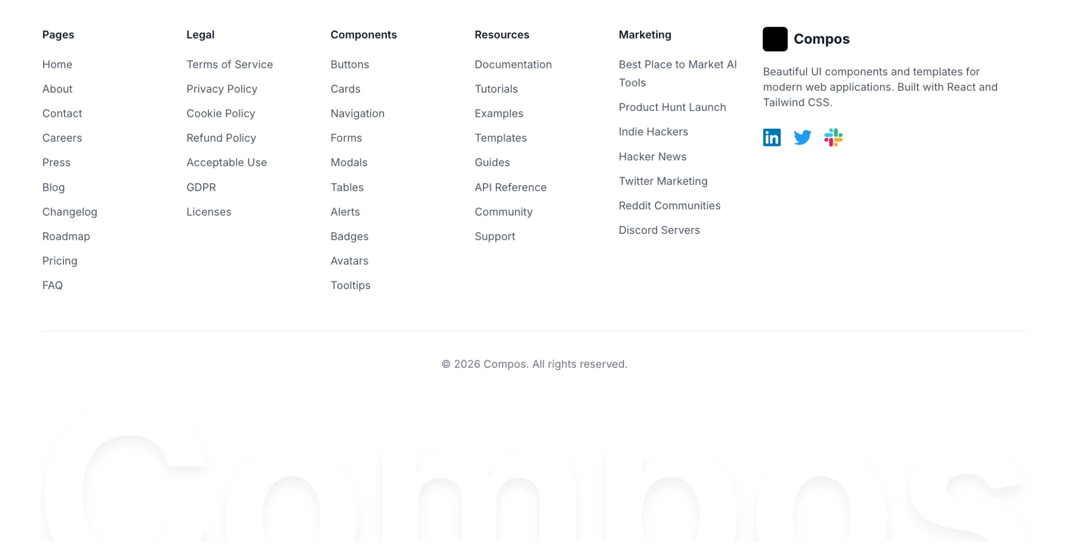
A comprehensive footer with multiple link categories, social icons, and a large animated brand name at the bottom with a gradient fade effect.
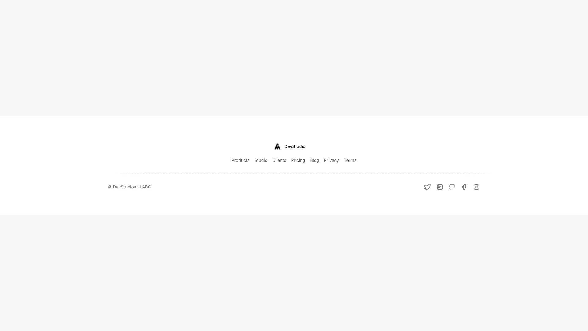
A minimal footer with centered logo, horizontal navigation links, and social media icons. A horizontal grid line divides navigation from the copyright section.
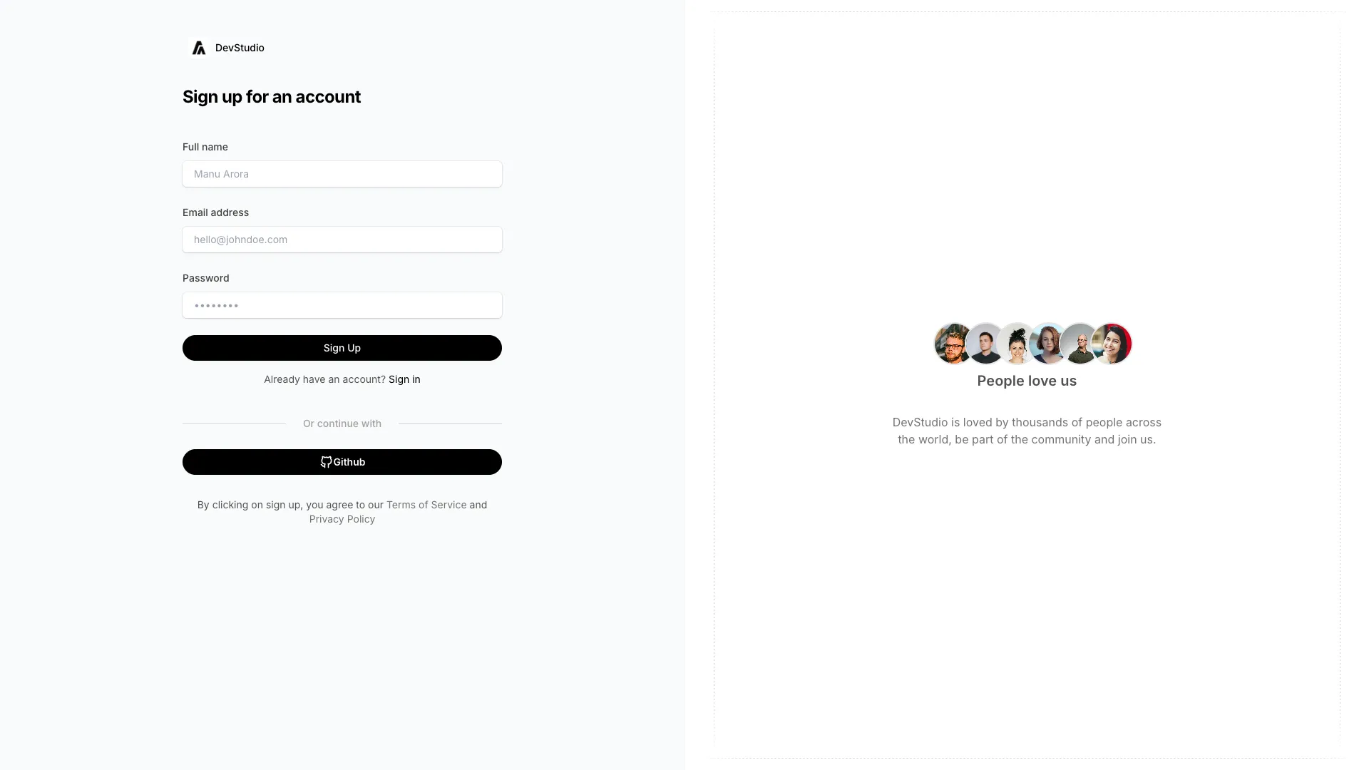
A split-screen registration page with form fields on the left and social proof testimonials on the right. Features overlapping user avatars and decorative grid lines.
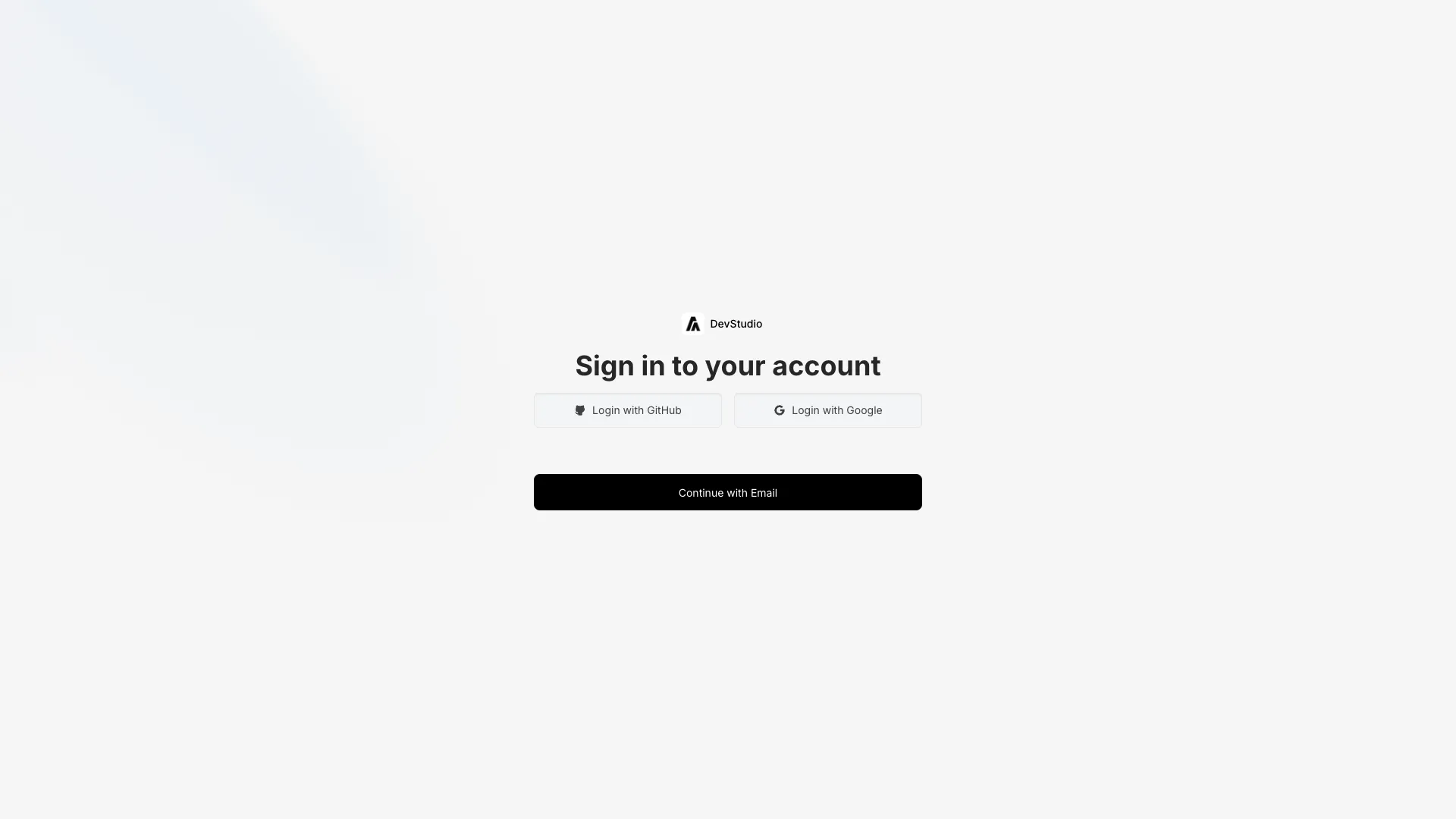
A centered login form with GitHub and Google buttons at top, and an animated email input that reveals on click. Features corner-expanding hover effects on the submit button.
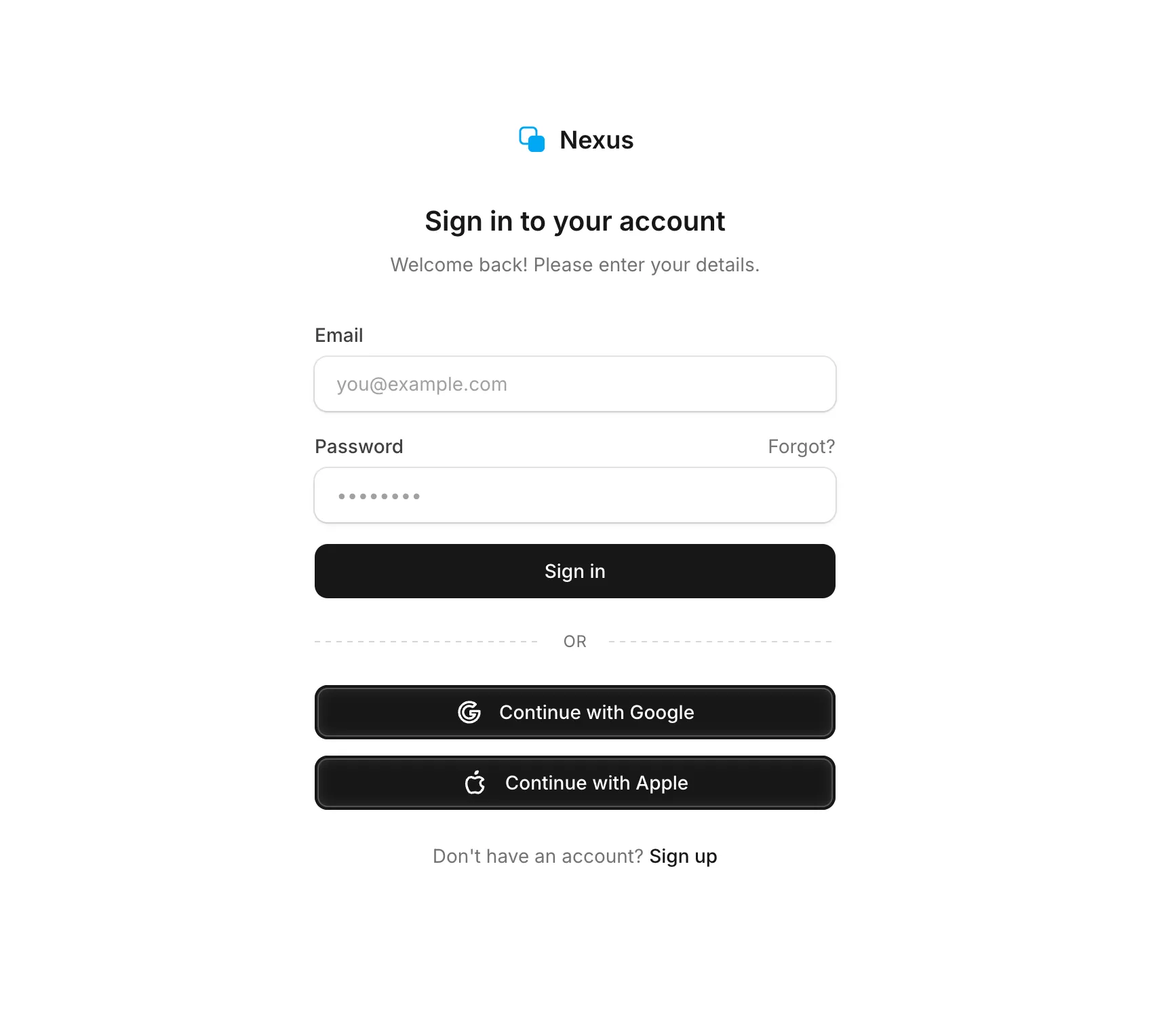
A clean and minimal login form with email and password fields, Google and Apple social login buttons, and a dashed divider. Features subtle input styling with ring borders and full dark mode support.
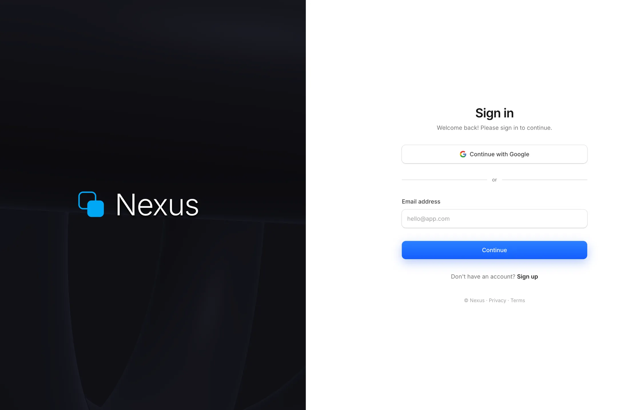
A full-screen split authentication layout with a real-time WebGL raymarched torus shader on the left panel and a clean sign-in form on the right. Features Google OAuth, email input, and dark mode support.
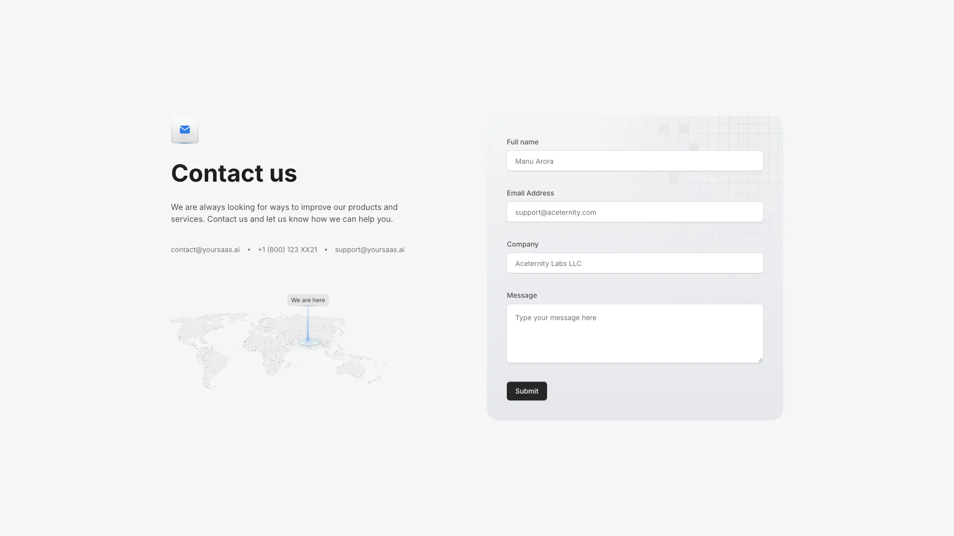
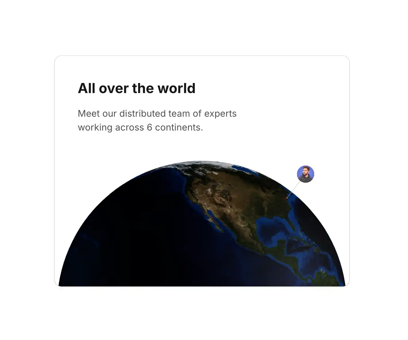
A two-column contact section with a 3D tilted world map on the left and a full contact form on the right. Includes animated location pins and a subtle grid background.
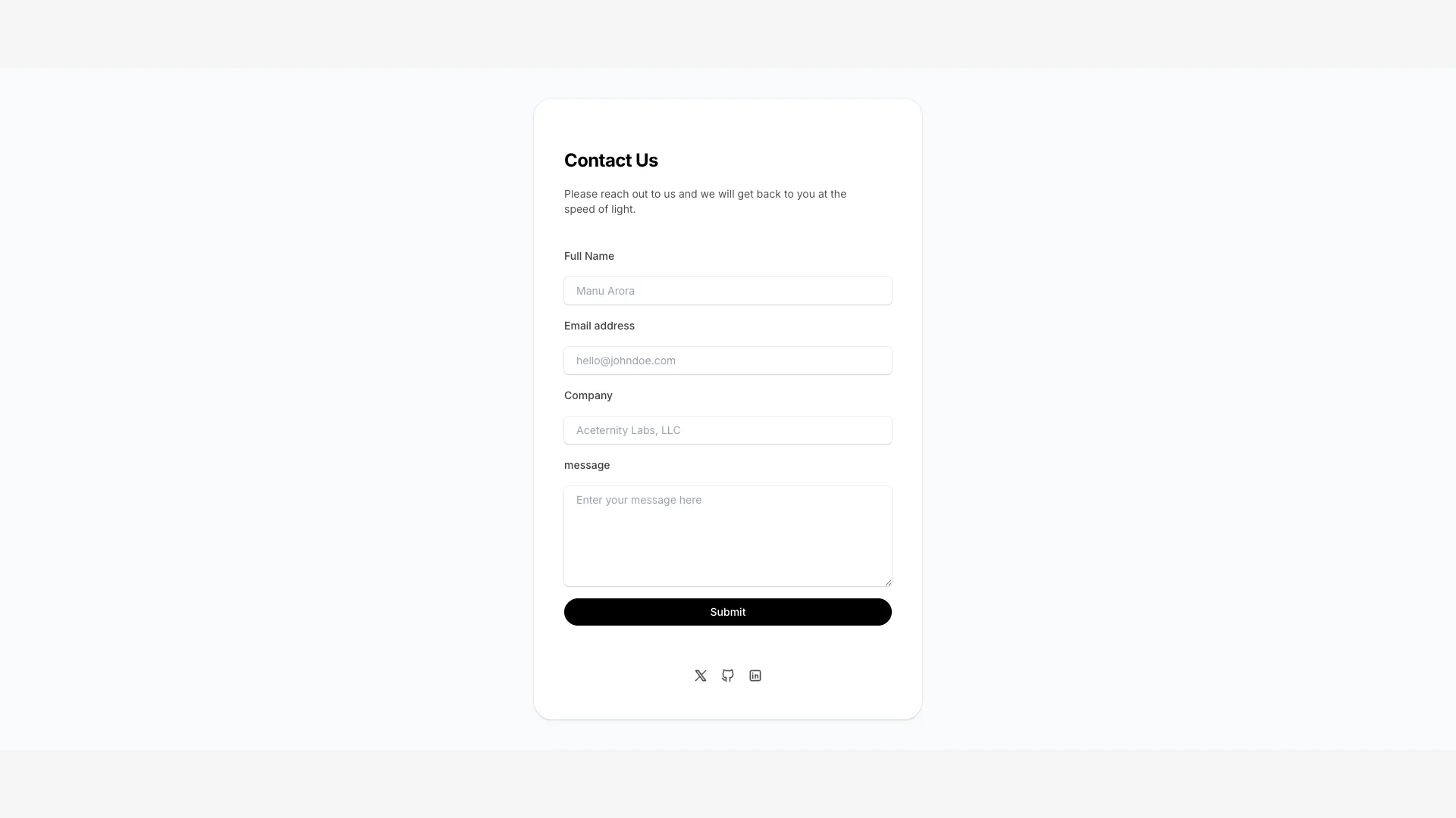
A compact centered contact form card with name, email, company, and message fields. Includes social media links at the bottom.
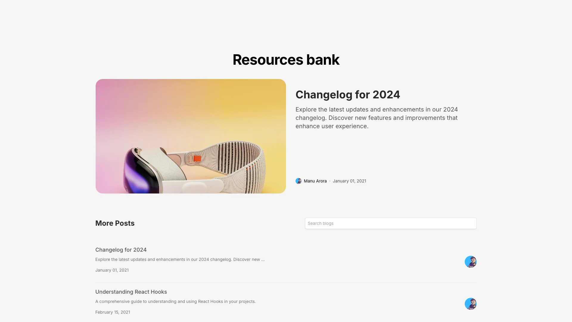
A blog listing page with fuzzy search filtering. Features a large featured post card and a filterable list of additional posts below.
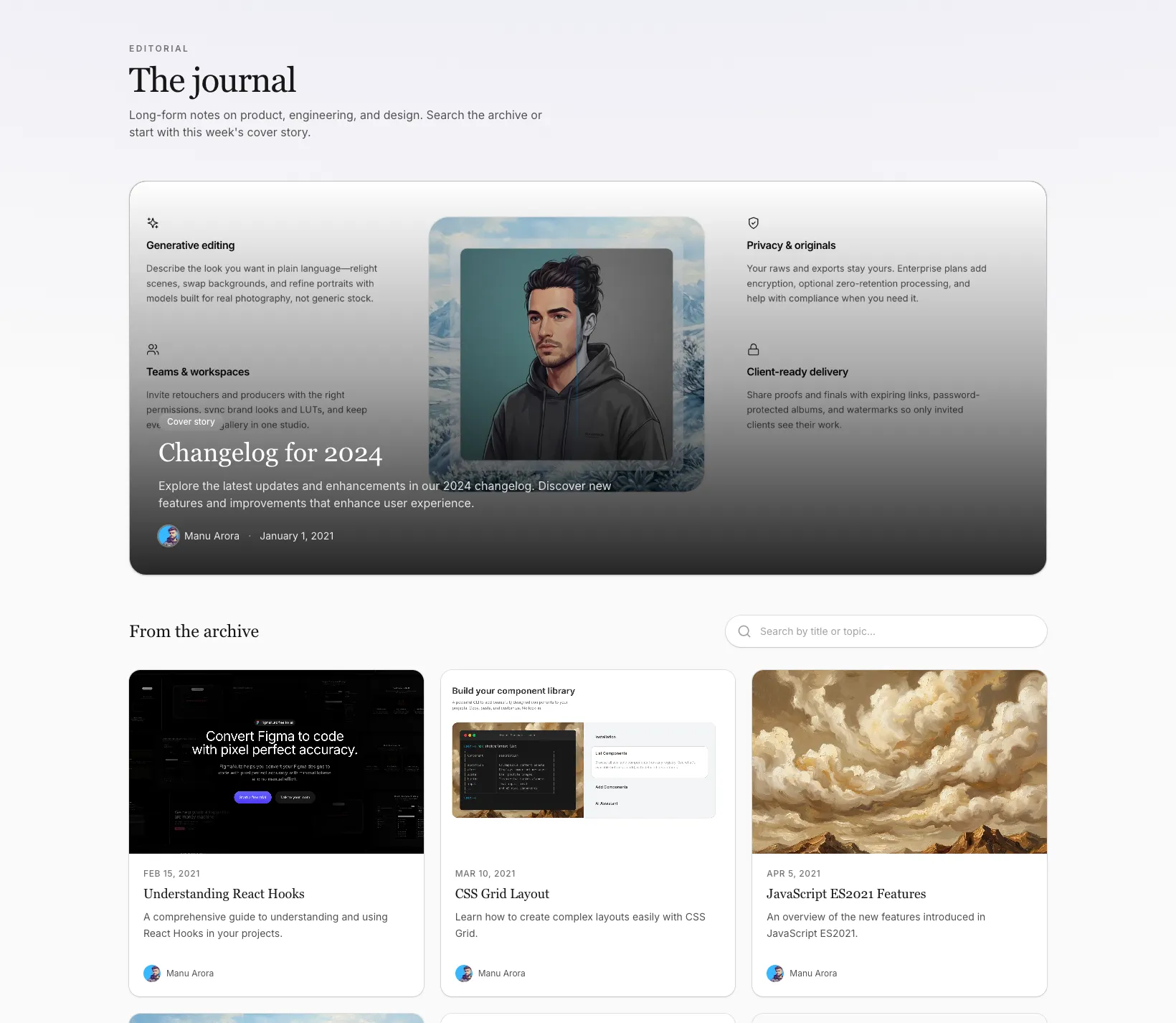
An editorial-style blog listing with a full-width cover story, fuzzy search, and a responsive card grid for the rest of your posts.
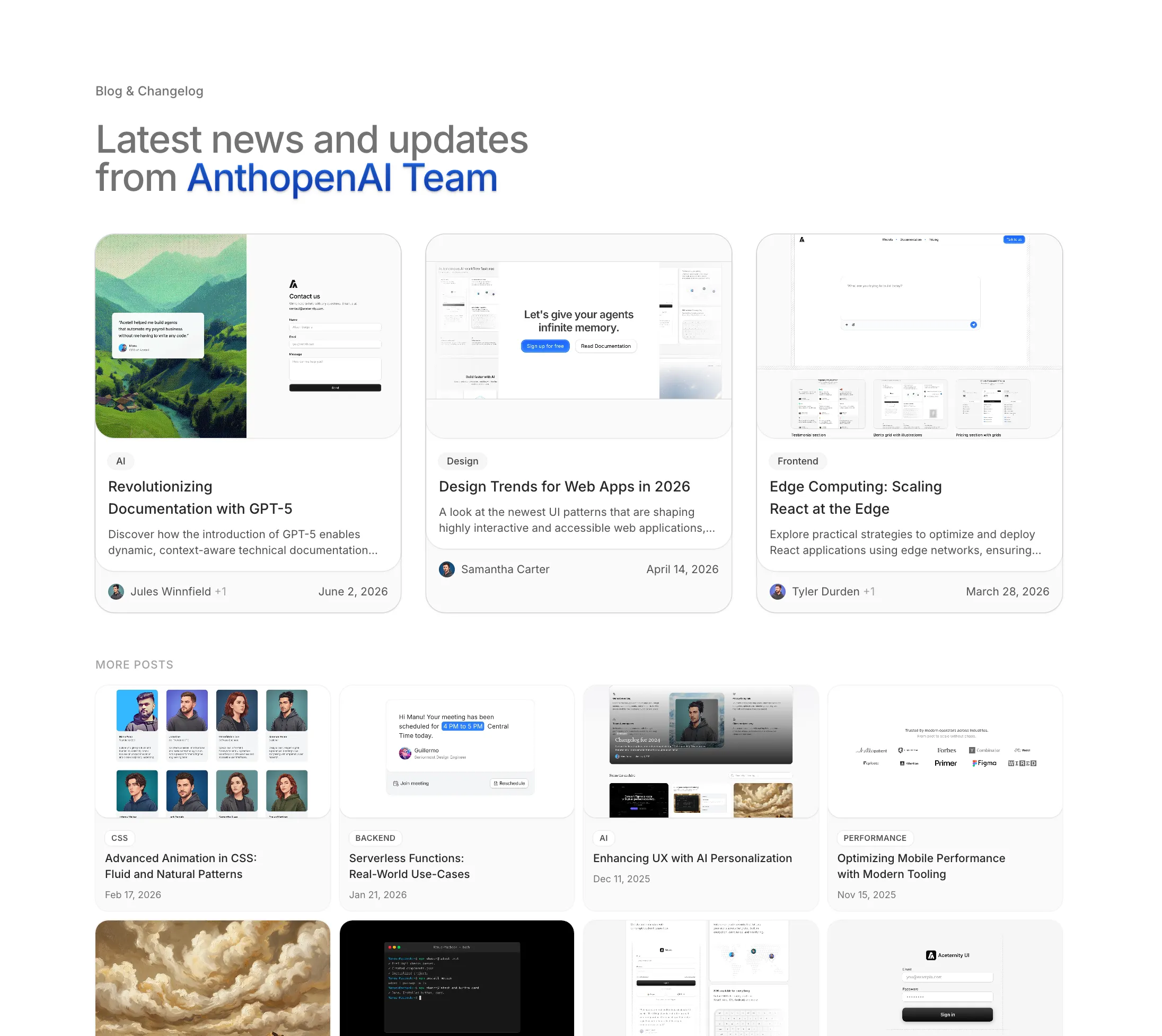
A changelog-friendly blog layout: three large featured posts with category, excerpt, and author row, plus a tighter four-column grid for the rest.
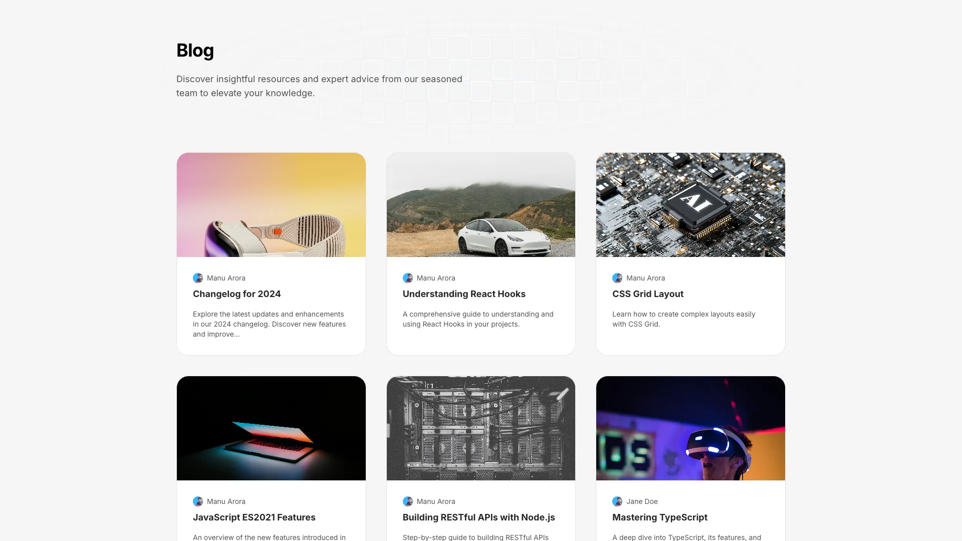
A blog listing page with a header section over a grid pattern background and a three-column card grid for posts. Cards scale on hover.
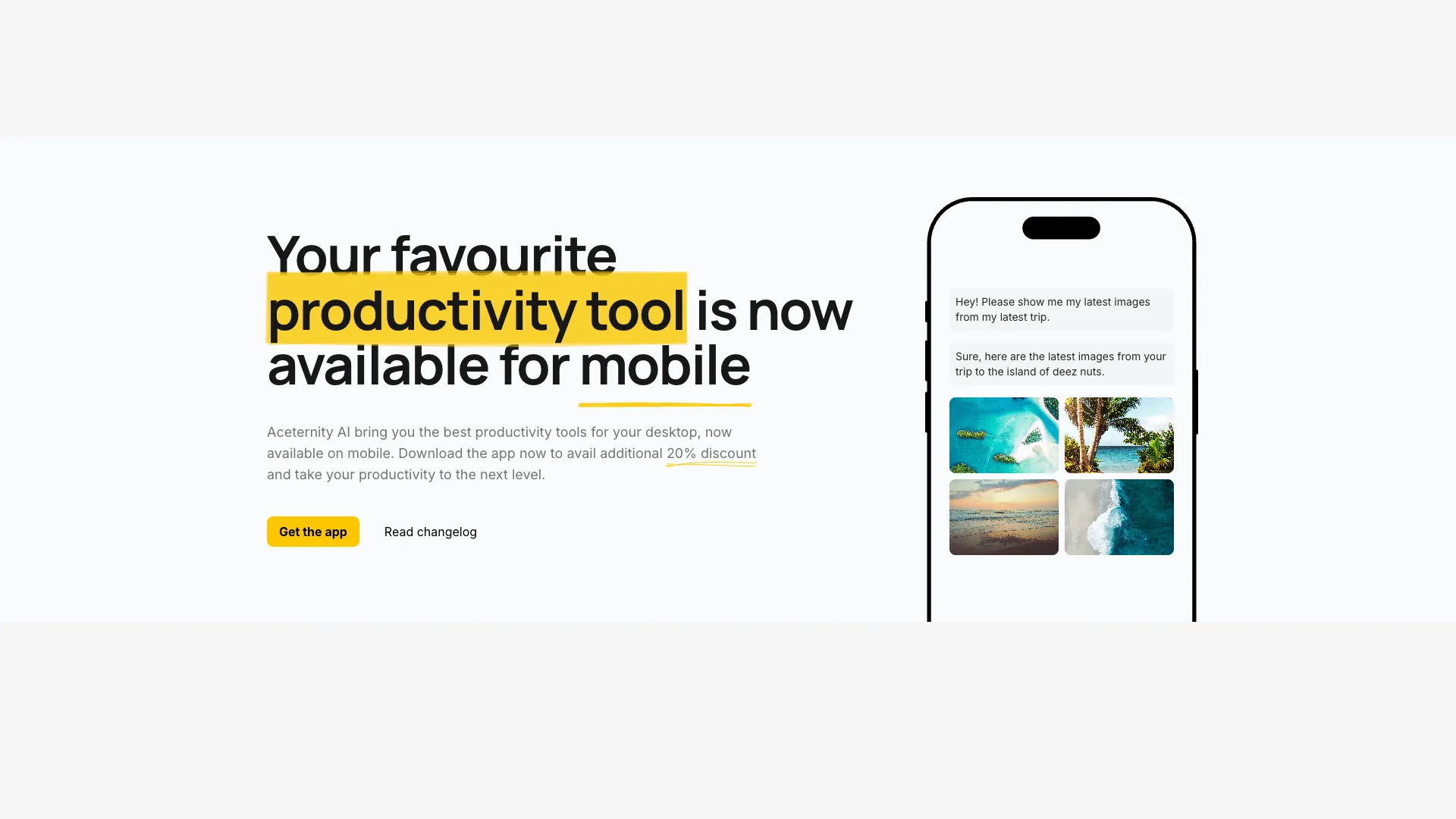
A fun, energetic hero section with hand-drawn highlight annotations and bouncy animations. Uses react-rough-notation for sketch-style word underlining and circling. Perfect for creative agencies, educational platforms, personal brands, and startups that want to feel approachable and human.
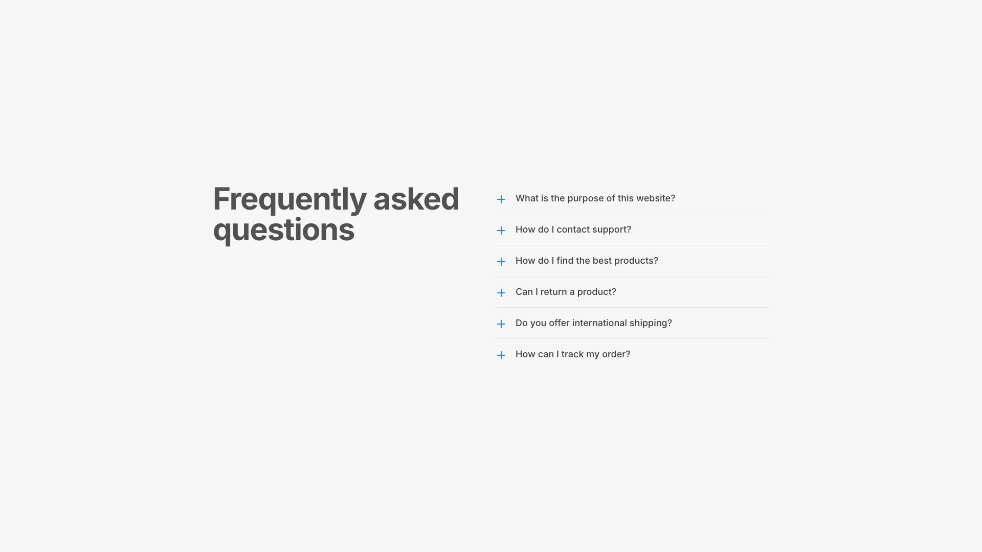
A two-column FAQ layout with an animated accordion on the right. Plus/minus icons rotate and scale with CSS transitions when items expand or collapse.
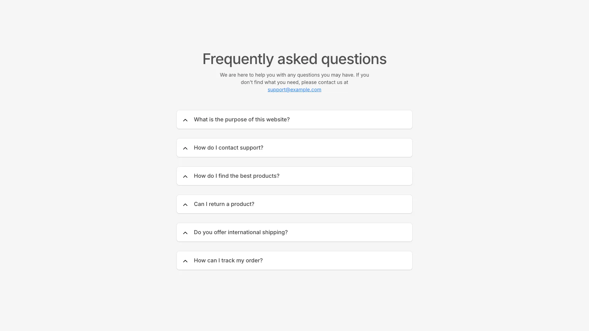
A centered FAQ section with chevron-based accordions. Each item has a subtle background that appears when expanded for visual feedback.
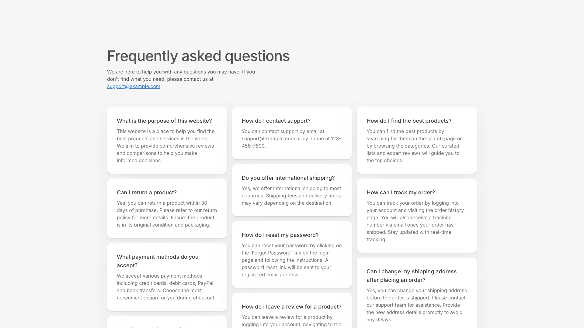
A three-column masonry-style FAQ layout where questions and answers display as static cards. No accordion interaction, all content visible at once.
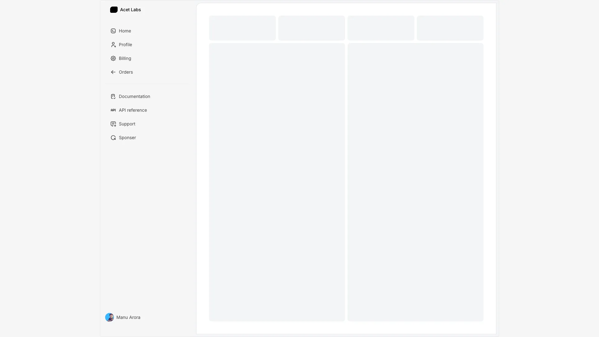
A sidebar that expands on hover to reveal link labels. Shows only icons when collapsed, full labels when hovered or active.
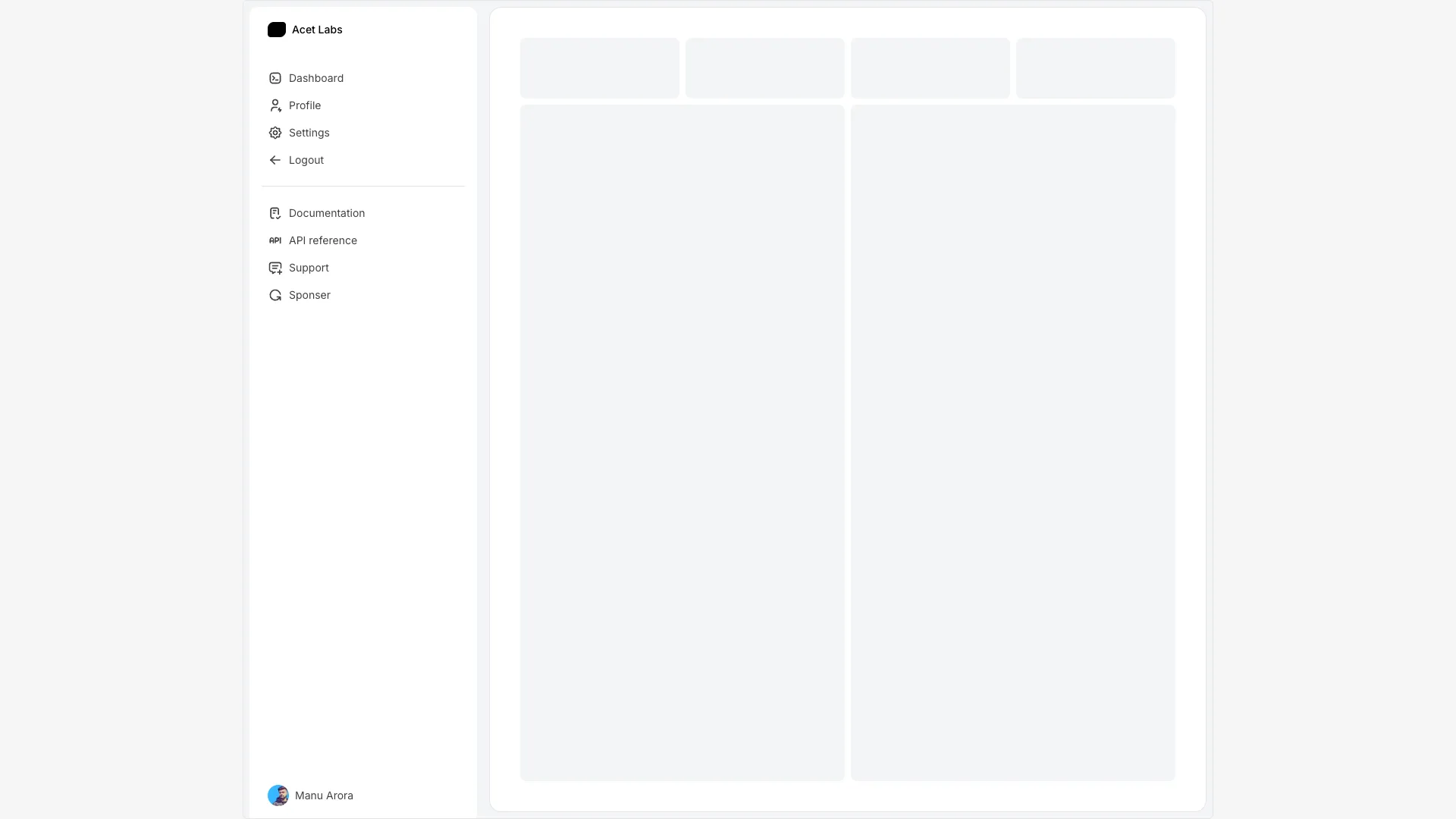
A sidebar with a toggle button to expand and collapse. Maintains state between interactions and includes a smooth width transition.
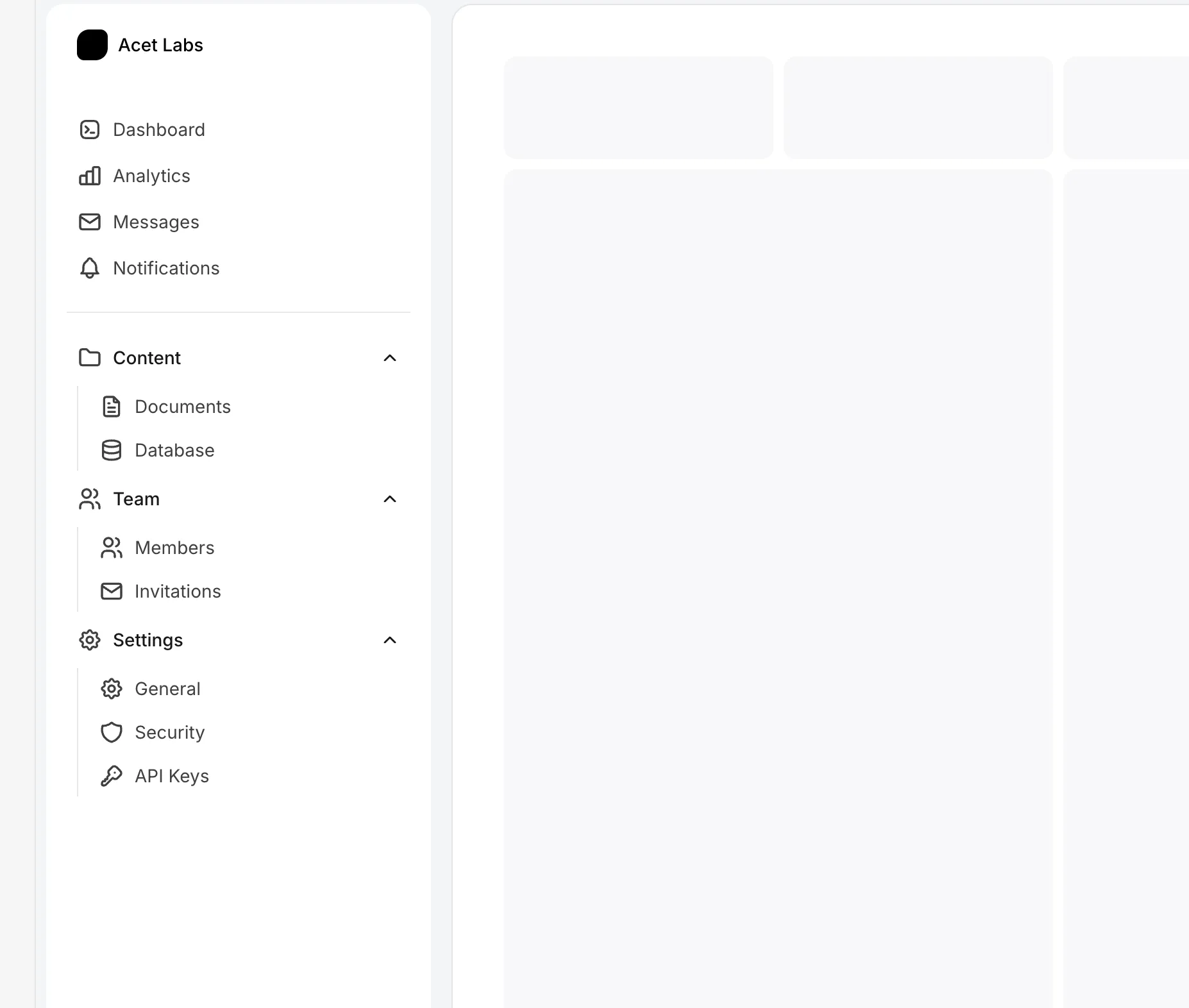
A collapsible sidebar with grouped navigation sections. Features persistent state for both sidebar open/close and individual group expansion using localStorage.

A centered single-column blog post layout with a large hero image, author byline, and Markdown content rendered through react-markdown.

A two-column blog layout with a sticky table of contents sidebar. The TOC includes hover animations and collapses into a floating button on mobile.
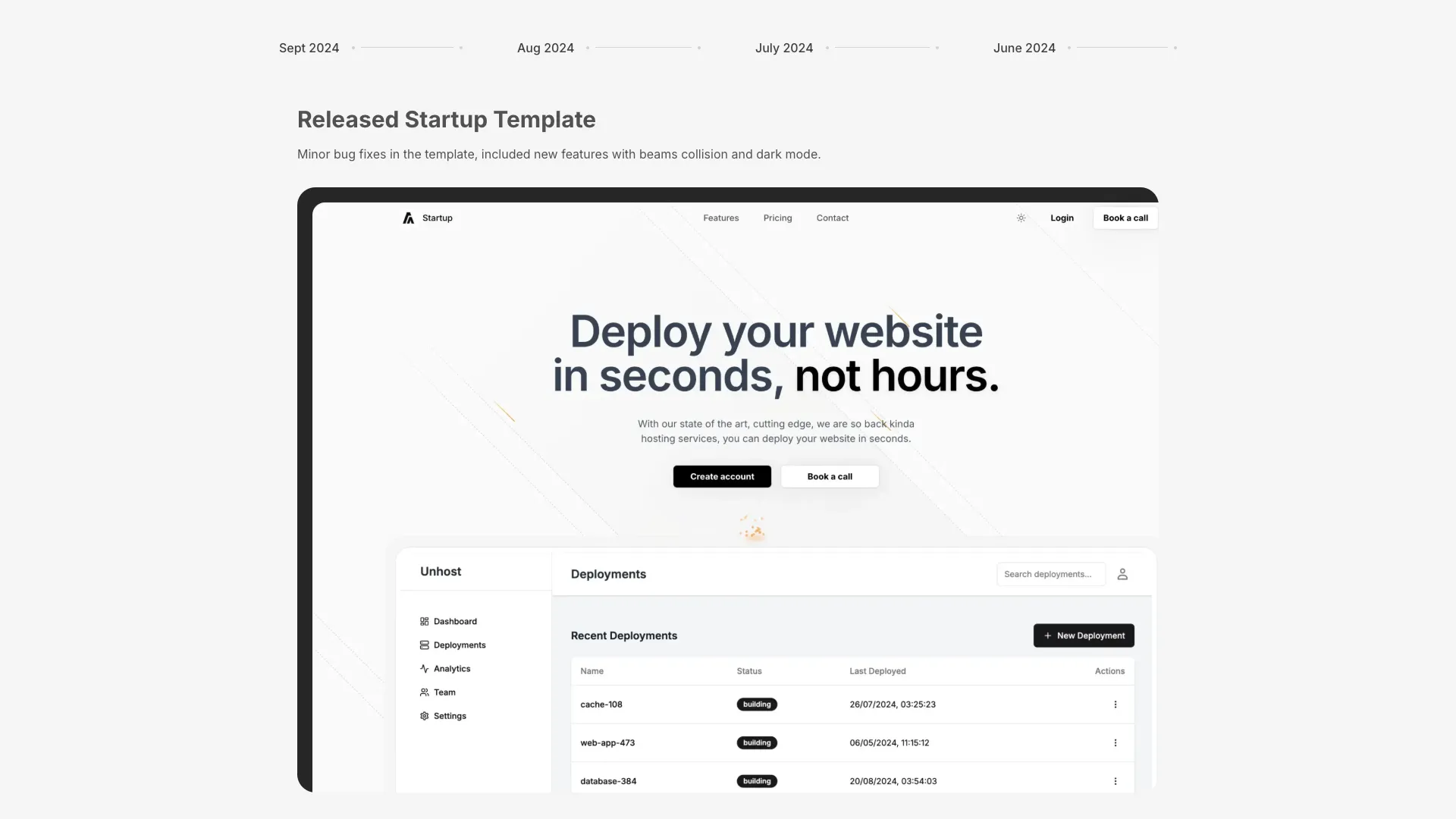
A timeline-style changelog section with date tabs and content cards. Clicking tabs reveals corresponding release notes with images.
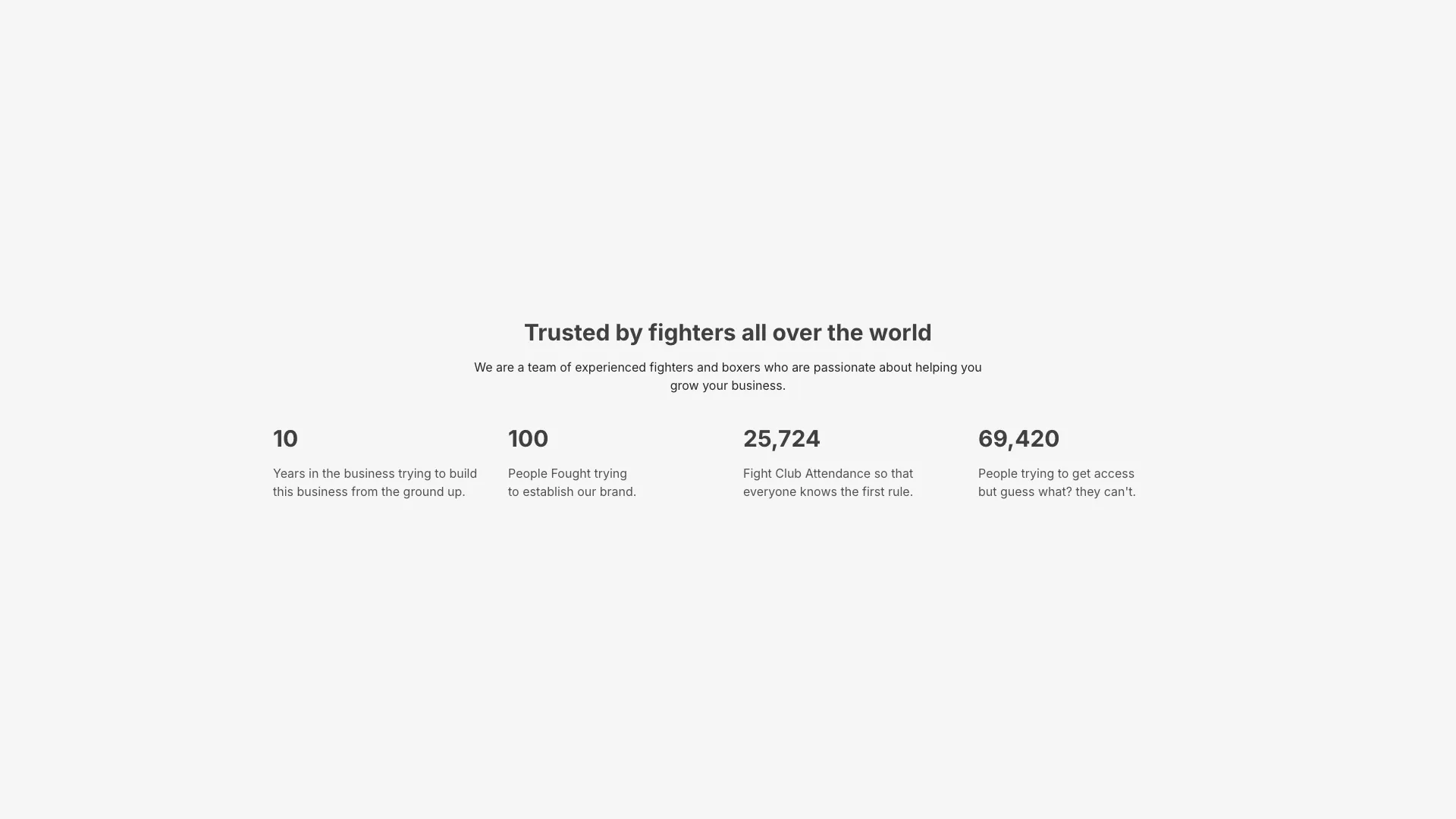
A stats section with animated counting numbers. Values tick up from zero when the component enters the viewport, using spring physics.
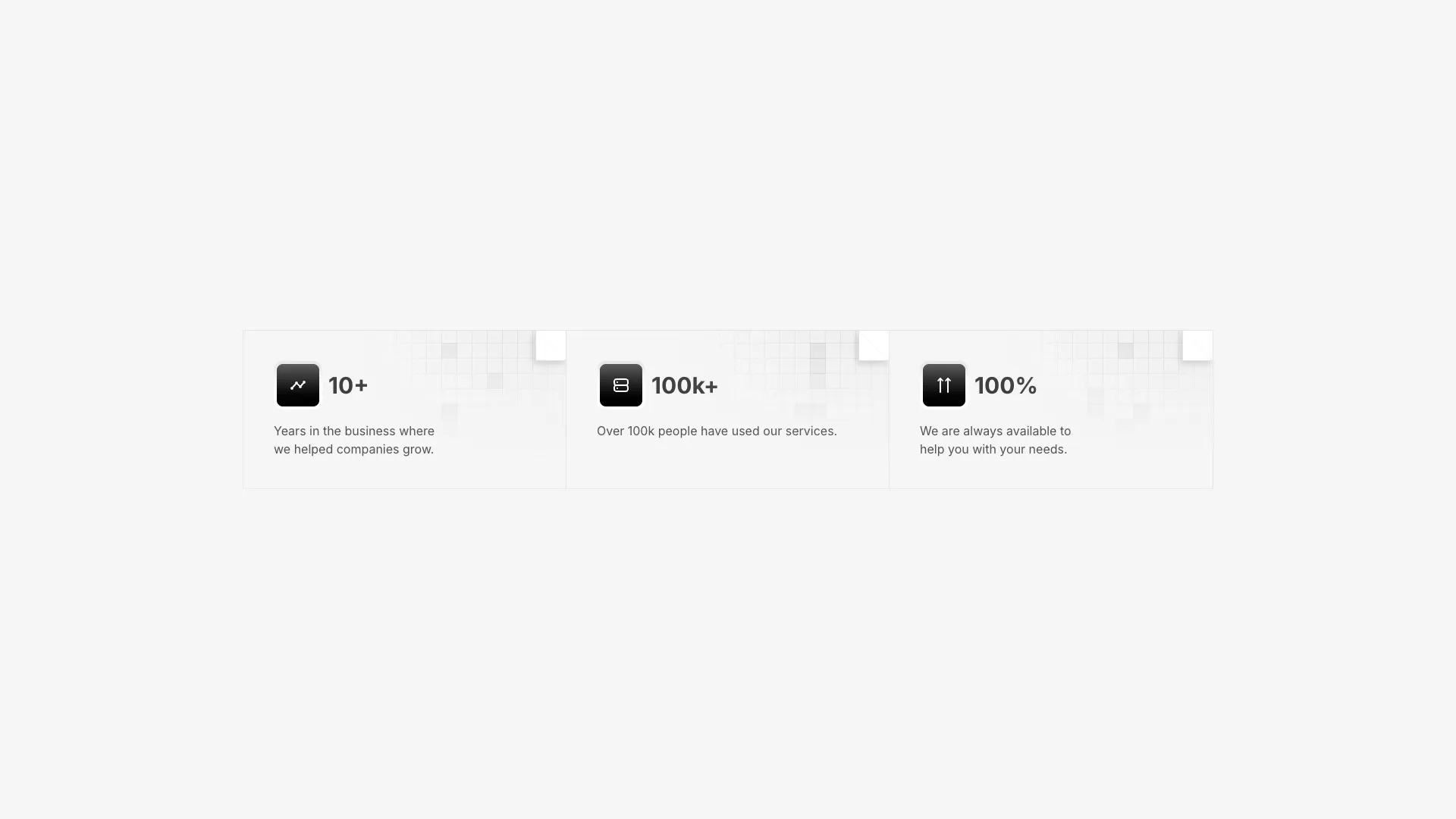
A three-column stats section with icon containers, values, and descriptions. Each card has an SVG grid pattern background and a hover-animated corner element.
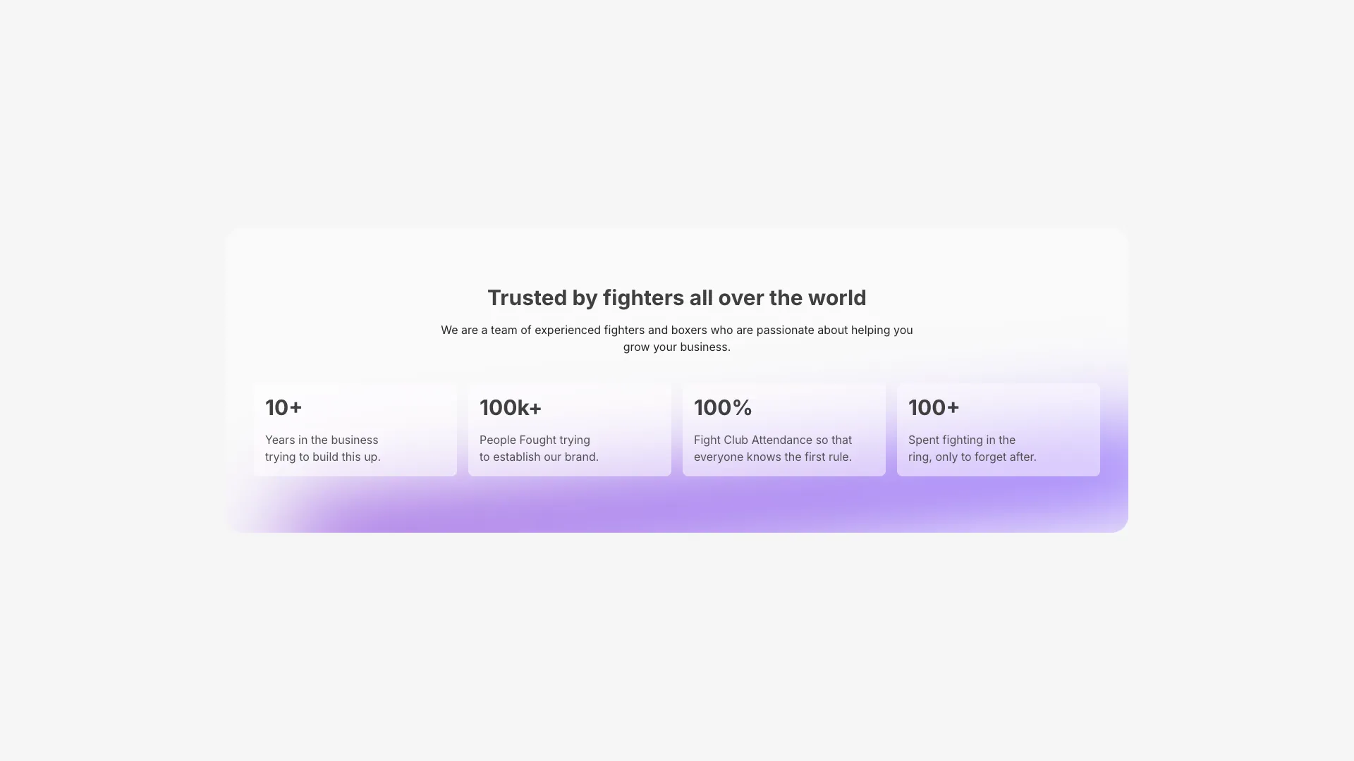
A four-column stats grid with glassmorphism cards. Features an animated purple gradient beam at the bottom and decorative SVG bar patterns.
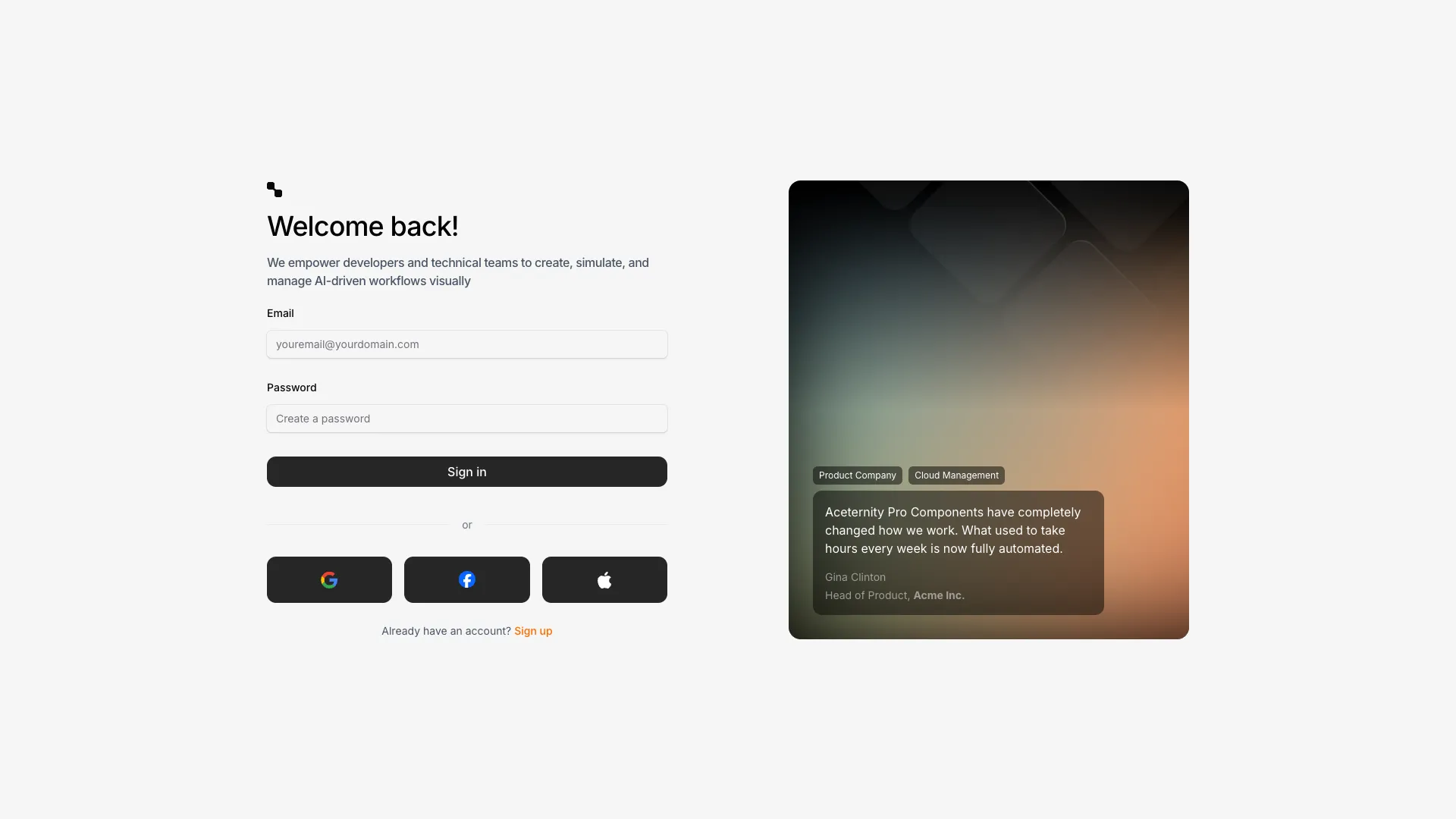
A two-column login page with form fields on the left and an animated gradient illustration on the right. Includes social login buttons and custom input styling.
A traditional header layout with logo, horizontal nav links, search input, and CTA button. Clean and familiar navigation pattern.
A mega menu navbar with large dropdown panels containing categorized links. Products and Resources sections display in a two-column grid.
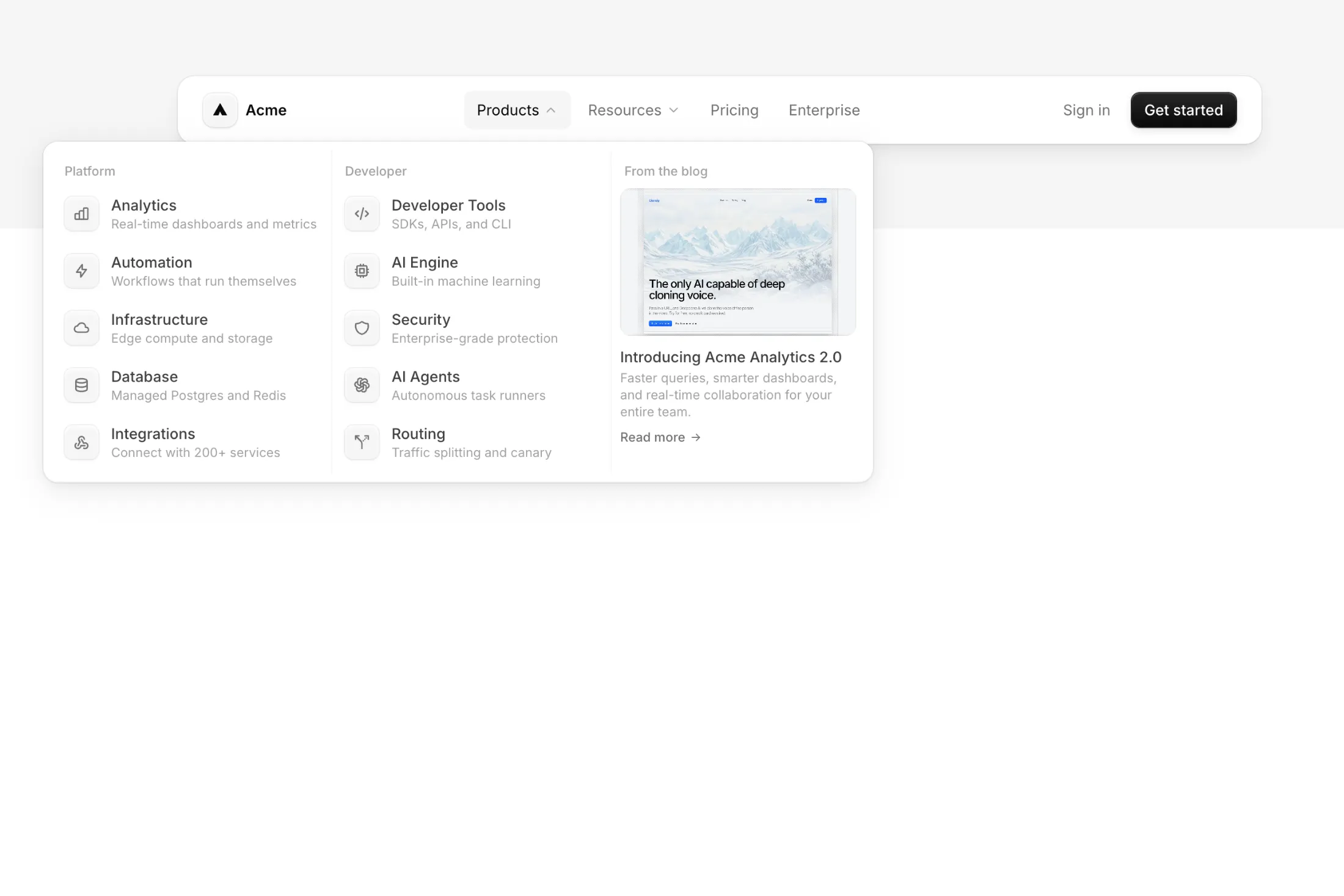
A dark navbar with deep ridge and groove shadows, dropdown mega menu with a 3-column grid layout including a blog panel, and full light/dark mode support.
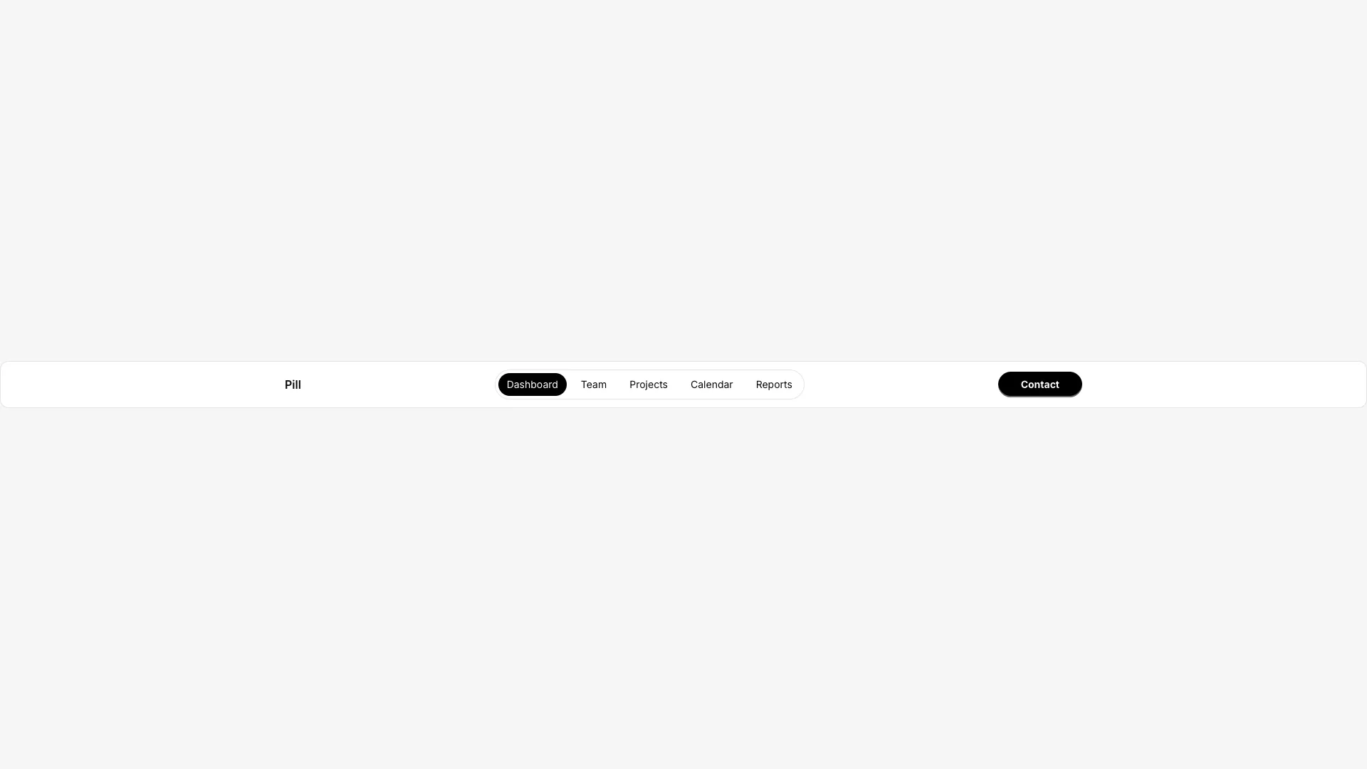
A navigation bar with pill-style tabs that highlight the active link. The centered nav sits inside a rounded container with backdrop blur.
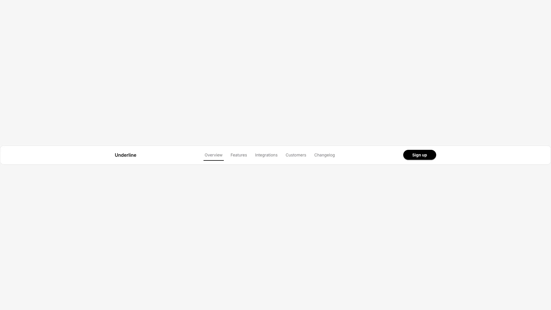
A navigation bar with underline indicators for active and hover states. A thin line appears below the selected link.
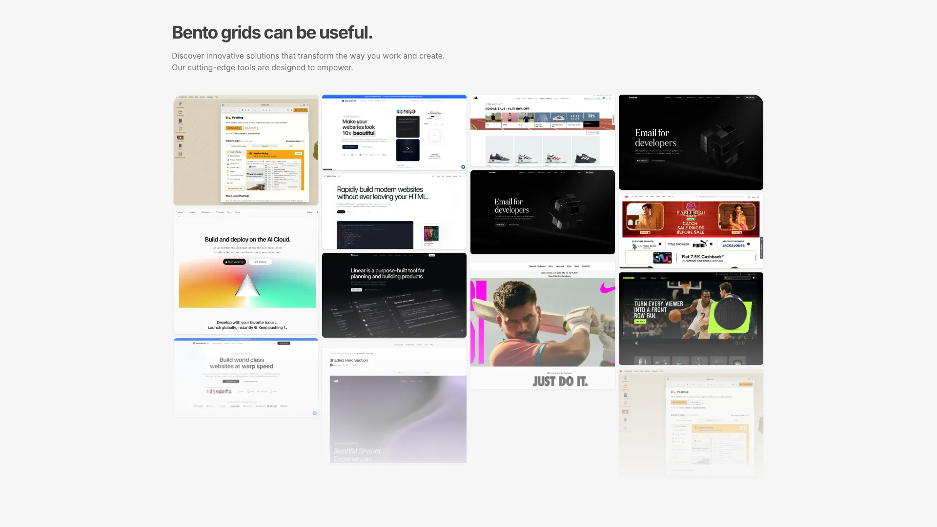
A four-column masonry layout of linked image cards with hover overlays. Each card reveals the link URL on hover with a dark overlay transition.

A clean, minimal hero section where stacked images create a parallax depth effect on scroll. The layered image composition adds visual sophistication without overwhelming the content. Ideal for portfolios, creative agencies, and product websites that value elegant simplicity.

A modern hero section with a product image that reveals animated scales on mouse hover. The interactive reveal effect creates curiosity and engagement. Built with Tailwind blue-500 color palette. Perfect for tech products, SaaS dashboards, and developer tools that want to showcase depth behind the interface.
A logo grid with scroll-triggered entrance animations. Logos fade in from above with blur that clears as they enter the viewport.
A logo cloud with automatic rotation. Displays 10 logos in a 5x2 grid that swap every 3 seconds with horizontal motion and blur effects.
A single-line “trusted by” strip with a heading and five logos that alternate between two sets every two seconds, with staggered blur and slide motion. Stacks cleanly on smaller screens.
Four rows of logos mixed with empty tiles, scrolling in opposite directions with a left-right fade. Built for a bigger “tools these teams already use” band.
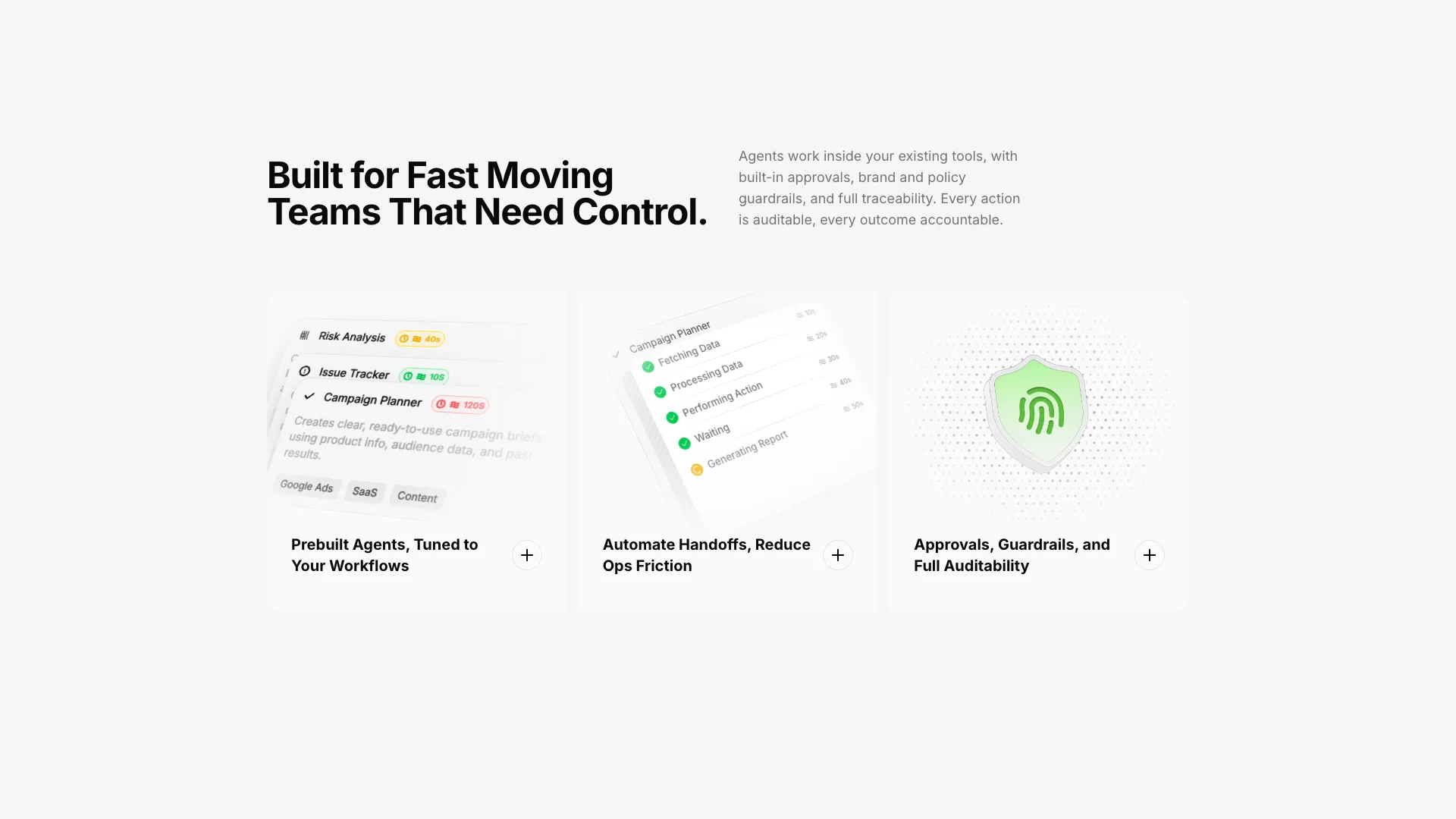
A three-column feature grid with tall cards displaying animated skeleton illustrations. Each card shows a workflow or status visualization with 3D perspective effects.
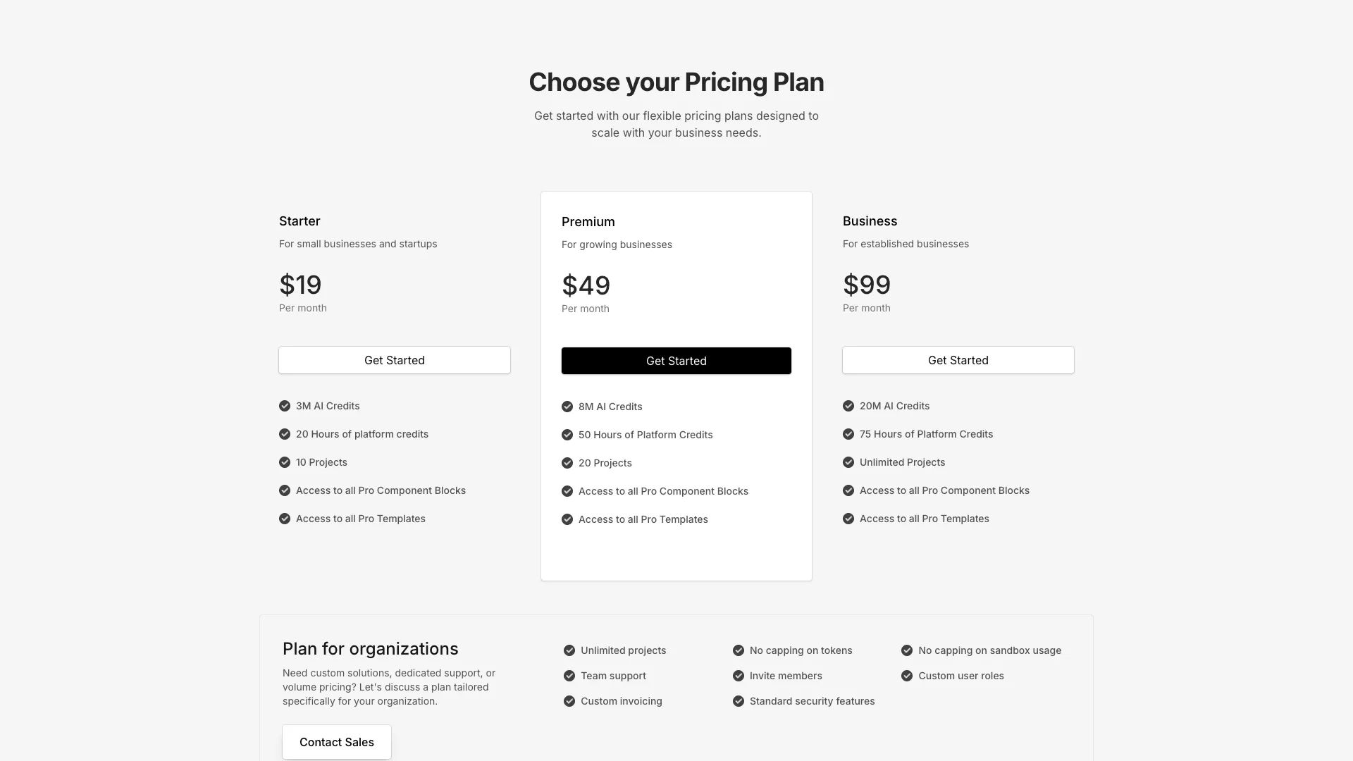
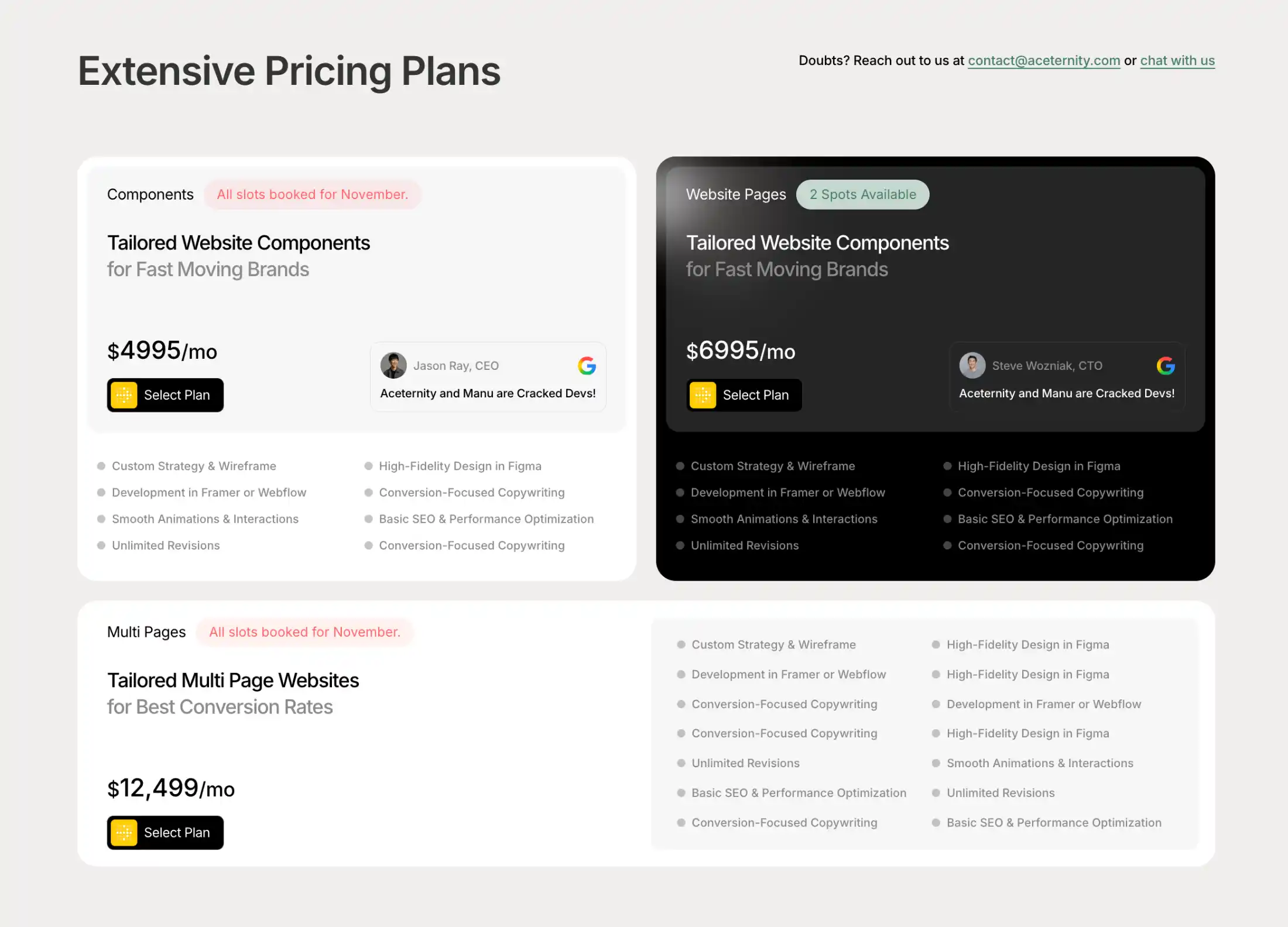
A complete pricing page with three tiers plus a separate enterprise card. Features discounted pricing display and comprehensive feature lists.
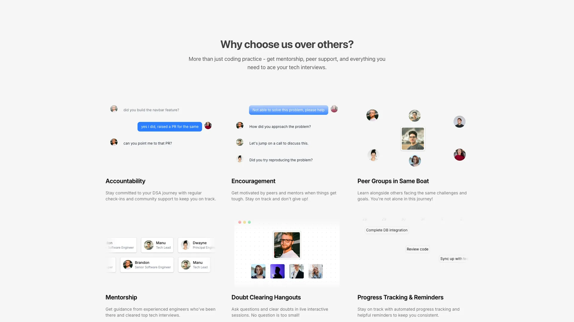
A six-card bento grid where each card contains an animated skeleton illustration. Features chat messages, video call grids, mentorship marquees, and floating avatars.
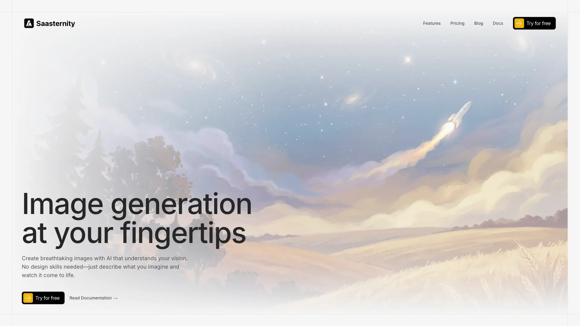
A sleek hero section with an animated background effect and an integrated navigation bar. The combined layout creates a seamless visual experience from the very first viewport. Ideal for SaaS platforms, tech startups, and product websites that need both navigation and visual impact in one cohesive block.
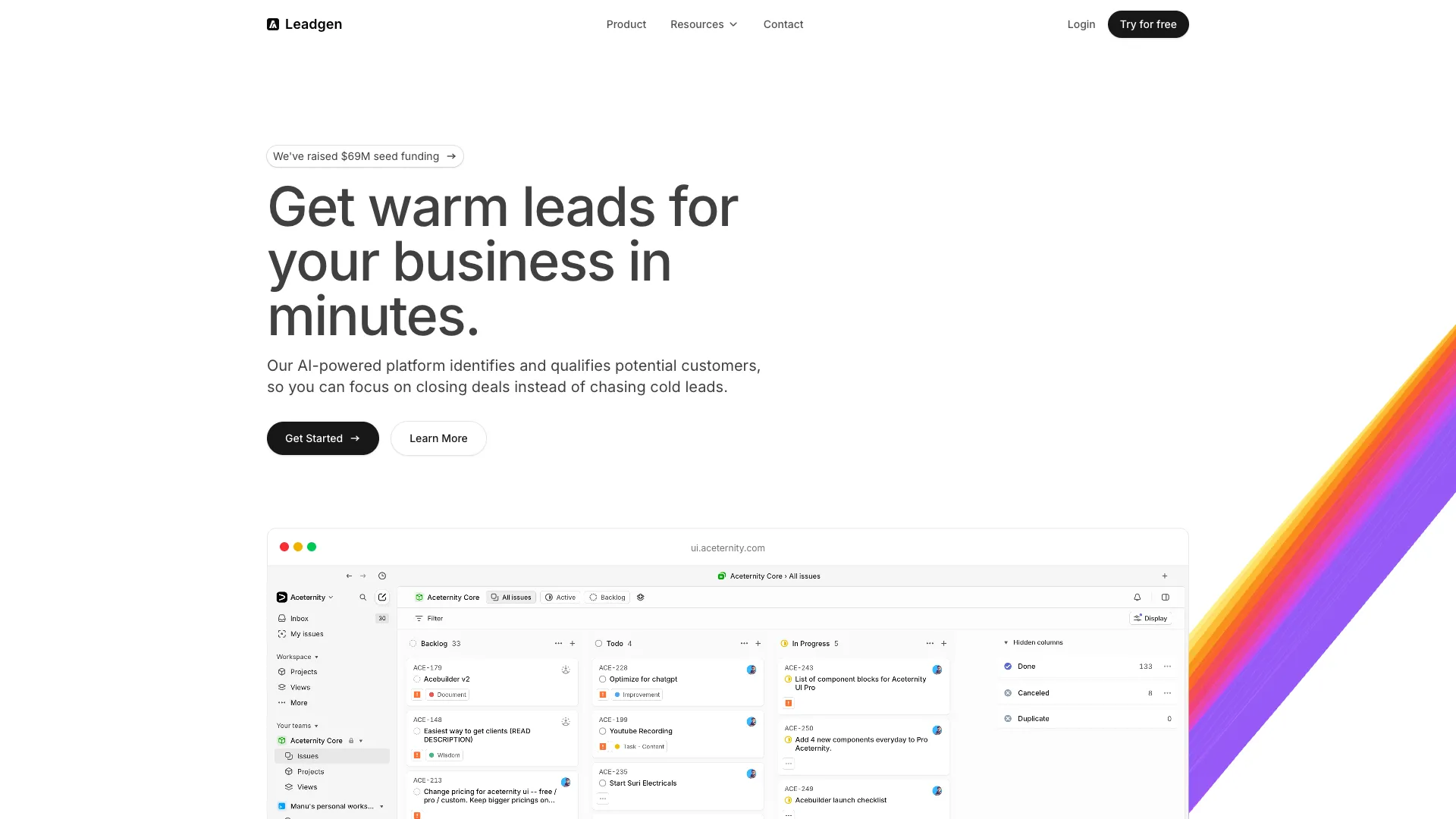
A vibrant hero section featuring a multi-color animated background that shifts between color palettes. The dynamic color transitions create a lively, attention-grabbing atmosphere. Perfect for creative products, design tools, marketing agencies, and brands that want to convey energy and creativity.
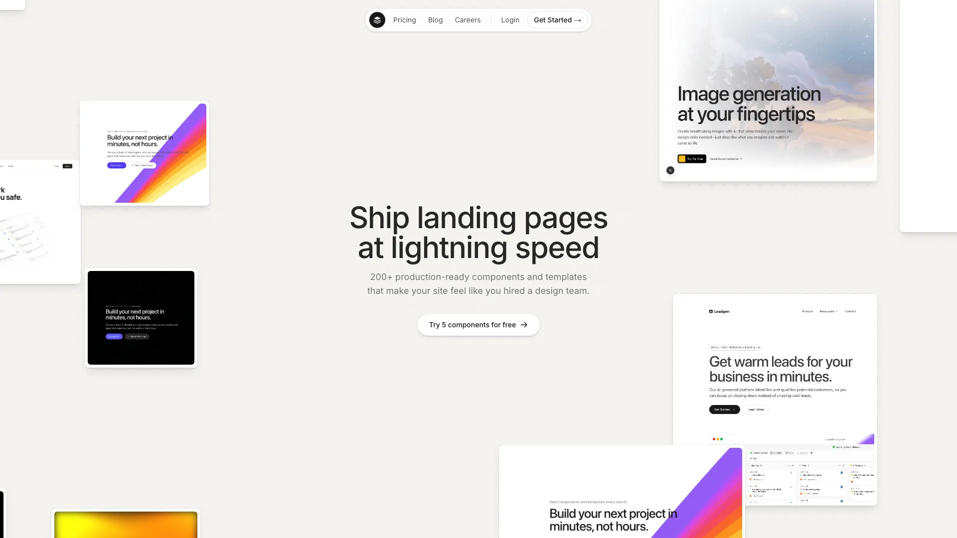
A dynamic hero section featuring infinitely scrolling card elements that create continuous visual movement. The auto-scrolling cards showcase content, features, or testimonials in a flowing stream. Perfect for social platforms, marketplaces, content-heavy products, and any site that wants to convey abundance and activity.
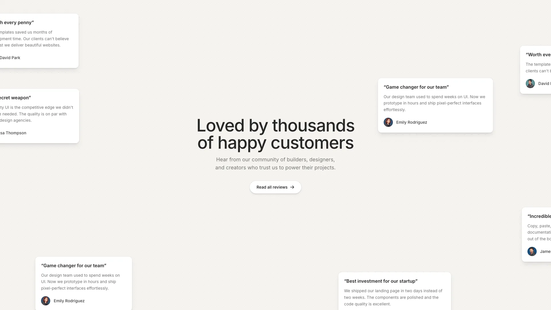
A hero-style testimonials section with draggable cards scattered in the background. Cards can be picked up and moved, creating an interactive experience.
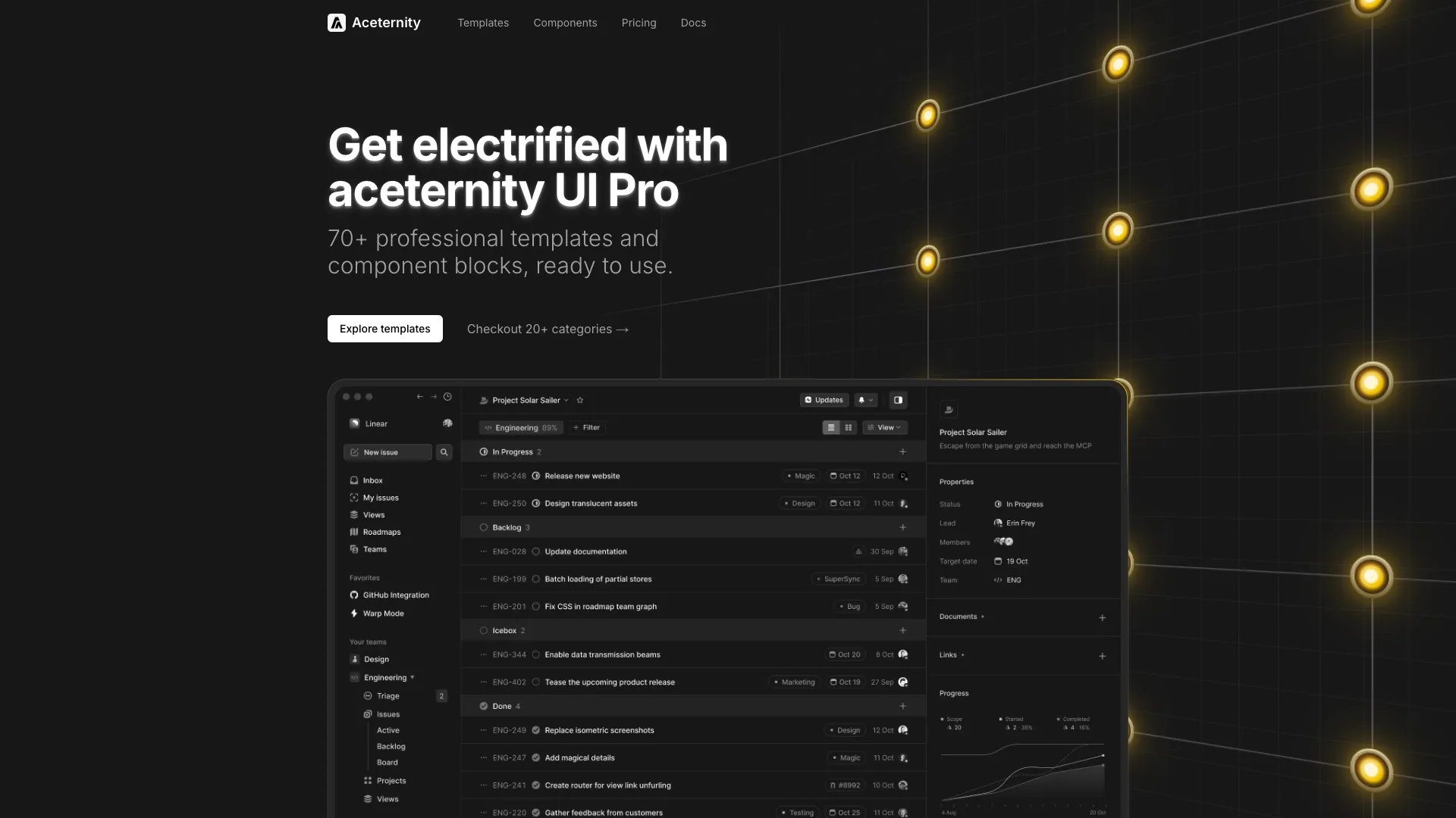
A cinematic hero section with animated flickering light bulbs on a steel grid. The bulbs power up one by one with realistic flicker effects, occasionally fusing and coming back to life. Perfect for industrial, tech, or creative brands wanting a dramatic, high-impact introduction.

A modern hero section featuring an interactive tabbed browser window preview. Tabs auto-rotate through different content sections with smooth animations, showcasing multiple features or pages in a single component. Perfect for SaaS, portfolios, and product showcases.
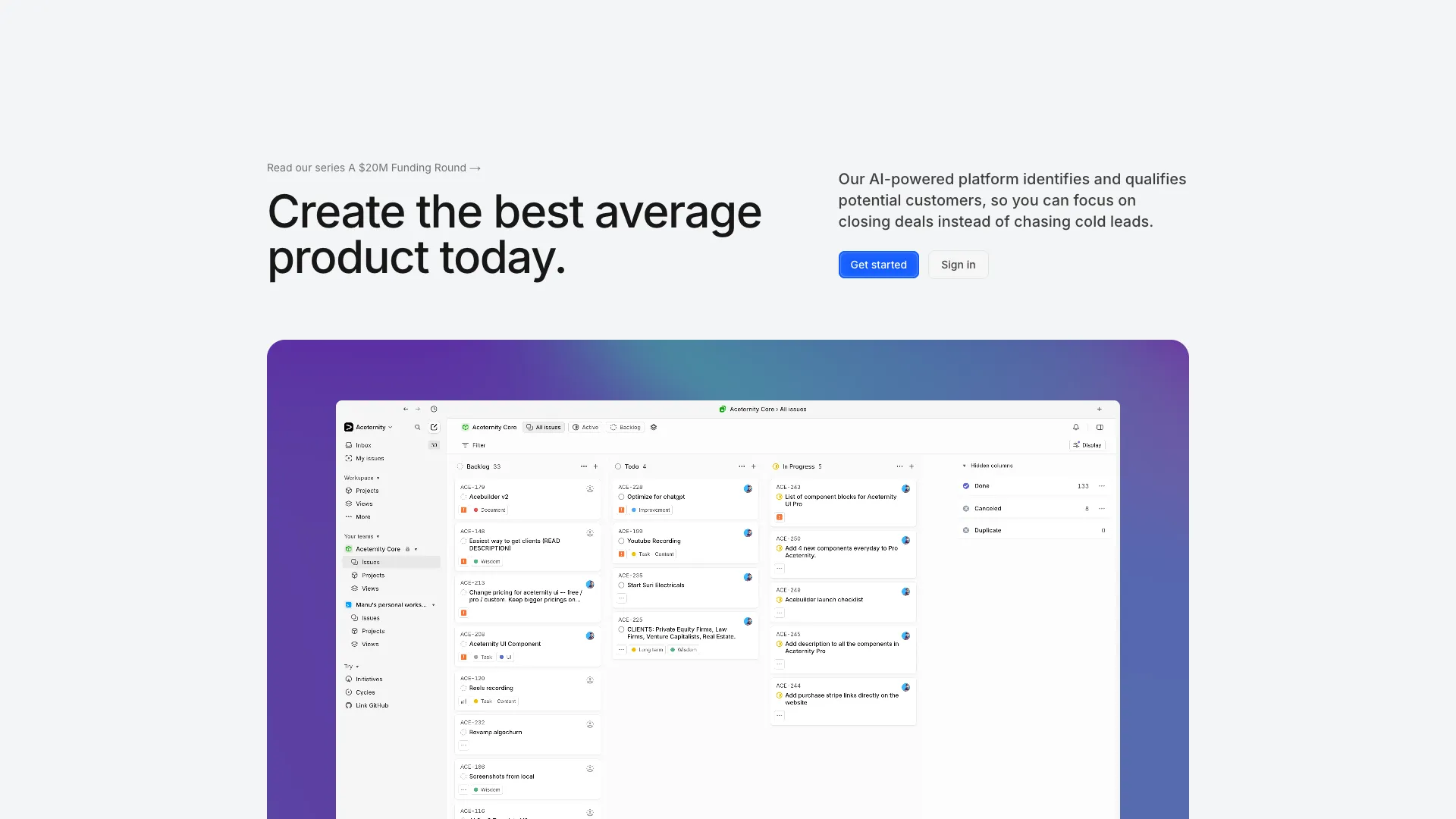
A modern hero section featuring a vibrant mesh gradient background with smooth color transitions. Includes centered content with headline, description, and call-to-action buttons.
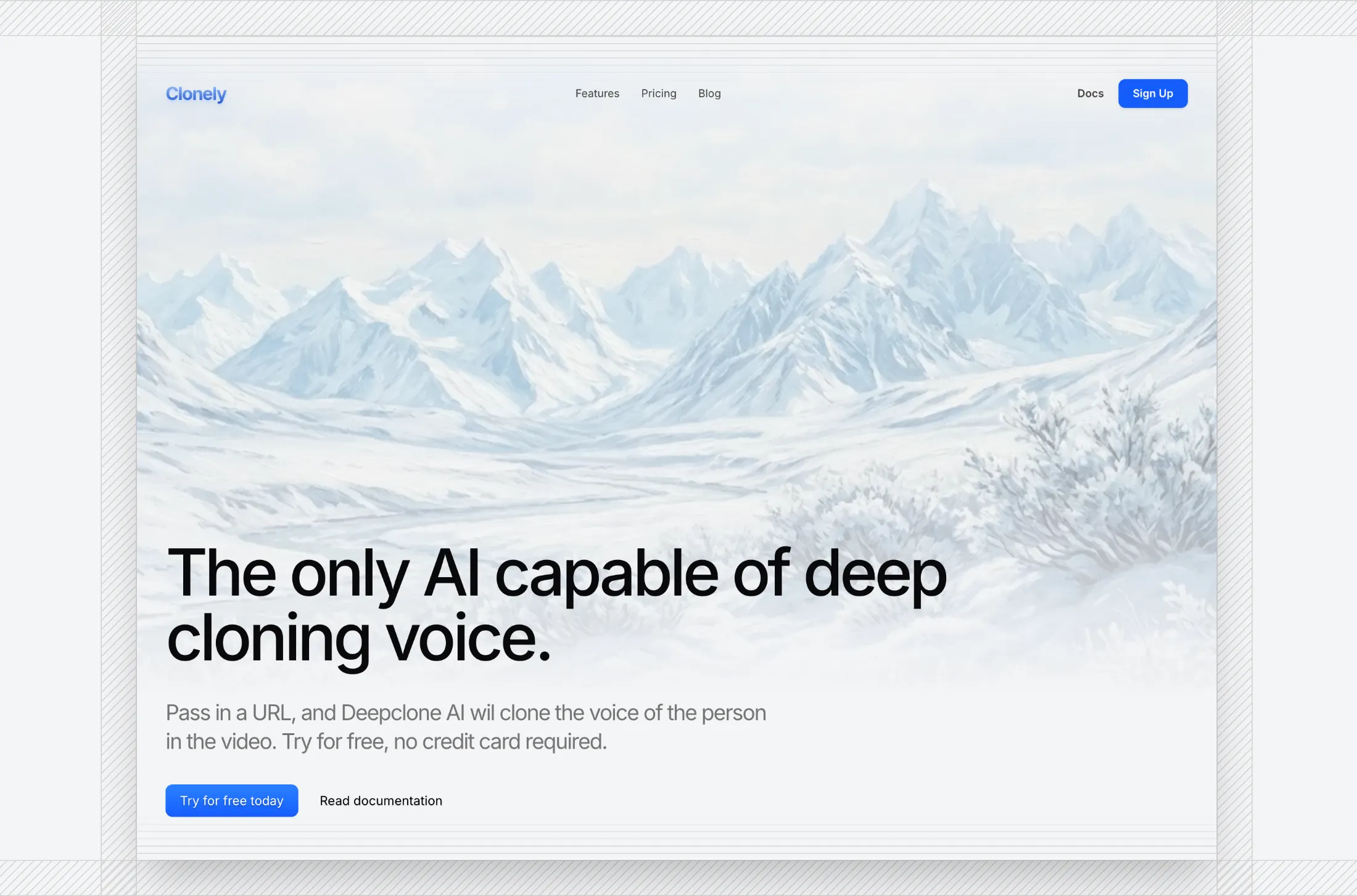
A full-height hero with a landscape image, ruler-style borders, and a simple nav. Works on mobile with a collapsible menu. Good for AI, audio, or SaaS landing pages that want a crisp, editorial first screen.

A hero with a canvas dither treatment on a background photo, fixed nav, headline, CTAs, logo marquee, and a framed product shot. Good for SaaS or AI landing pages that want a retro, graphic look instead of a flat image.

A hero with rail guides, hatch scale bands, an animated Bayer dither panel behind a product screenshot, and a logo rail. Built for SaaS and infra landing pages that want a technical, print-like fold.
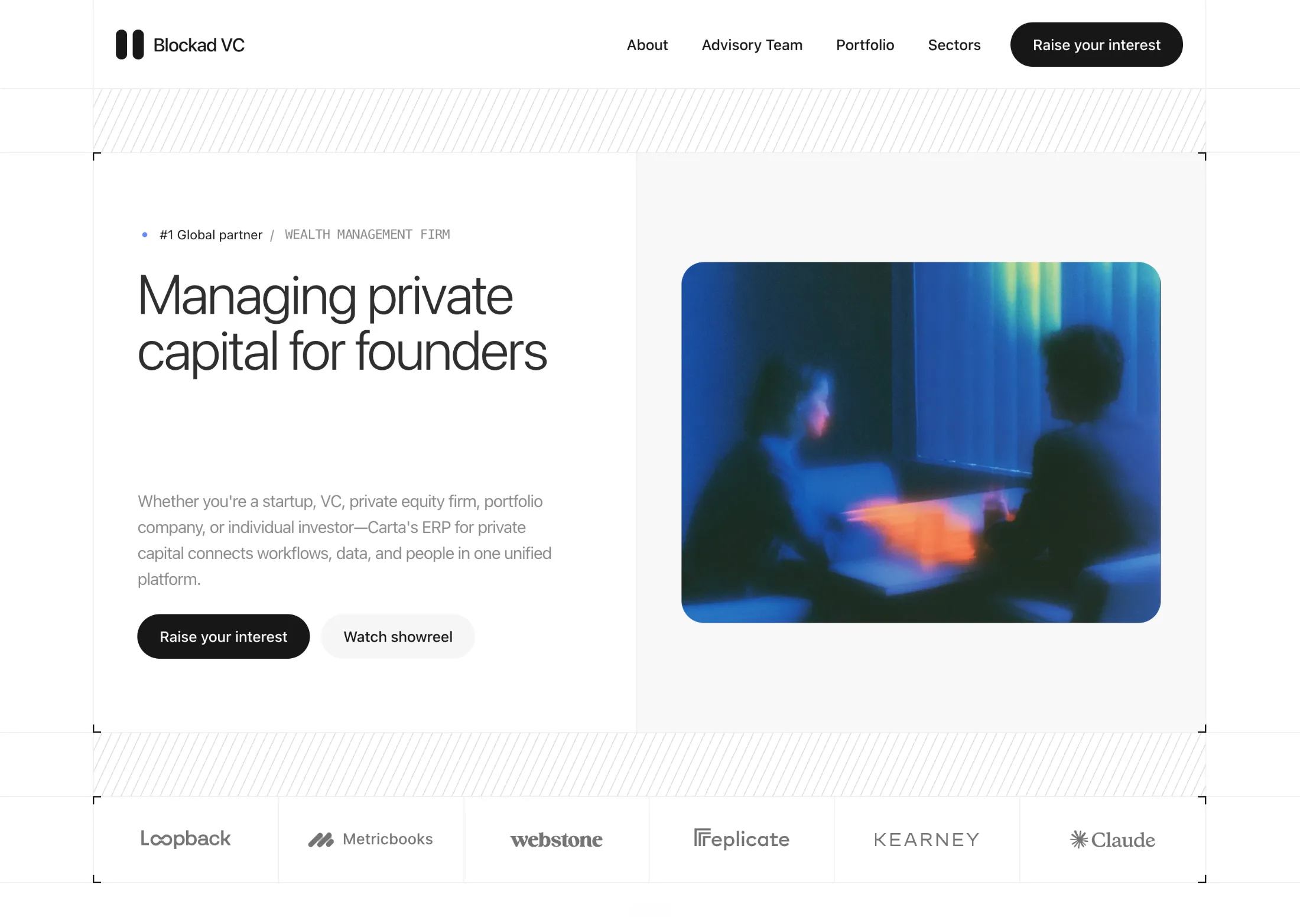
A hero with rail guides, hatch scale bands, L-corner frames, split copy and image, and a logo rail. Built for VC, fund, and advisory landing pages that want a print-like fold.
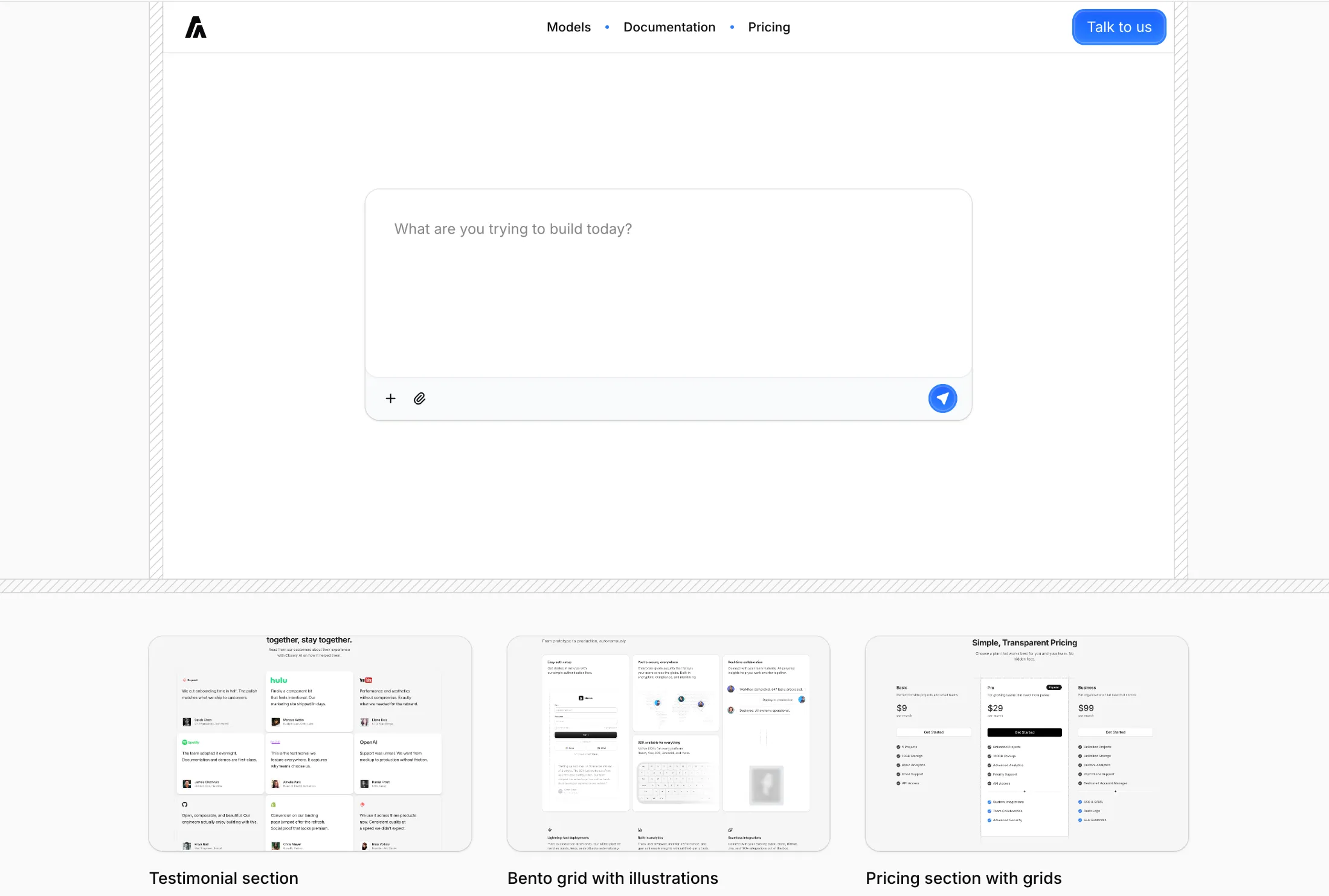
A hero with a top nav, a large prompt-style textarea with attach and send actions, diagonal stripe borders, and a three-up row of thumbnails and credits—suited to AI builders, prompts, or product homepages that open with a single question.
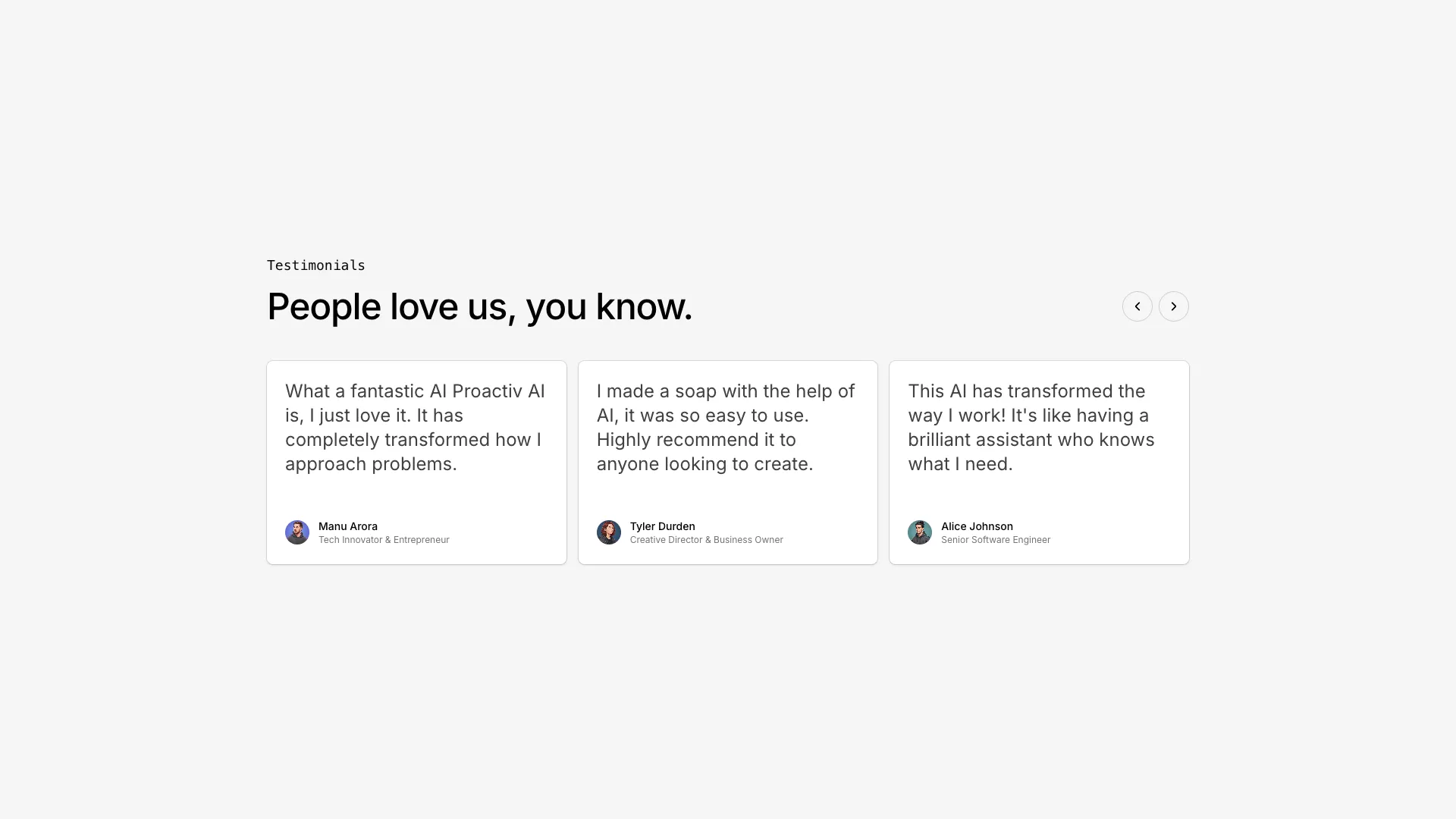
A testimonials section with paginated carousel navigation. Displays three testimonials at a time with smooth animated transitions between pages.
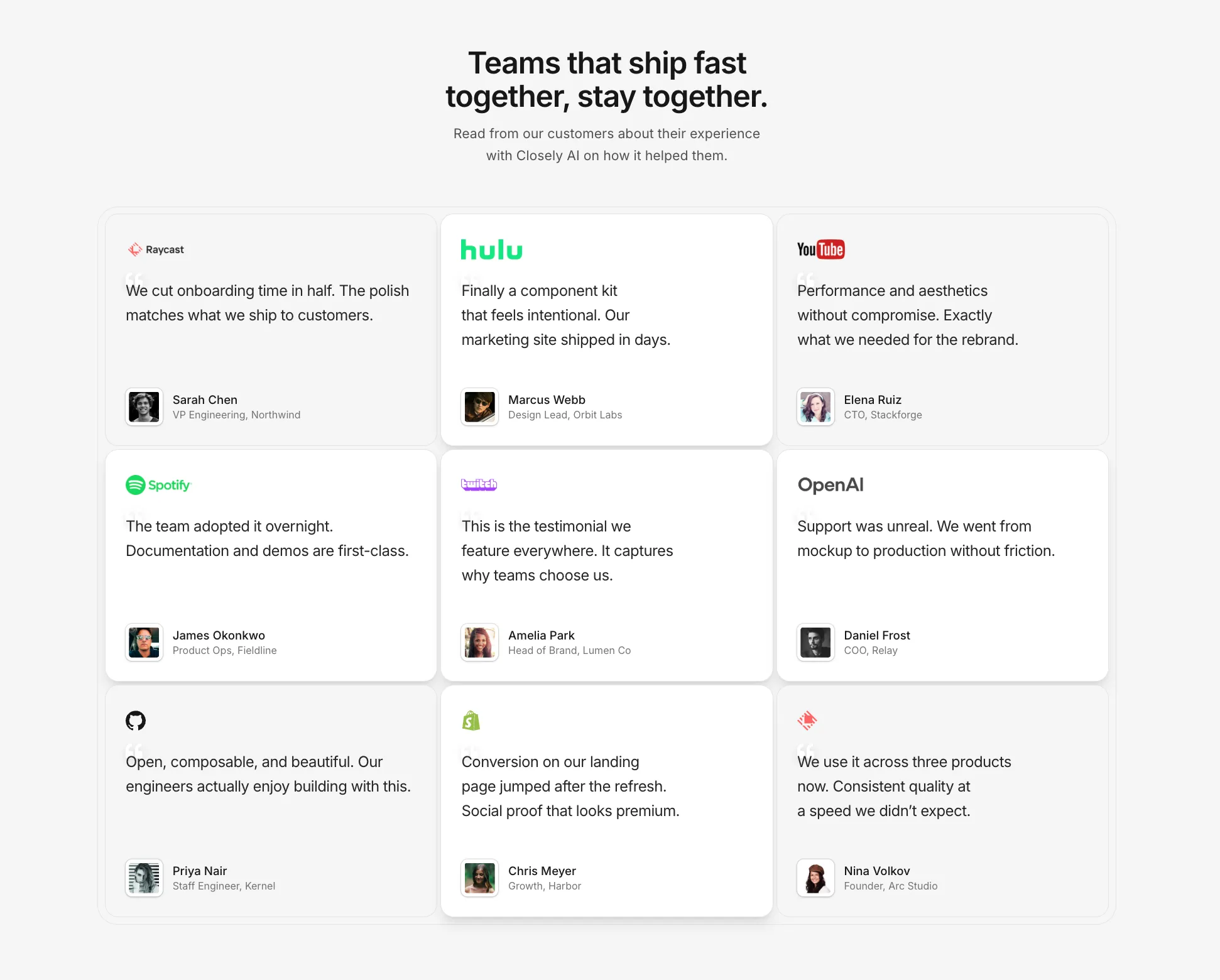
A heading, short intro, and a responsive grid of testimonial cards with logos, quotes, and avatars. Highlight key cards when you want one story to stand out.
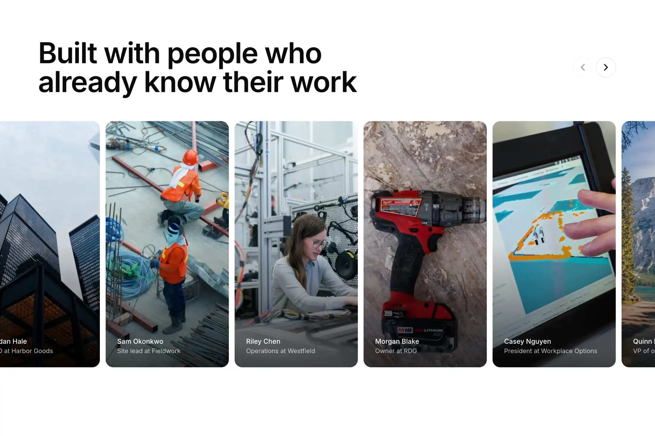
A full-bleed row of portrait photo cards. Hover or click a card to expand it and read the quote on the image.
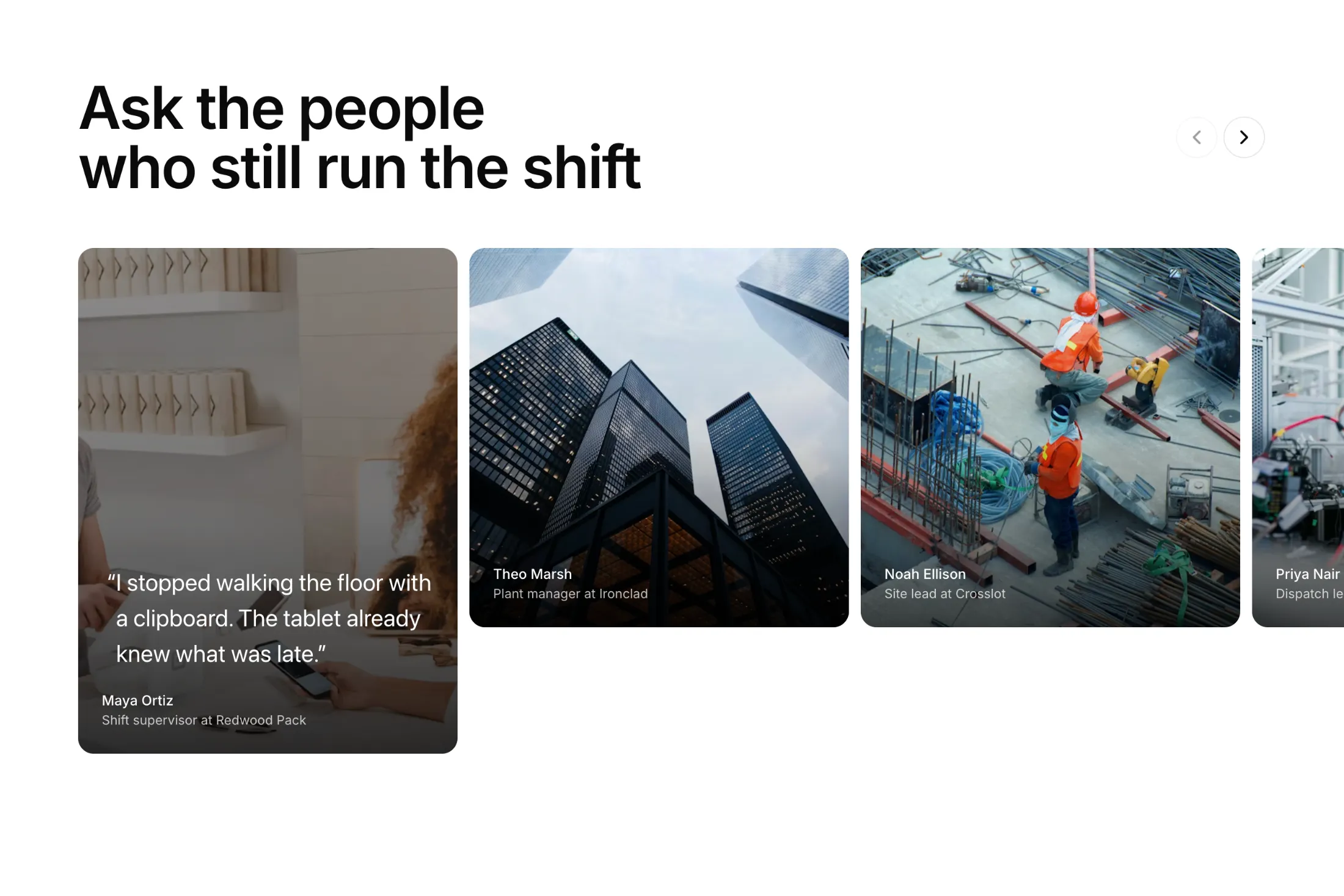
Equal-width portrait cards in a carousel. The active card grows taller so the quote has room on the photo.
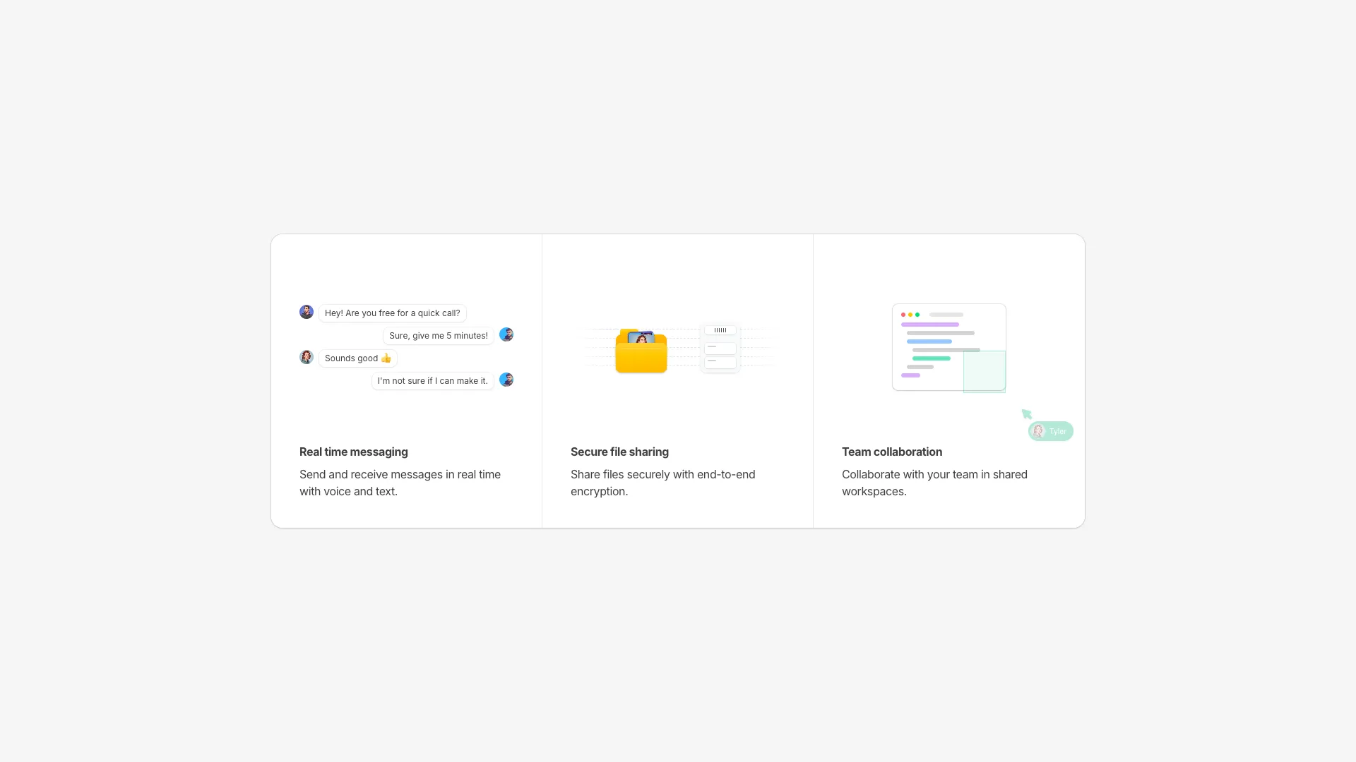
A features section with animated skeleton loaders that bring each card to life. Each card shows a different feature with a unique skeleton animation.
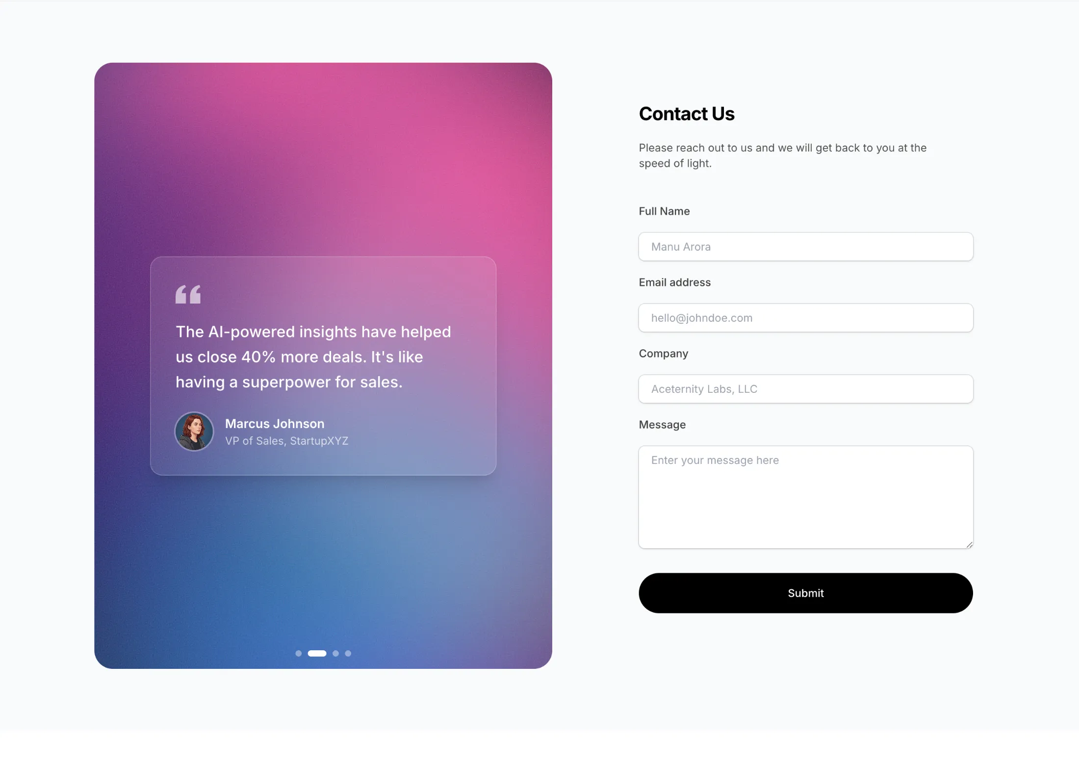
A two-column contact section with an animated WebGL shader background and rotating testimonial cards. The shader features flowing gradients with customizable colors.
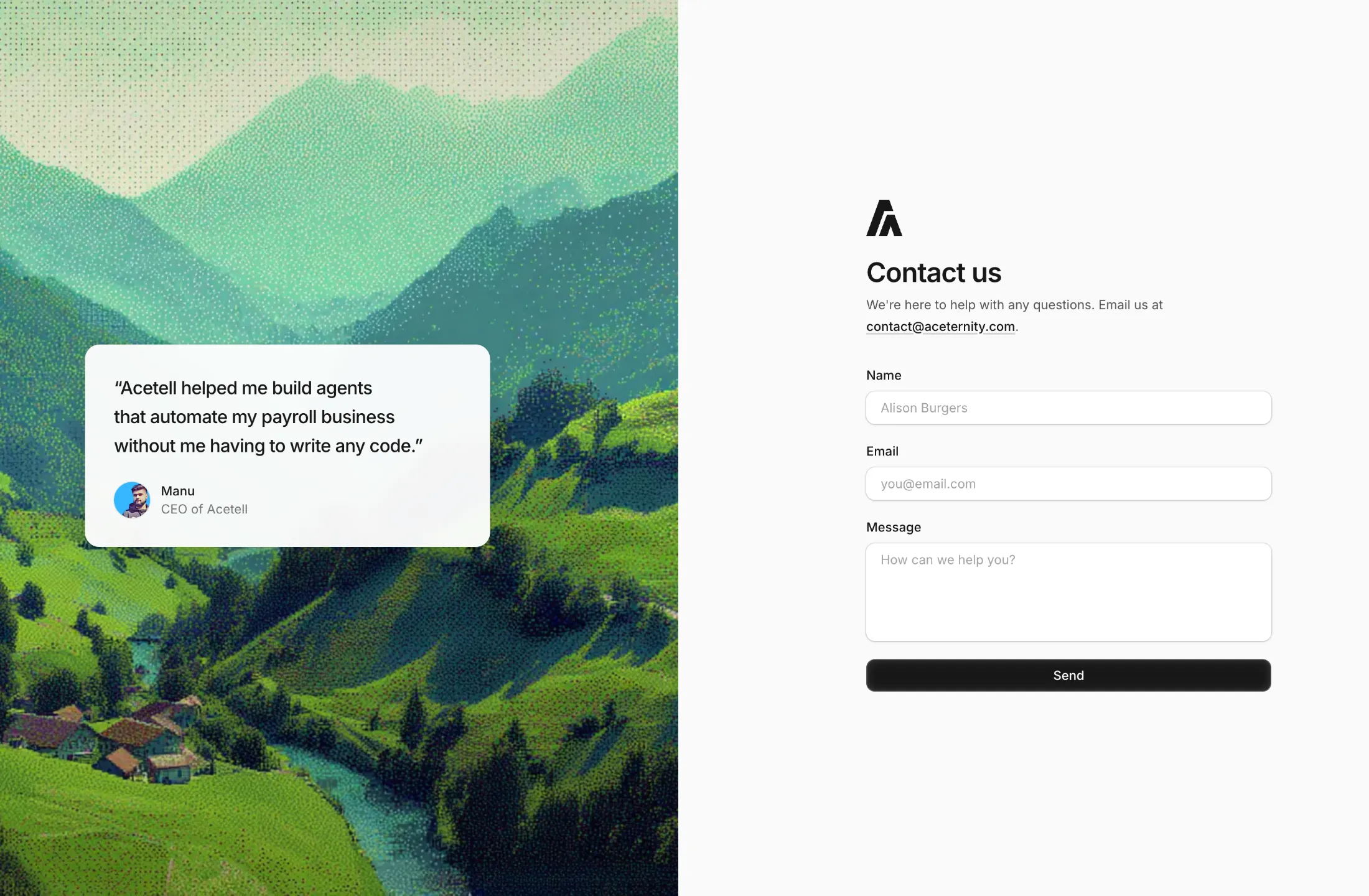
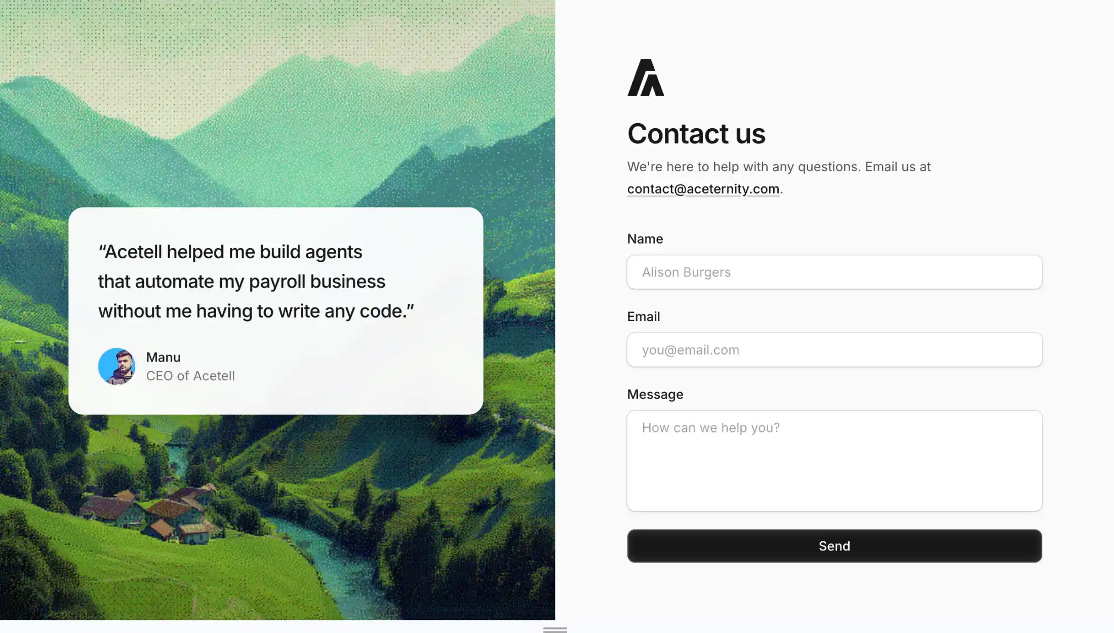
A two-column contact section with a dithered landscape on one side, a short testimonial card, and a clean name, email, and message form on the other. Works when you want social proof and a form without heavy animation.
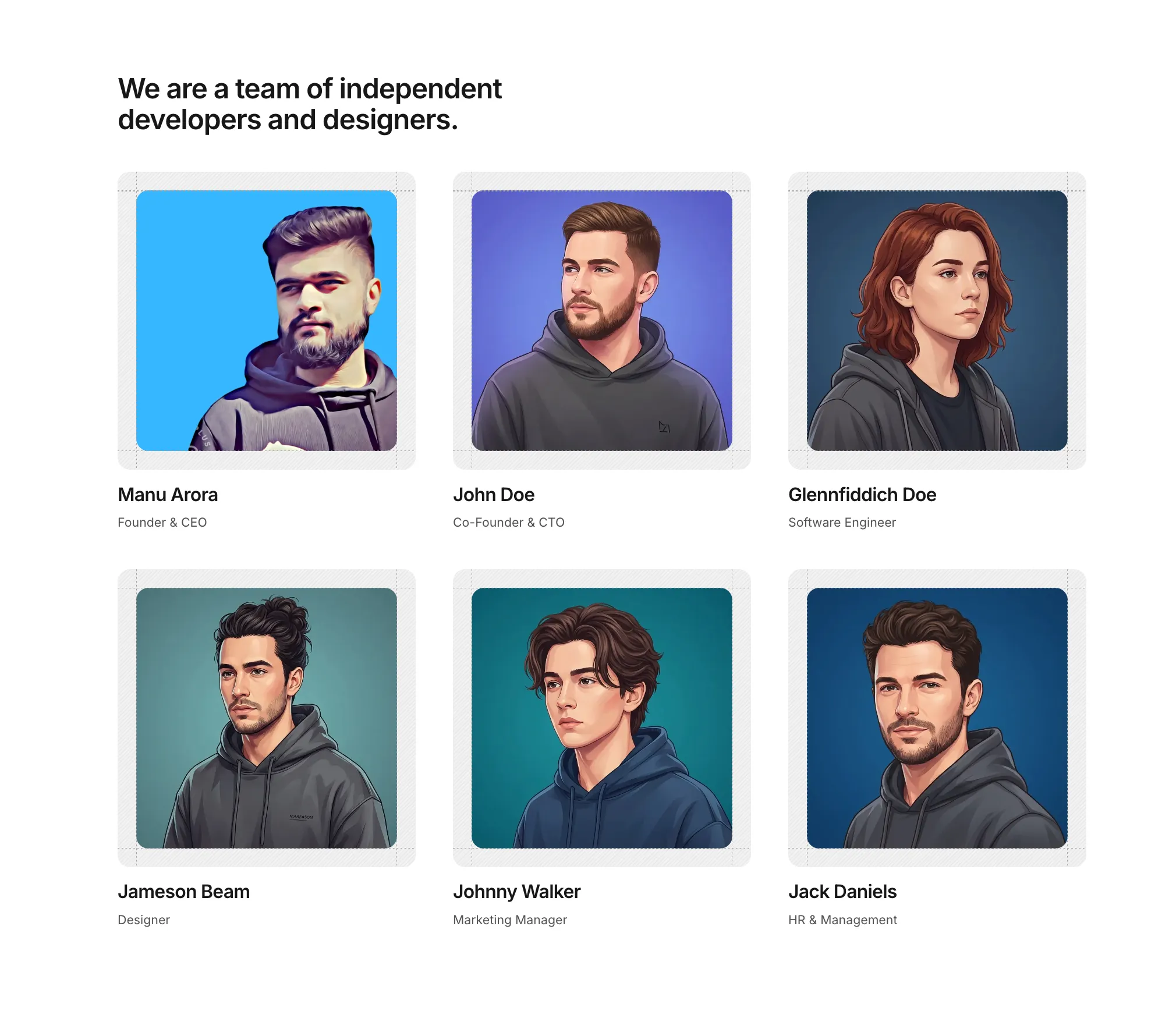
A team grid with portrait cards, names and roles, and subtle ruler-style grid lines for a structured about or culture section.
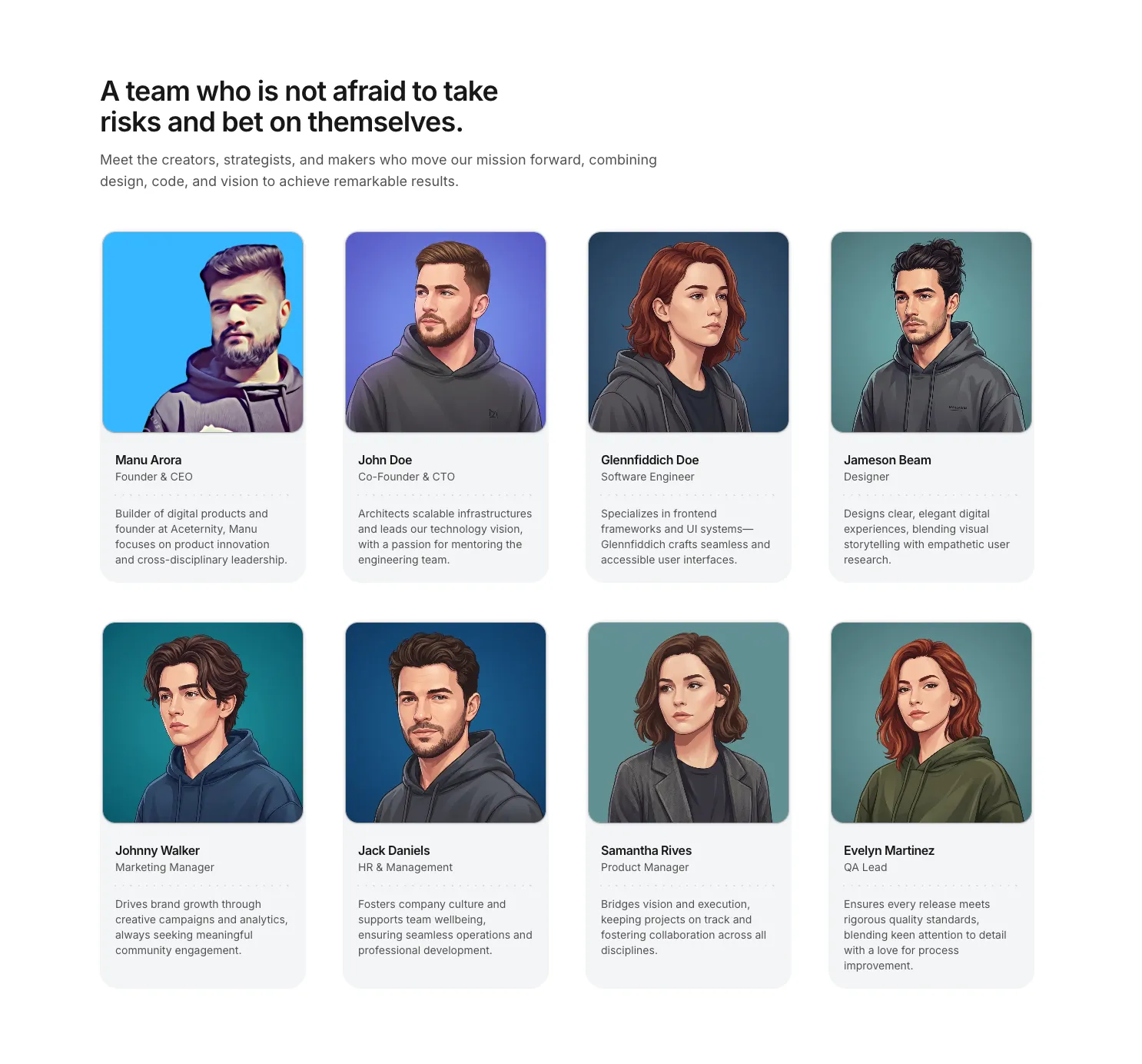
A responsive team grid with portrait cards on soft gray surfaces, names and roles, and a dotted divider before each short bio.
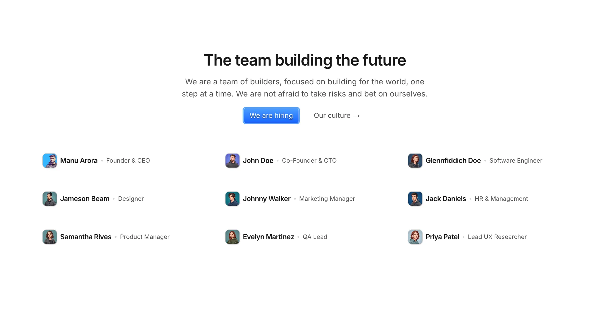
A compact team list with tiny avatars, names, and roles—plus centered intro copy and optional hiring or culture links.
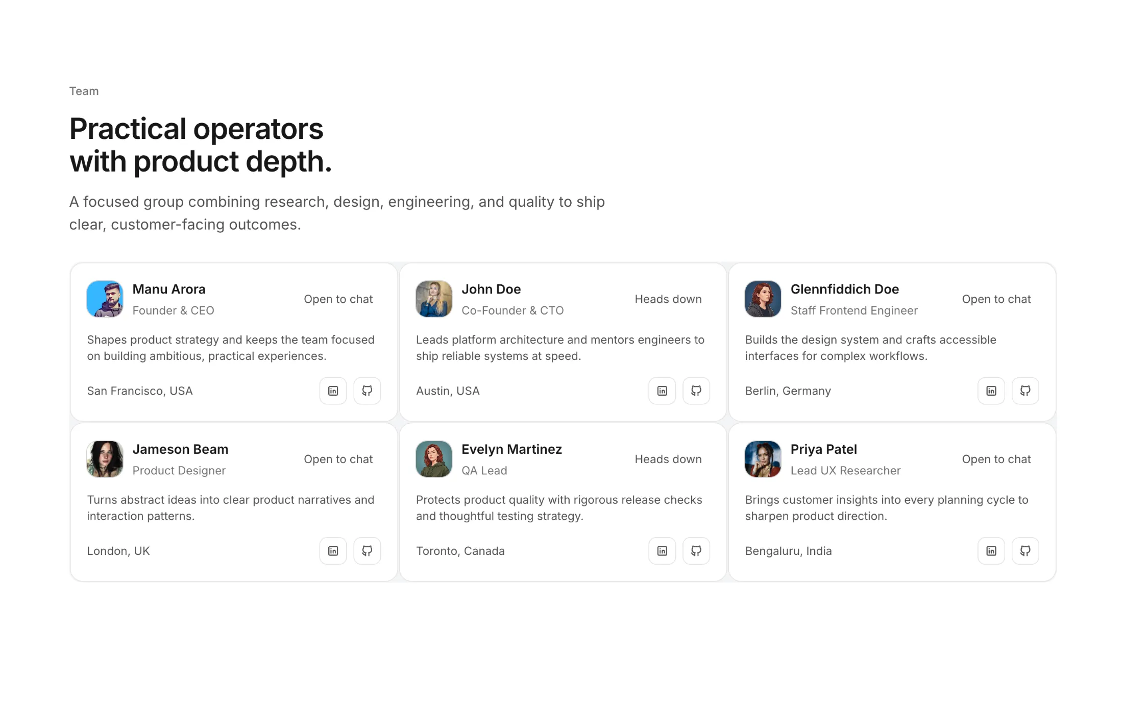
A clean team grid with profile cards, availability badges, location details, and social actions.
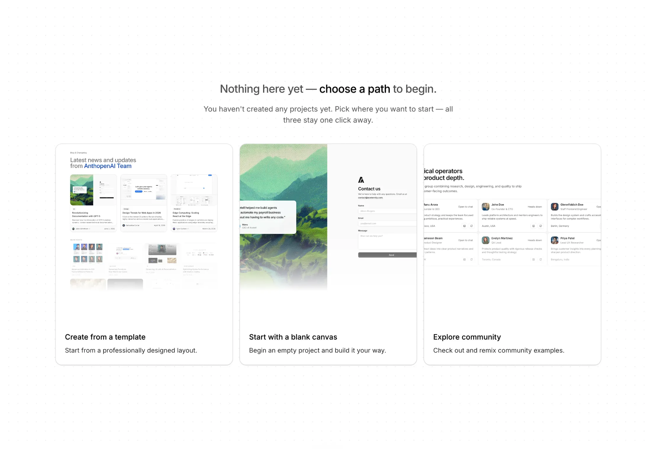
A quiet full-screen empty state with a subtle dot grid and three large cards so people can pick a path instead of staring at a blank page.
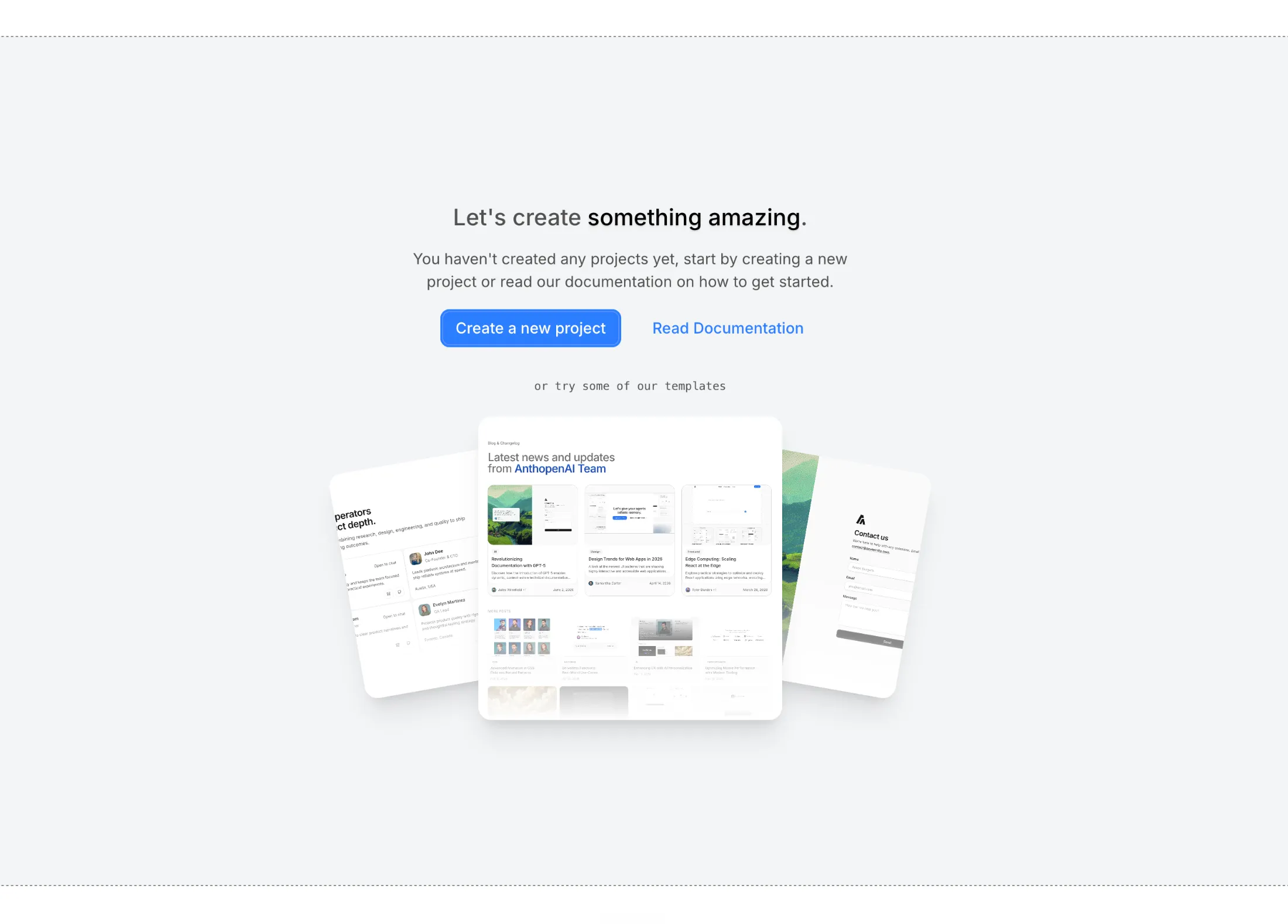
An empty project view framed by light grid lines, primary and secondary actions, and three tilted template previews that invite a click.
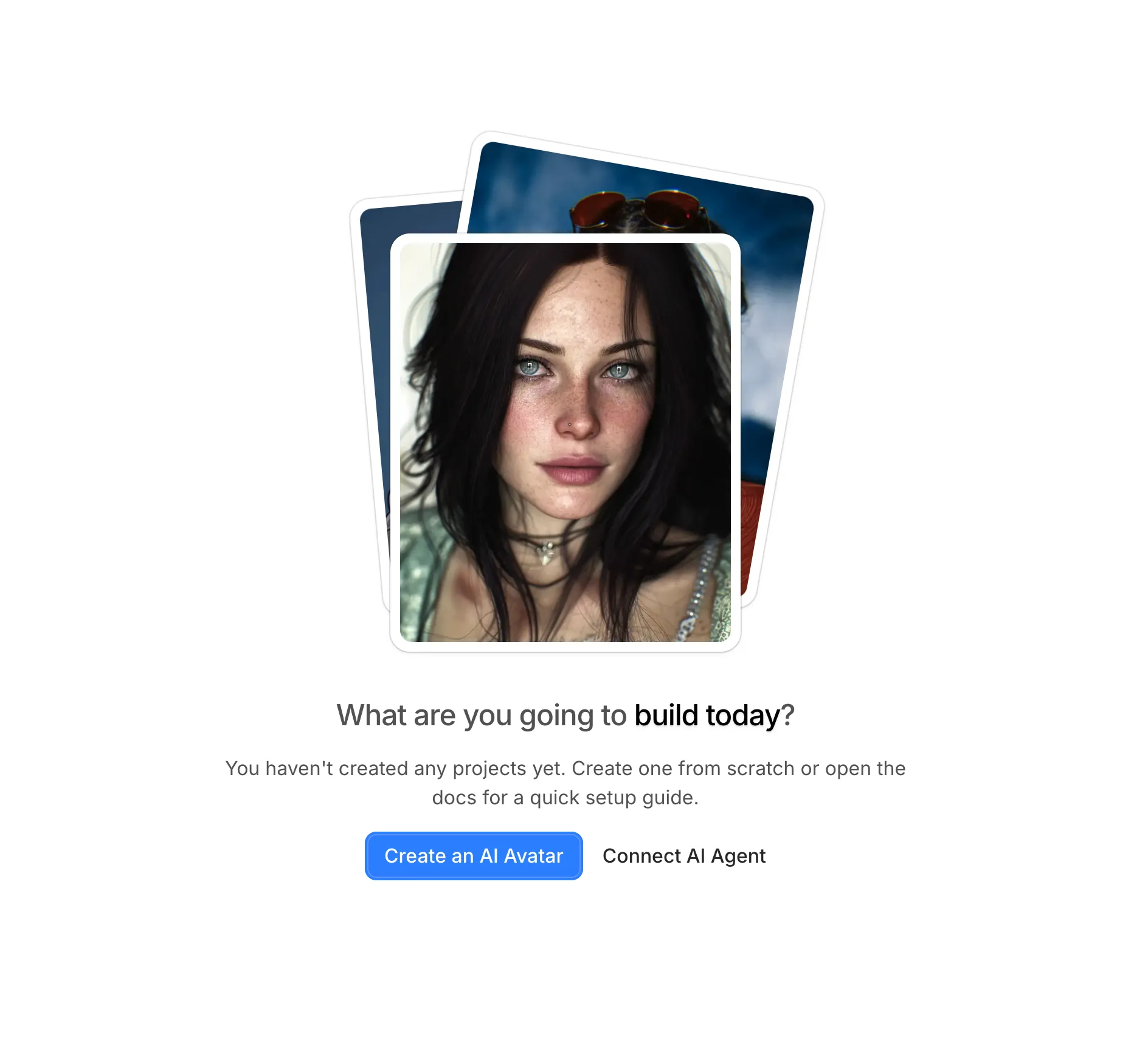
Stacked framed photos, a short headline, and two buttons—built for creative or profile products that need warmth before the first item exists.

A swipeable deck with profile-style cards, then a headline and actions—handy when the empty moment is about choosing people or records.
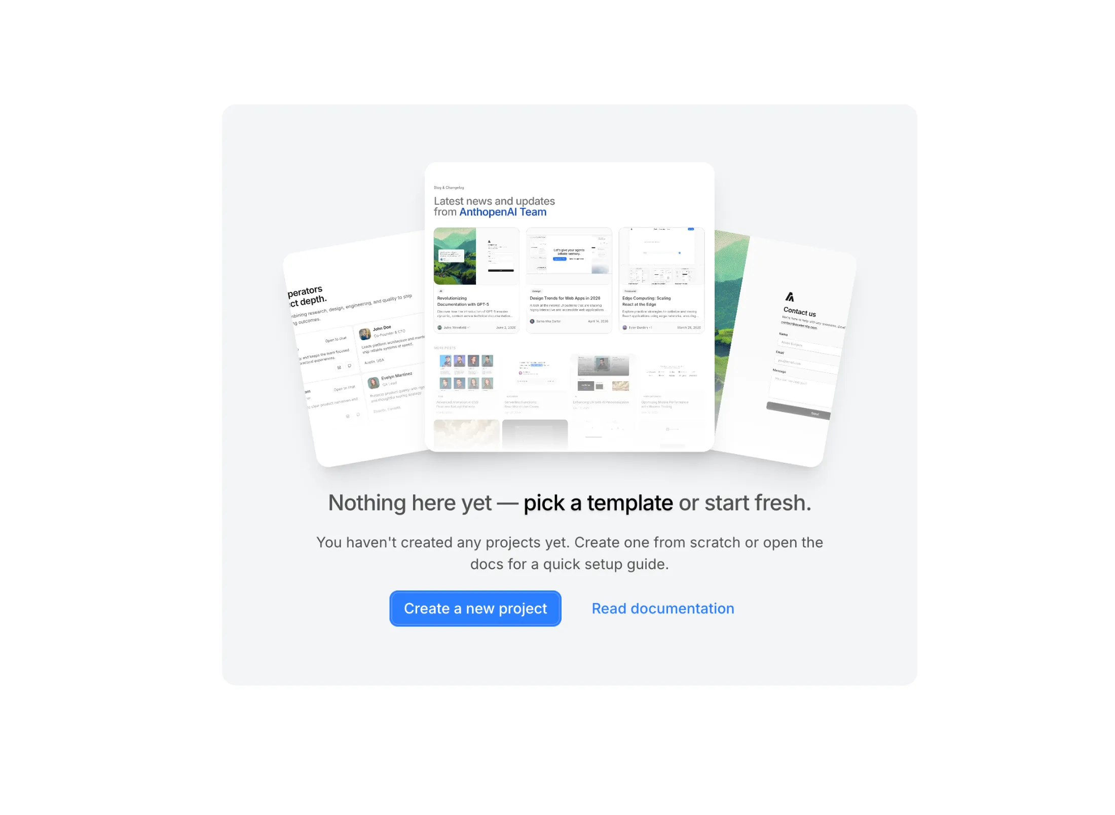
A padded neutral panel with three overlapping preview tiles and standard create-or-docs actions—compact enough for modals or settings-style shells.
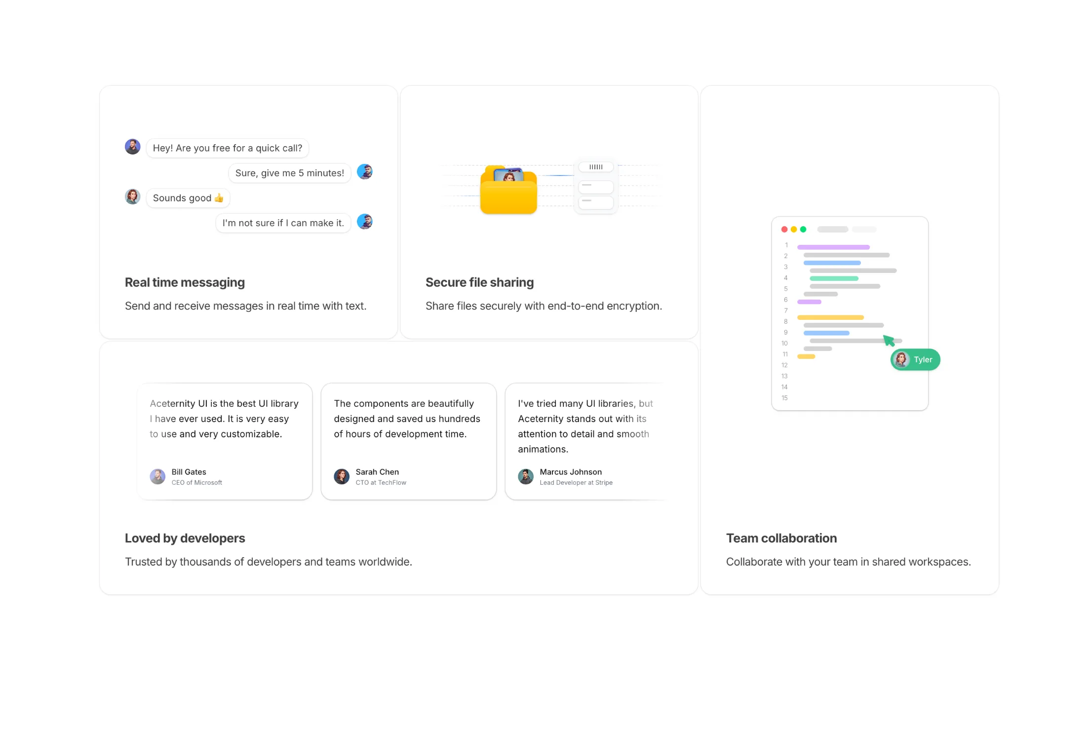
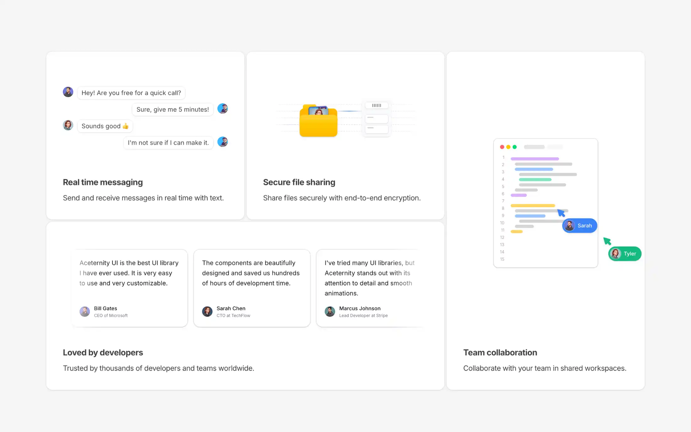
A bento grid feature section with 4 animated skeleton cards showcasing messaging, file sharing, team collaboration, and testimonials.

Feature cards with animated isometric box illustrations. Each card showcases a different animation direction on hover - left, right, or top face movement.
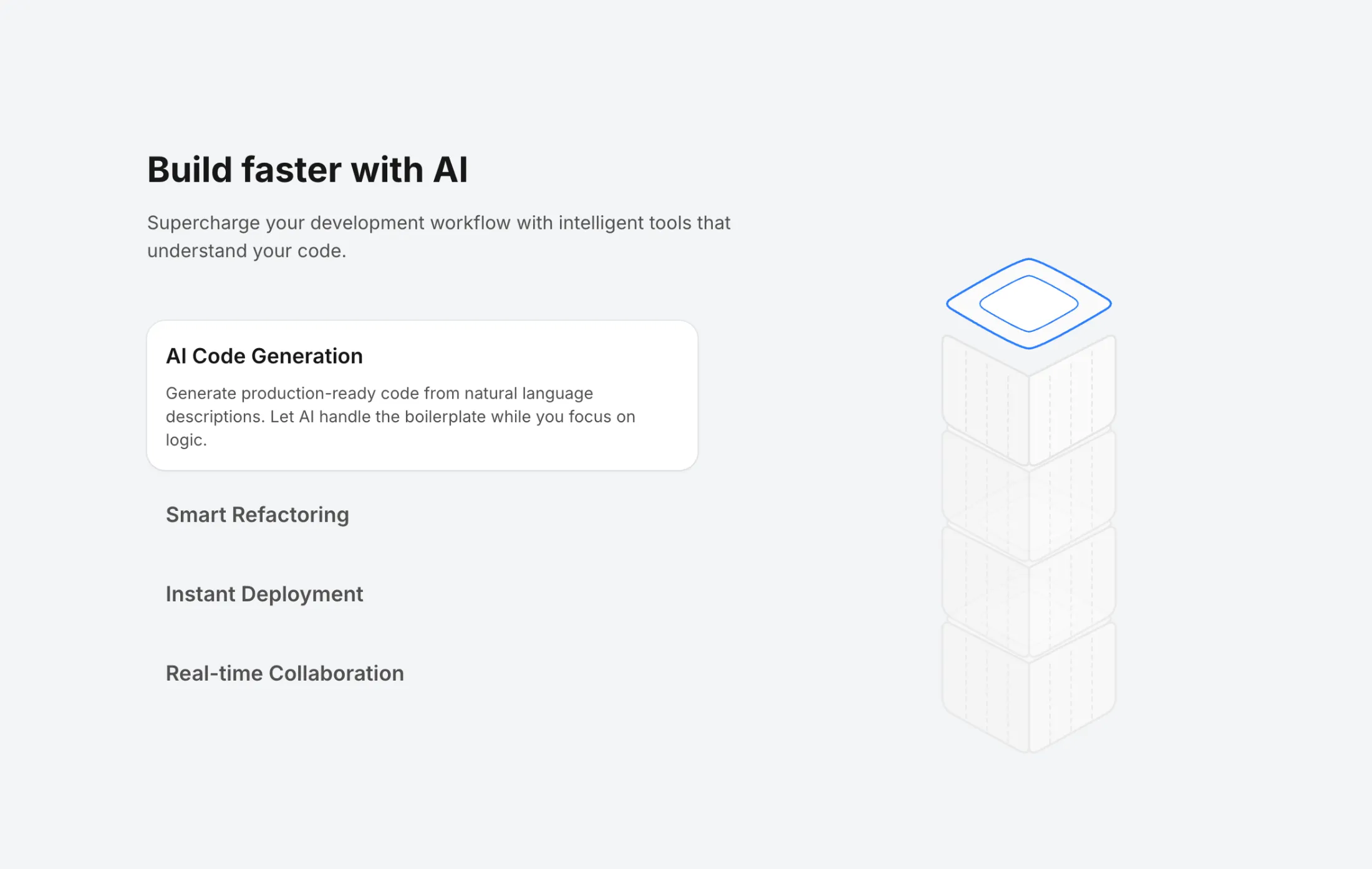
A feature section with stacked isometric boxes that animate based on active selection. Features autoplay with 5-second intervals and click-to-select functionality.
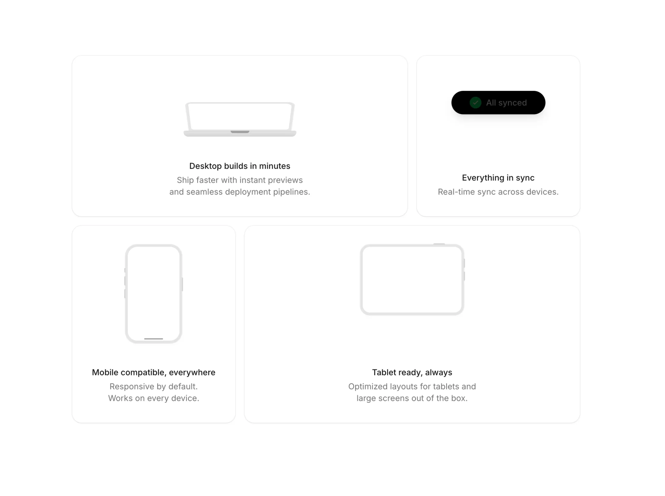
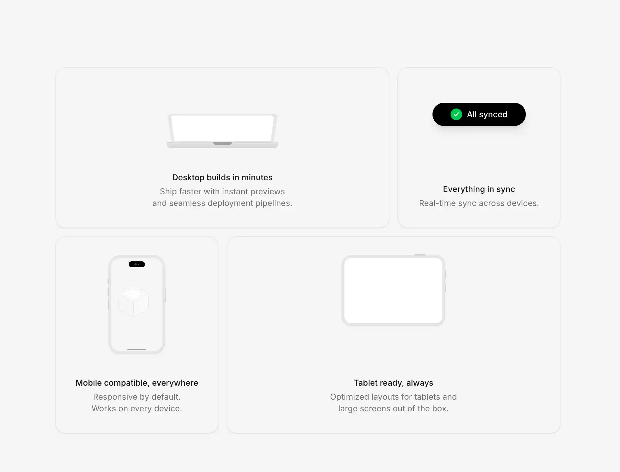
A minimal bento grid showcasing device illustrations with MacBook, iPhone, iPad, and Dynamic Island. Features hover animations, blur fade-in content, and compound components.
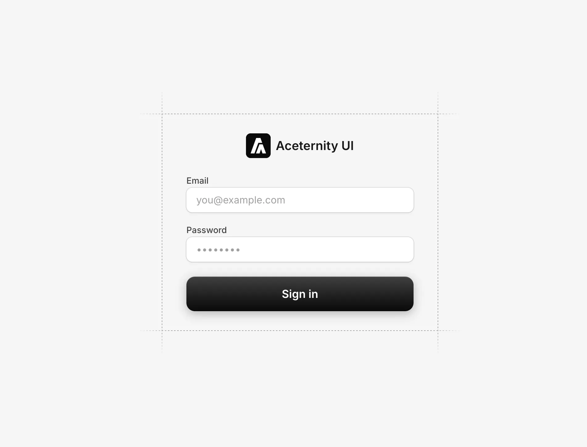
A clean login form with decorative dashed grid lines forming a border around the form. Features email and password inputs with subtle shadow and ring styling, plus a gradient submit button.
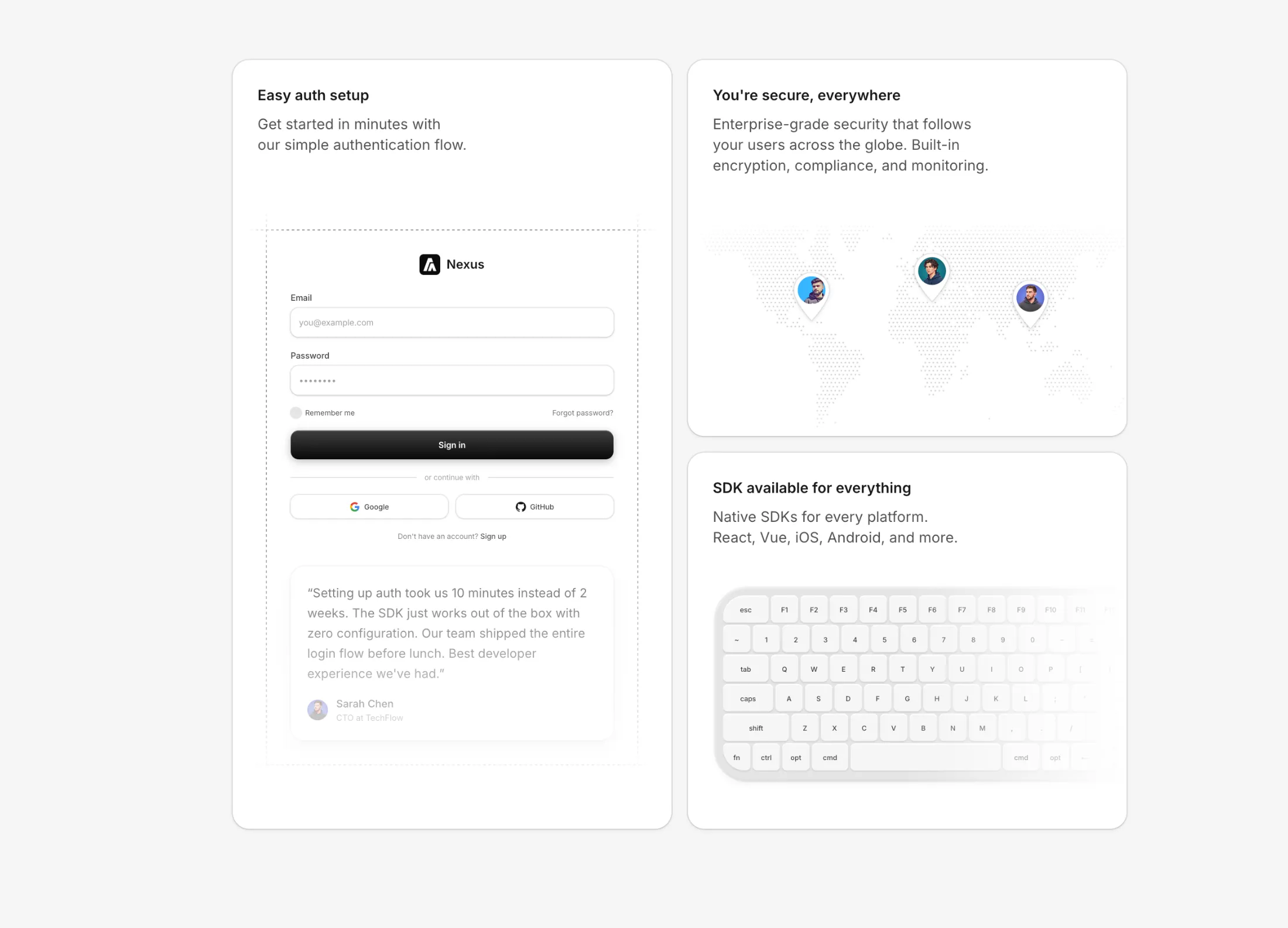
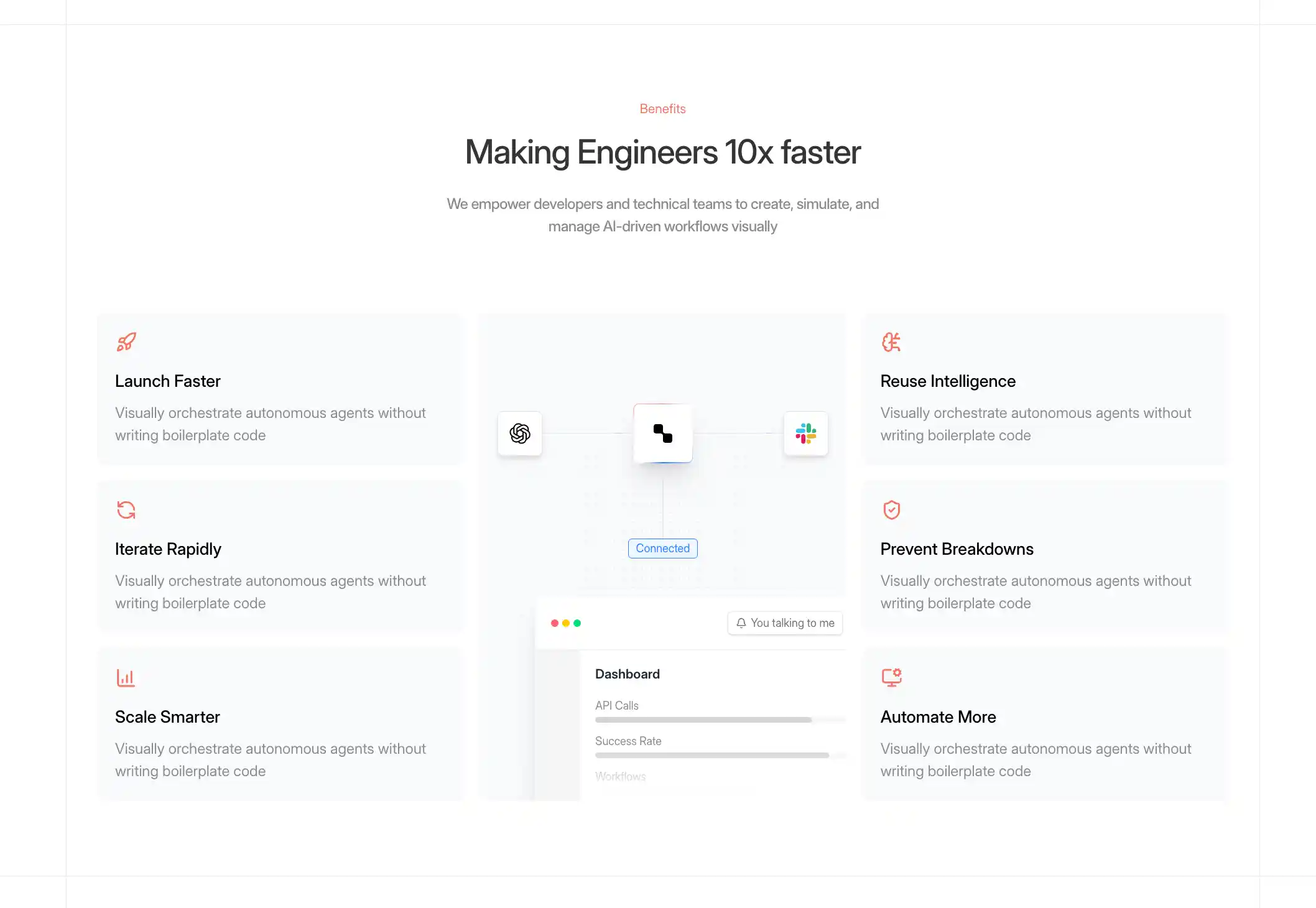
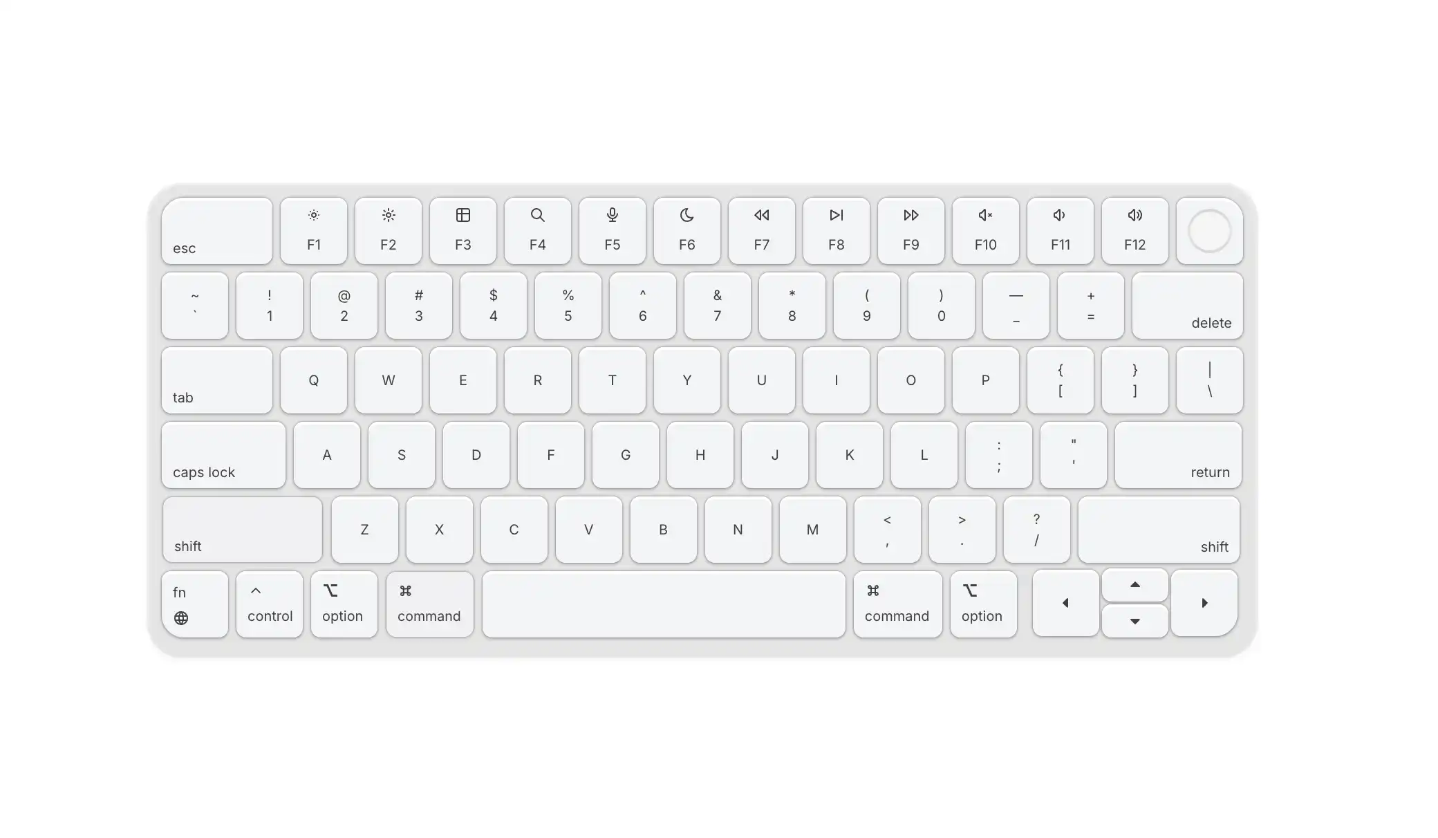
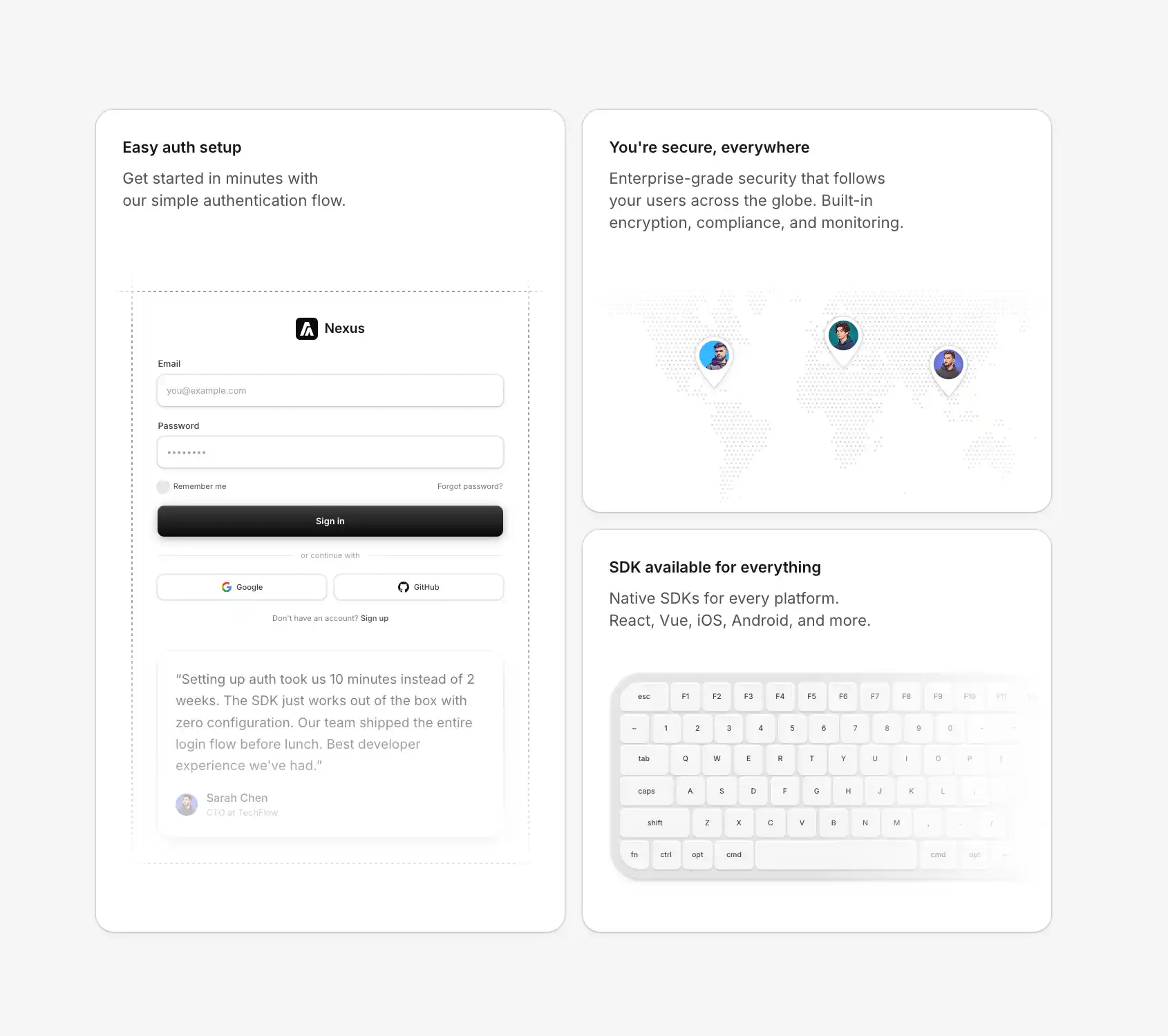
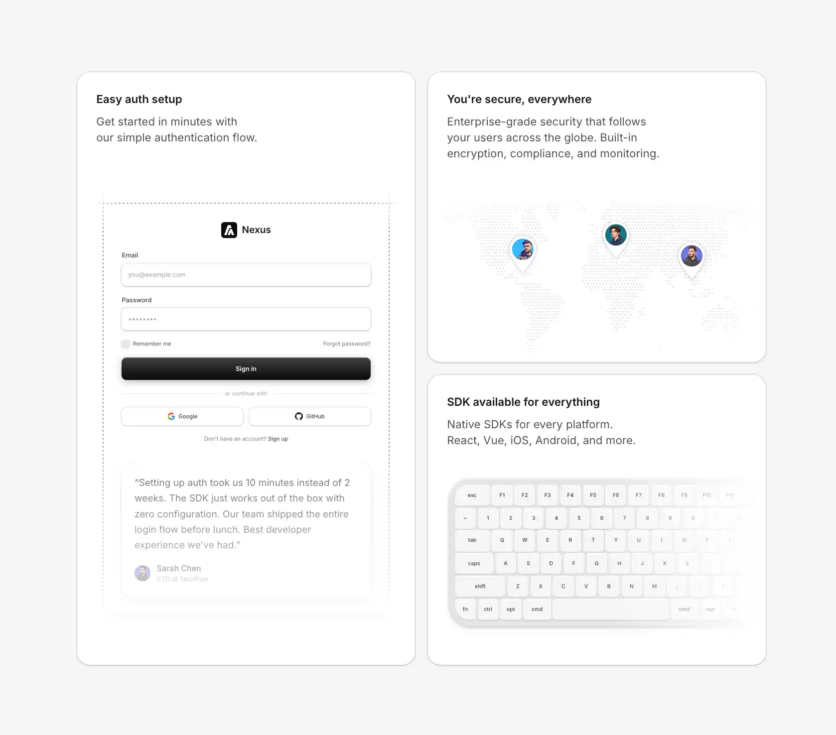
A bento grid layout with 3 feature cards showcasing world map, keyboard, and login form illustrations with testimonials.
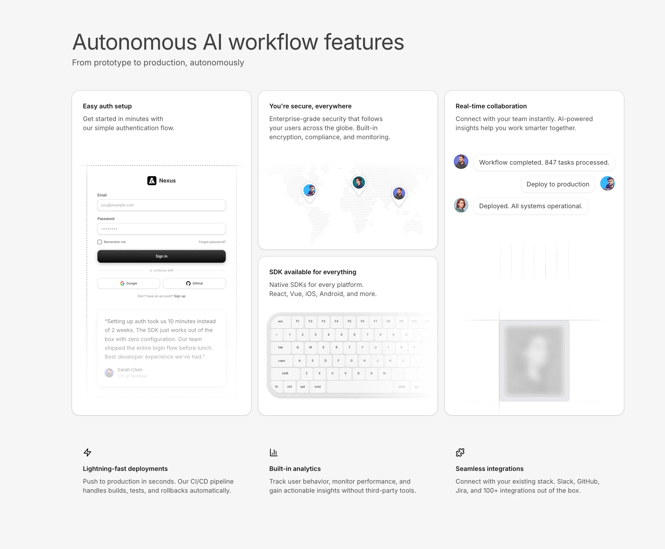
A feature section with a vertical grid layout featuring animated skeletons including login form, world map, chat conversation, and keyboard illustrations.
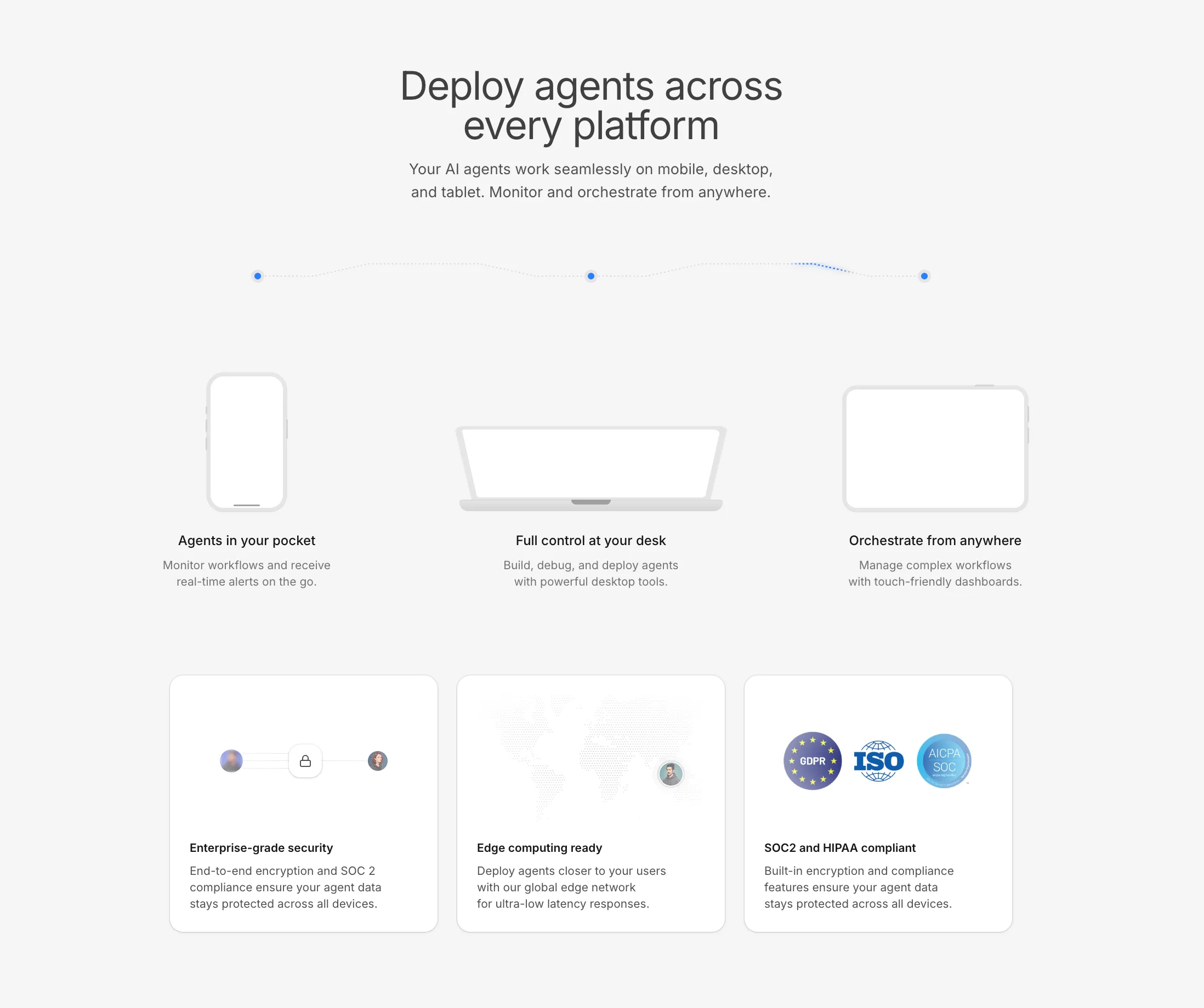
A horizontal feature section with device skeletons (iPhone, MacBook, iPad), animated beam paths, Dynamic Island interactions, and compliance cards.
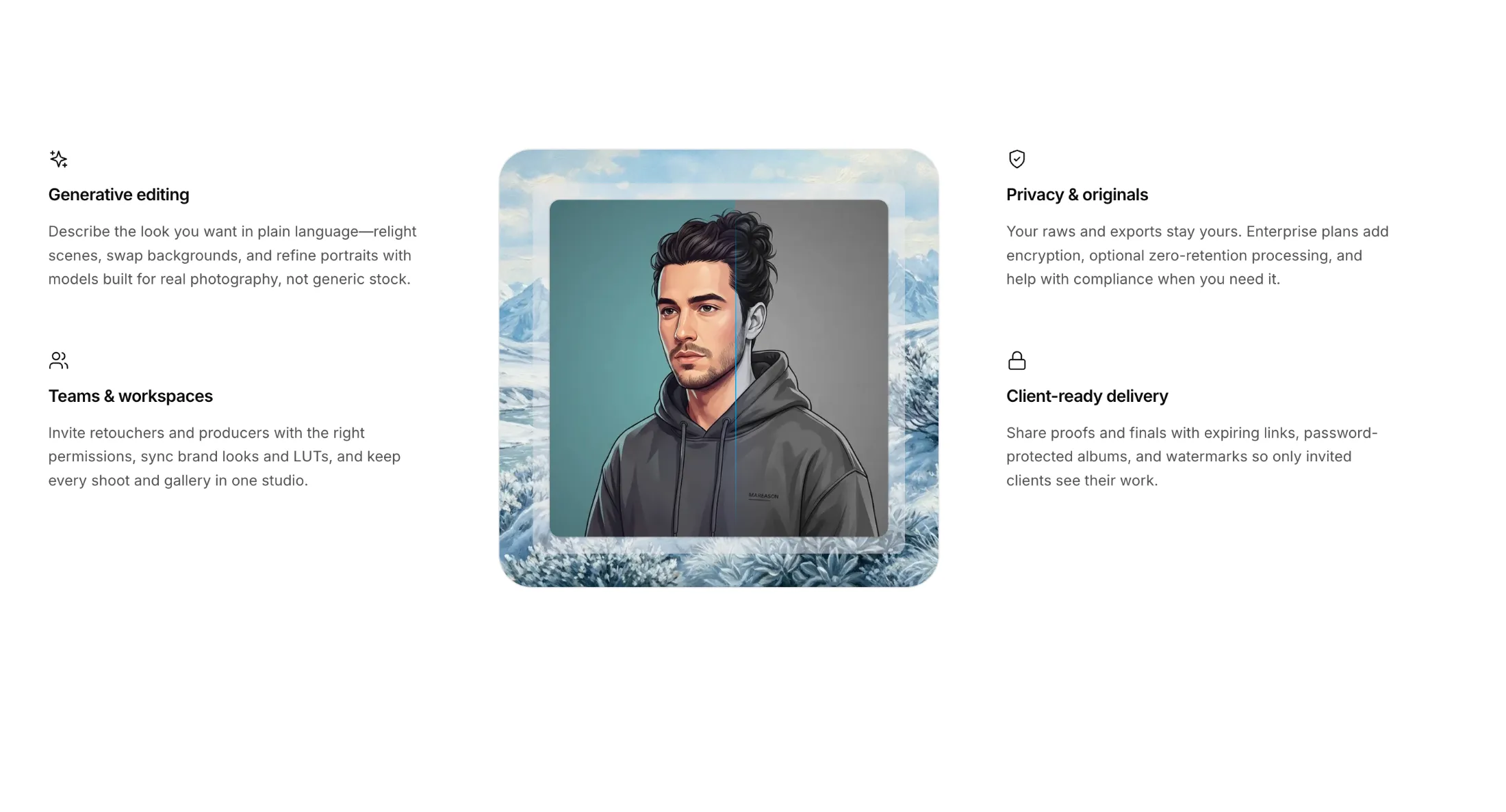
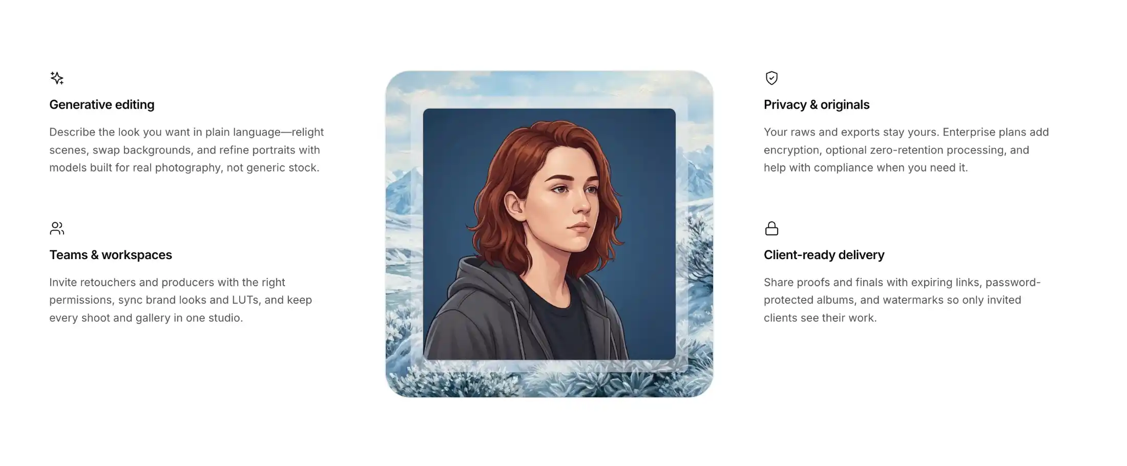
A three-column feature section with icon-led copy on the left and right, and a centered showcase panel with backdrop imagery and an animated scan-and-reveal treatment.
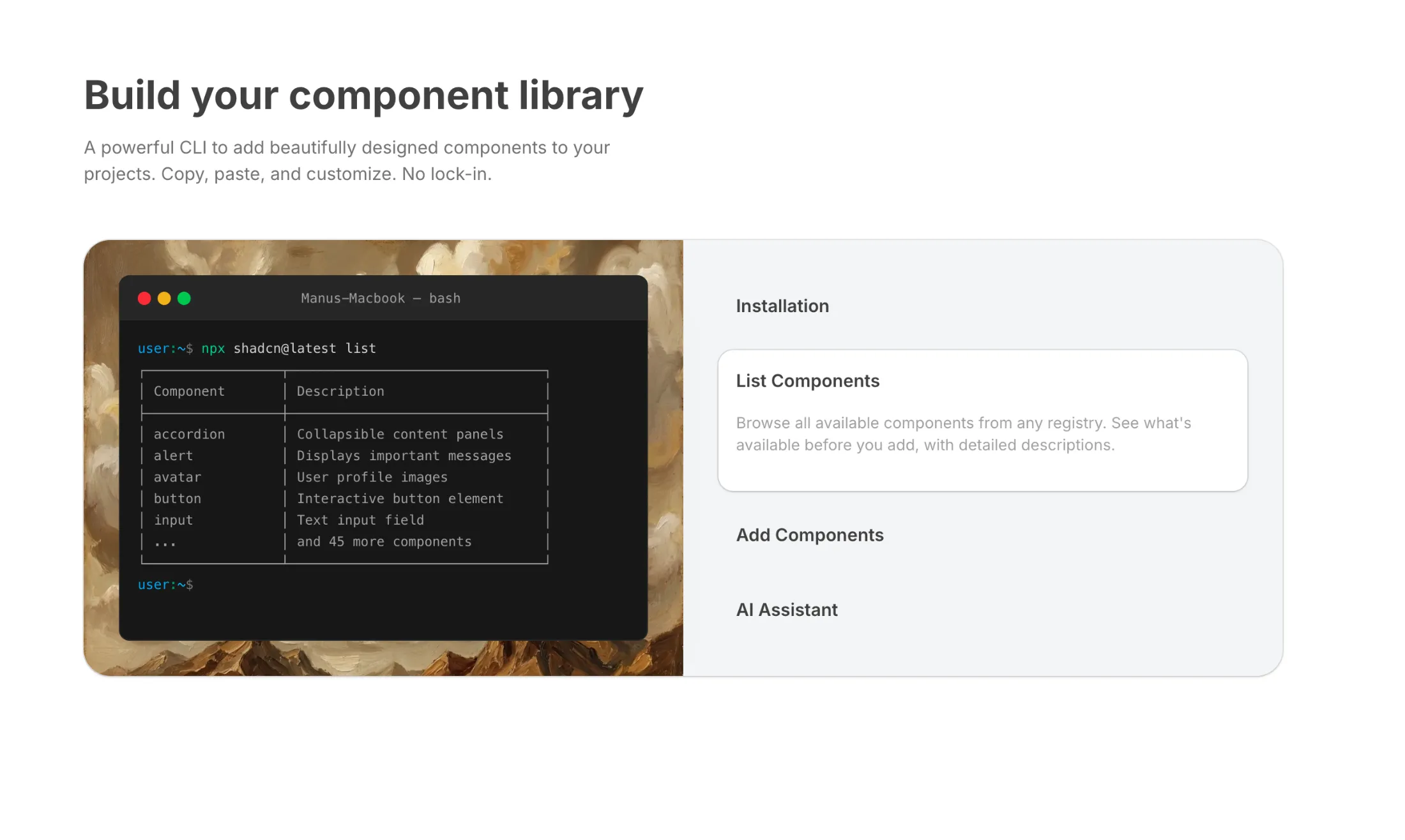
A feature section with an animated terminal on the left and expandable feature tabs on the right. Each tab shows different CLI commands with realistic terminal output.
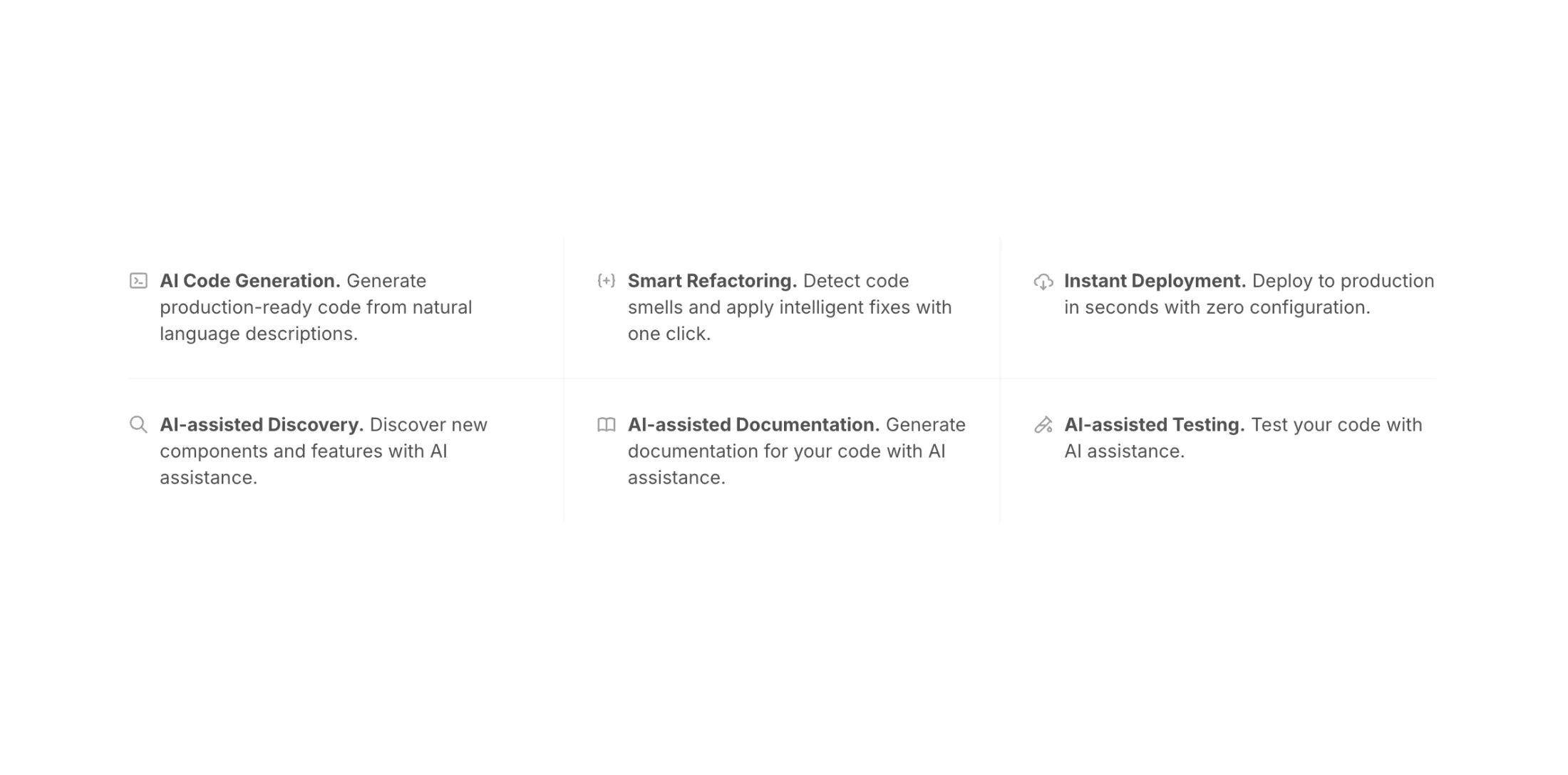
A minimal feature grid displaying icons inline with text. Features responsive separators that adapt to 1, 2, or 3 column layouts with clean border lines between items.
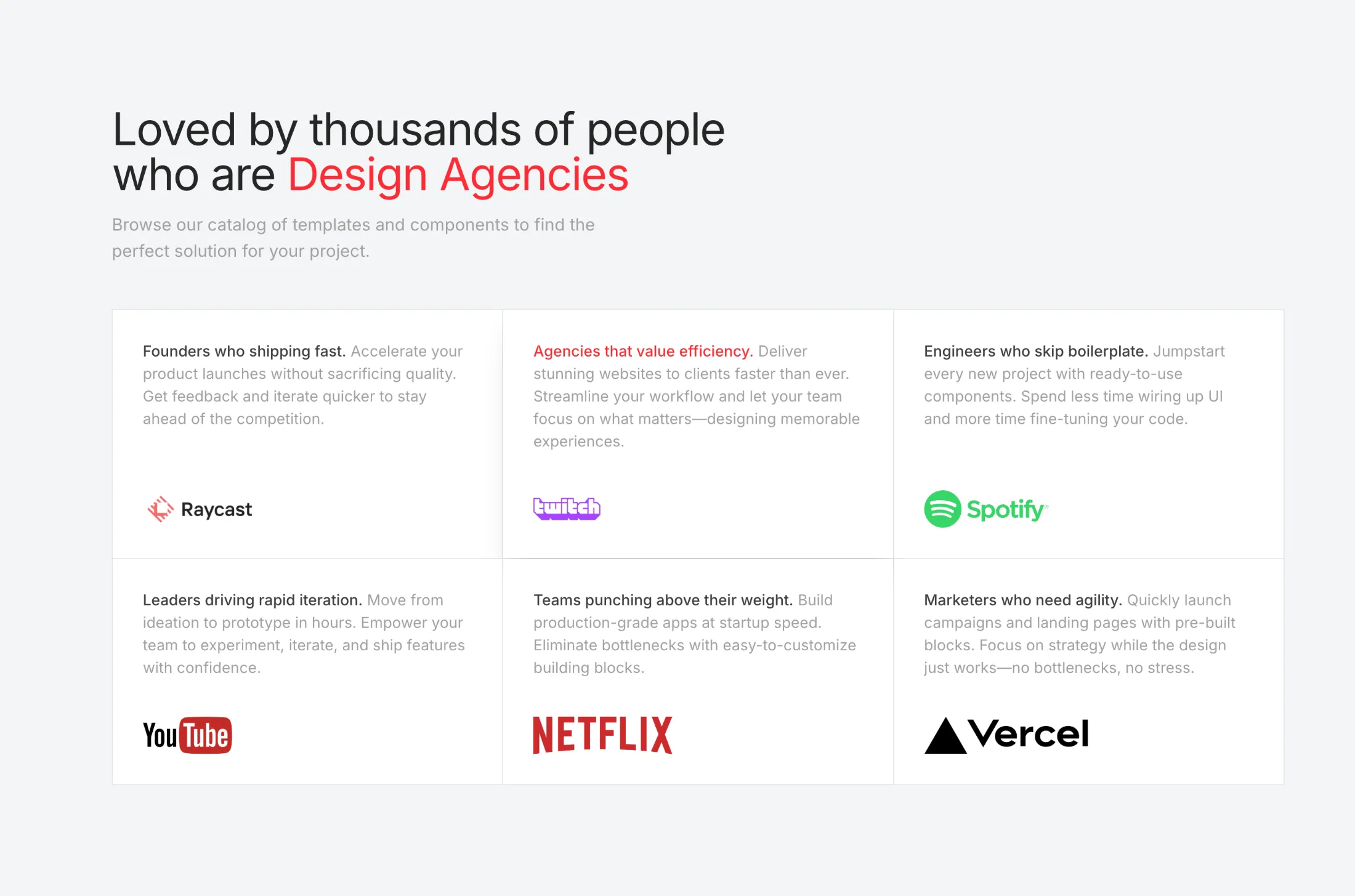
A feature grid with thin dividers between cells. Hovering a card updates the headline with a Motion swap and tints the active row so each audience reads clearly.
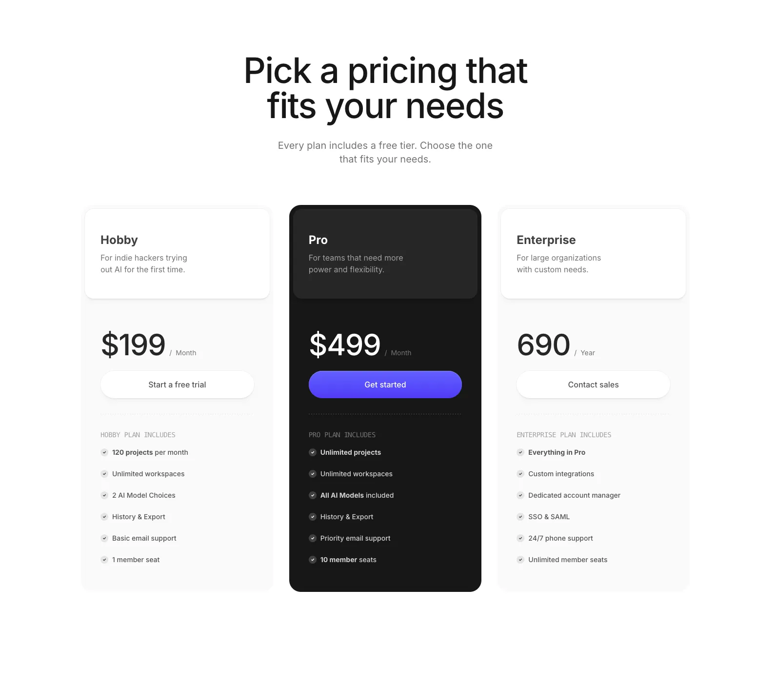
Data-driven pricing section with three tiers, featured plan styling, checkmark icons, and full dark mode support. Plans are defined as a typed array for easy customization.
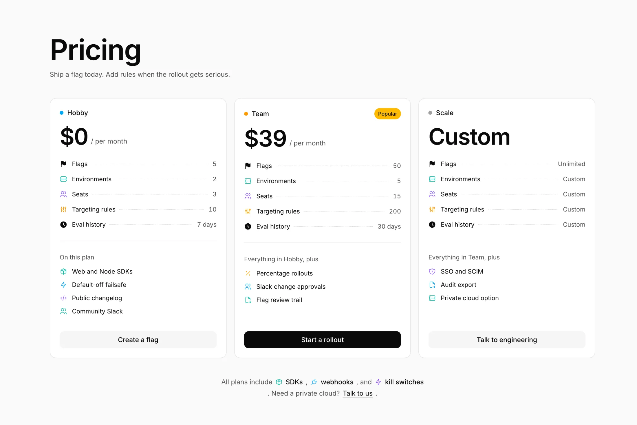
Three pricing cards with a colorful icon on each limit row, a Popular badge on the middle plan, and a short footnote under the grid.
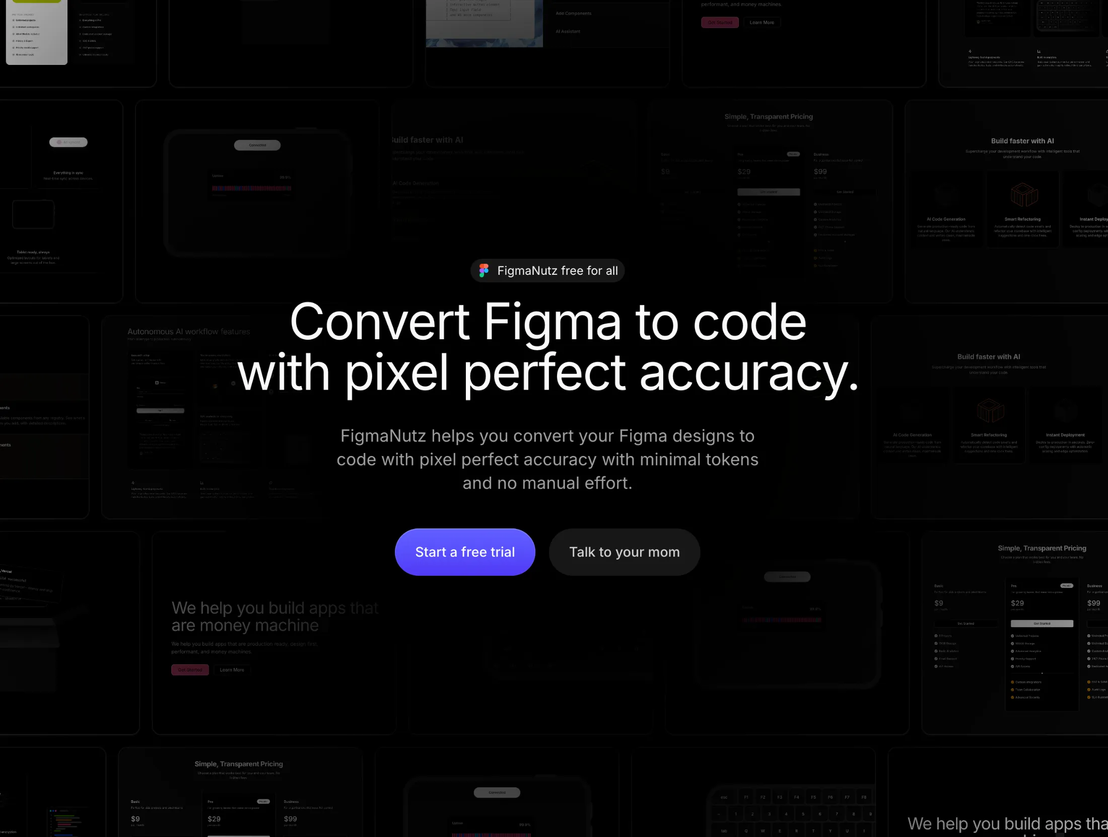
A hero section with interactive hover highlighting that displays element dimensions. Features a sliding number animation, horizontal masonry grid backdrop, and smooth Framer Motion transitions as you hover between elements.
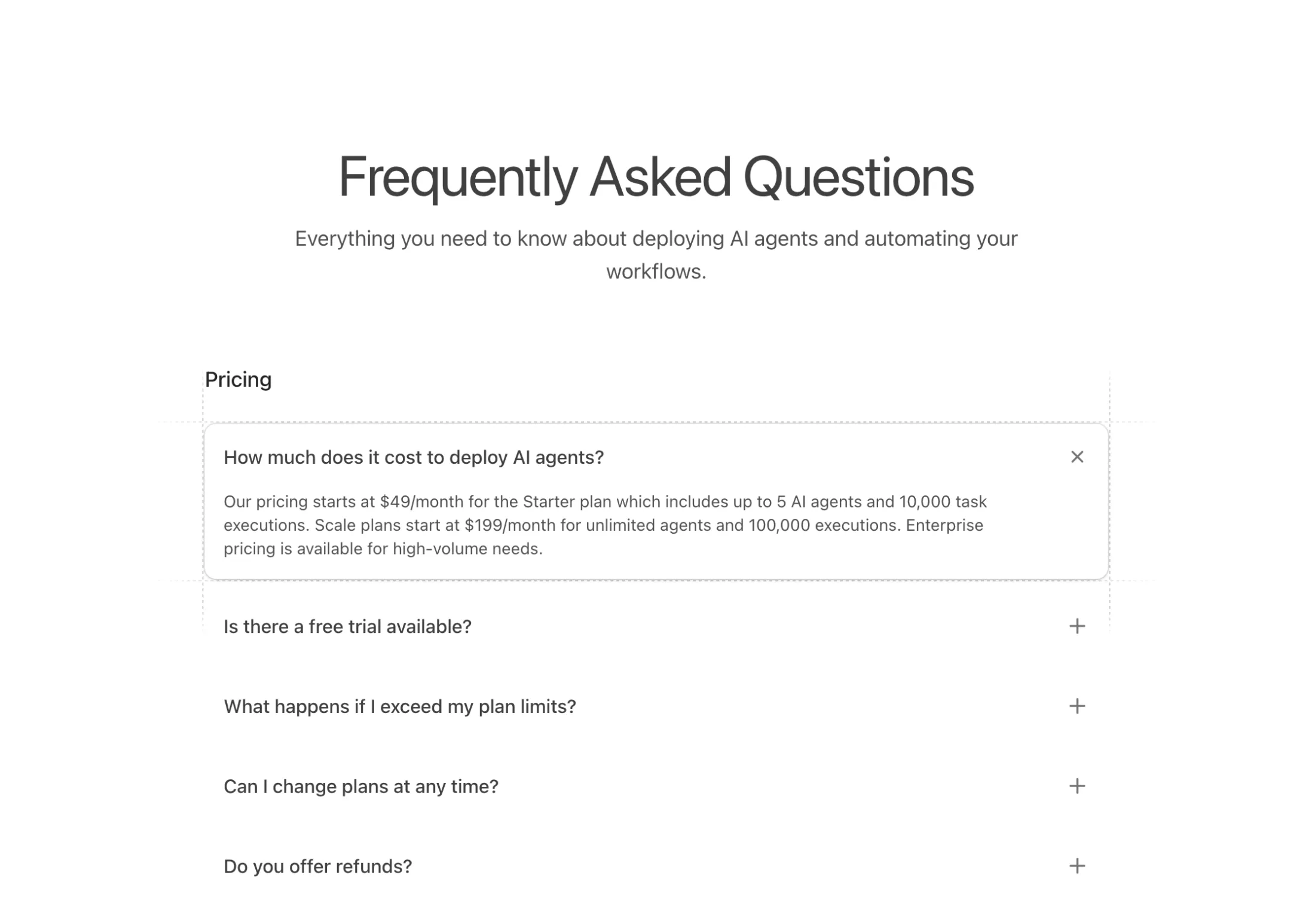
An accordion-style FAQ component with animated dashed grid lines that appear on active items. Features grouped sections with smooth expand/collapse transitions.
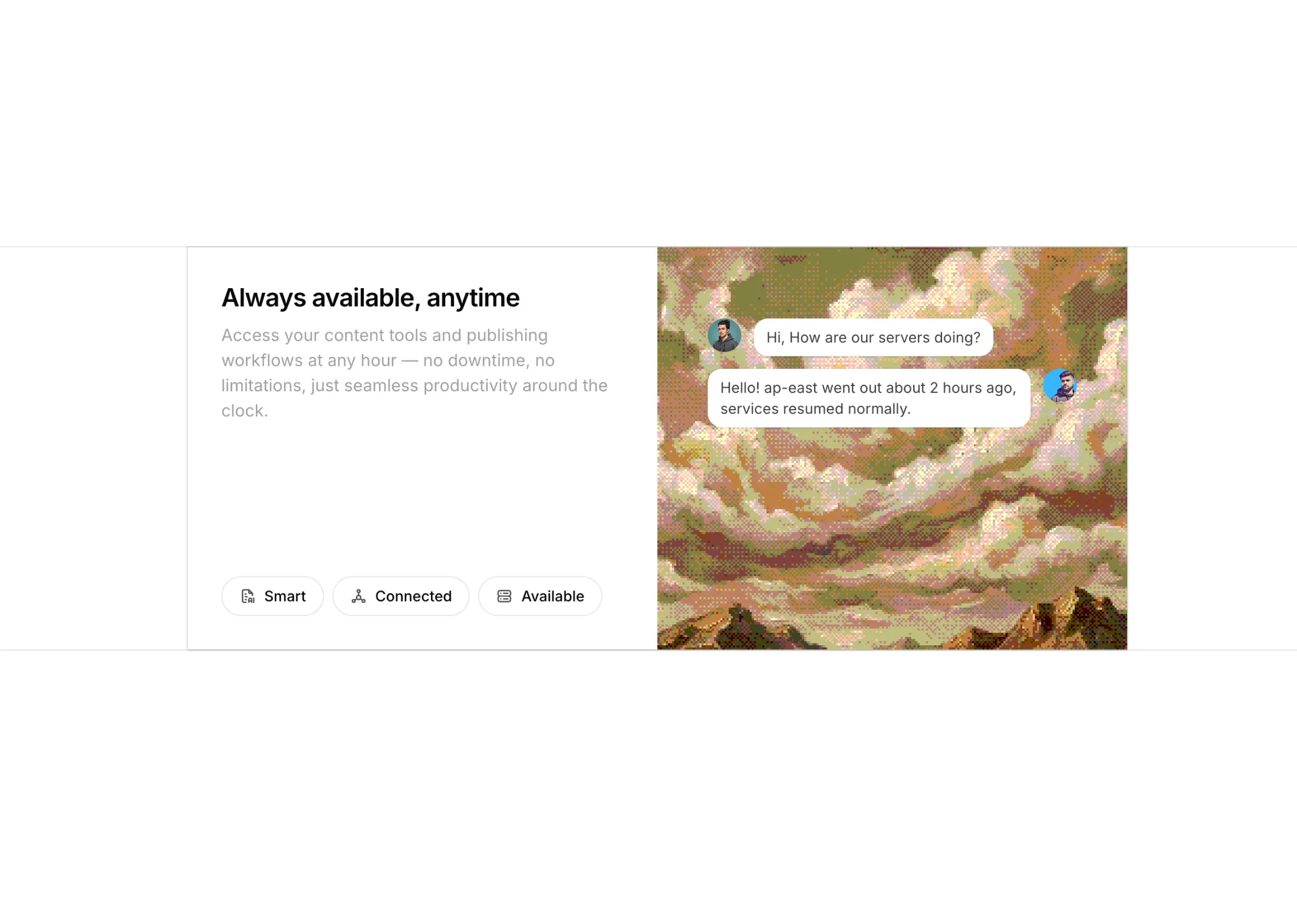
A feature section with a dithered image backdrop, tabbed content cards, and chat conversation skeletons for each feature.
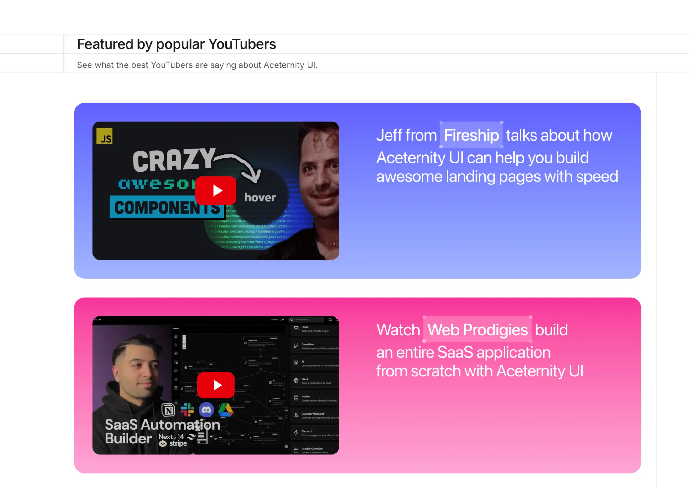
A bordered feature section that highlights YouTube creator coverage with multicolor gradient rows, thumbnails, and an inline modal for playback.
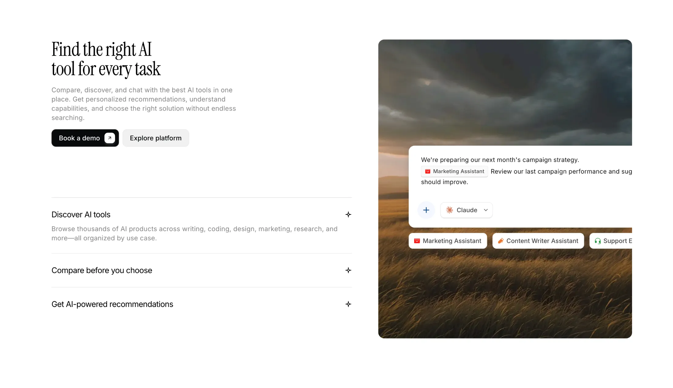
A two-column feature section with a serif headline, CTAs, an accordion feature list, and a cinematic image panel with floating assistant UI.

A sticky-scroll feature section with numbered nav, landscape illustration panels, and light/dark support.
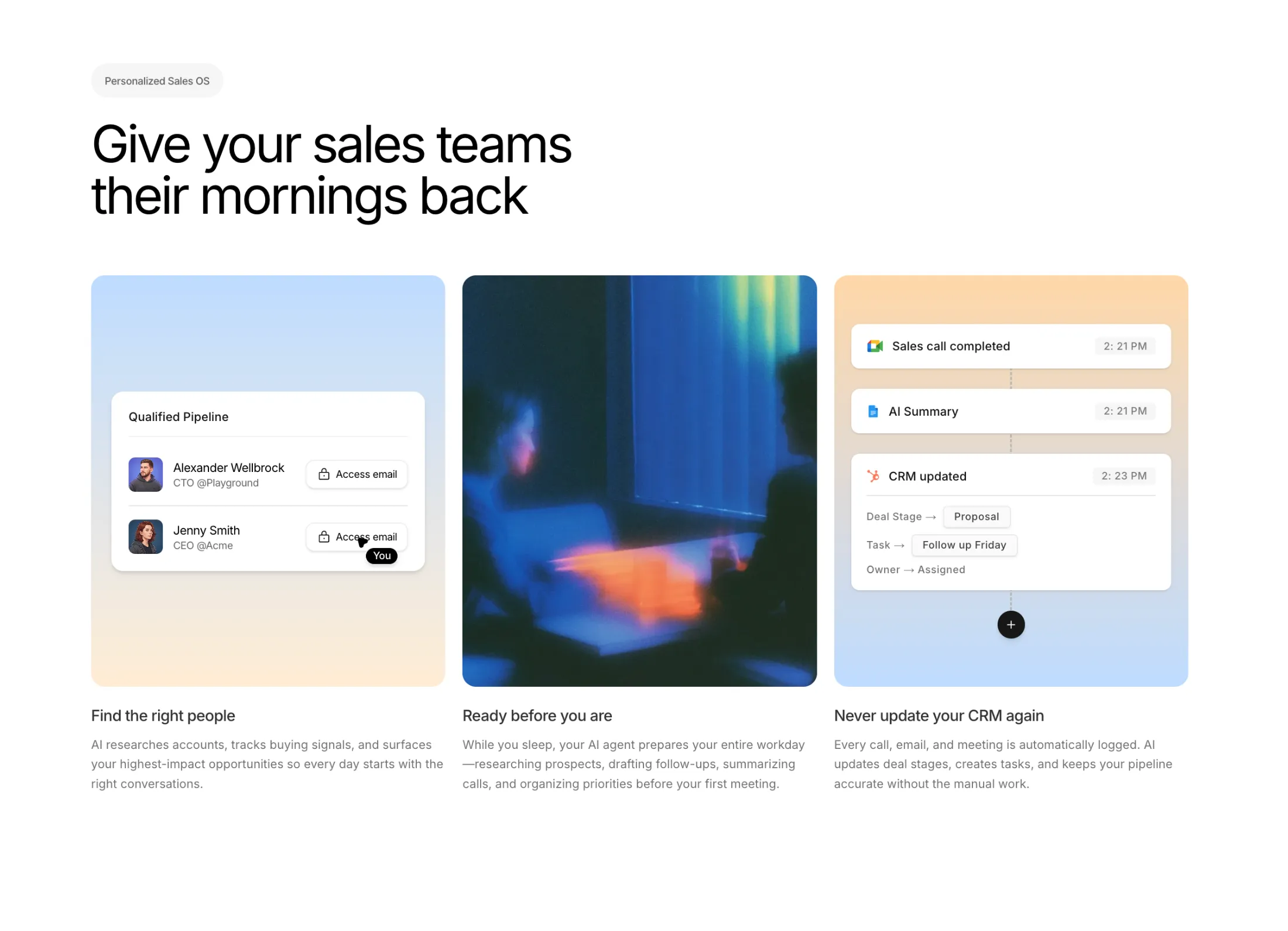
A three-column feature section with a pipeline UI card, lifestyle image, and CRM activity timeline—built for sales and AI product pages.
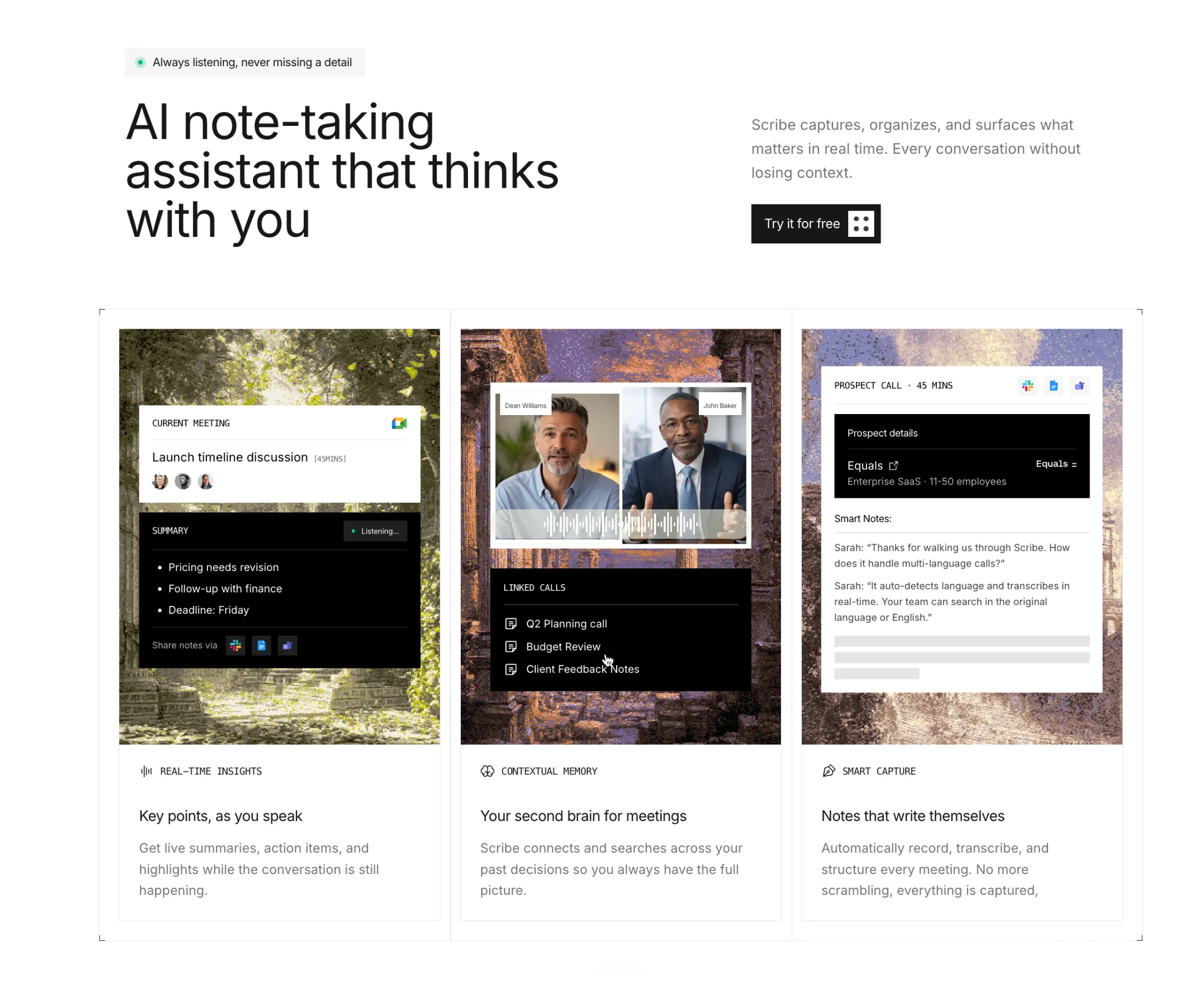
A three-column feature section with square-edged cards, corner crop marks, and layered AI note-taking UI mockups.
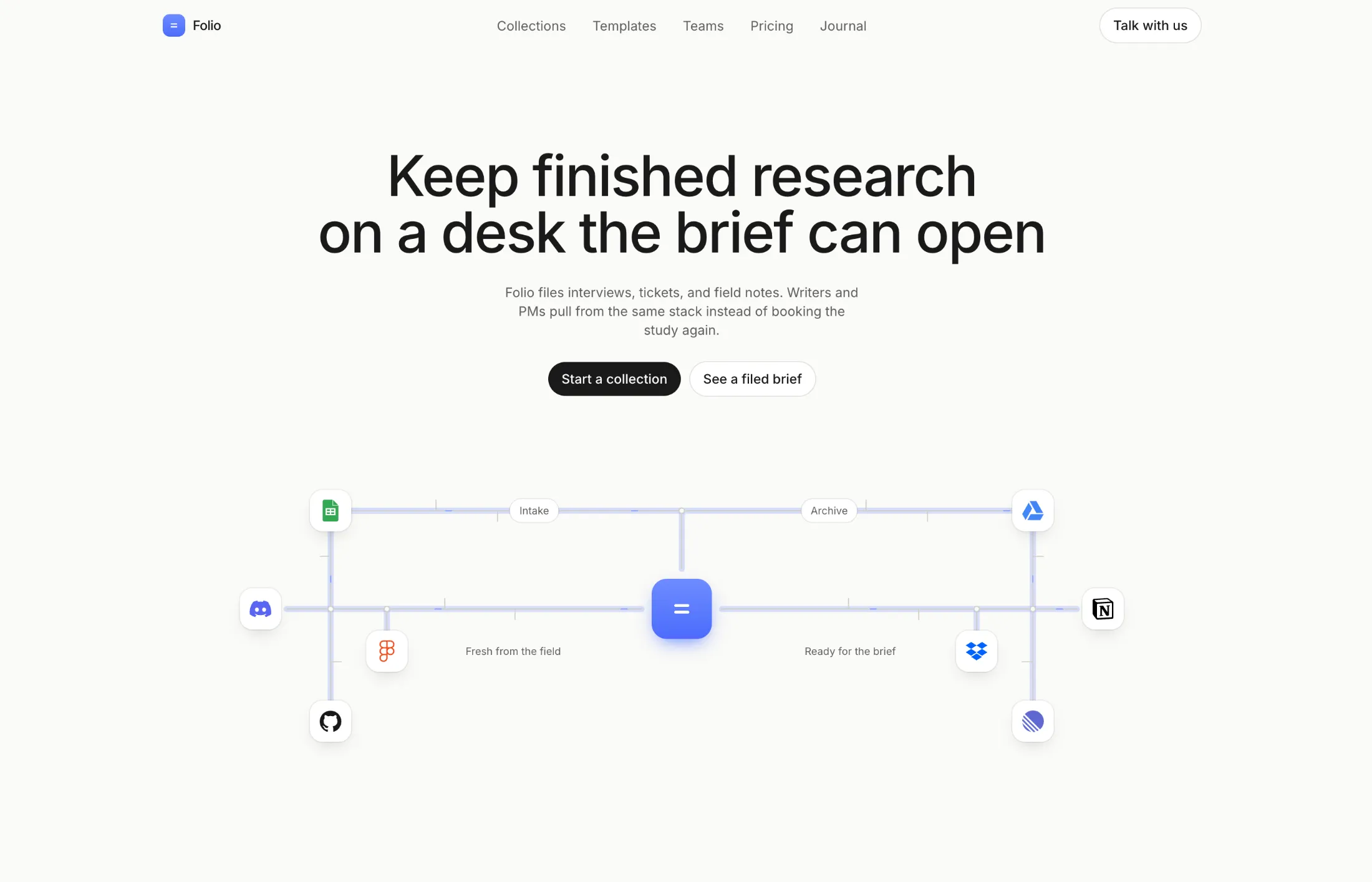
A centered SaaS hero with pill CTAs and a hub-and-spoke tool diagram. Beams travel the bus lines around one desk.
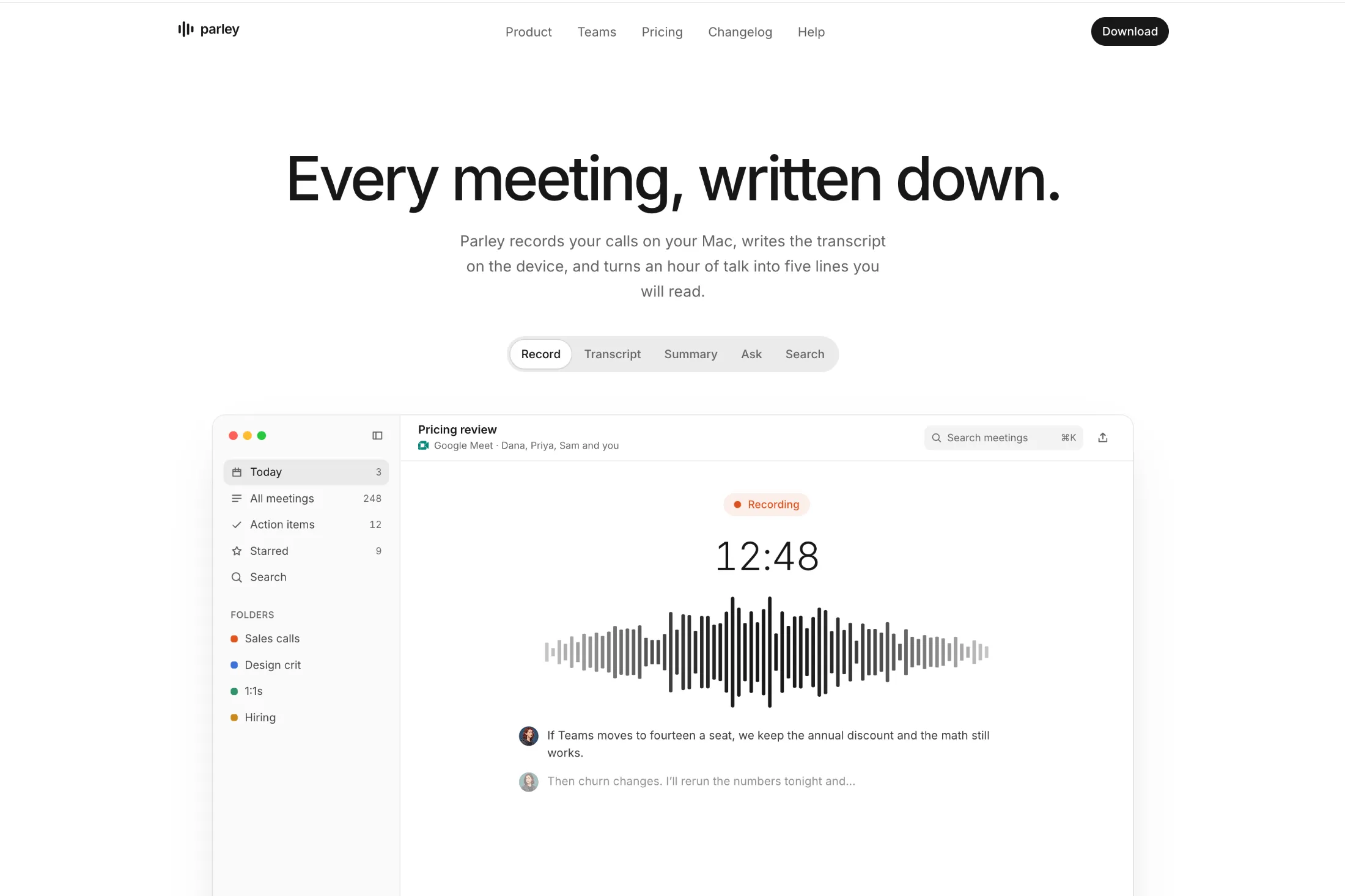
A minimal hero with a navbar, two CTAs, and a large product window. Tabs switch the window between five views with a blur crossfade.
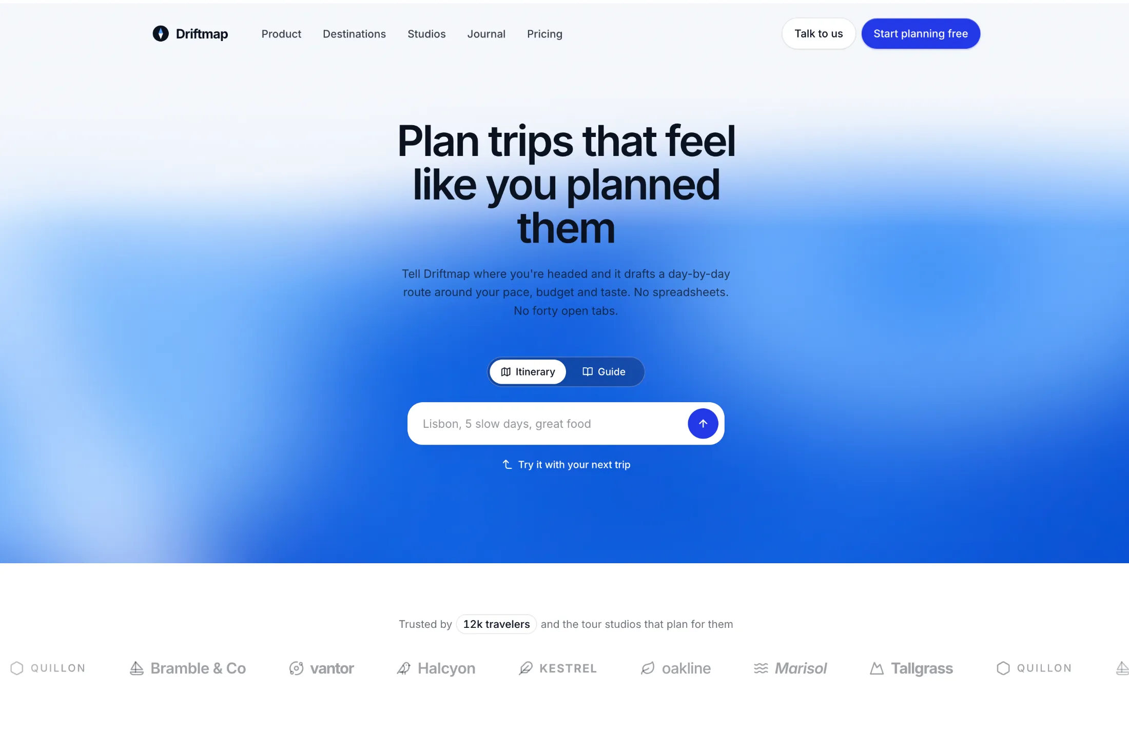
A hero with a drifting blue fluid gradient, a two-mode prompt input, and a looping partner logo marquee. Works in light and dark mode.
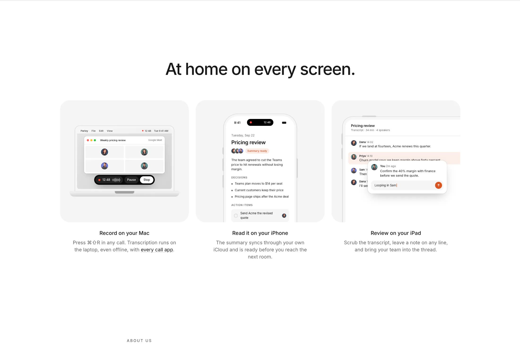
A three-column feature grid with minimal laptop, phone, and tablet illustrations. Each device opens and fills with content as it scrolls into view.
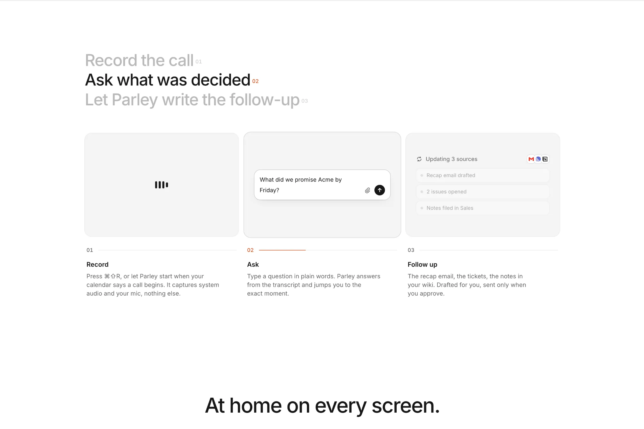
A three-step feature grid that works like tabs. Steps advance on a timer with a progress bar, and each step has its own animated visual.
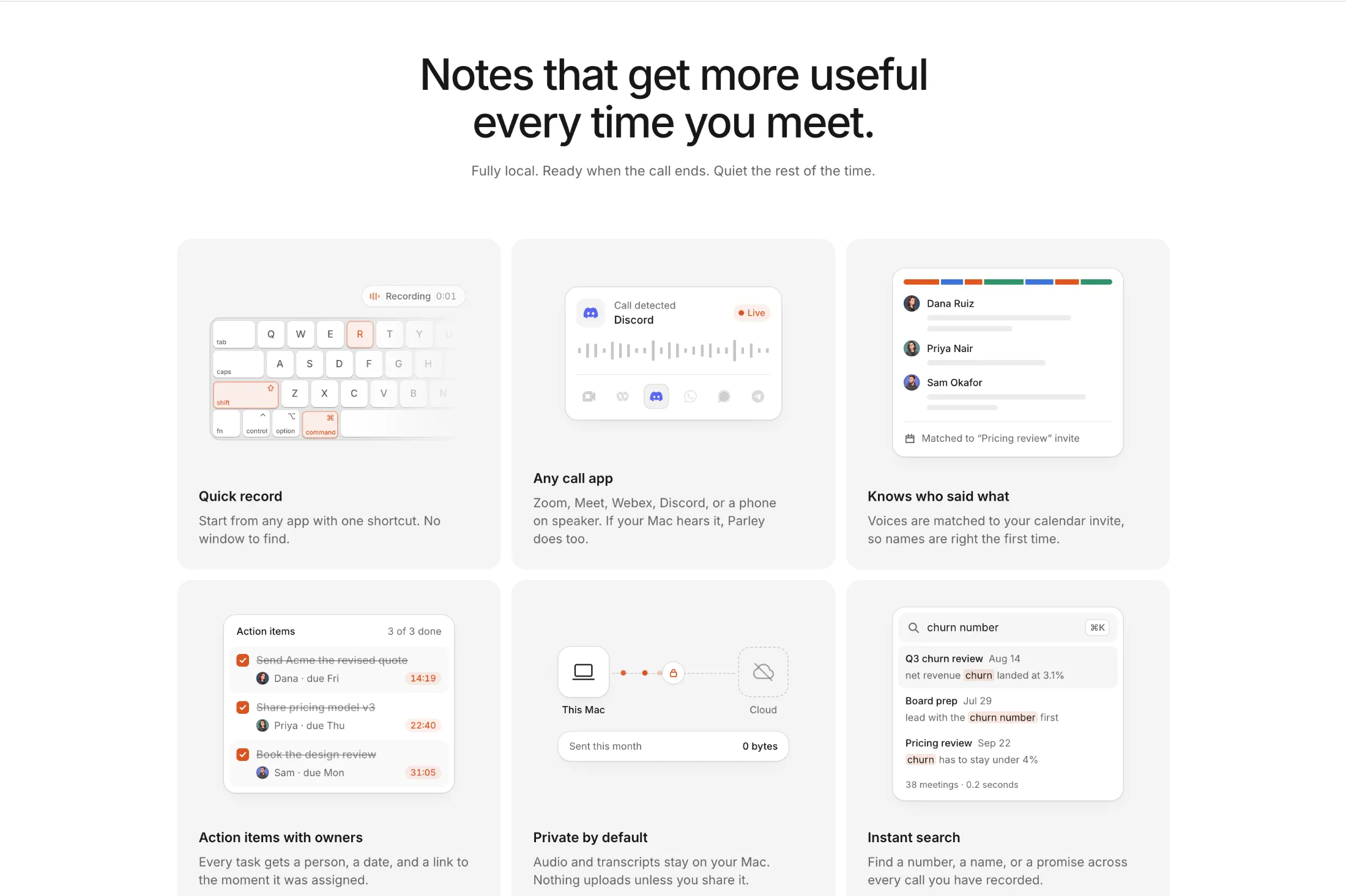
A six-card bento grid with detailed animated illustrations: a keyboard shortcut, app detection, name matching, tasks, a privacy diagram, and search.
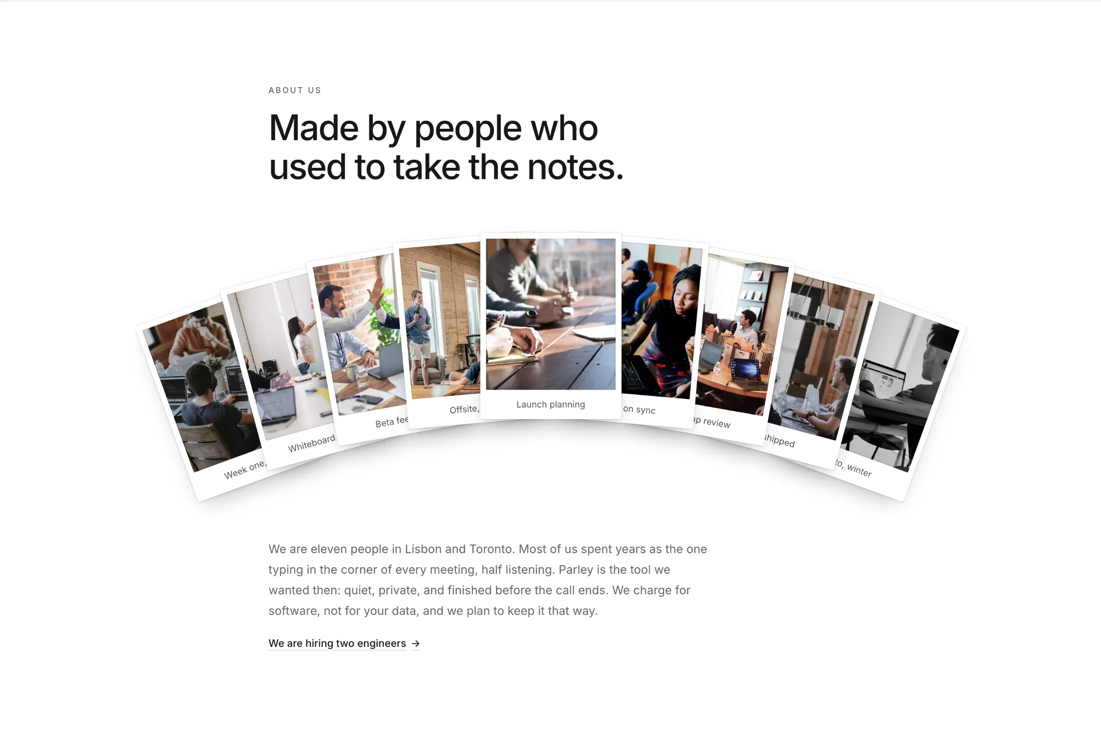
An about us section with a heading, a short story, and a fan of photo cards. Drag any card and it moves to the top.
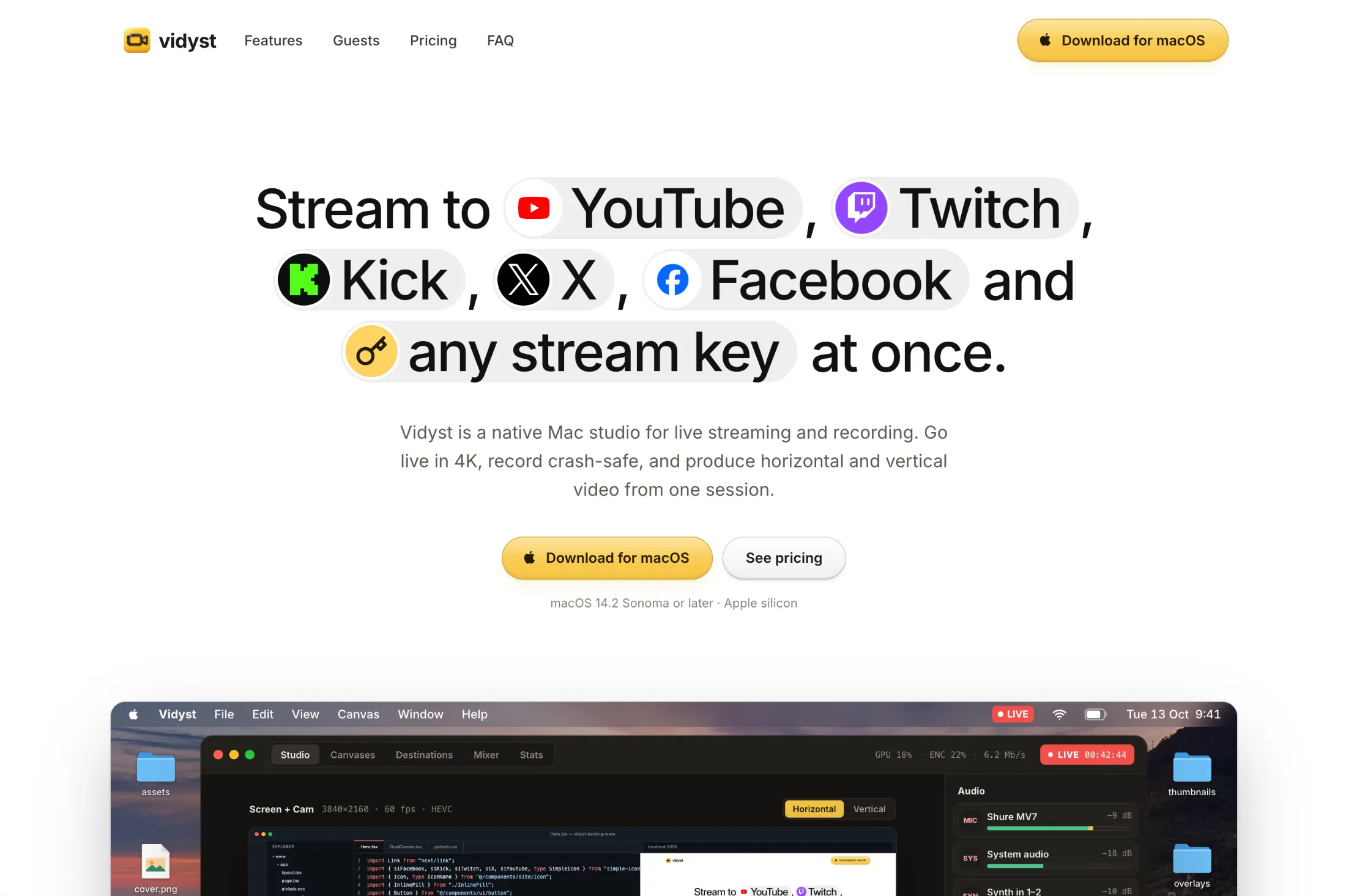
A hero for streaming apps. Platform pills pop into the headline, the navbar turns into a floating pill on scroll, and a live studio mockup sits below.

A layered poster intro animation with staggered image reveals, camera zoom, and a replay control

A play/pause button whose two pause bars smoothly morph into a play triangle by interpolating SVG path data with motion
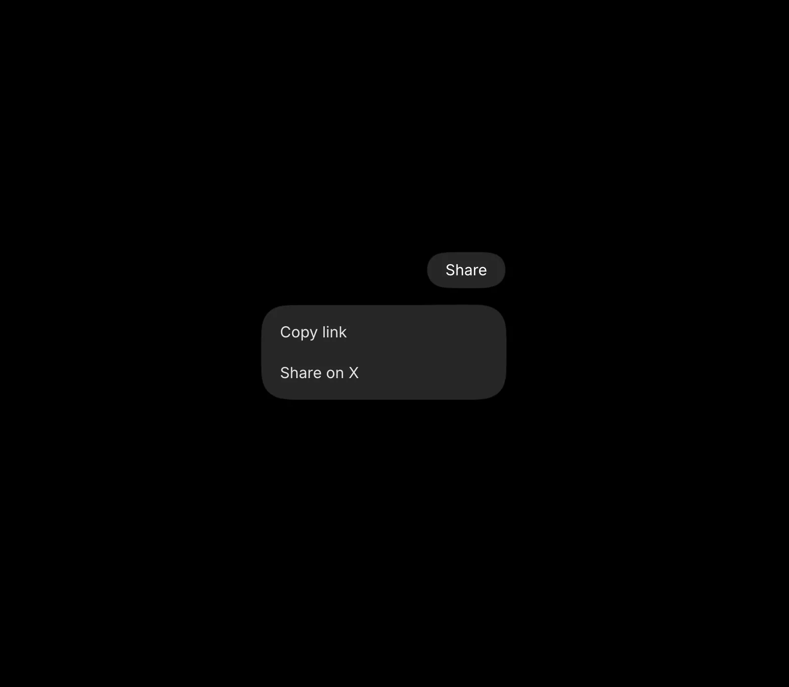
A gooey dropdown where the trigger pill morphs into the menu panel, inspired by aave.com website
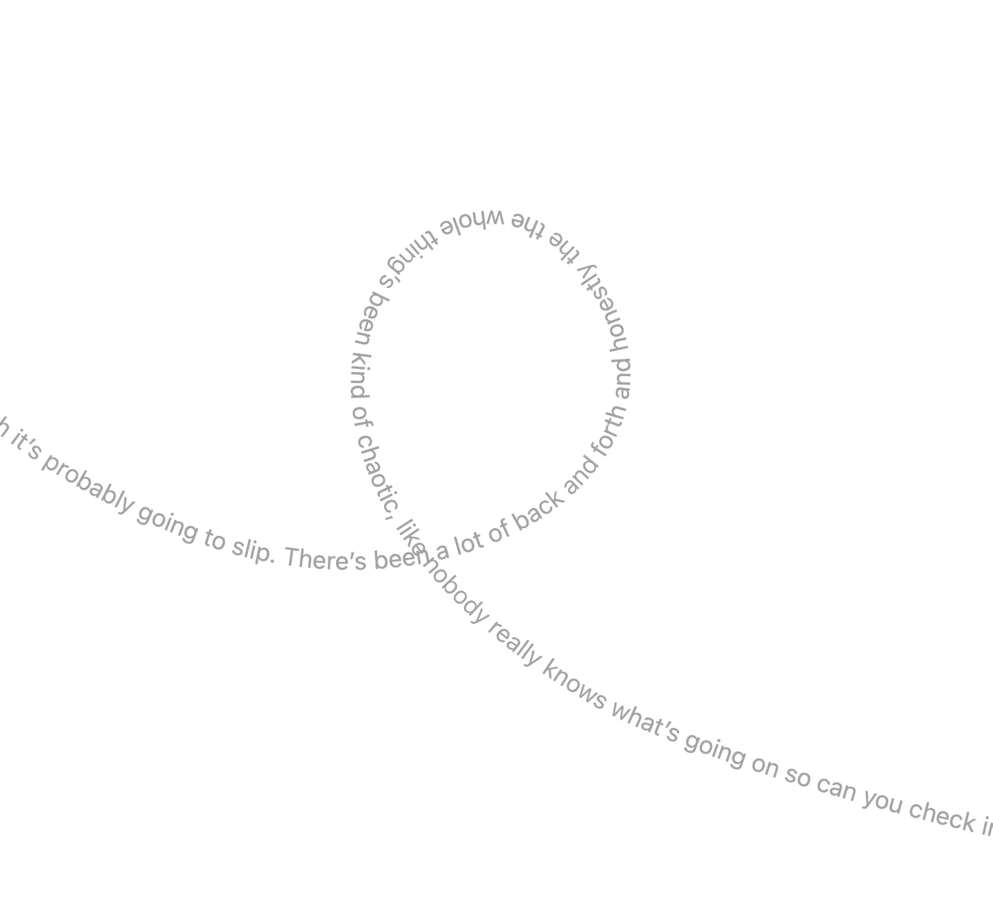
Text marquee animation achieved with SVG and motion, as seen on wisprflow.ai
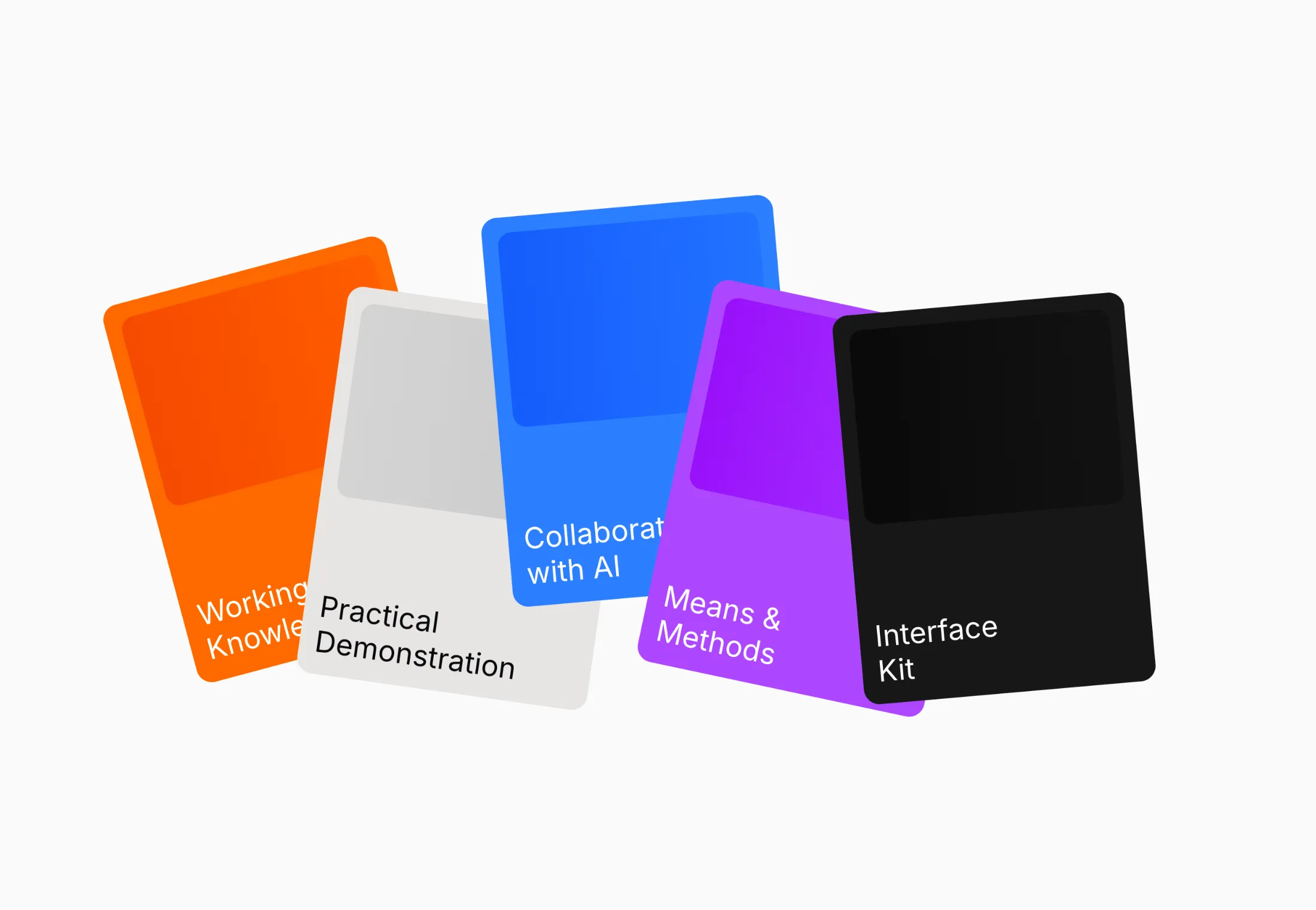
Cards with layout and scale animations, as seen on interfacecraft.dev website
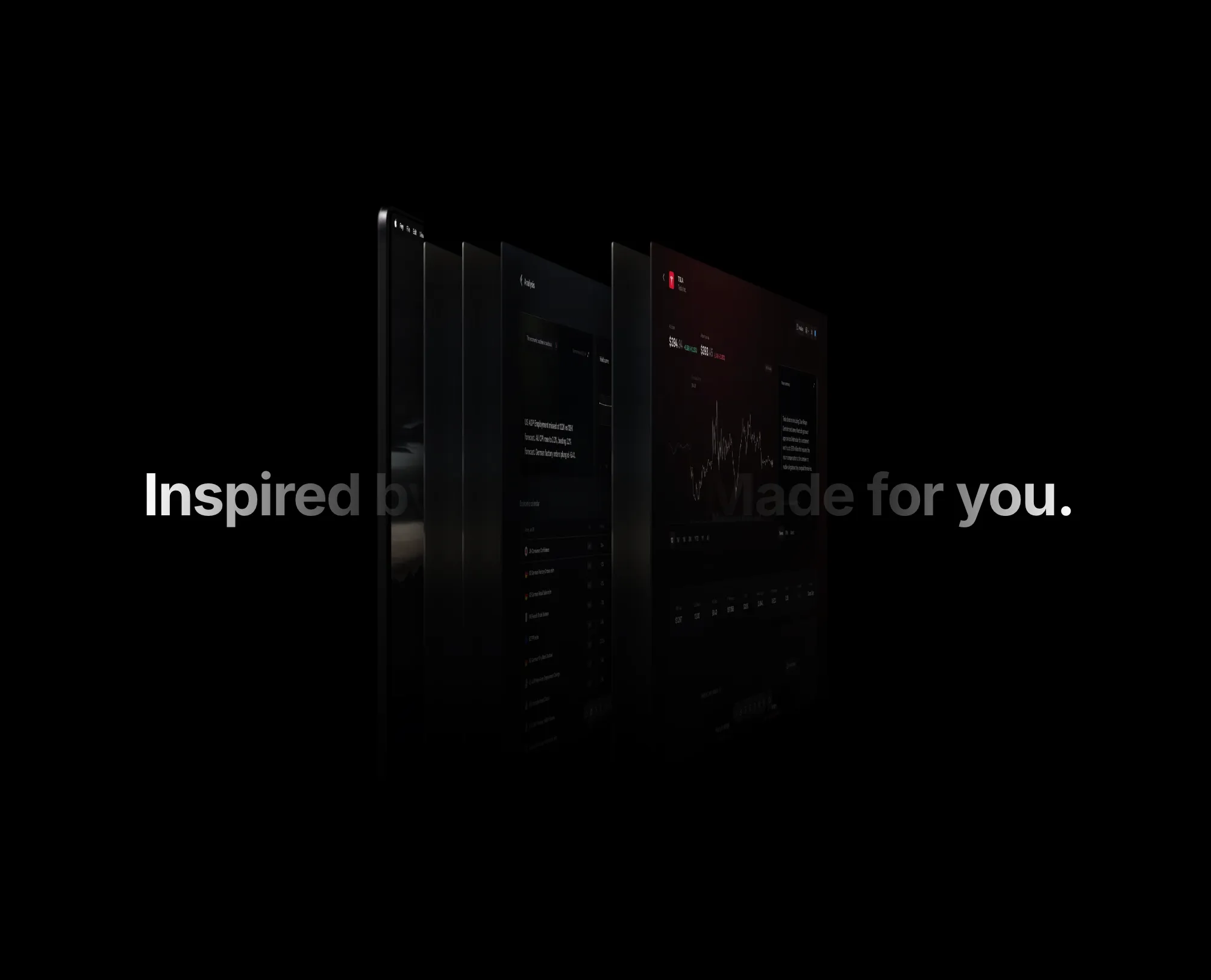
Cards that fan apart on hover or tap to reveal a shifting headline gradient, as seen on fey.com website
A simple grid and dots background to make your sections stand out.
A configurable sparkles component that can be used as a background or as a standalone component.
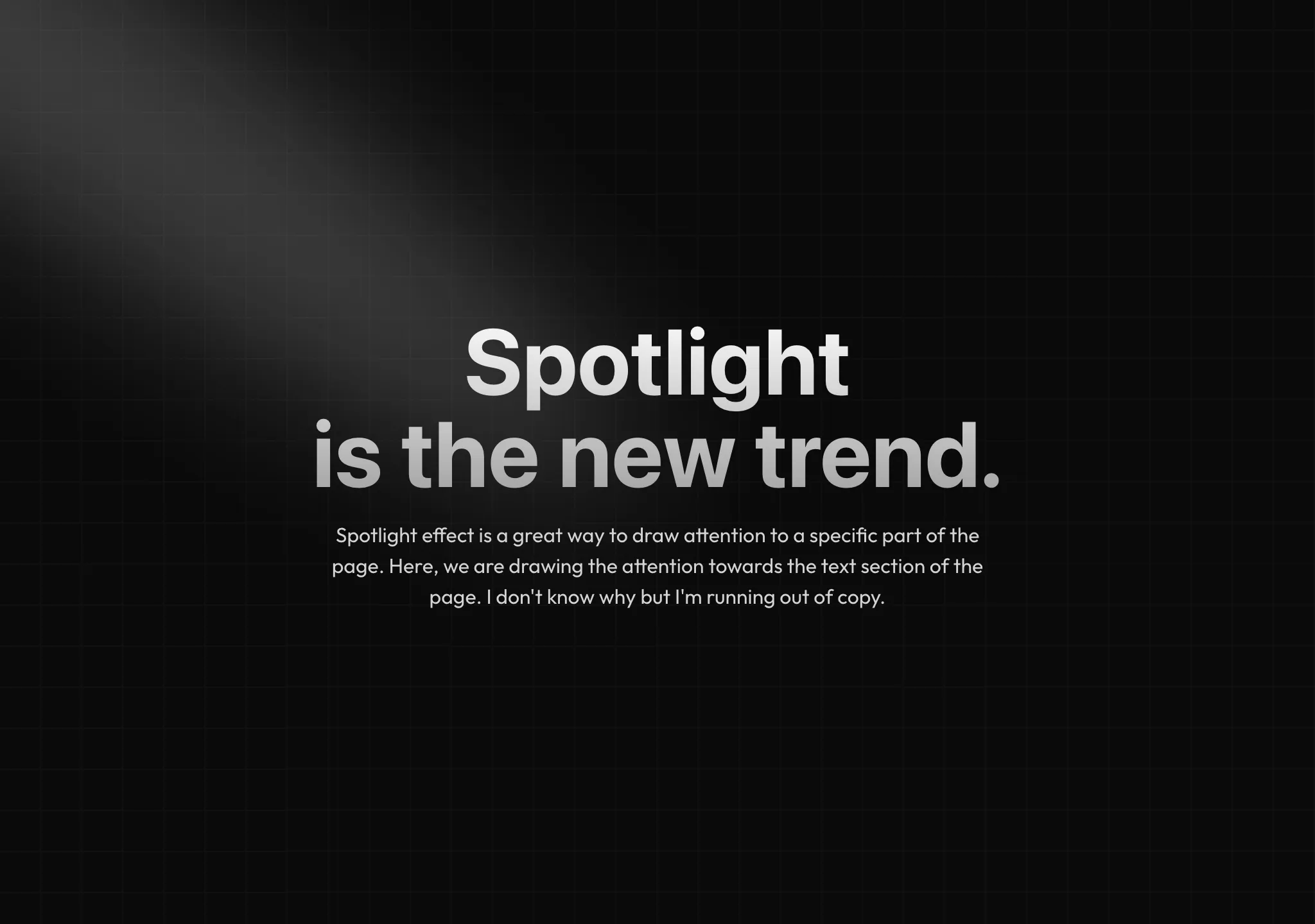
A spotlight effect with Tailwind CSS, good for drawing attention to a particular element on the page.
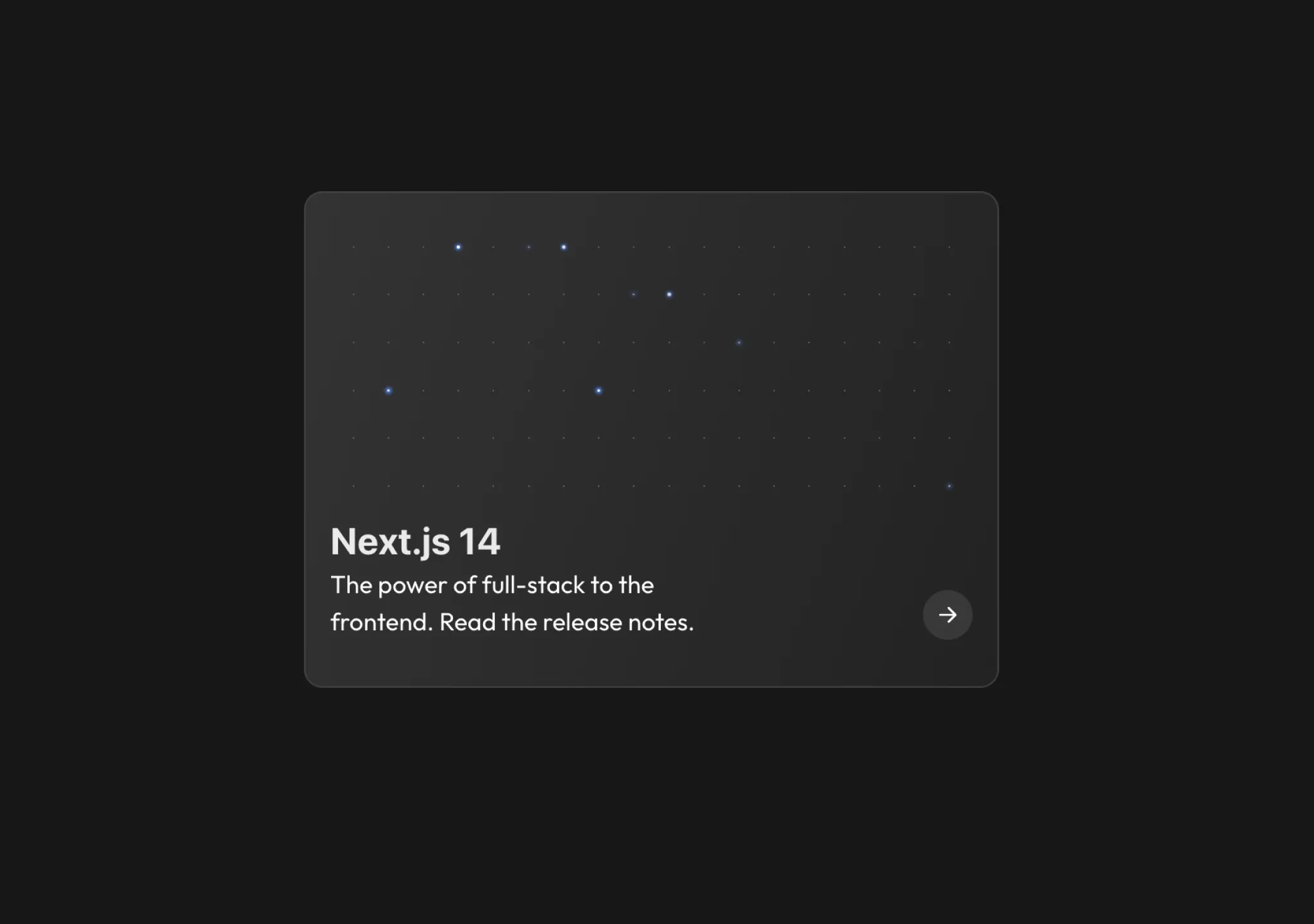
Card background stars that animate on hover and animate anyway
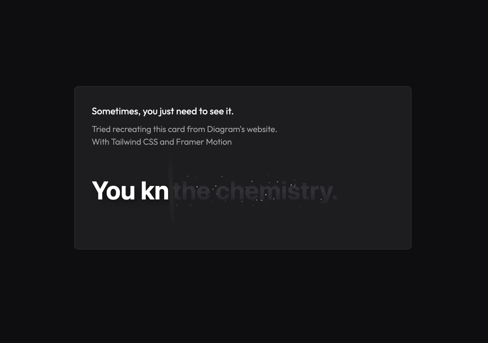
Mousemove effect to reveal text content at the bottom of the card.
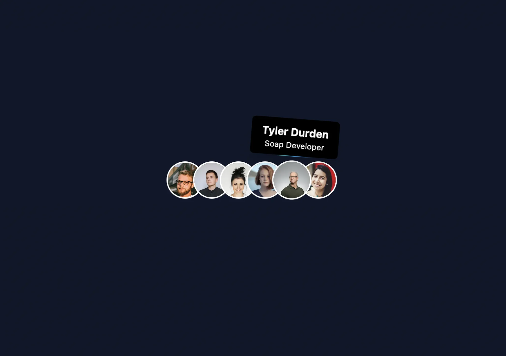
A cool tooltip that reveals on hover, follows mouse pointer
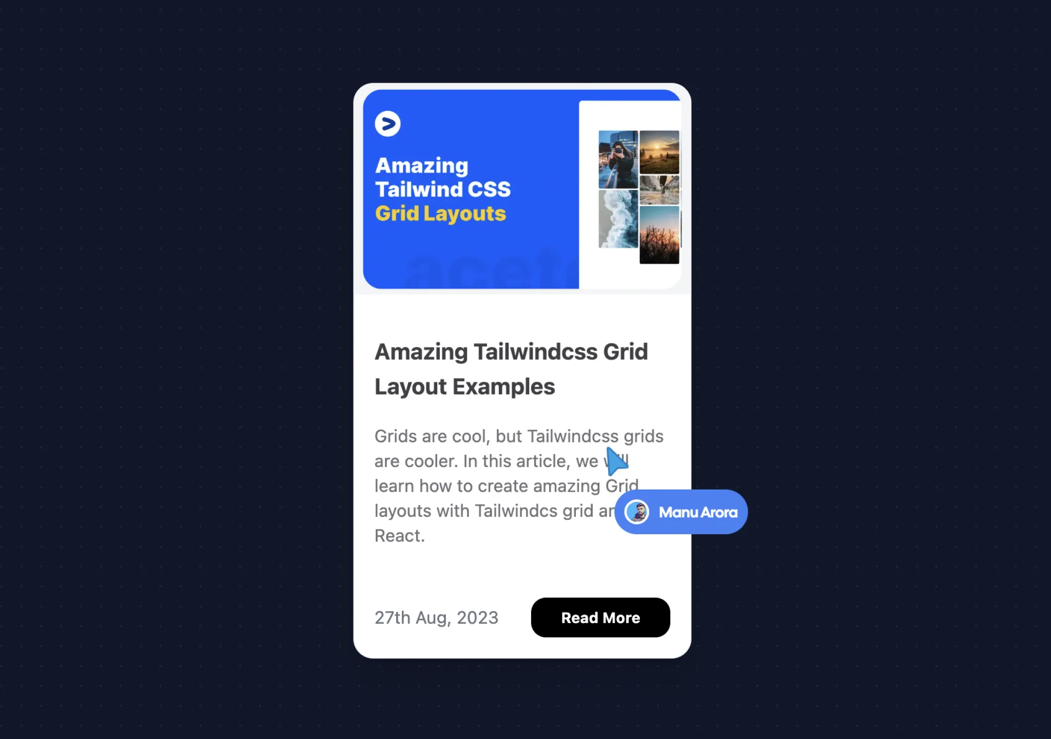
A custom pointer that follows mouse arrow and animates in pointer and content.
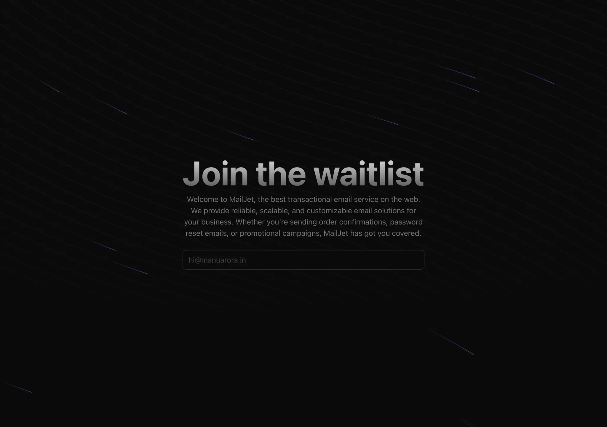
Multiple background beams that follow a path of SVG, makes a good hero section background.
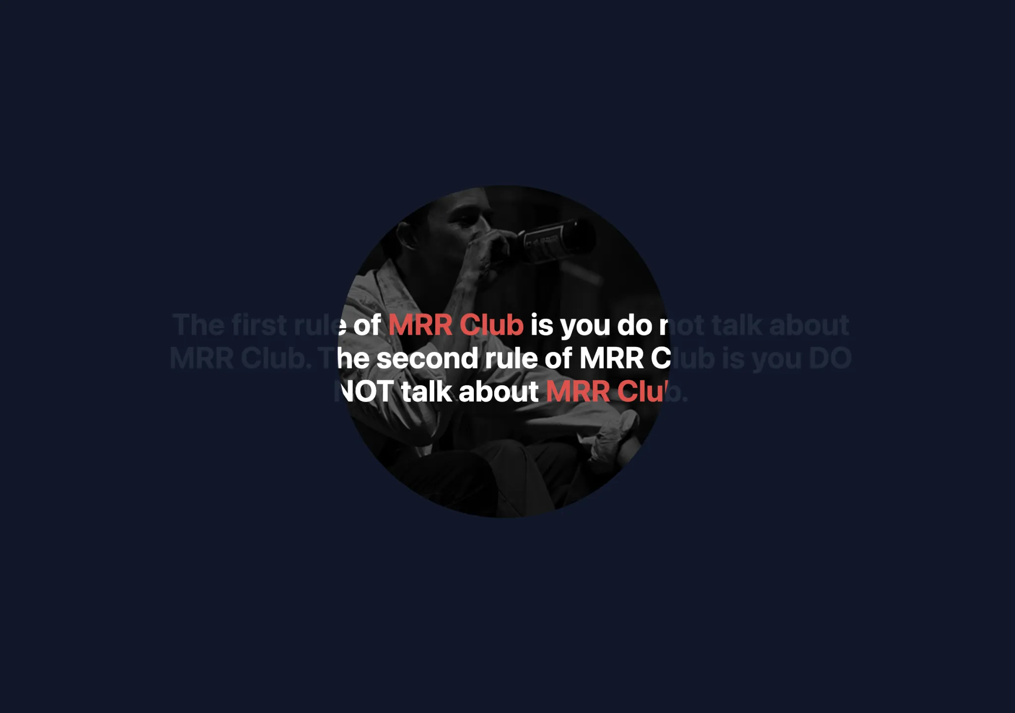
A mask reveal effect, hover the cursor over a container to reveal what's underneath.
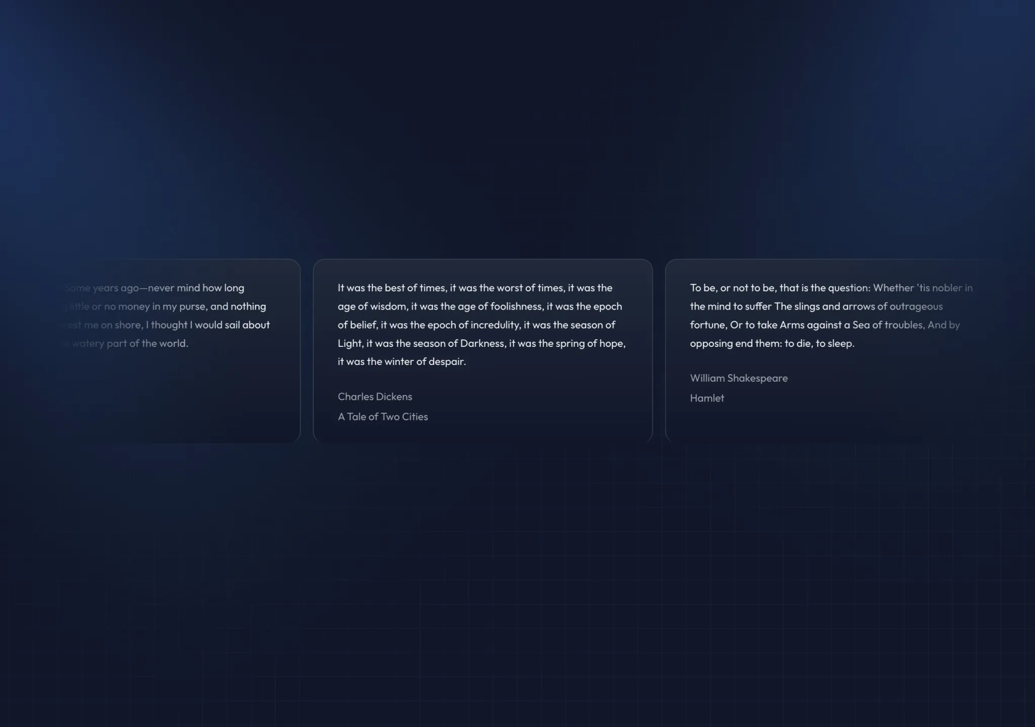
A customizable group of cards that move infinitely in a loop. Made with Framer Motion and Tailwind CSS.
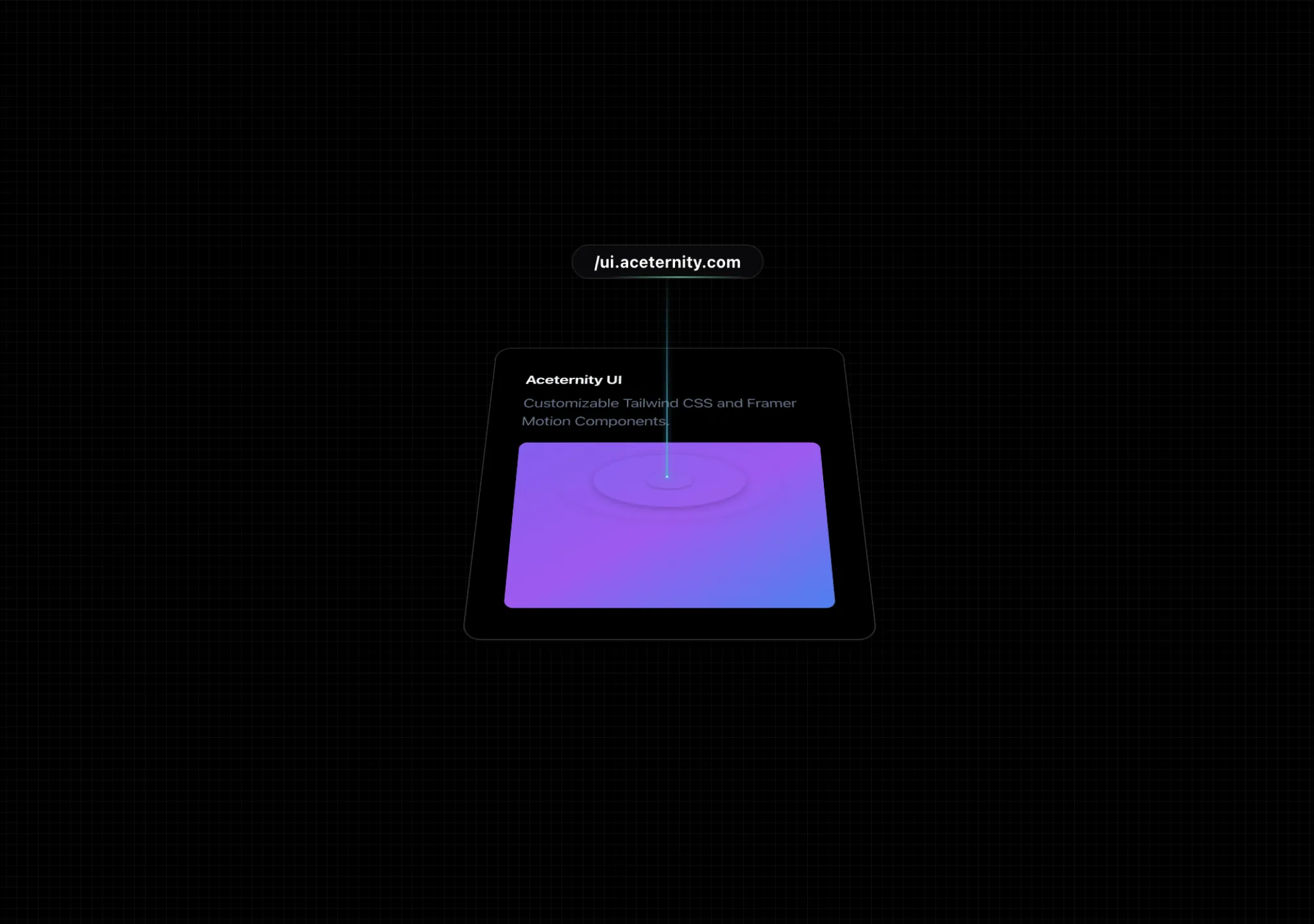
A gradient pin that animates on hover, perfect for product links.
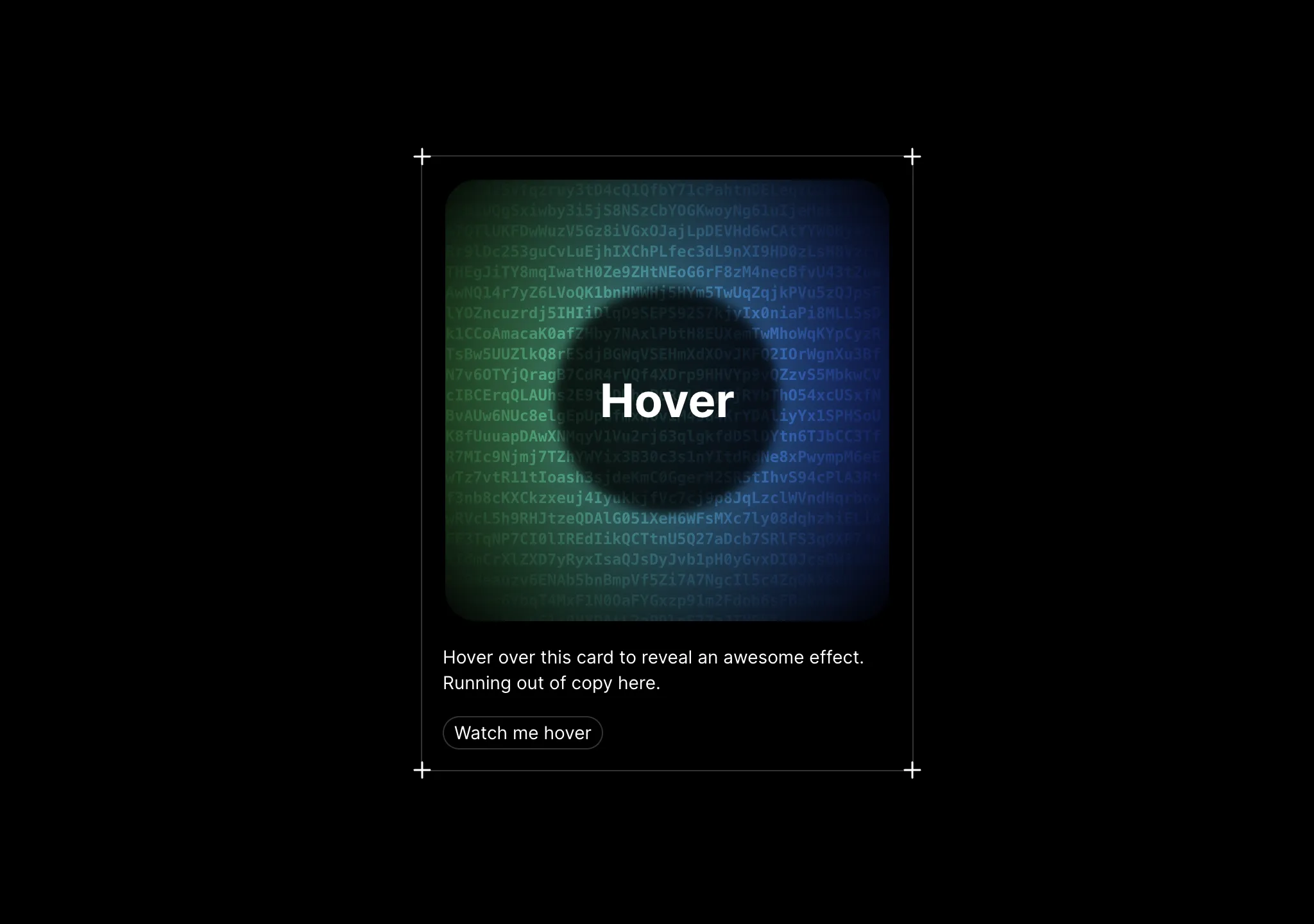
A cool card with amazing hover effect, reveals encrypted text and a mixed gradient.
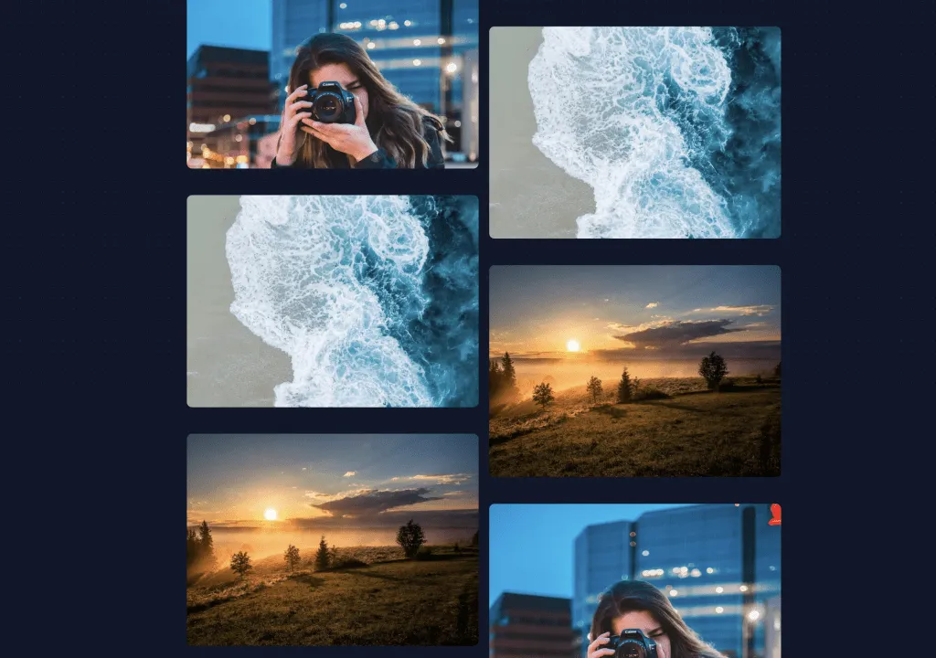
A grid where two columns scroll in oposite directions, giving a parallax effect.
A grid where two columns scroll in oposite directions, giving a parallax effect.
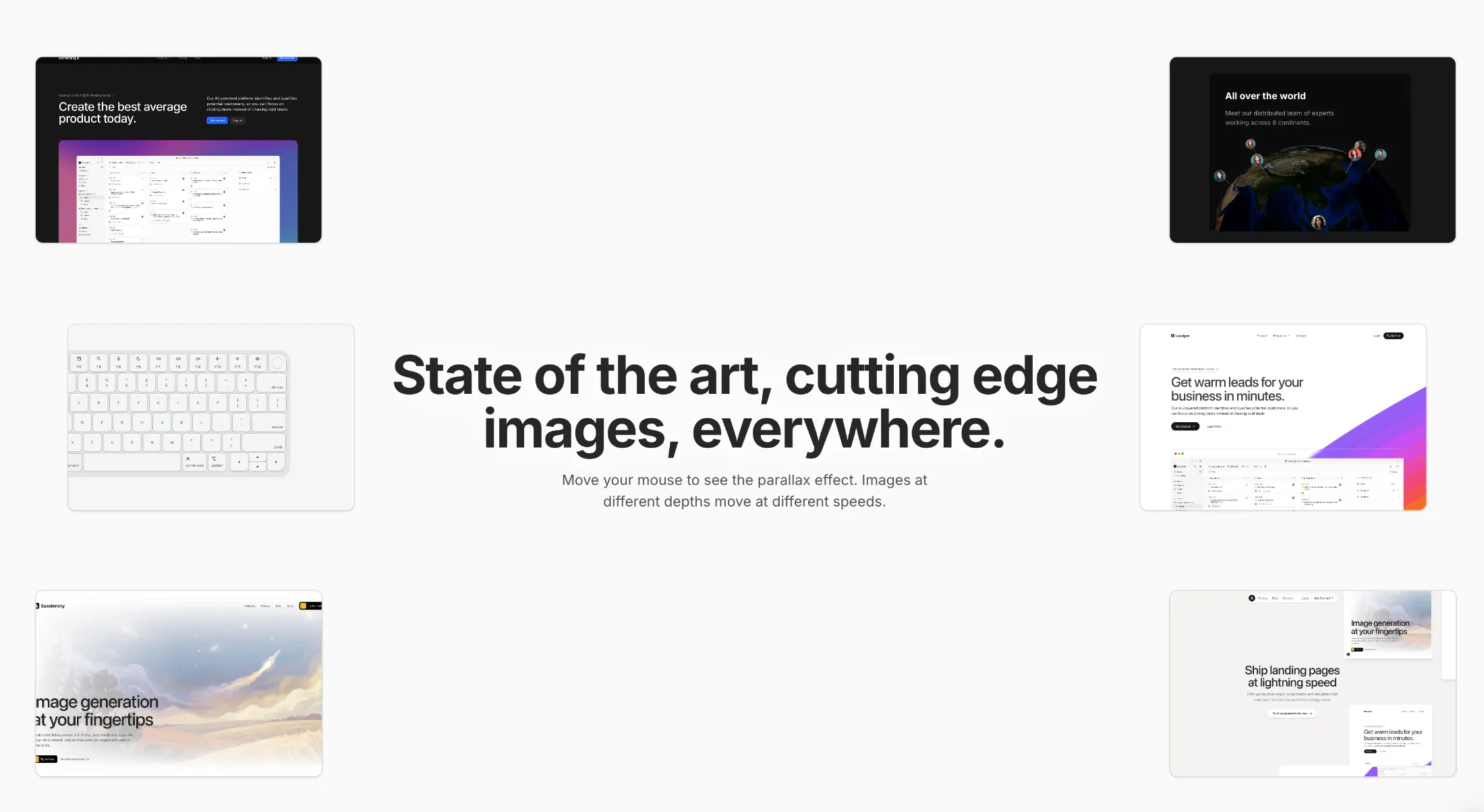
Mouse-driven parallax effect, perfect for hero sections. Images blur fade in and move at different depths.
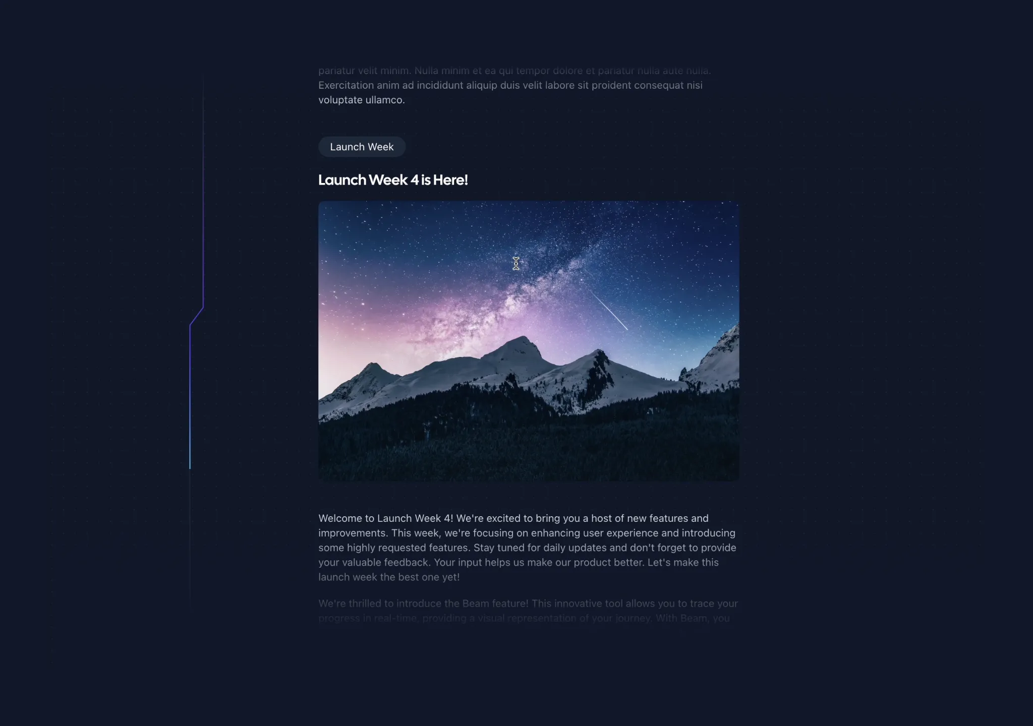
A Beam that follows the path of an SVG as the user scrolls. Adjusts beam length with scroll speed.
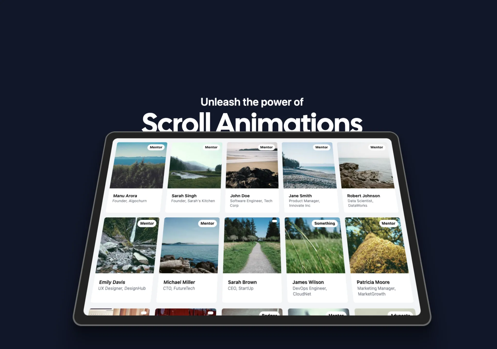
A scroll animation that rotates in 3d on scroll. Perfect for hero or marketing sections.

A cool text effect that fades in text on page load, one by one.
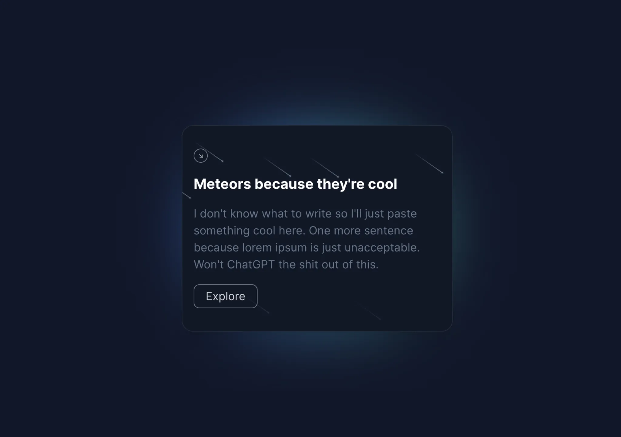
A group of beams in the background of a container, sort of like meteors.
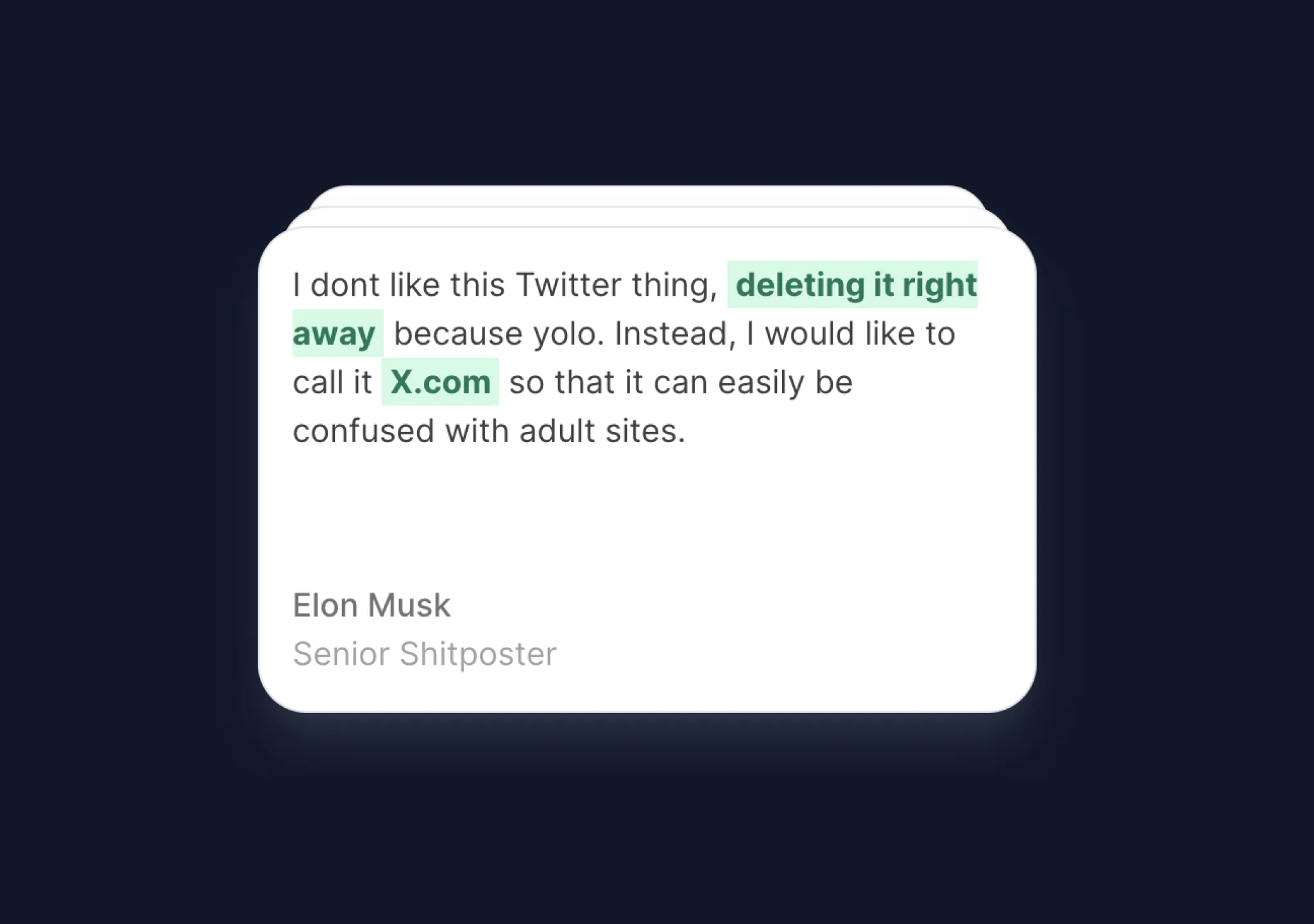
Cards stack on top of each other after some interval. Perfect for showing testimonials.
A border that moves around the container. Perfect for making your buttons stand out.
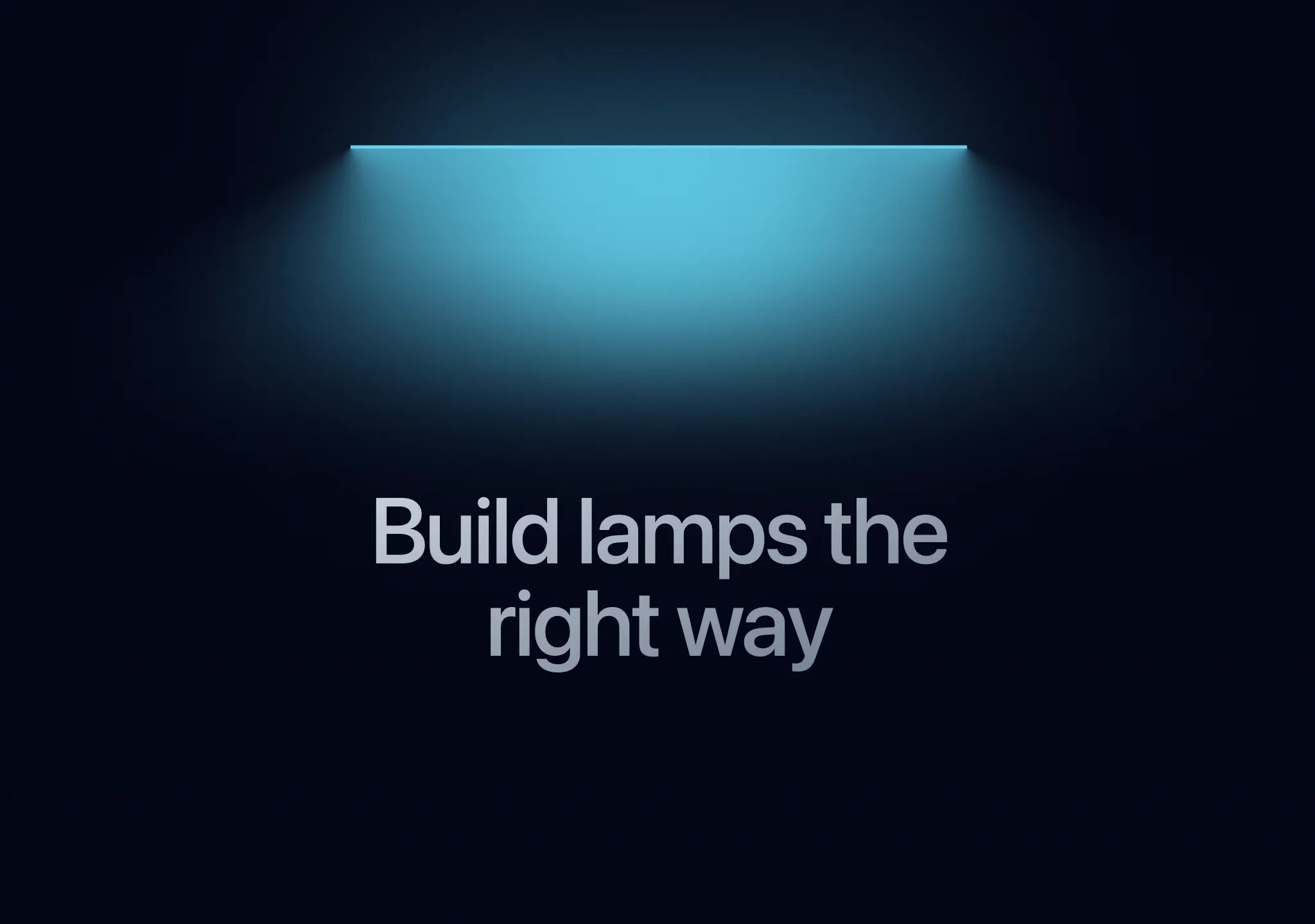
A lamp effect as seen on linear, great for section headers.
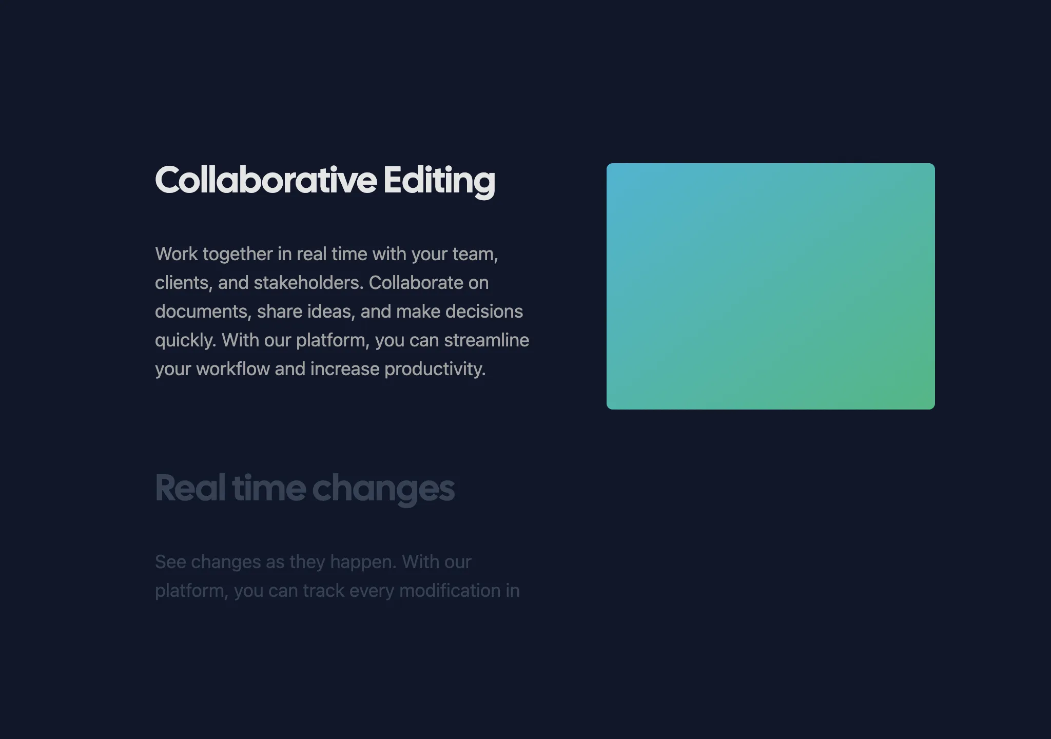
A sticky container that sticks while scrolling, text reveals on scroll
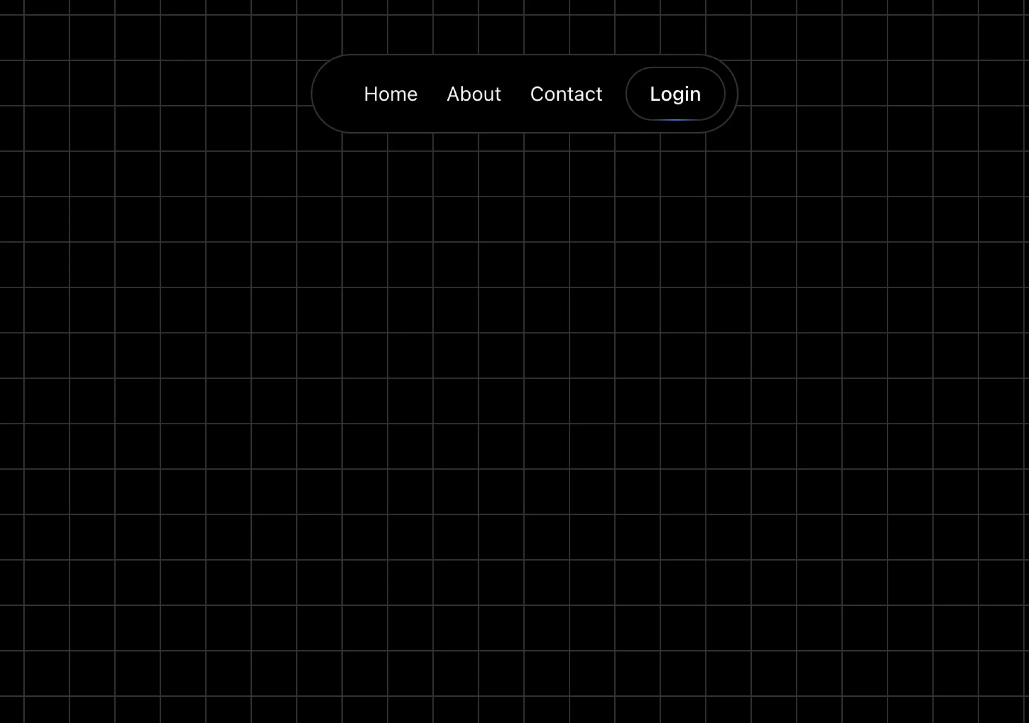
A sticky Navbar that hides on scroll, reveals when scrolled up.
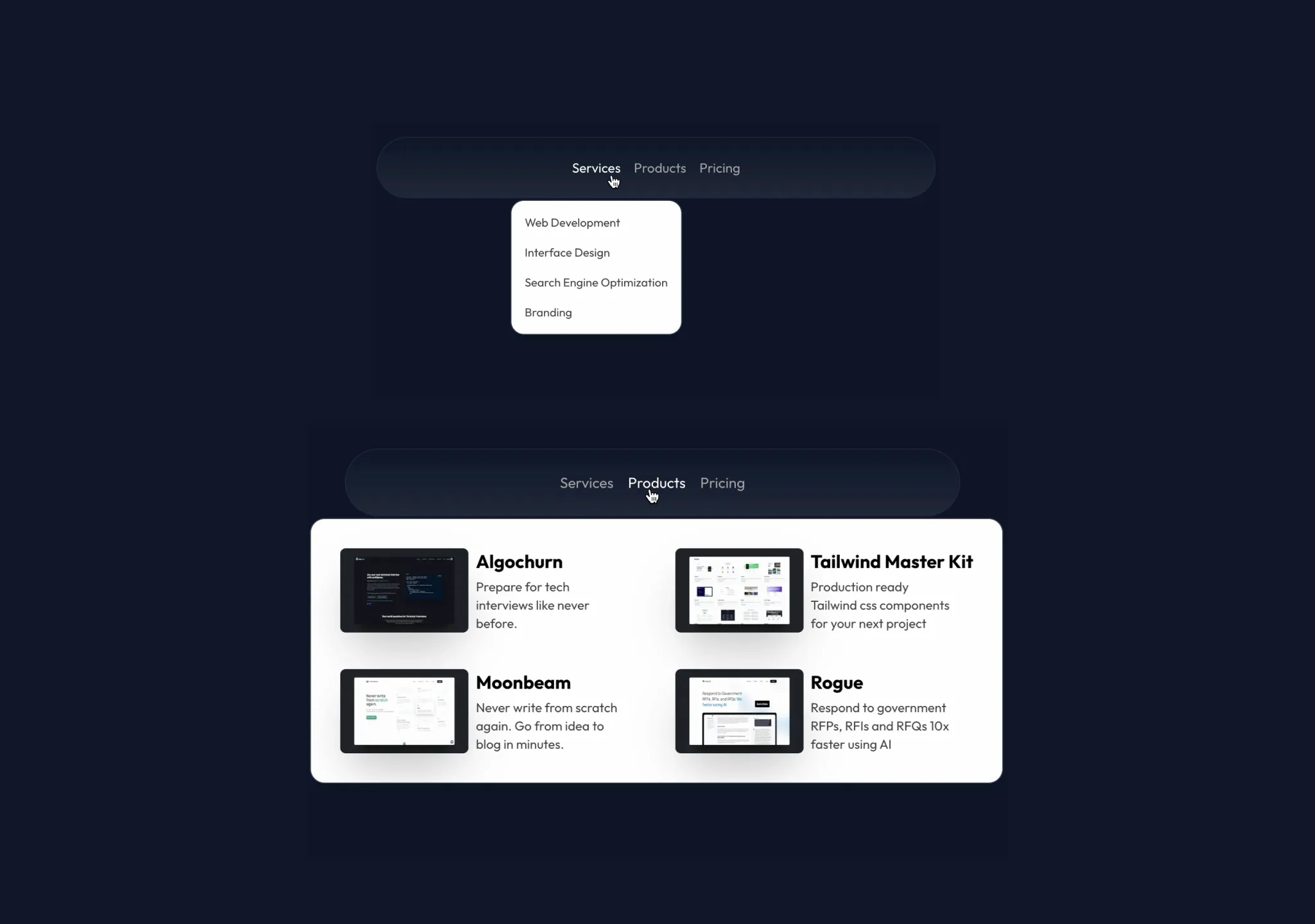
A navbar menu that animates its children on hover, makes a beautiful bignav
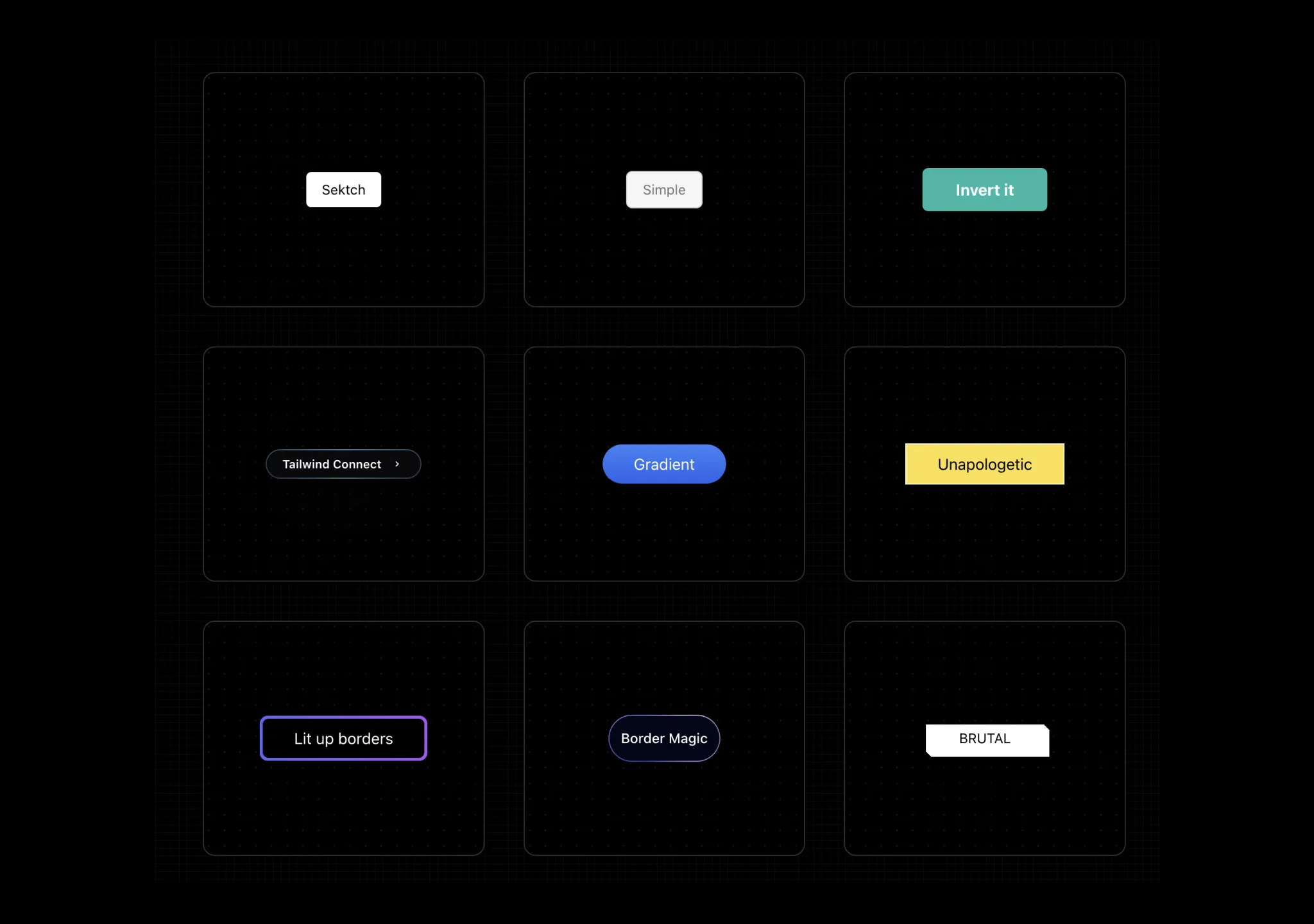
A curated list of awesome, battle tested Tailwind CSS buttons components
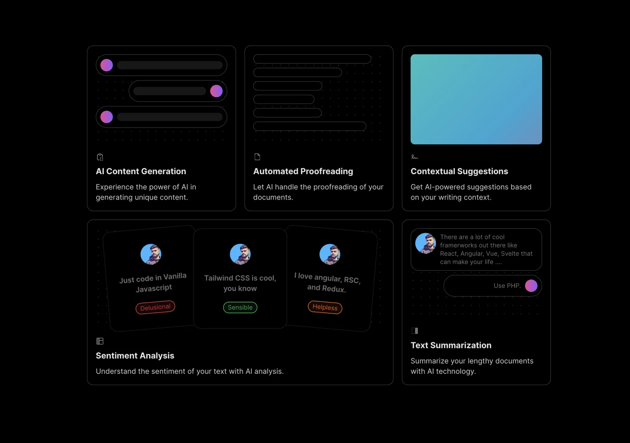
A skewed grid layout with Title, description and a header component
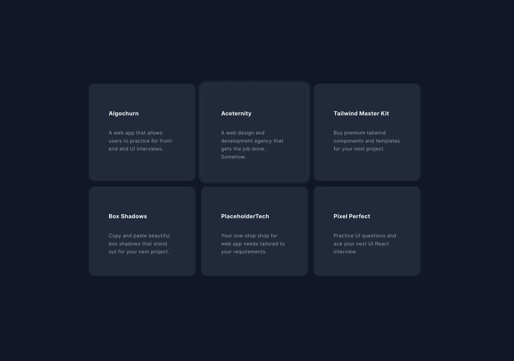
Hover over the cards and the effect slides to the currently hovered card.
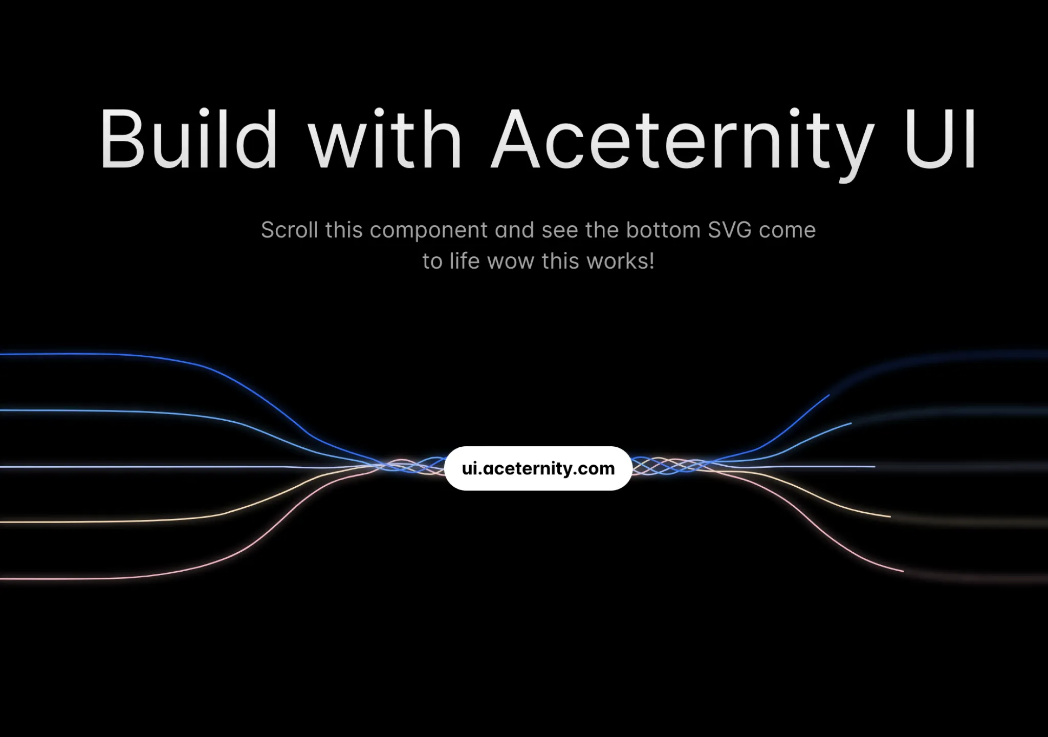
An effect of SVGs as seen on the Google Gemini Website
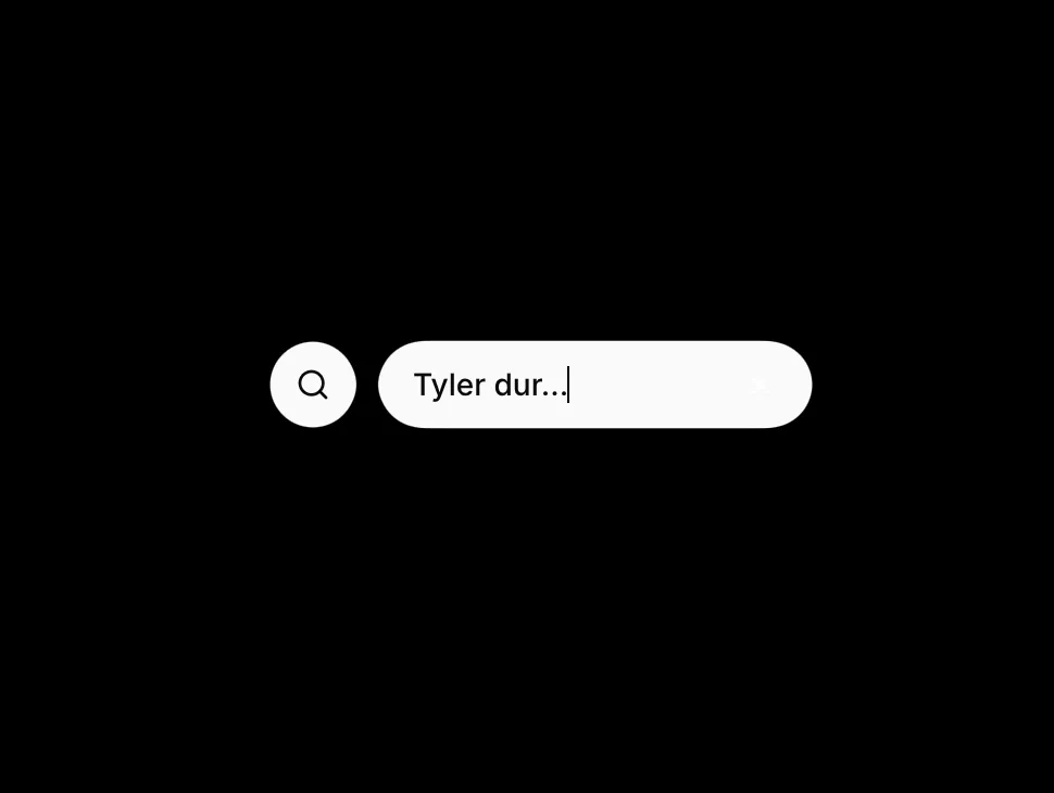
A search-style input that expands with a gooey SVG filter and shared layout animation
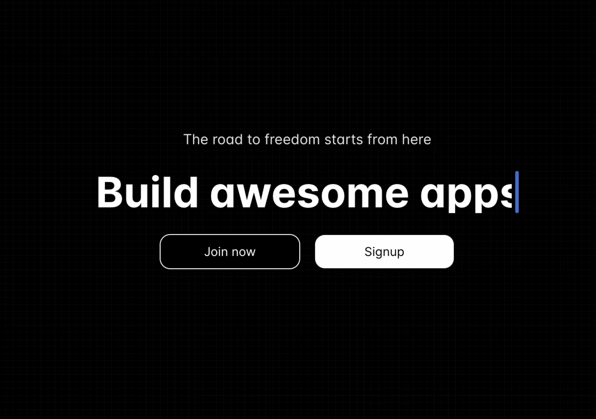
Text generates as if it is being typed on the screen.
A full width background box container that highlights on hover
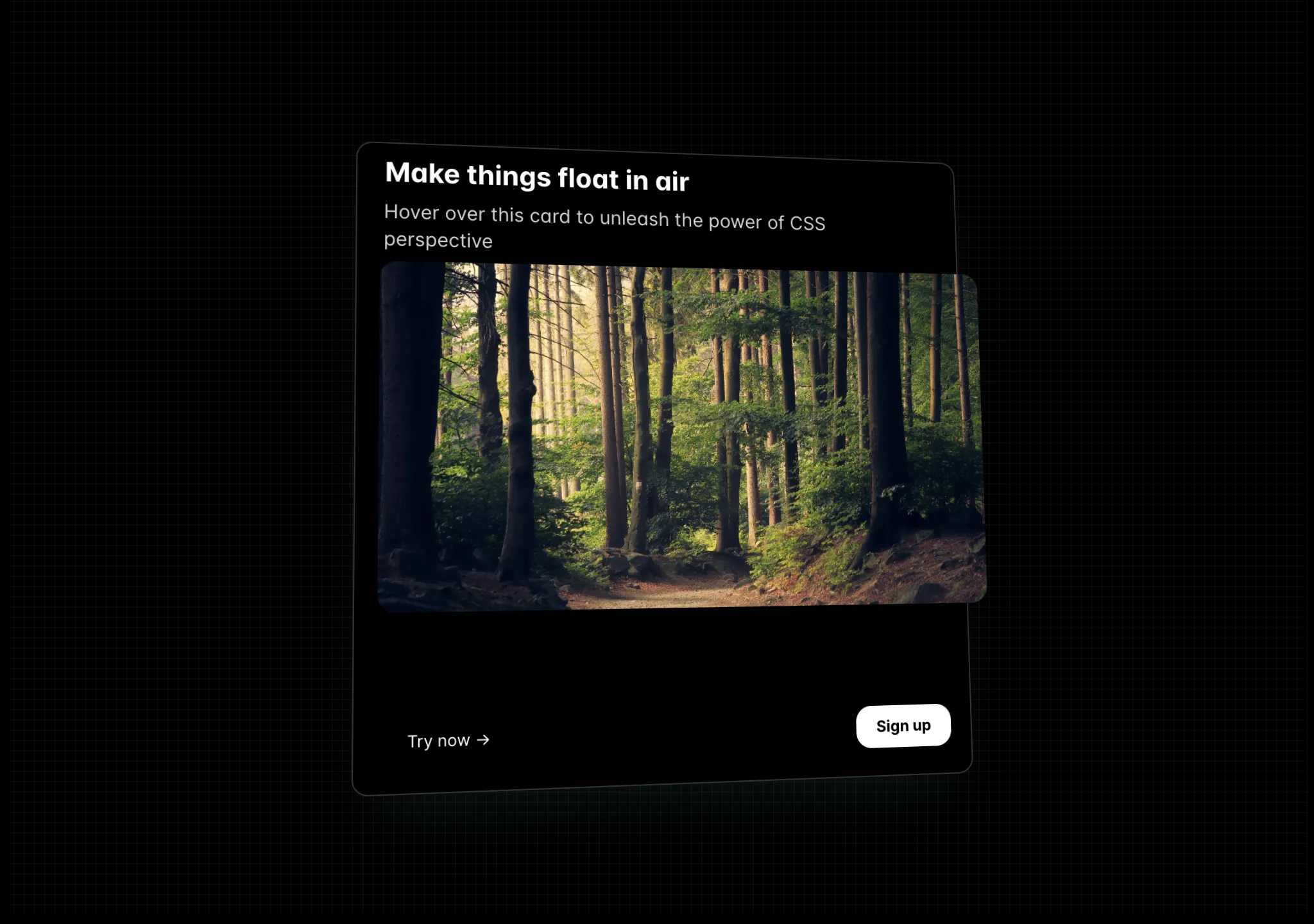
A card perspective effect, hover over the card to elevate card elements.
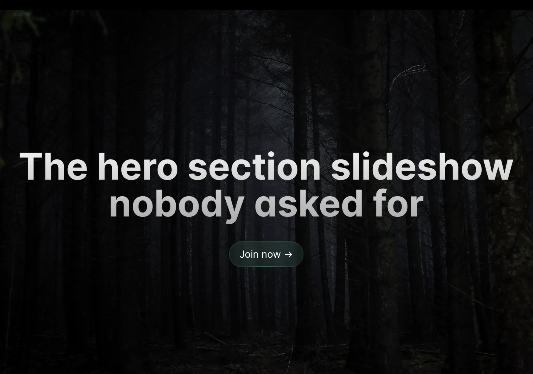
A full page slider with images that can be navigated with the keyboard.
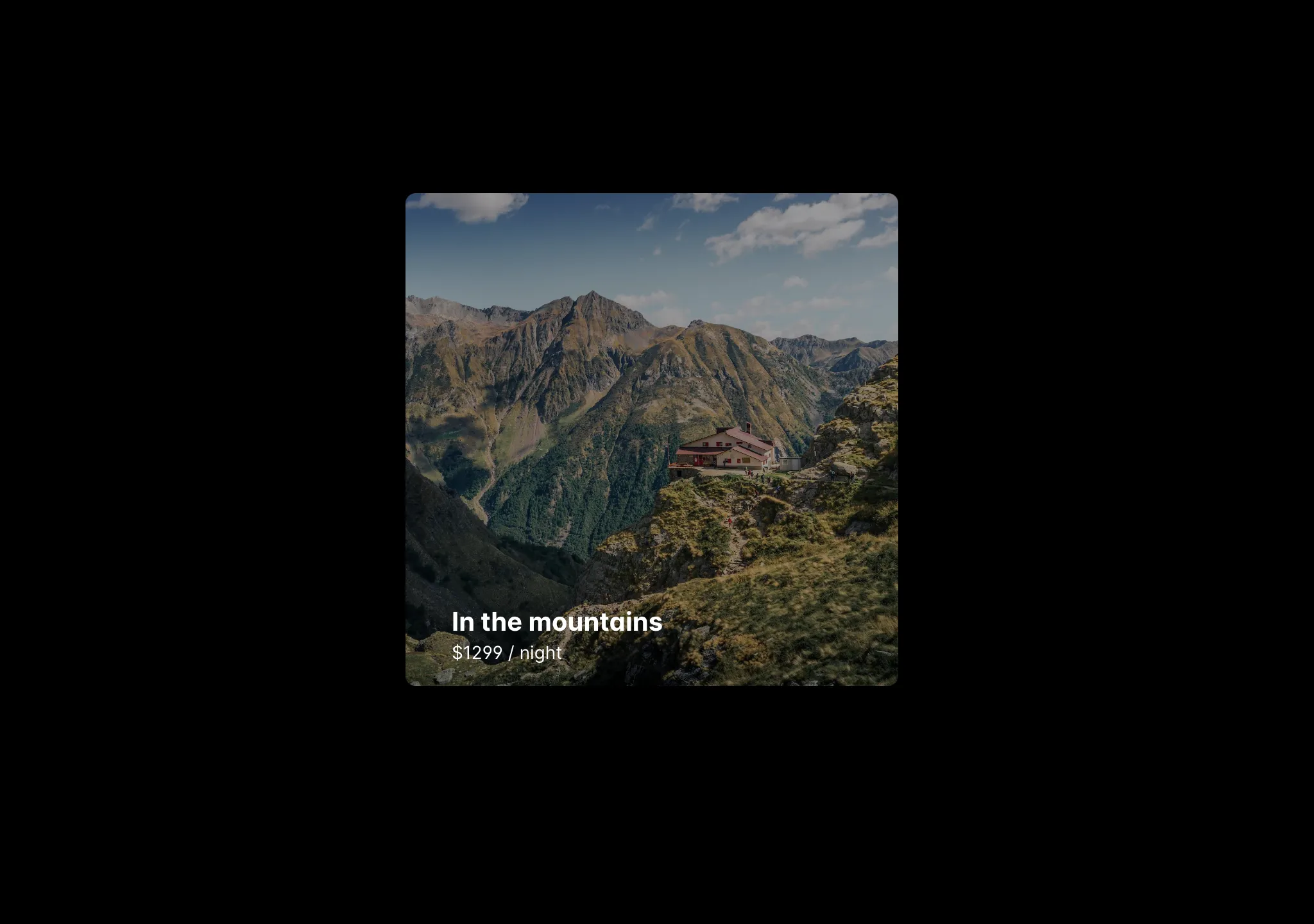
A direction aware hover effect using Framer Motion, Tailwindcss and good old javascript.
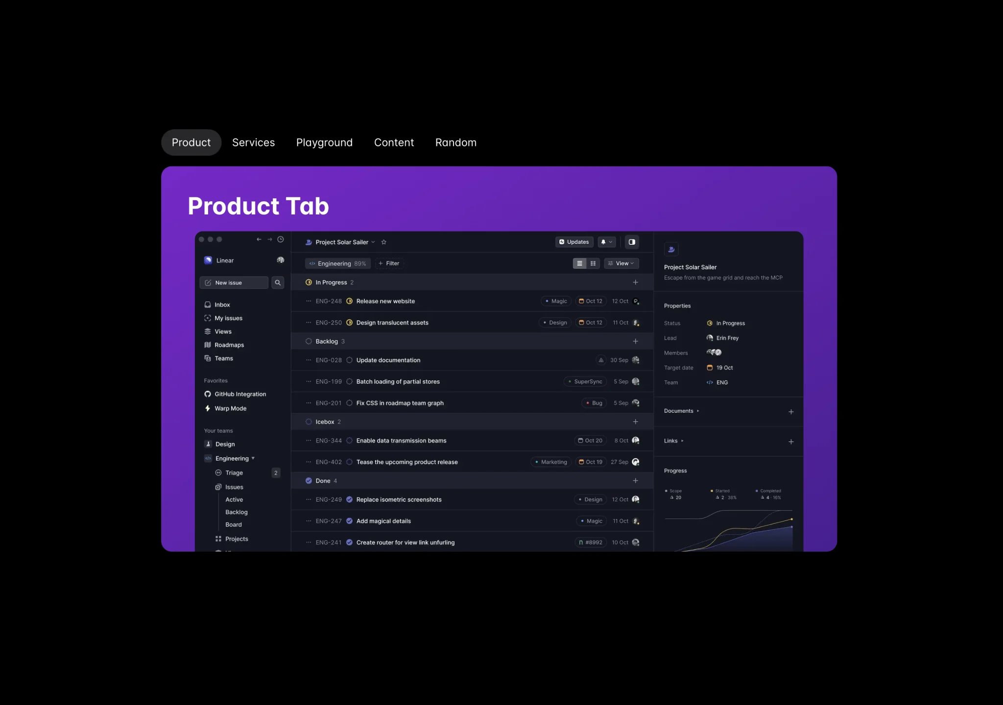
Tabs to switch content, click on a tab to check background animation.

A scroll effect with rotation, translation and opacity animations.
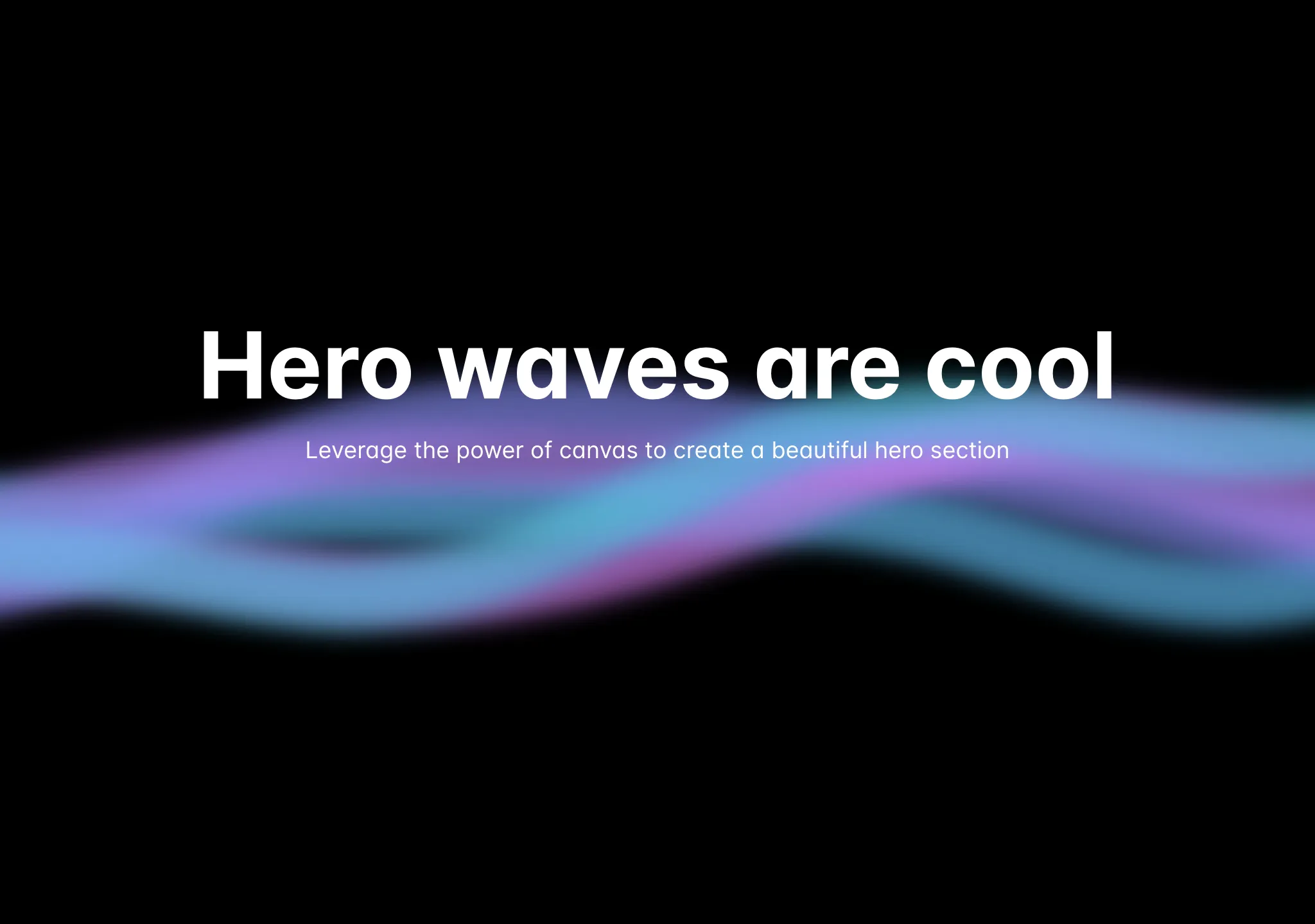
A cool background effect with waves that move.
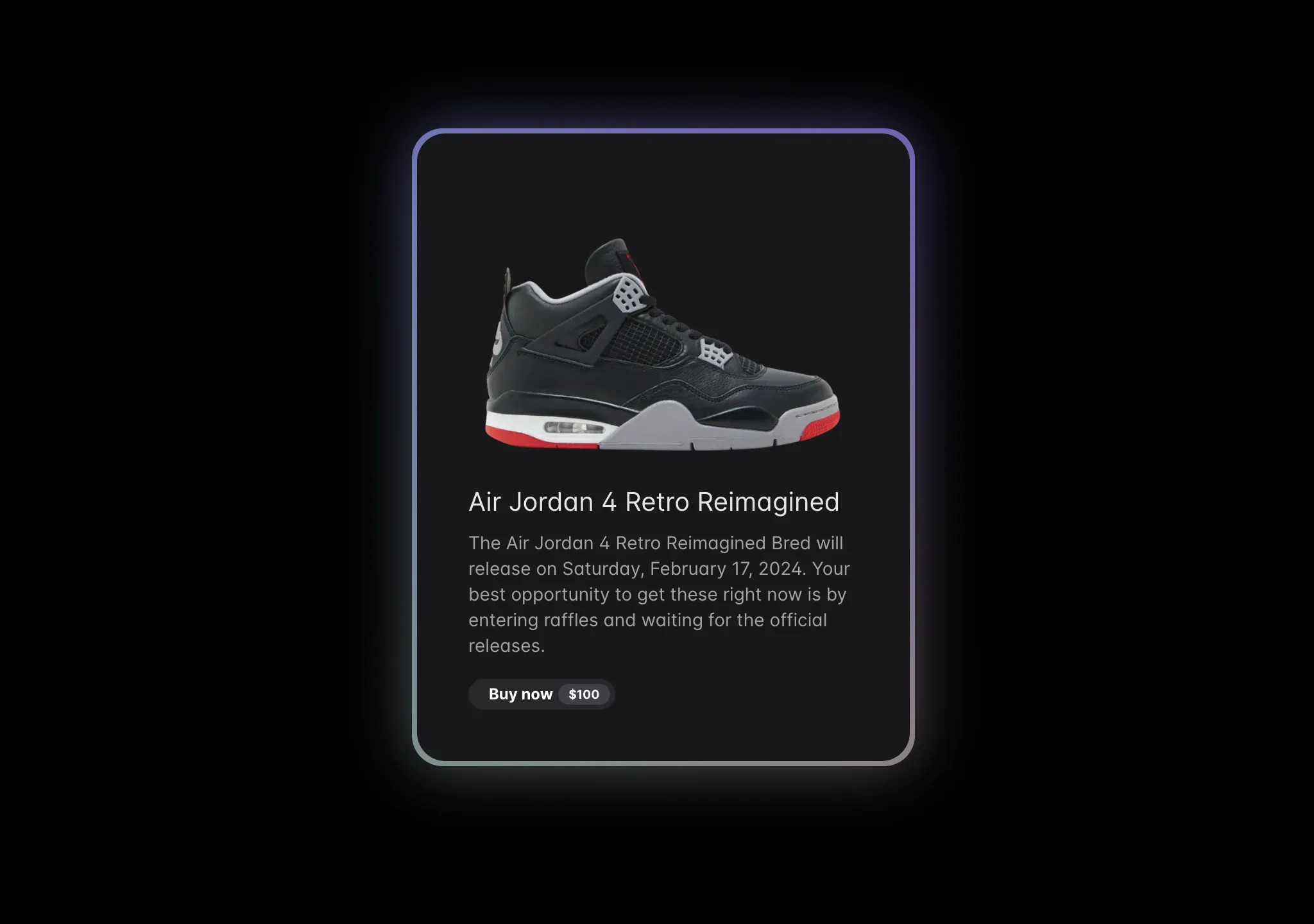
An animated gradient that sits at the background of a card, button or anything.
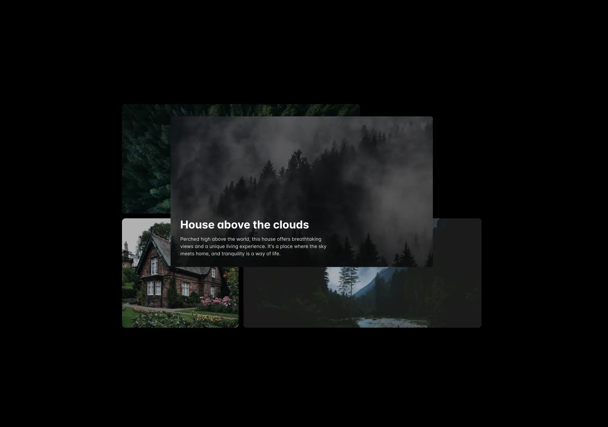
A layout effect that animates the grid item on click, powered by framer motion layout
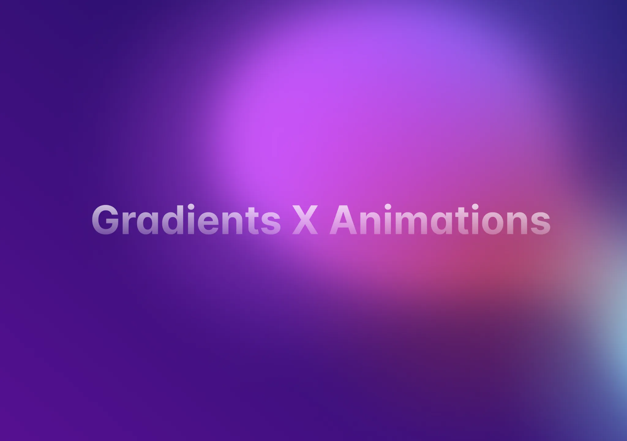
A smooth and elegant background gradient animation that changes the gradient position over time.
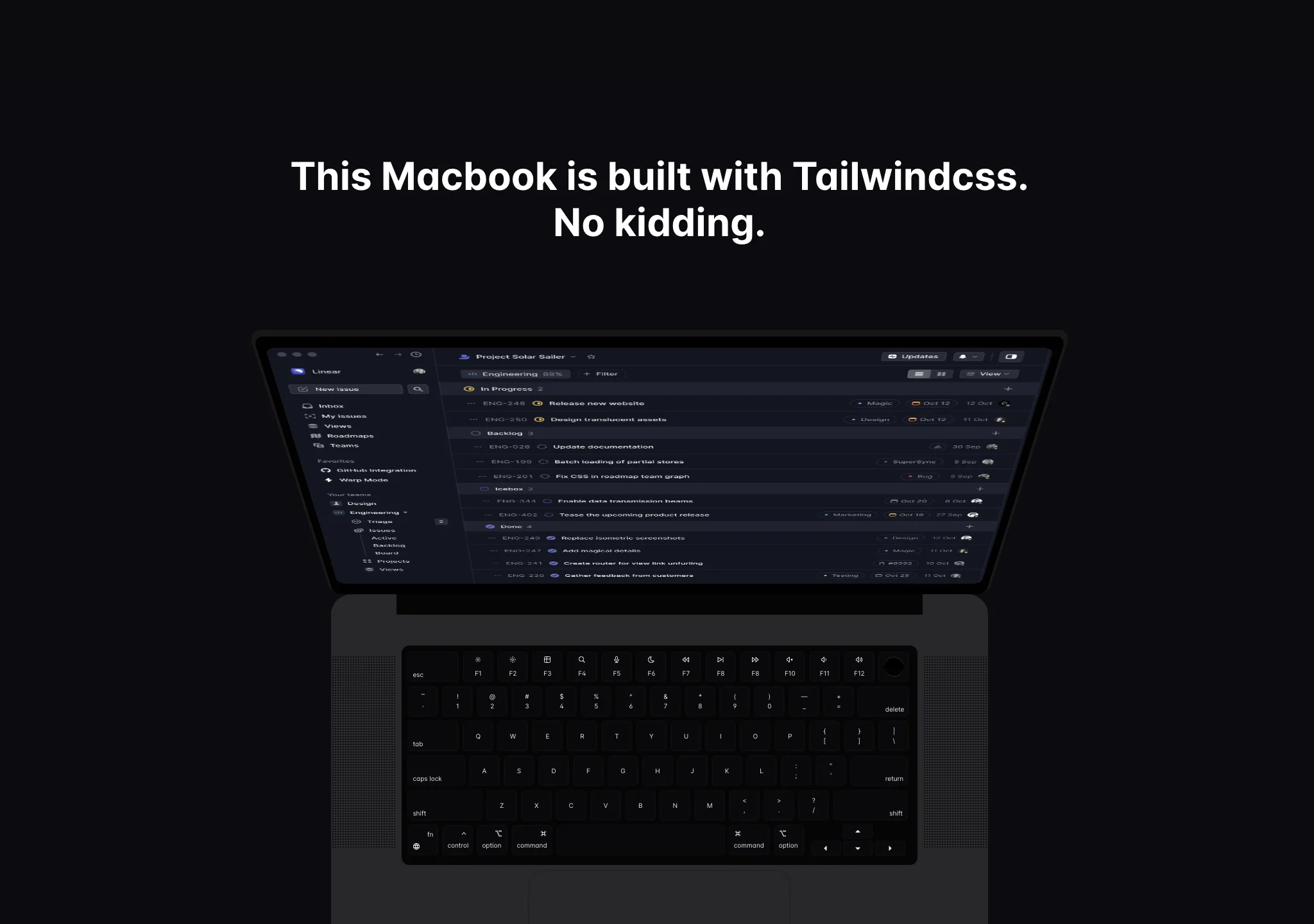
Scroll through the page and see the image come out of the screen, as seen on Fey.com website.
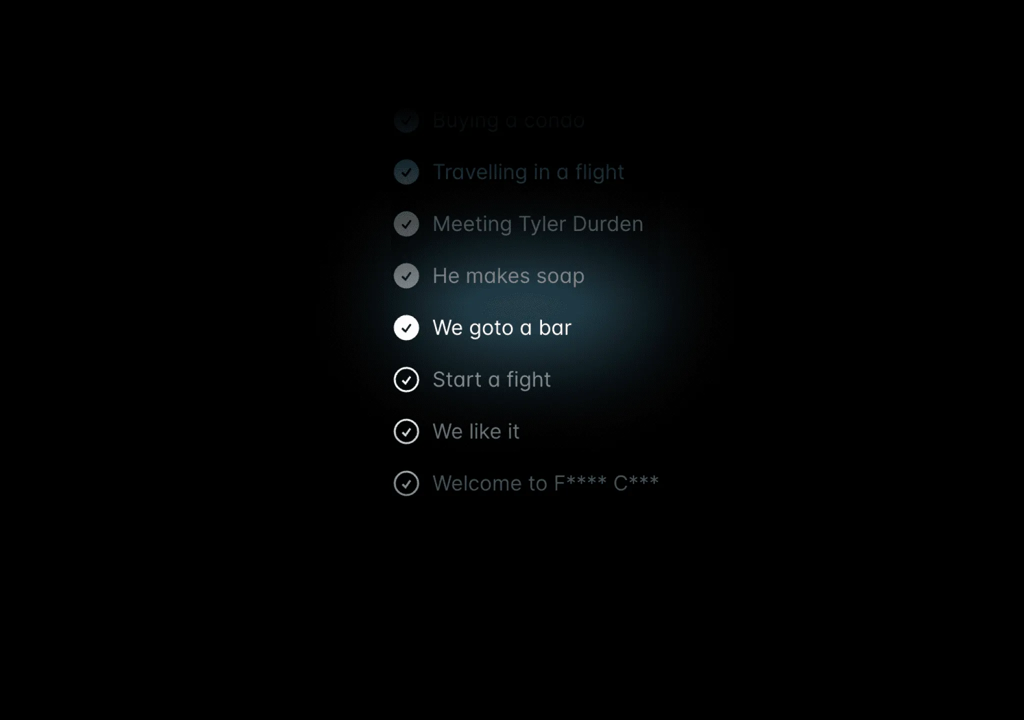
A step loader for screens that take a lot of time to load.
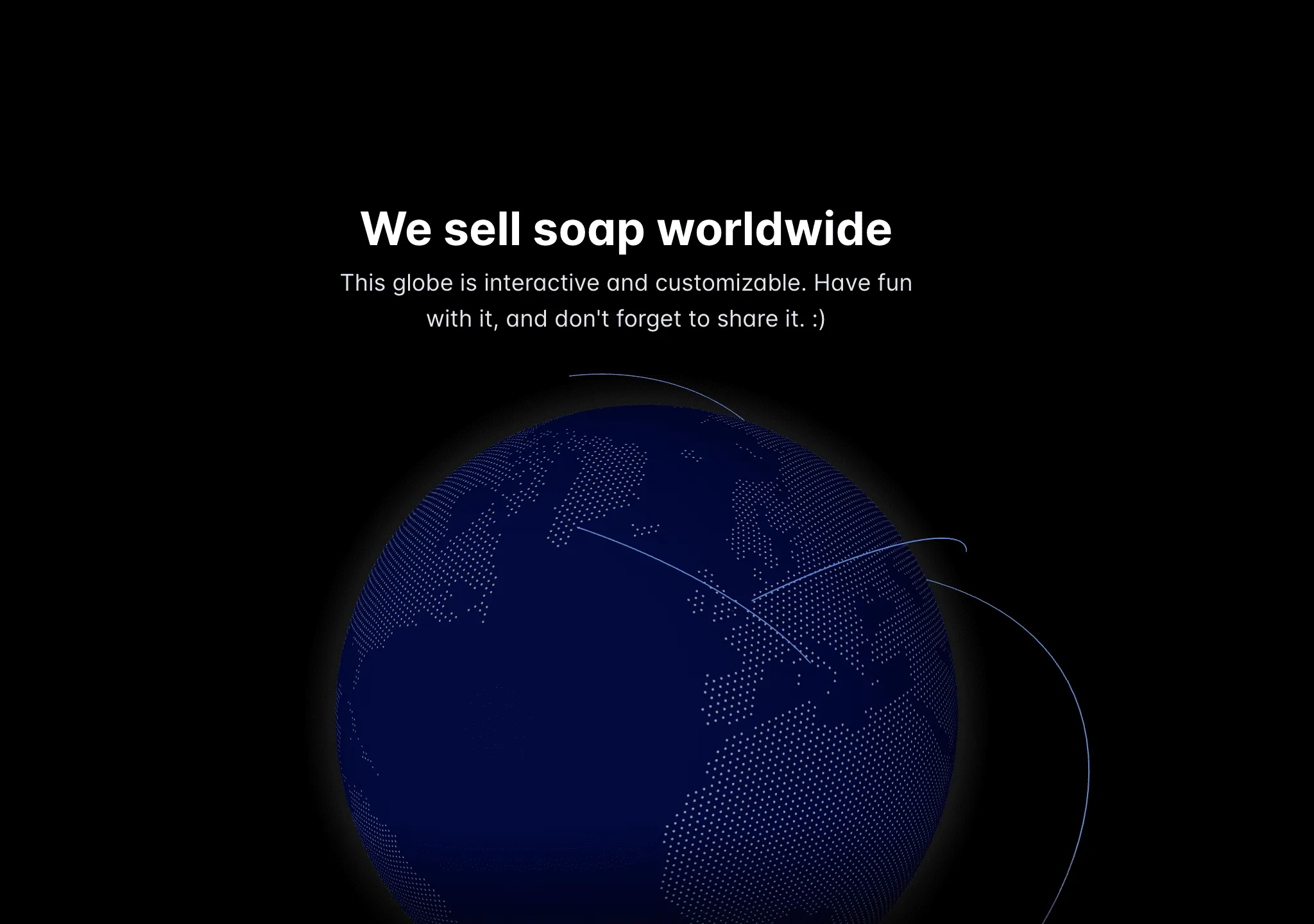
A globe animation as seen on GitHub's homepage. Interactive and customizable.
A subtle Aurora or Southern Lights background for your website.
A dot background that expands on hover, as seen on Clerk's website
A hover effect that expands to the entire container with a gradient border.
A background effect with a text highlight component, perfect for hero sections.

A wavy, swirly, vortex background ideal for CTAs and backgrounds.
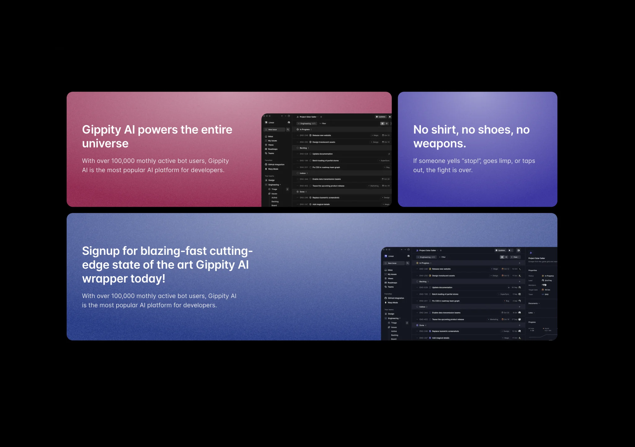
A card effect that translates and scales on mousemove, perfect for feature cards.
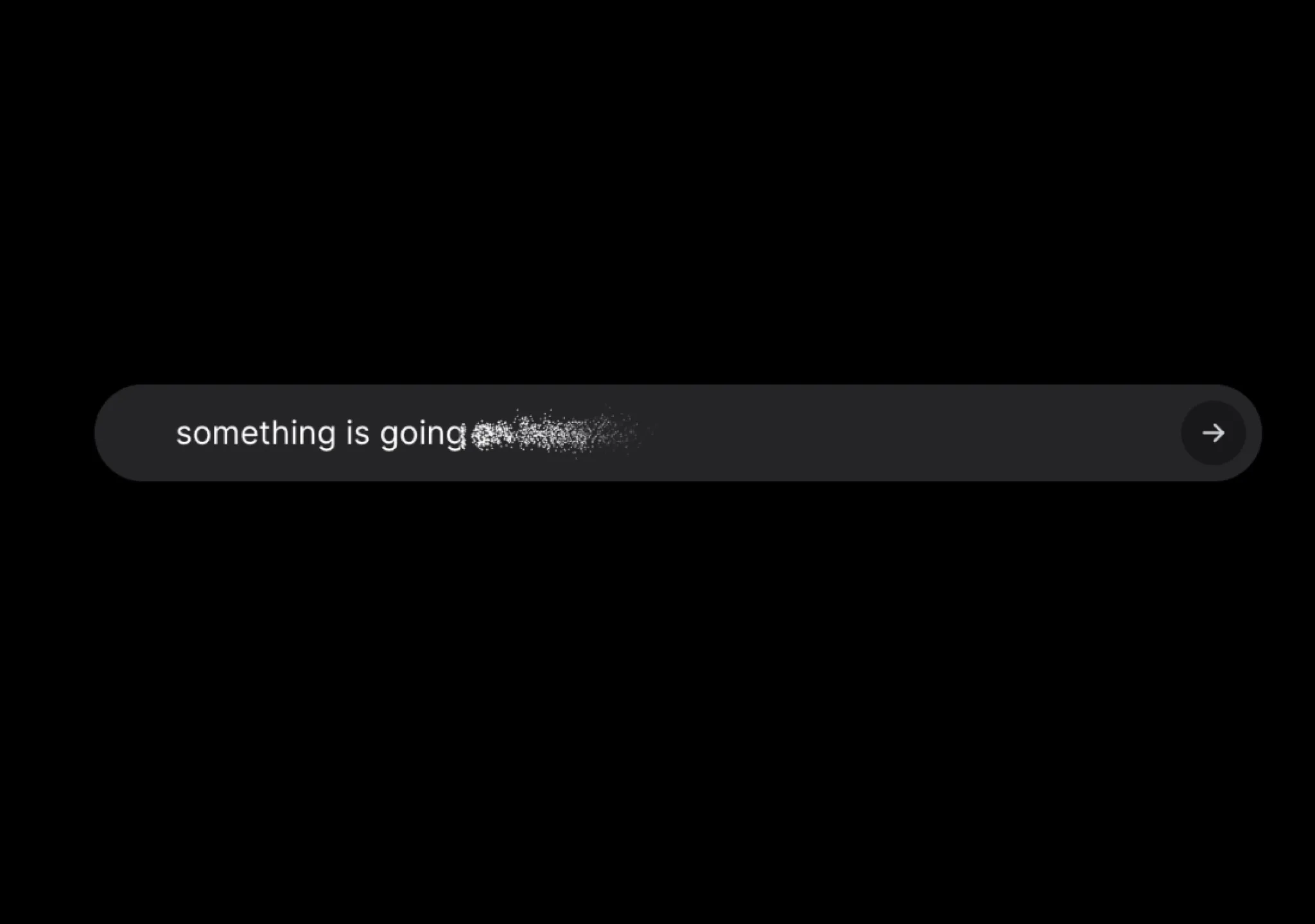
Sliding in placeholders and vanish effect of input on submit

A component that flips through a list of words
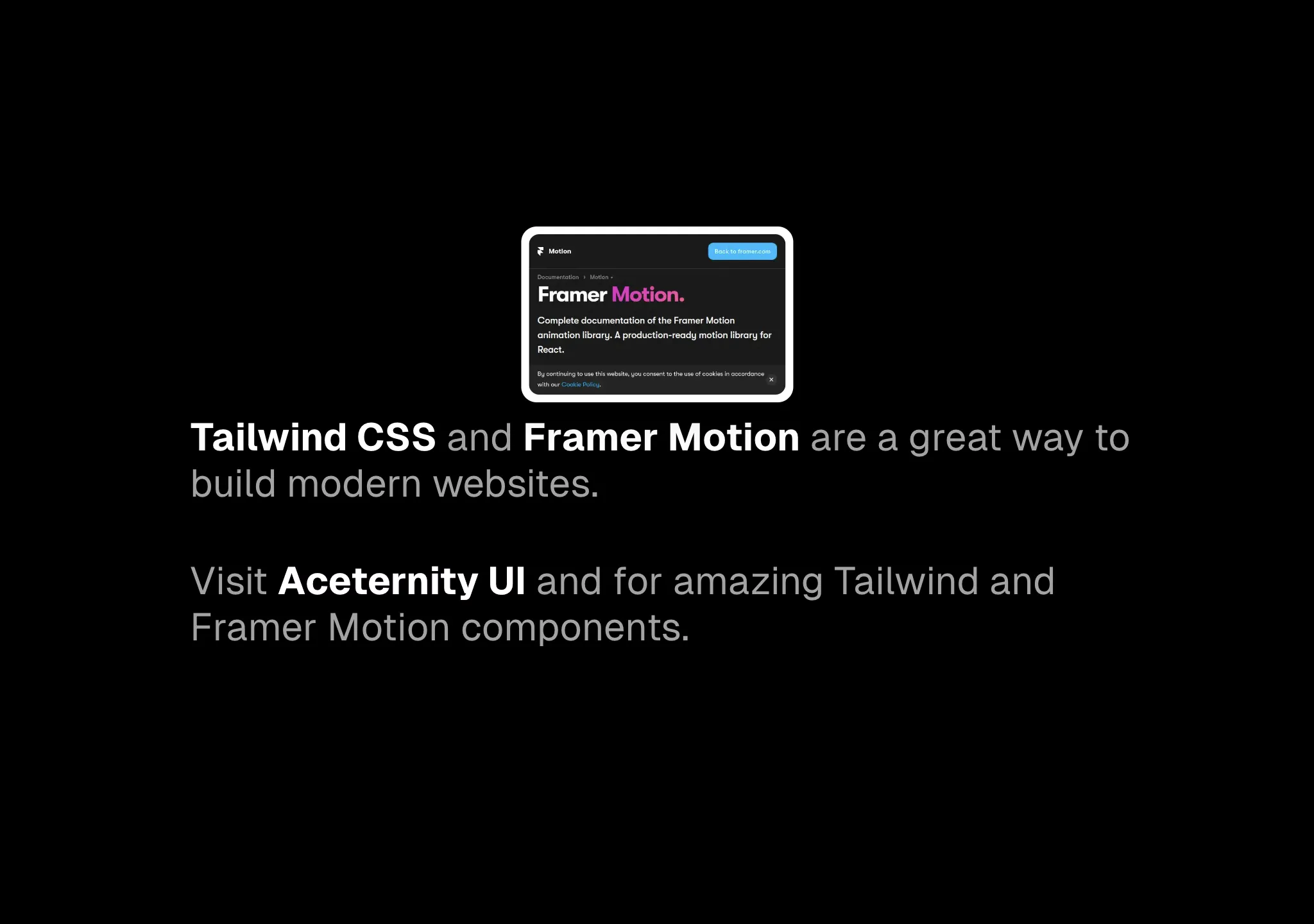
Dynamic link previews for your anchor tags
A glare effect that happens on hover, as seen on Linear's website
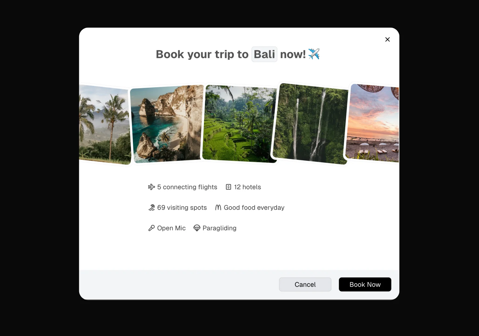
A customizable, compound modal component with animated transitions
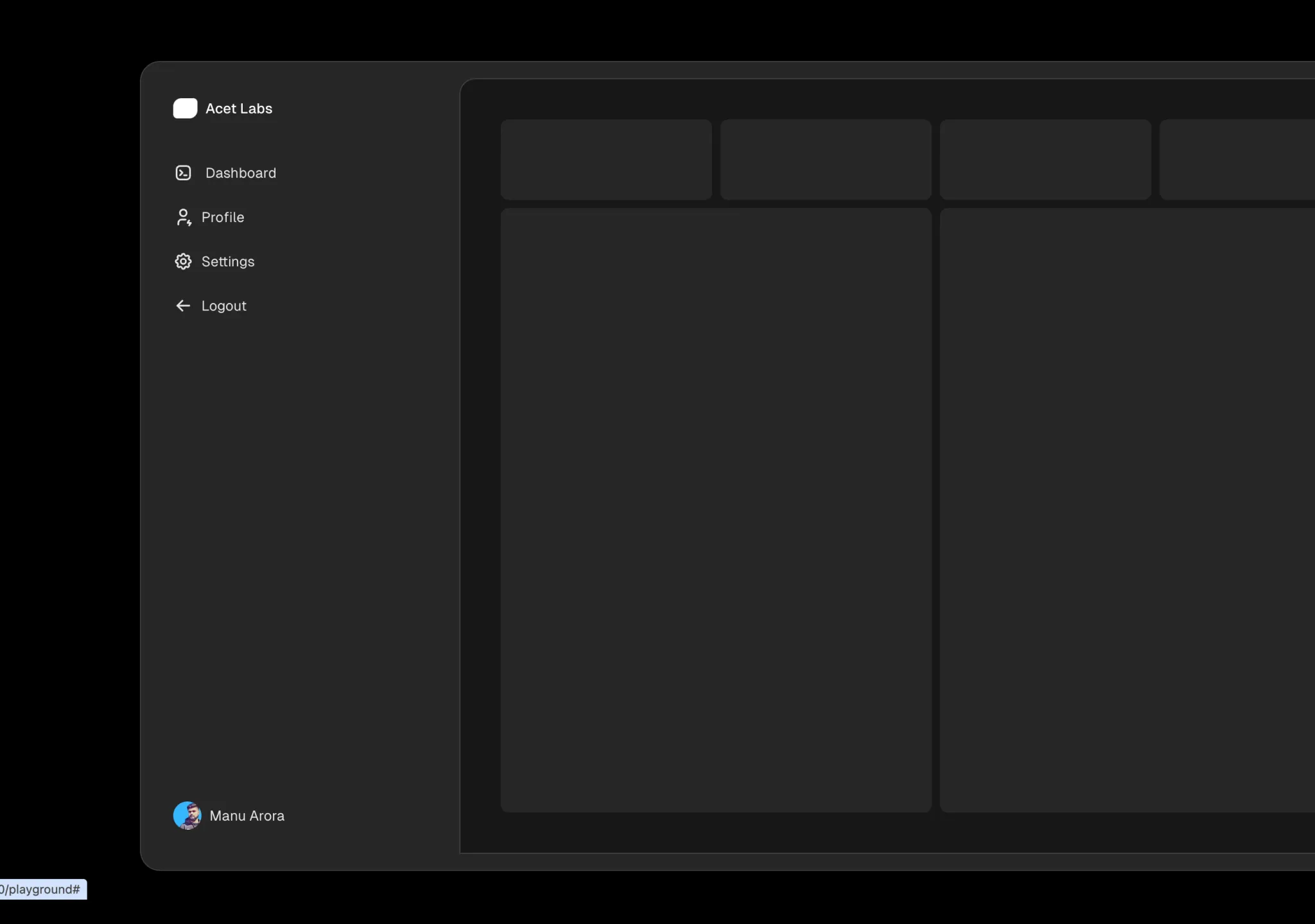
Expandable sidebar that expands on hover, mobile responsive and dark mode support
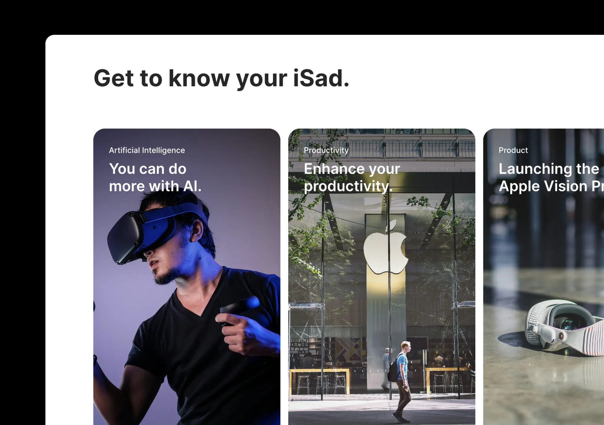
A sleek and minimal carousel implementation, as seen on apple.com
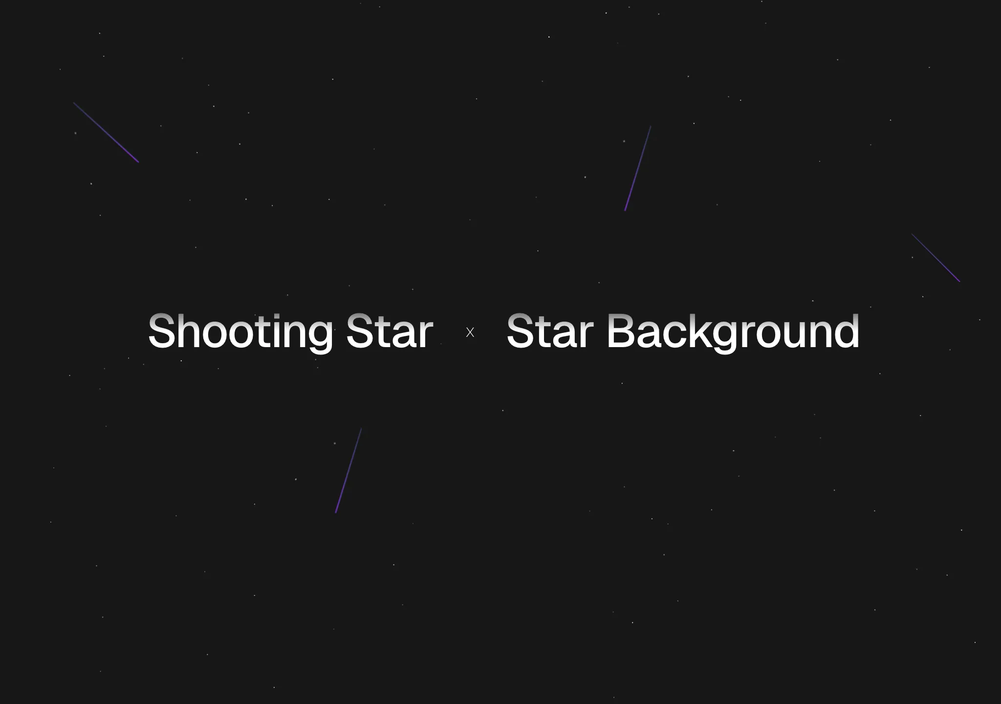
A shooting star animation on top of a starry background, as seen on figmaplug.in
A shooting star animation on top of a starry background, as seen on figmaplug.in
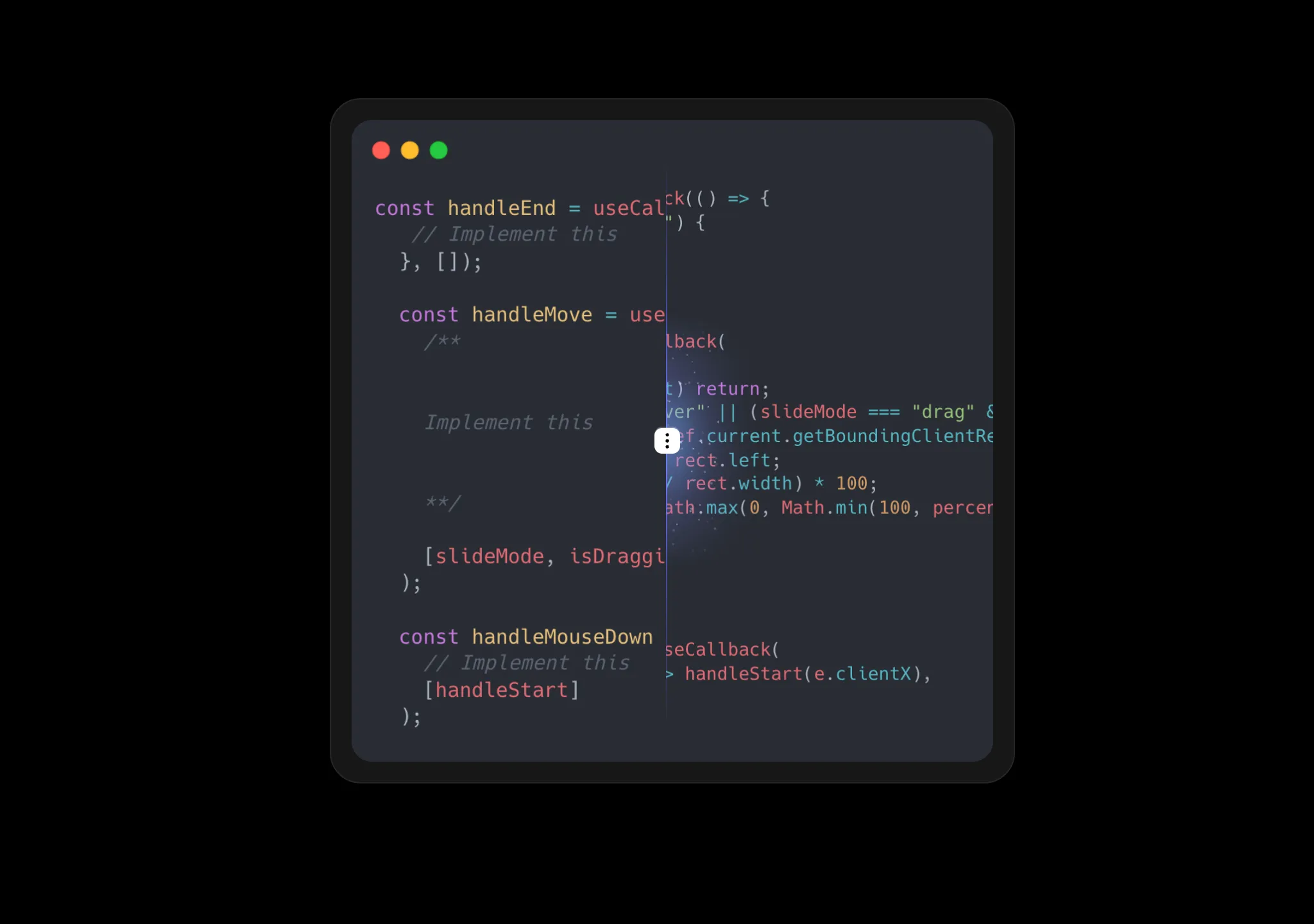
A comparison component between two images, slide or drag to compare
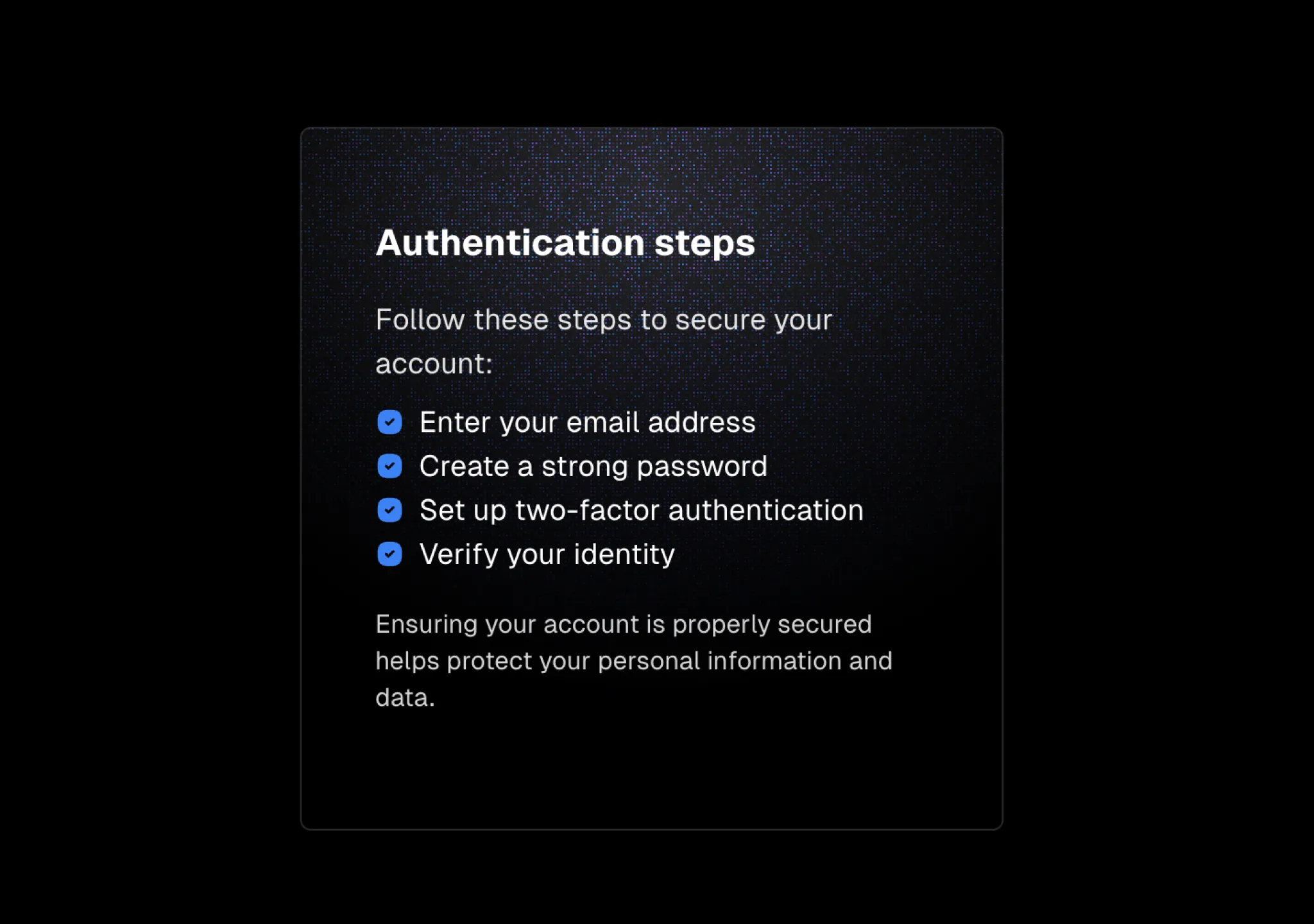
A card component with a spotlight effect revealing a radial gradient background
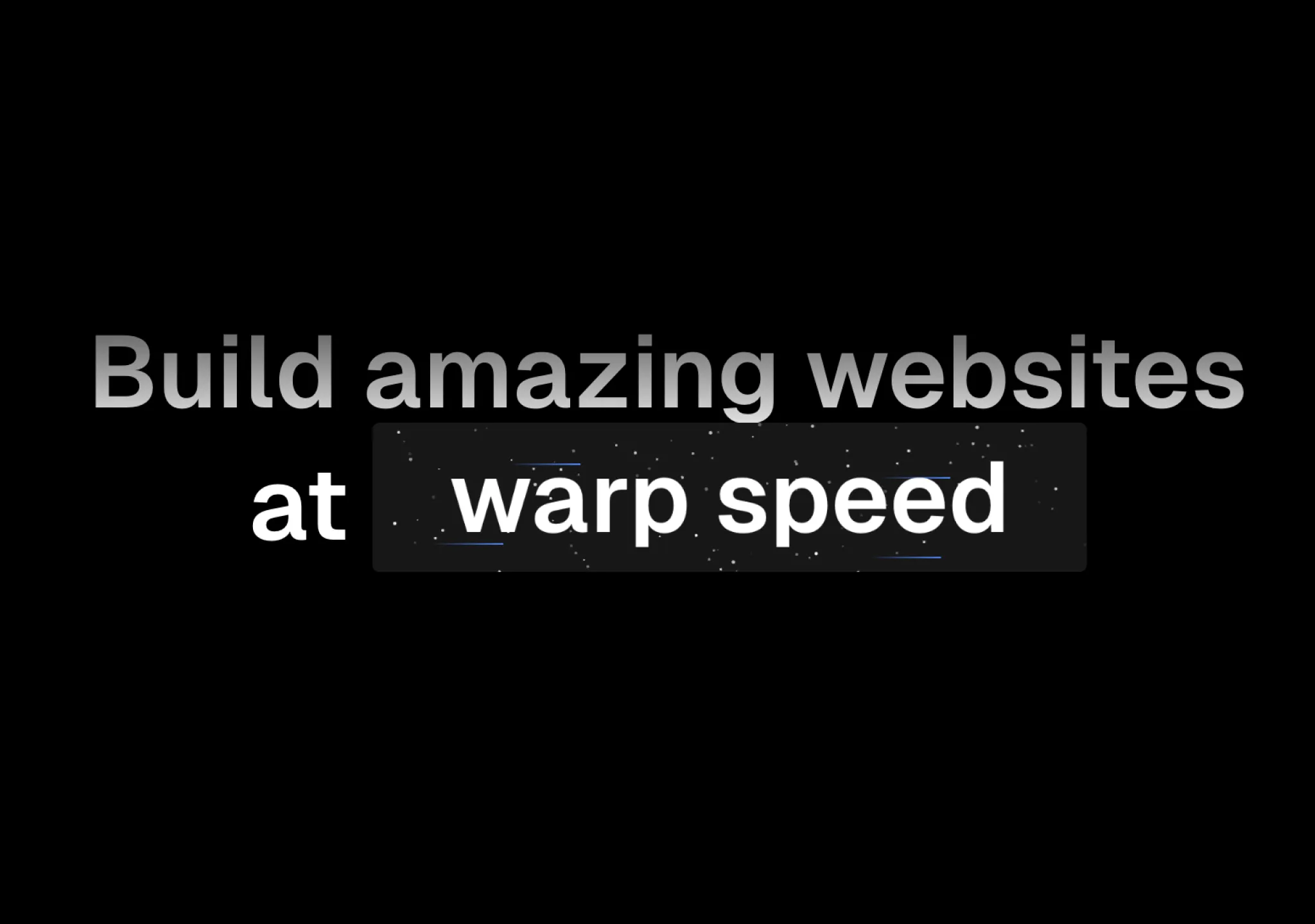
A Cover component that wraps any children, providing beams and space effect, hover to reveal speed.
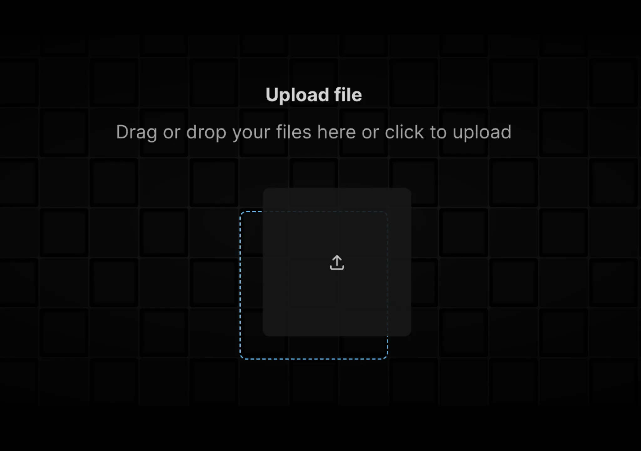
A minimal file upload form with background grid, drag and drop, and micro interactions.
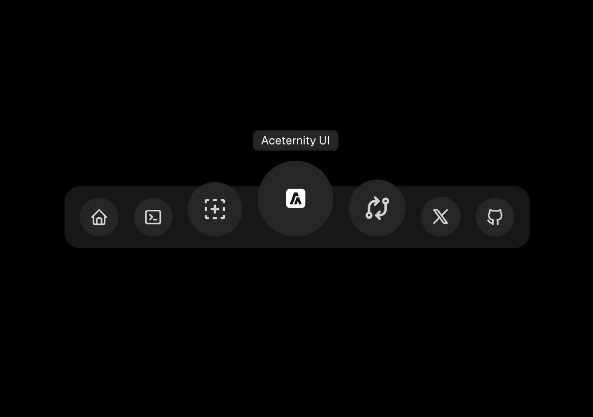
A floating dock mac os style component, acts as a navigation bar.

Hover over the card to focus on it, blurring the rest of the cards.
Exploding beams in the background
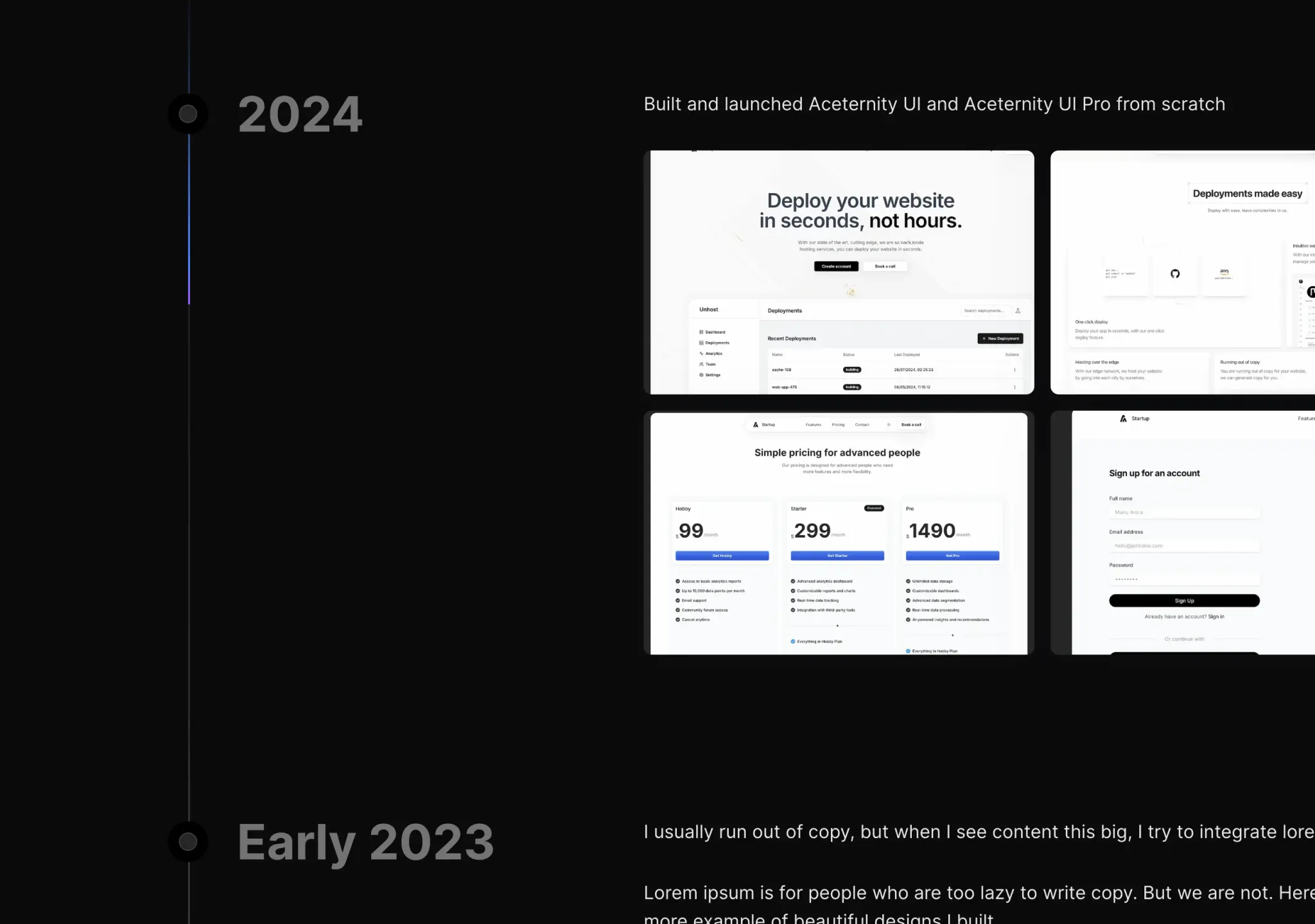
A timeline component with sticky header and scroll beam follow.

A text hover effect that animates and outlines gradient on hover, as seen on x.ai
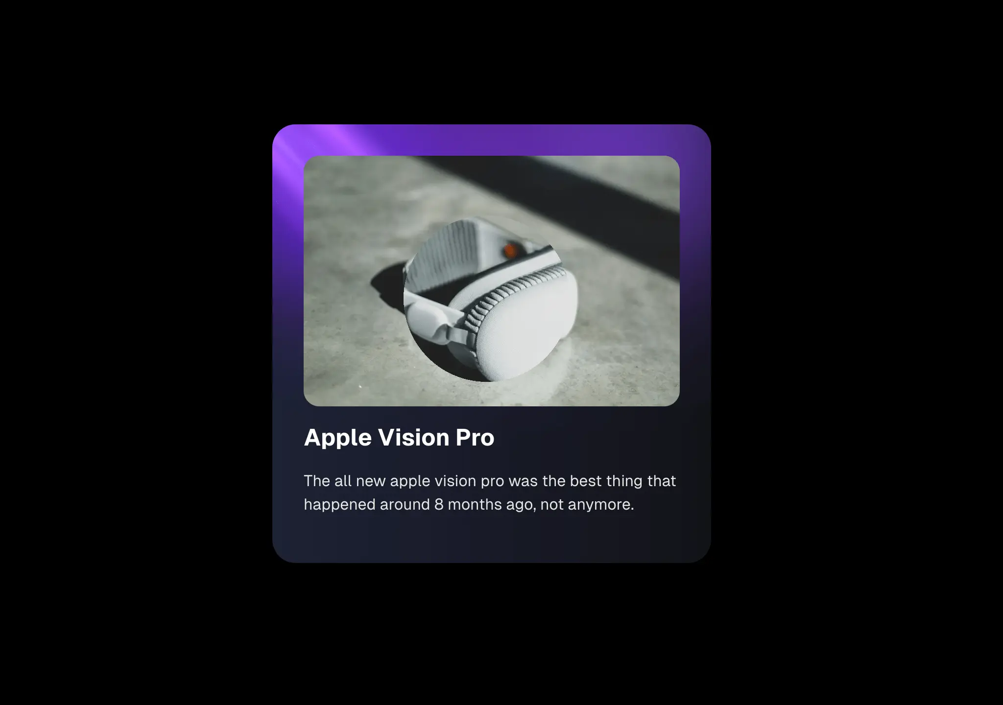
A lens component to zoom into images, videos, or practically anything.
An animated background with shooting star trails and pulsing concentric circles. Uses SVG animations for the stars and Framer Motion for the breathing circle effect.
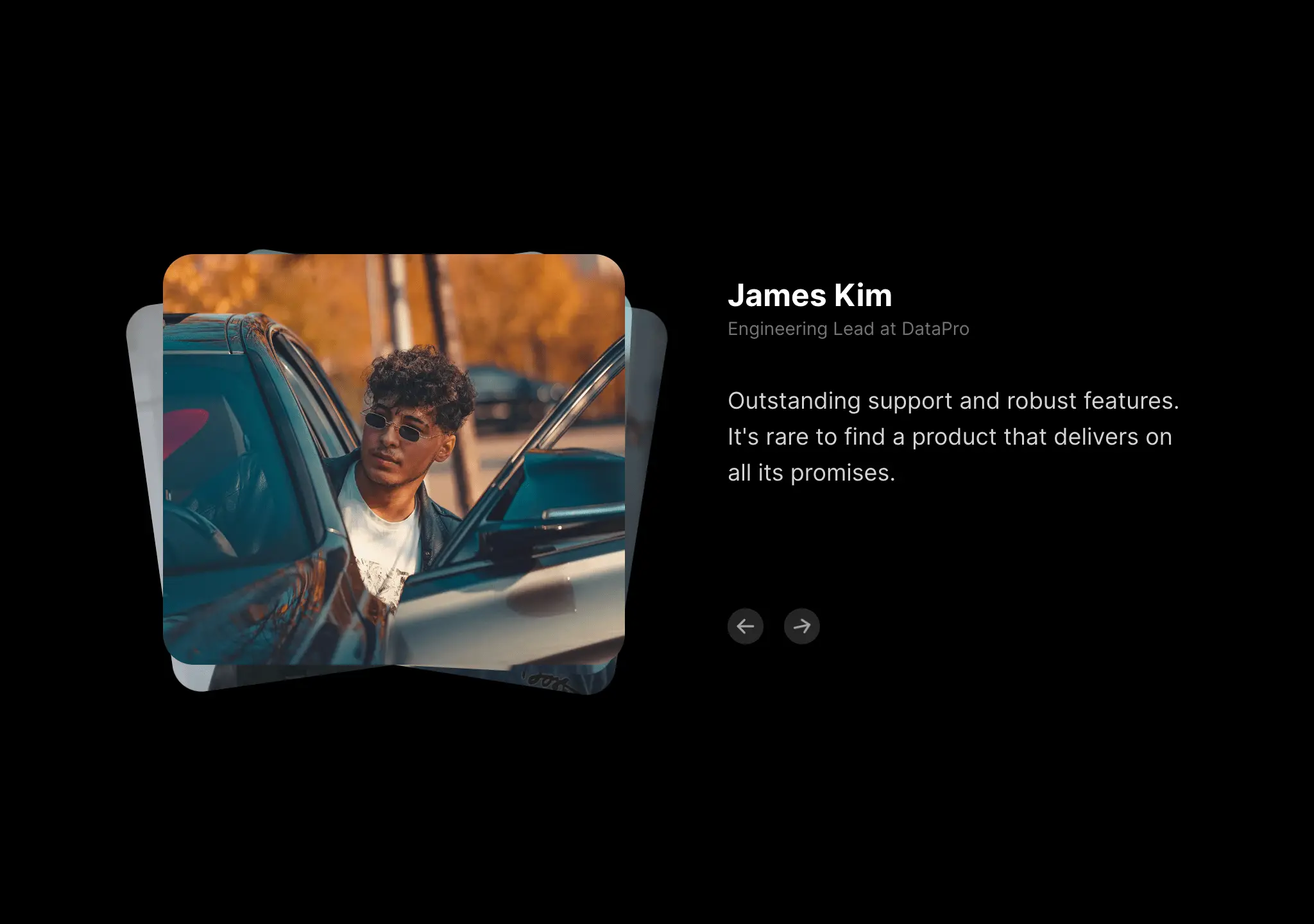
Minimal testimonials sections with image and quote.
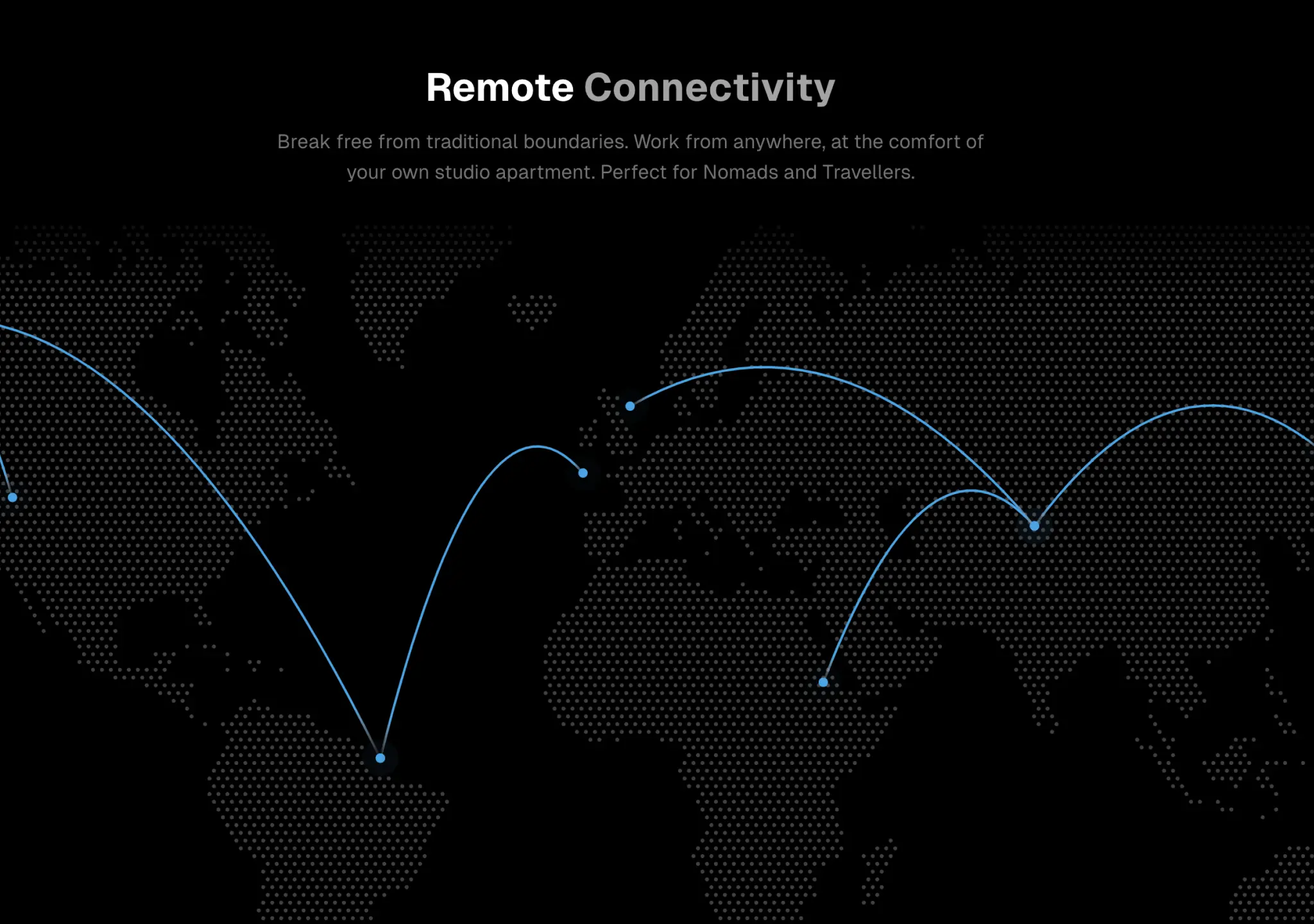
A world map with animated lines and dots, programatically generated.

A configurable code block component built on top of react-syntax-highlighter.
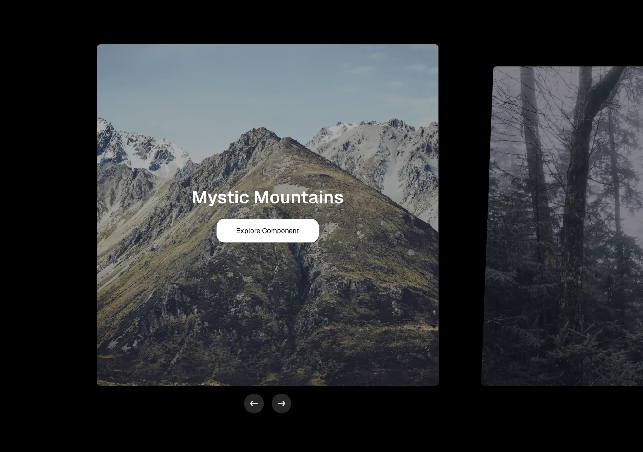
A customizable carousel with microinteractions and slider.

A text component with various colours, filter and scale effects.
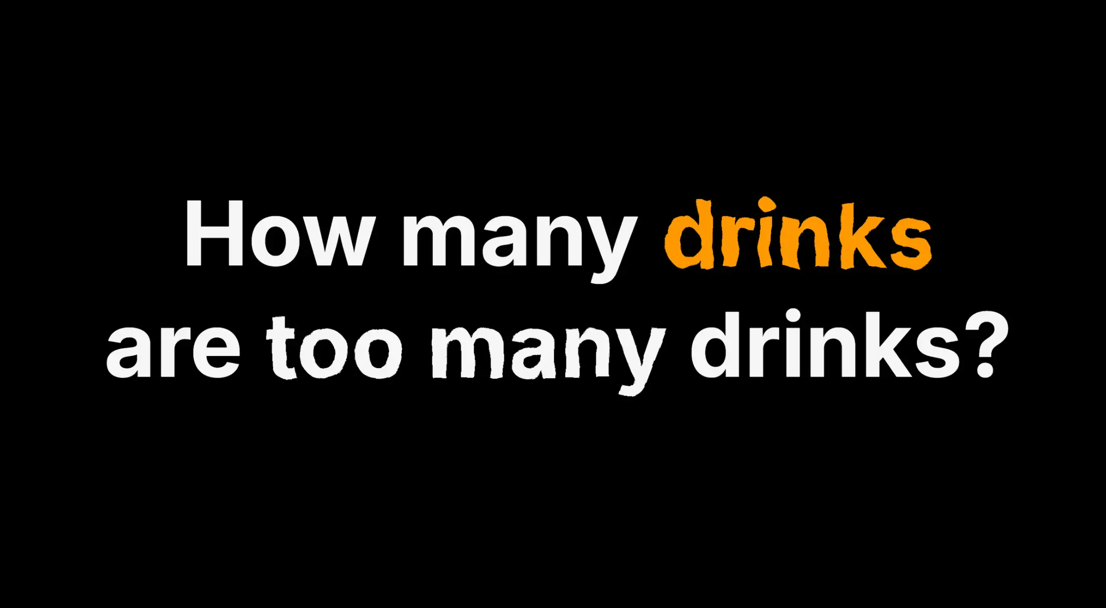
A squiggly text effect using SVG turbulence and displacement filters, animated with Motion.
A button that subtly drifts toward the cursor as you hover, with a spring-based return when you leave.
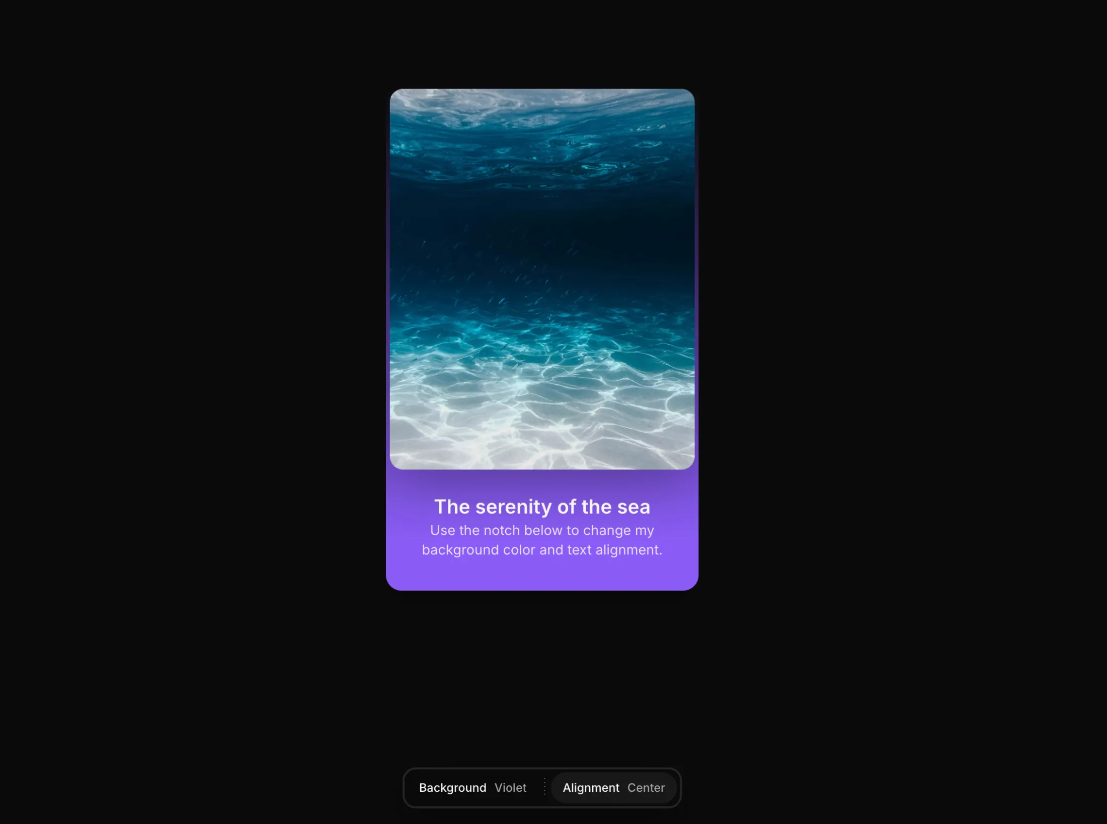
A floating, configurable notch that pins to the top or bottom of the screen. Pass an array of items with links and it animates the active state as you switch between them.
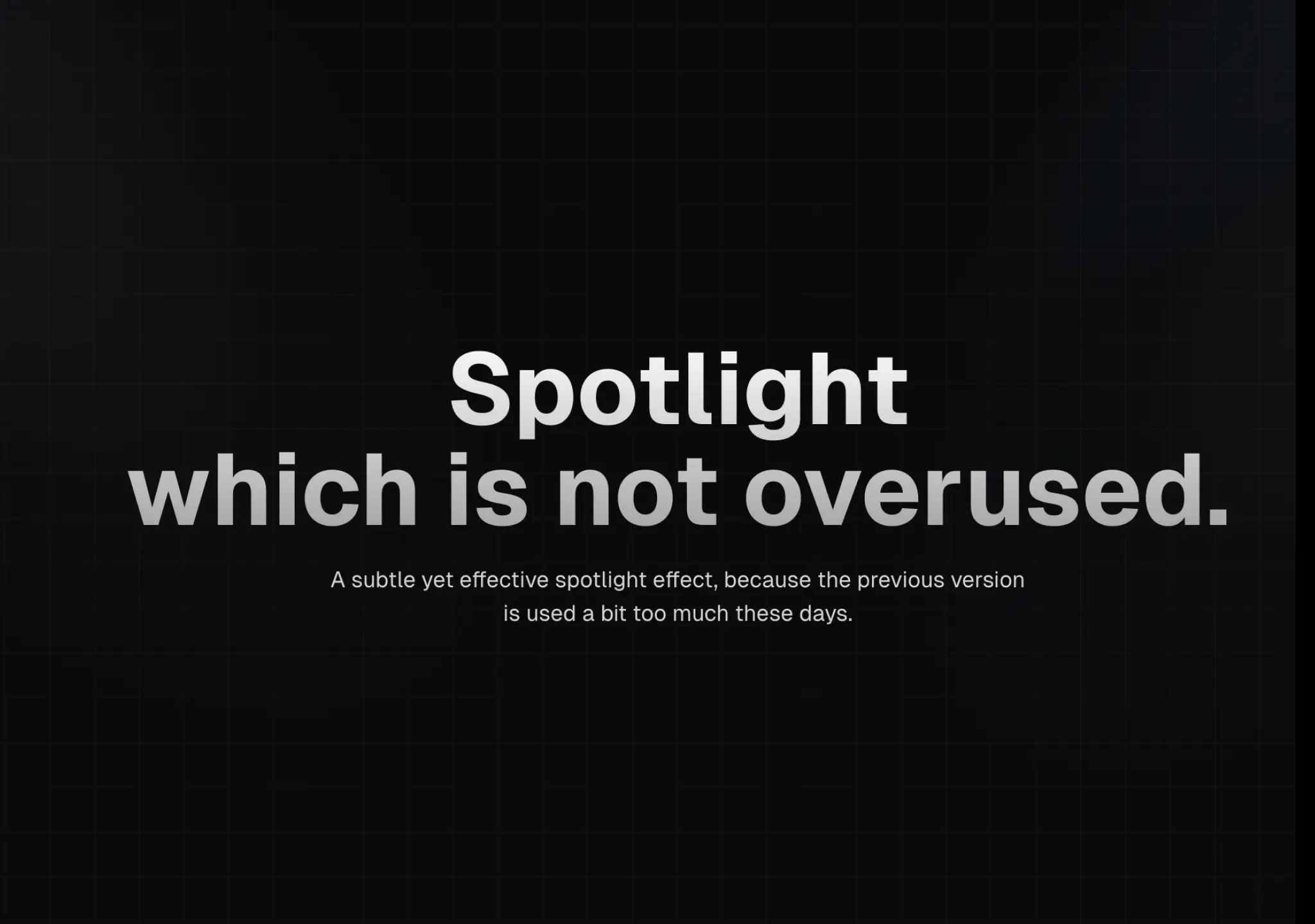
A new spotlight component with left and right spotlight, configurable and customizable.
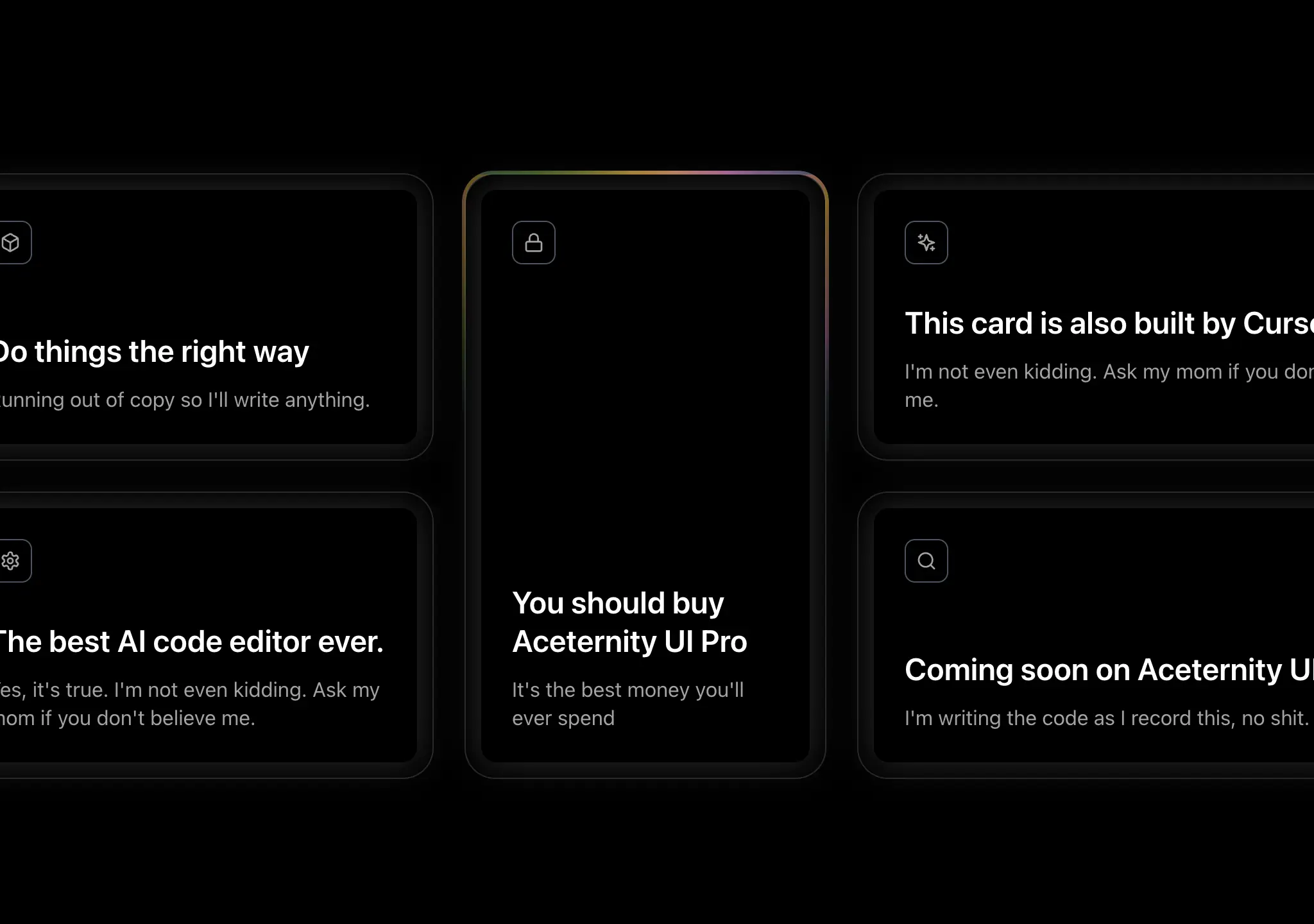
A border glowing effect that adapts to any container or card, as seen on Cursor's website.
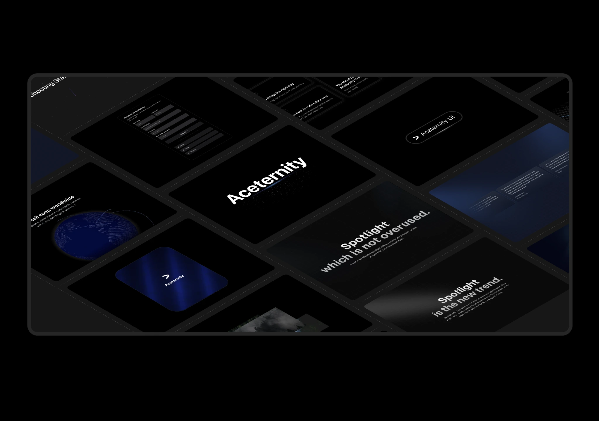
A 3D Marquee effect with grid, good for showcasing testimonials and hero sections

A container that flips through words, animating the width.
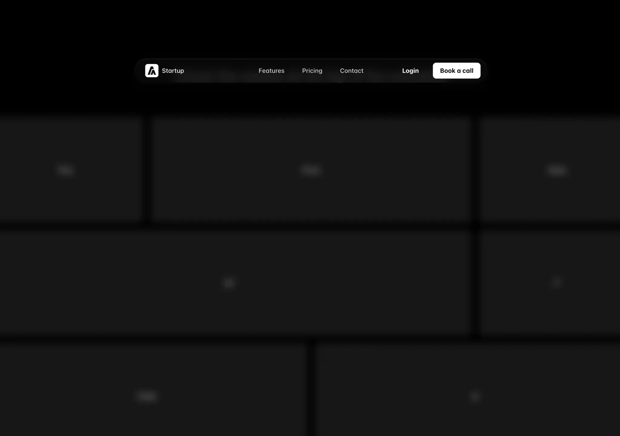
A navbar that changes width on scroll, responsive and animated.
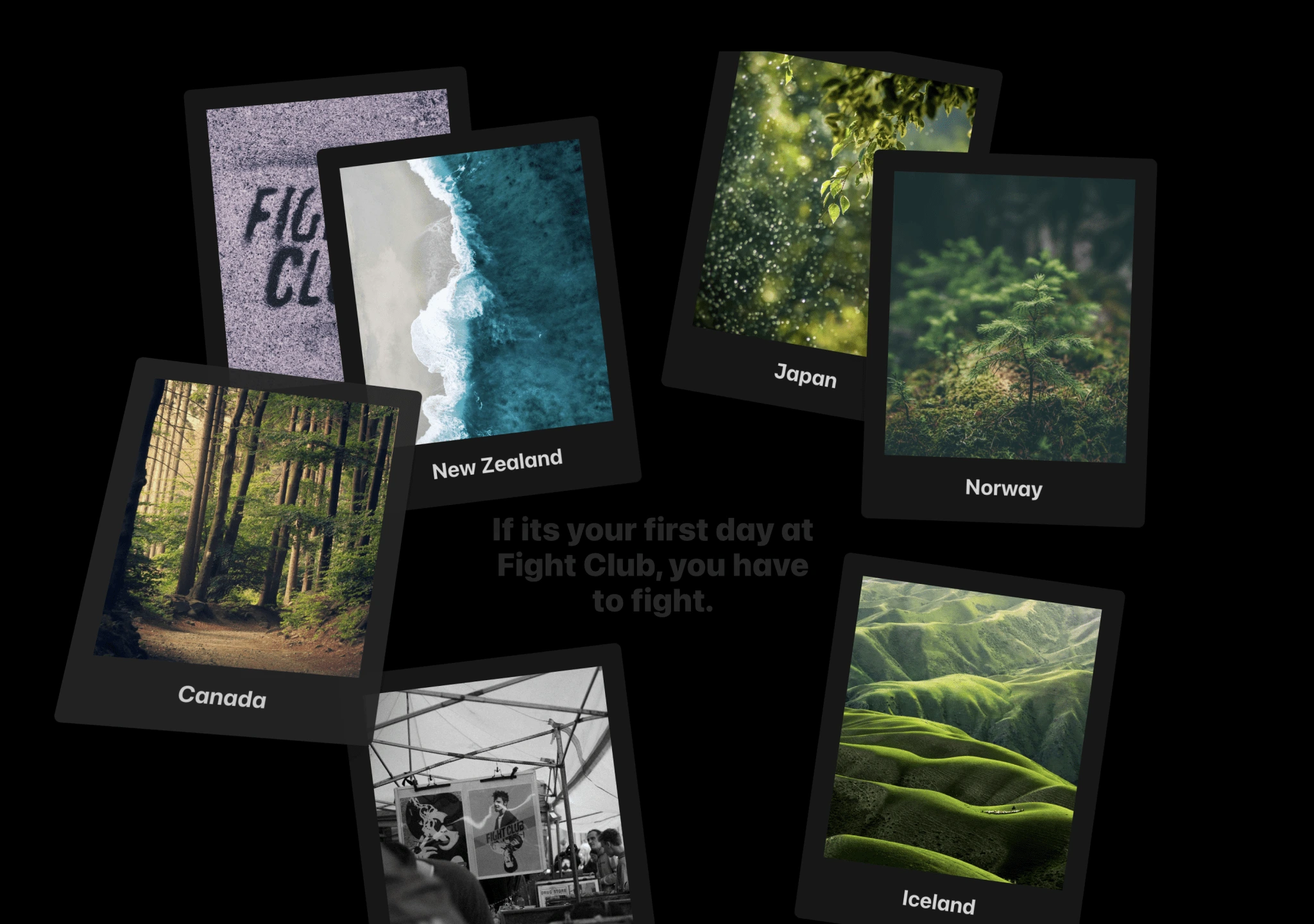
A tiltable, draggable card component that jumps on bounds.
A banner component that sticks to top, hides when user scrolls down
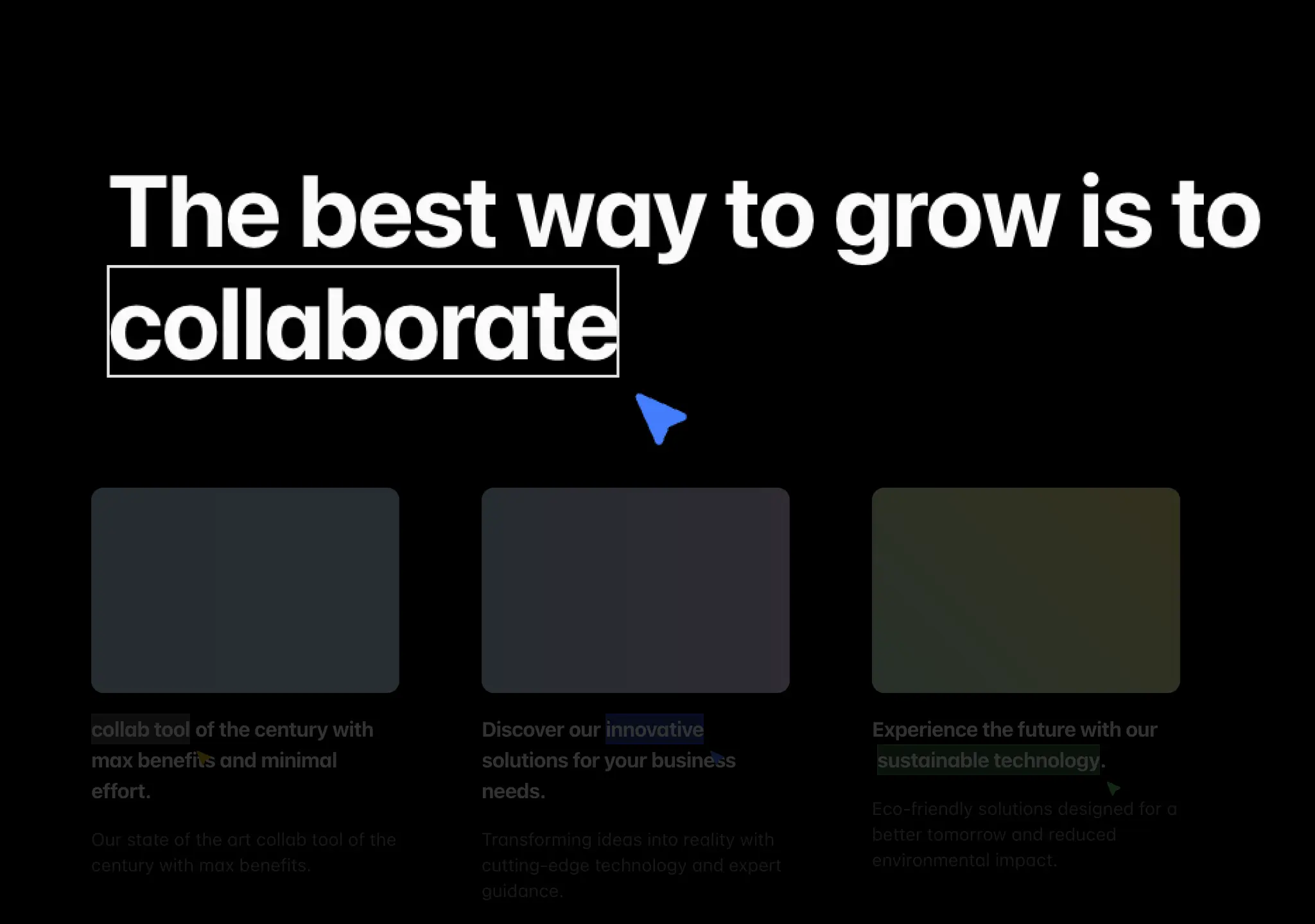
A component that highlights text when it's in view, with a pointer and border.
A button that shows a loading state when clicked, and a success state when the action is completed.

A set of simple and minimal loaders for your loading screens and components.
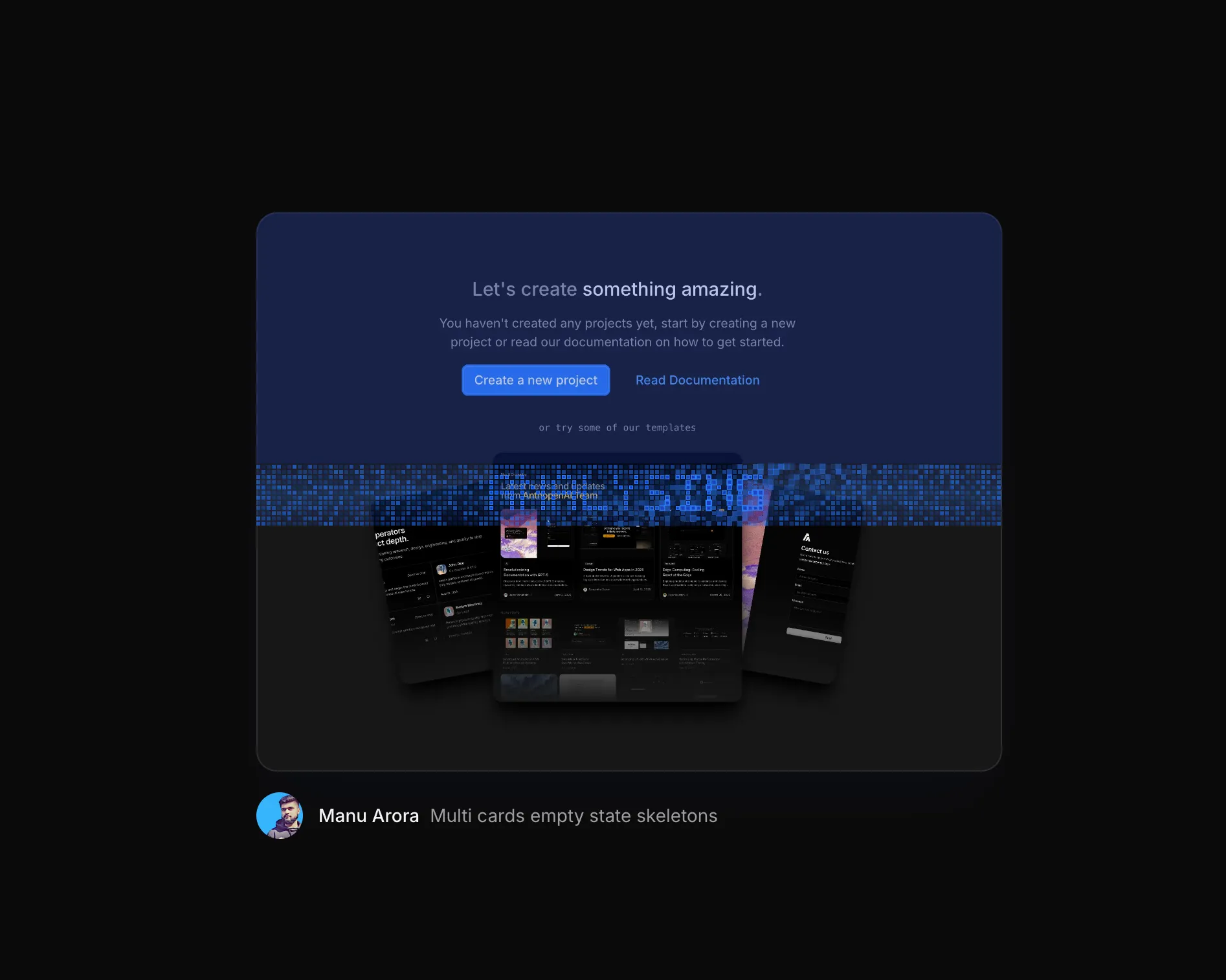
A canvas loader that scans across an image with animated pixel grids, text masks, and progress overlays.
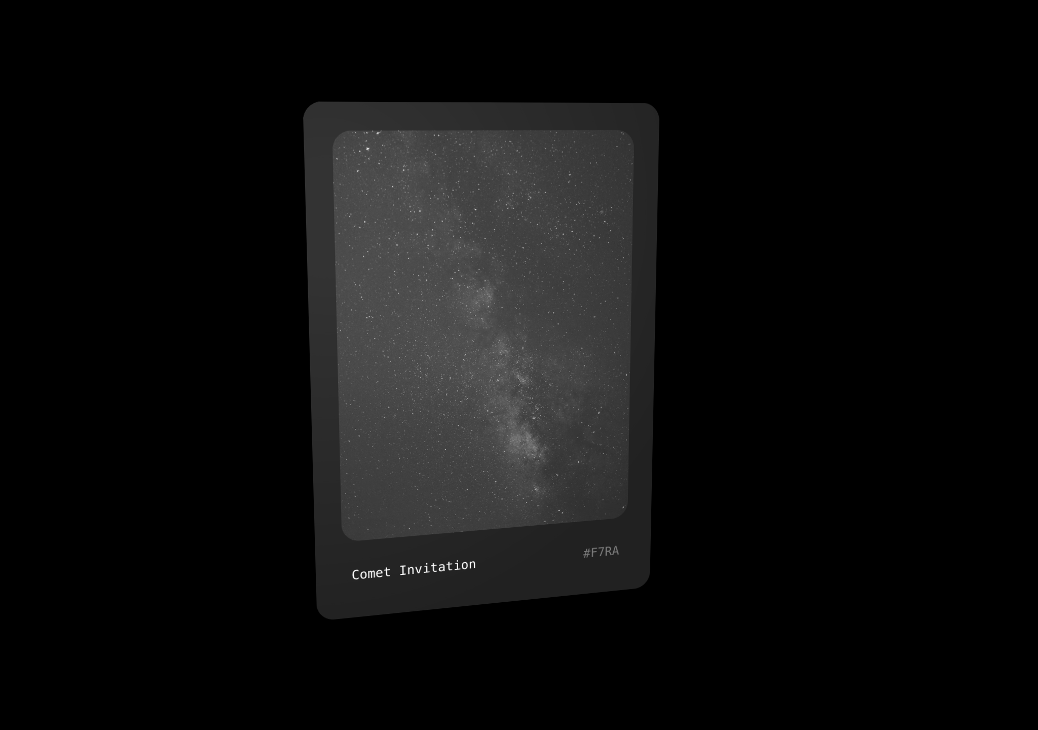
A perspective, 3D, Tilt card as seen on Perplexity Comet's website.
A grid of cells that ripple when clicked.
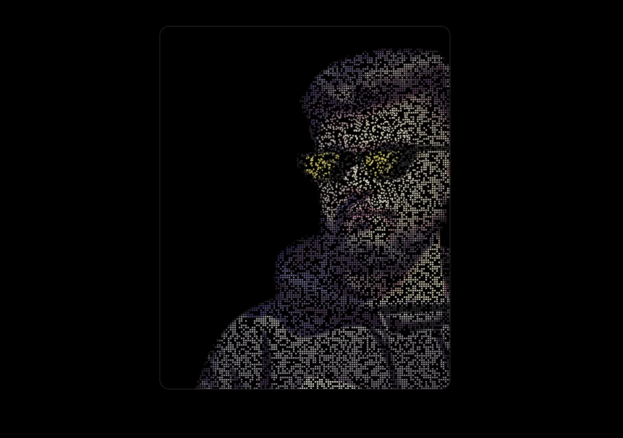
Convert any image to a pixelated canvas mouse distortion effects, as seen on Tailwind CSS Website.
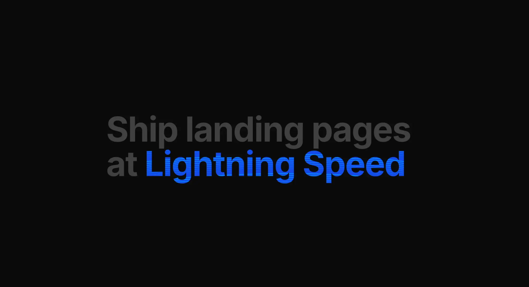
Animated text component with colorful curved lines rendered on canvas, clipped to the text shape.
A text flip effect that changes the layout of surrounding text
A background effect with opacity animation, glow effect and more.

A tooltip card container that follows mouse pointer when hovered over
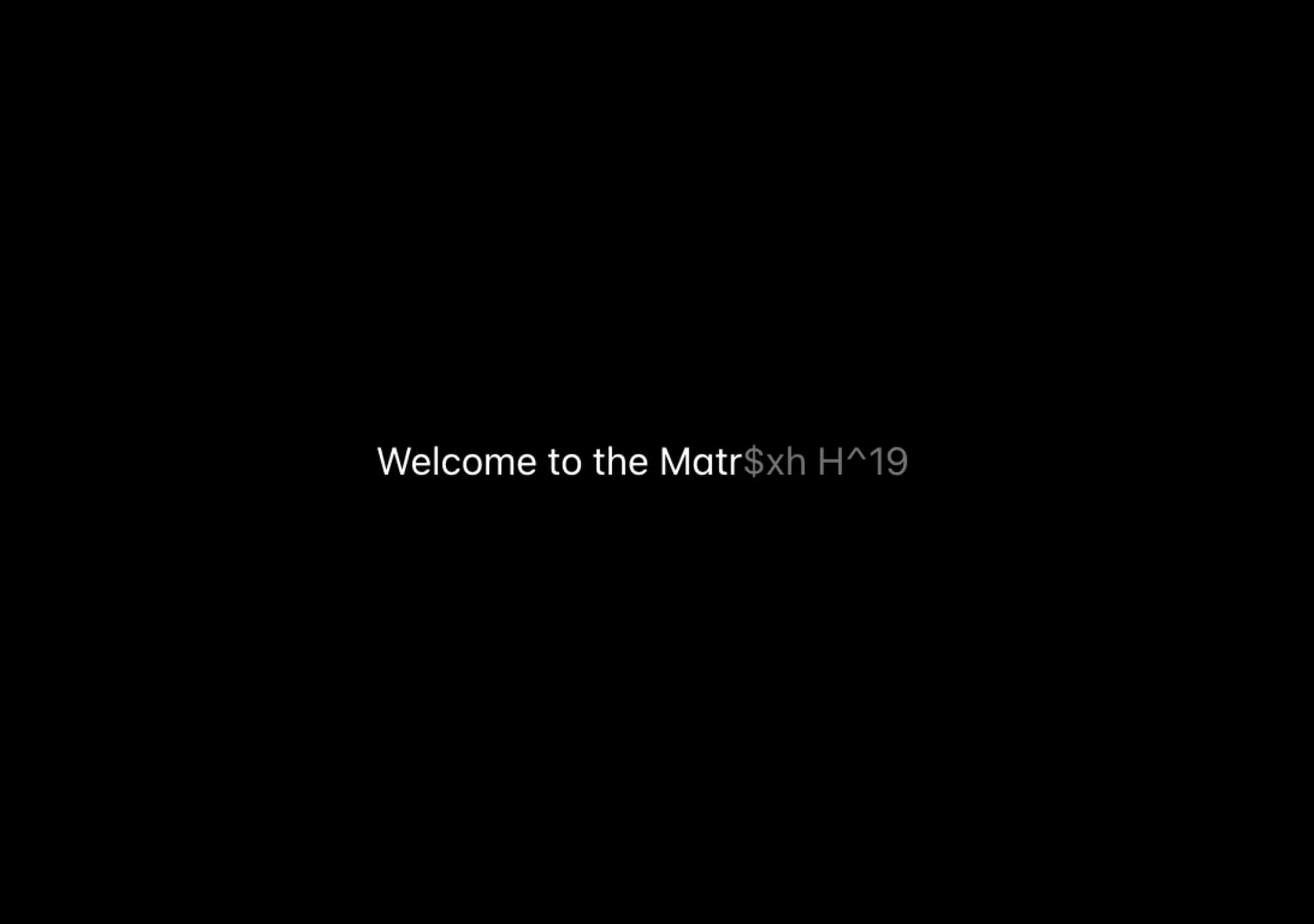
A text component that reveals the text gradually, gibberish effect.
A dynamic background effect with animated gradients, noise texture, and smooth motion.
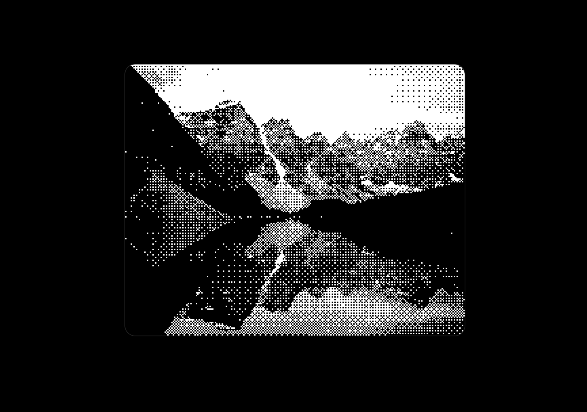
A real-time ordered dithering effect for images, perfect for pixel art and retro aesthetics.
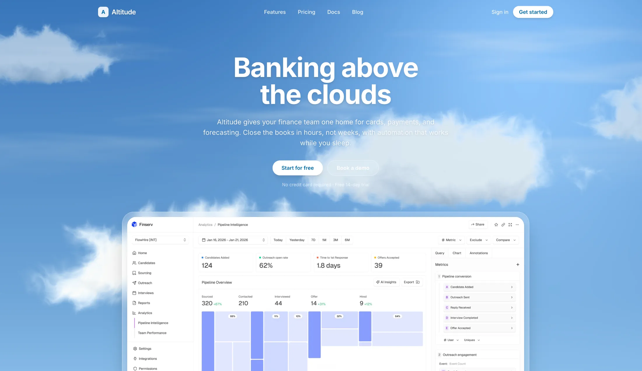
Soft procedural clouds that drift across the sky. Tune speed, count, and colors with props.

An interactive image with responsive color separation, displacement, and tilt.
A real-time webcam pixel grid effect, perfect for pixel art and retro aesthetics.
A badge with images that can be hovered to reveal more images.
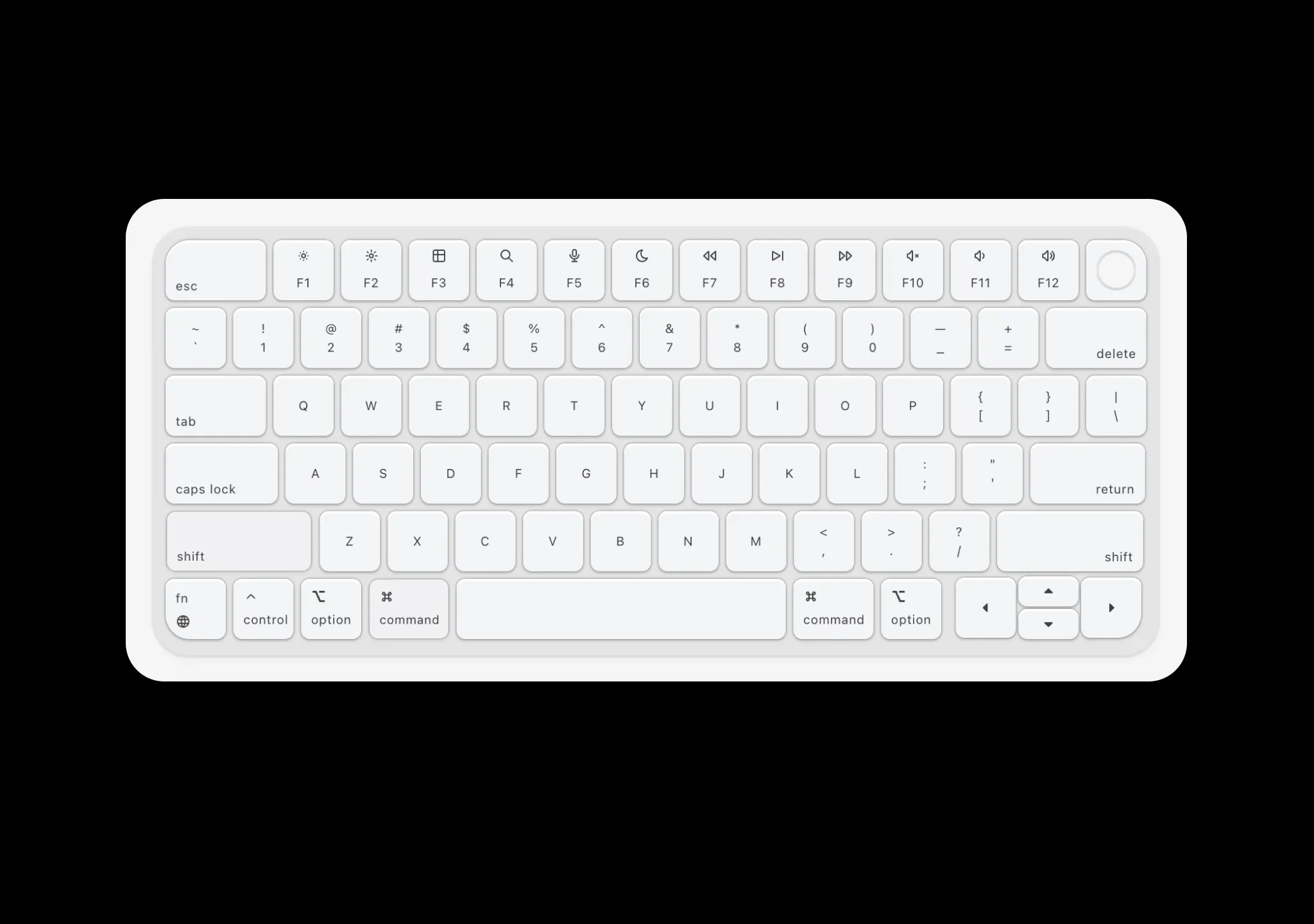
A mac style keyboard component with mechanical keys sound effects.
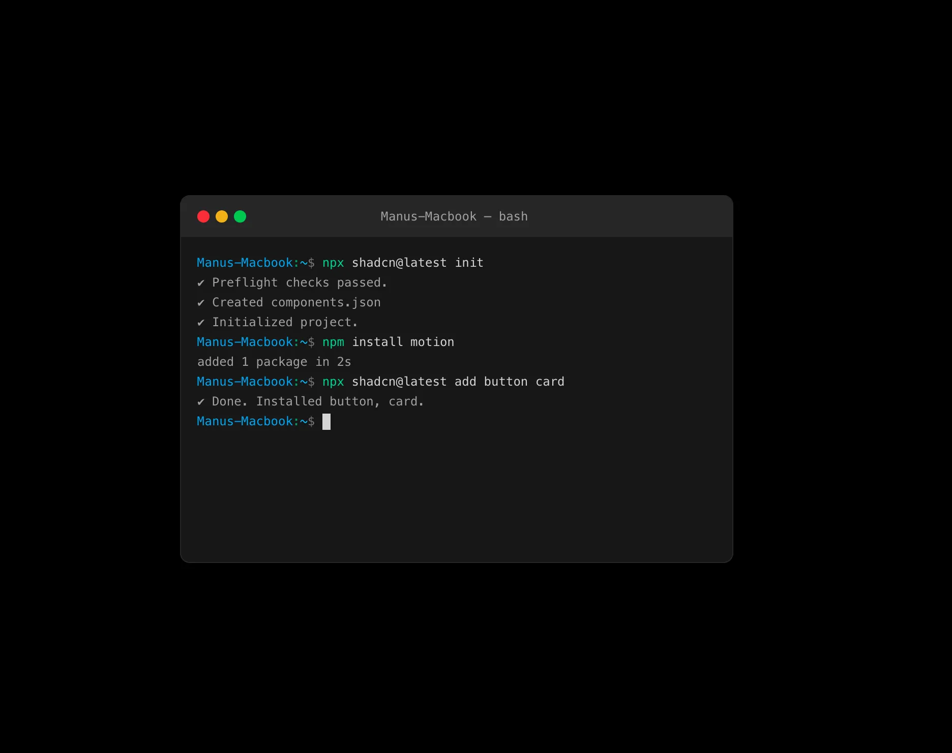
A mac style terminal component with bash syntax highlighting and typewriter effect.

A realistic globe component with tooltips and avatar tips
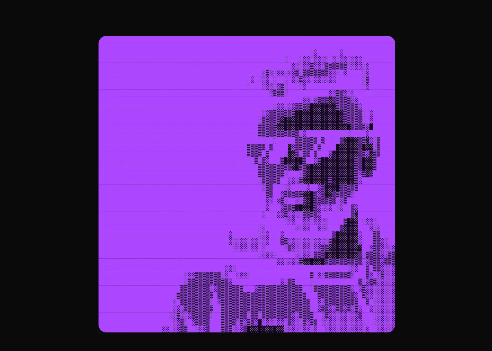
Convert any image to ASCII art with customizable charsets, colors, and animations.

A repeating diagonal, horizontal, or vertical line pattern background effect.
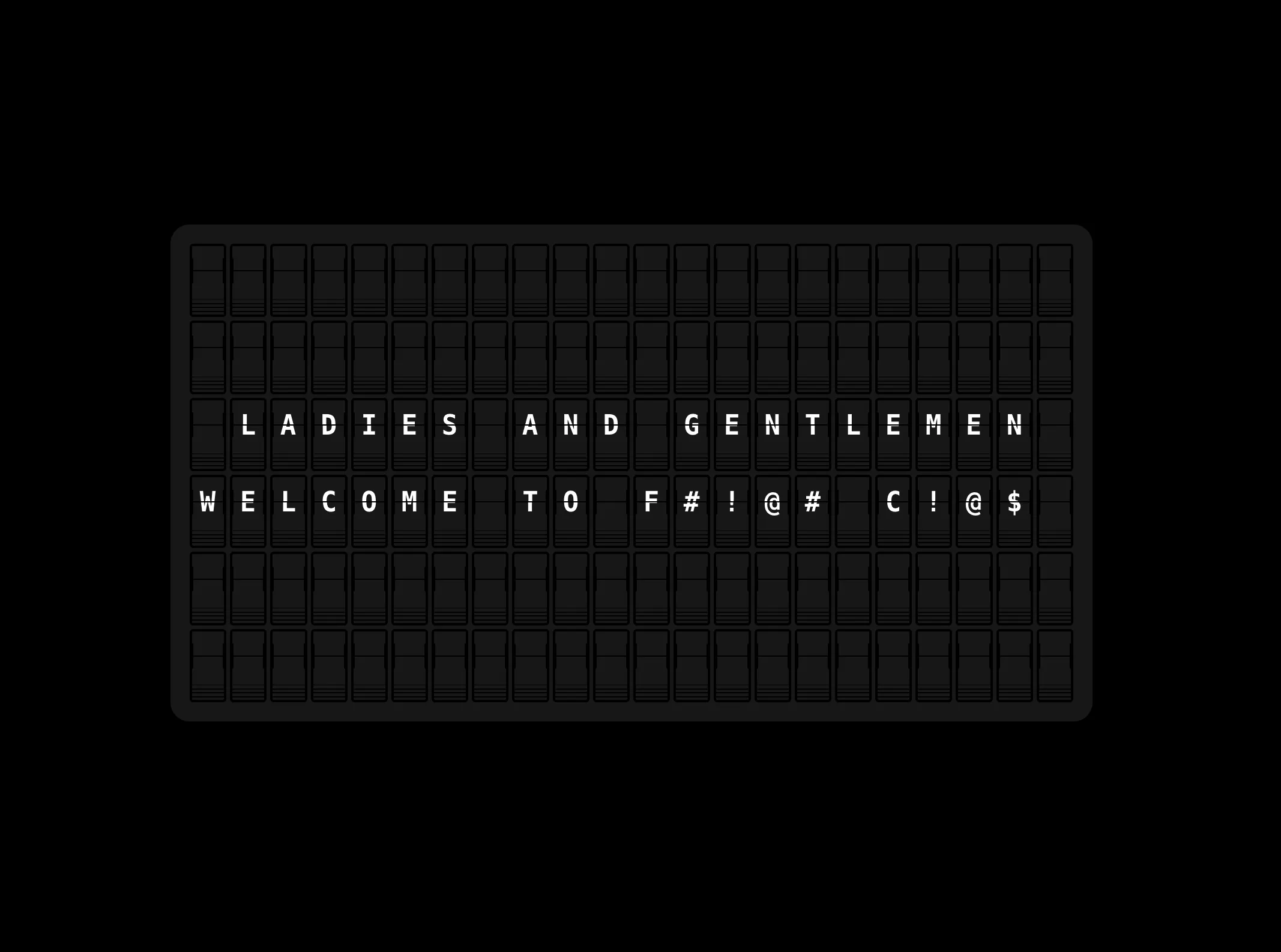
A split-flap display component that animates characters with flip transitions, inspired by Vestaboard.

A grid of 3D cubes that ripples under the cursor. Use the flat isometric field or a tilted perspective grid with glowing crests.
A full-screen video background that fades in on load with a radial mask in dark mode. Pairs with animated colorful text that cycles through colors on an interval.
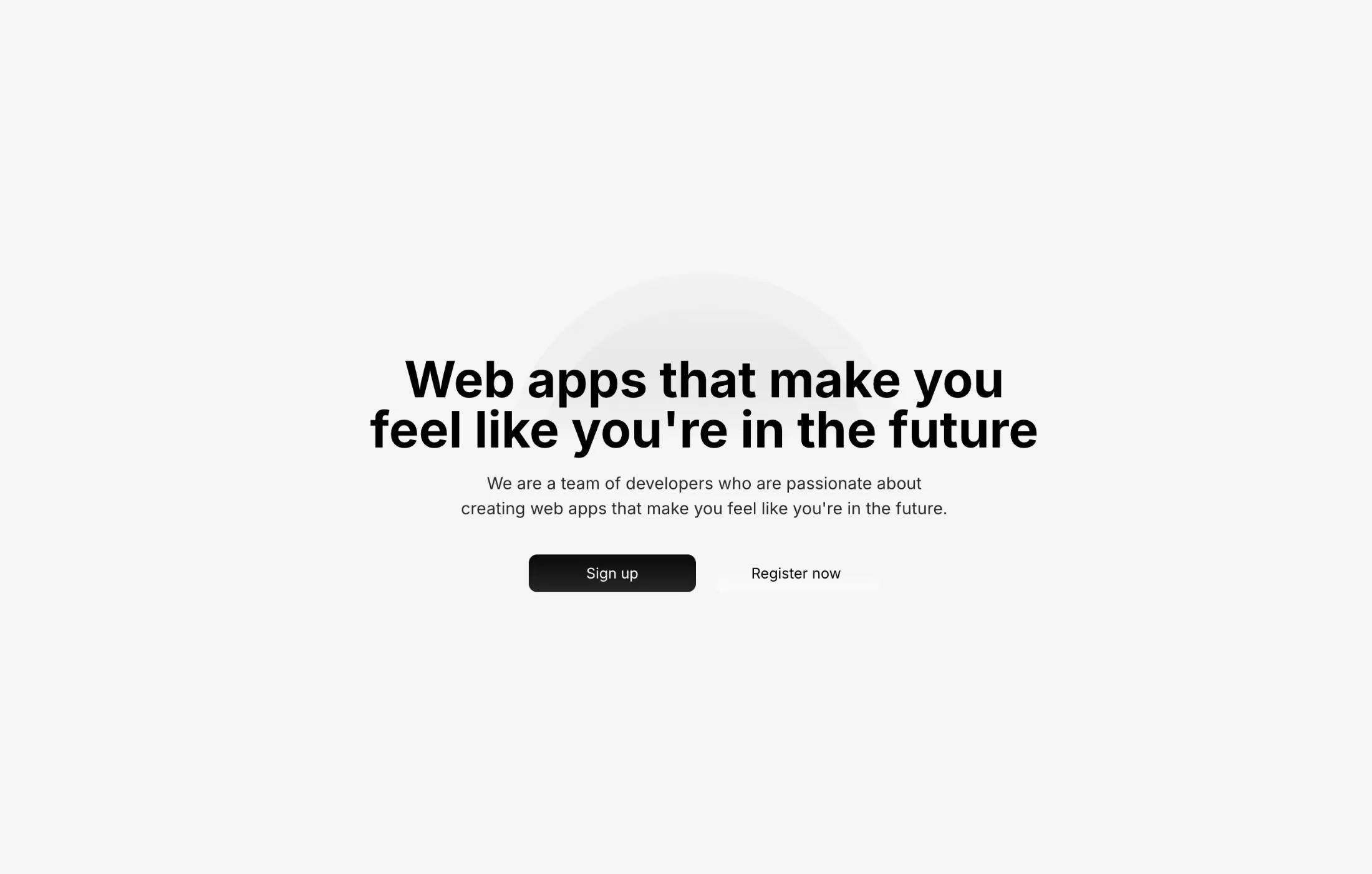
An animated background with shooting star trails and pulsing concentric circles. Uses SVG animations for the stars and Framer Motion for the breathing circle effect.
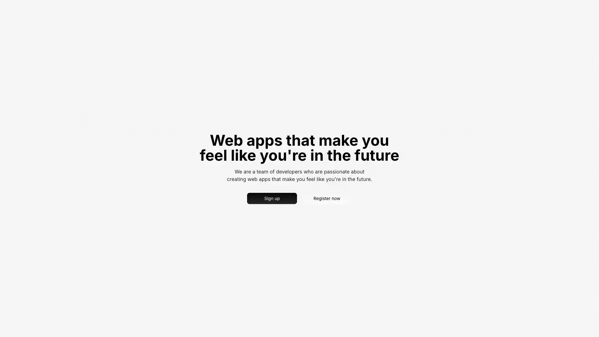
A CSS-only dotted pattern background using radial gradients. Lightweight alternative to SVG or canvas-based patterns with automatic dark mode support.
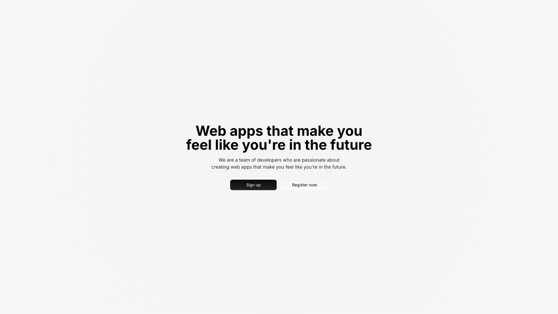
A dotted pattern with a radial CSS mask that fades the pattern from center to edges. Creates a spotlight effect that draws attention to centered content.
A dotted pattern with a linear vertical mask that fades from top to bottom. Ideal for hero sections where content continues below the fold.
An SVG-based grid pattern with dots at intersections. Features customizable grid size, dot radius, and colors with automatic dark mode support and radial fade effect.
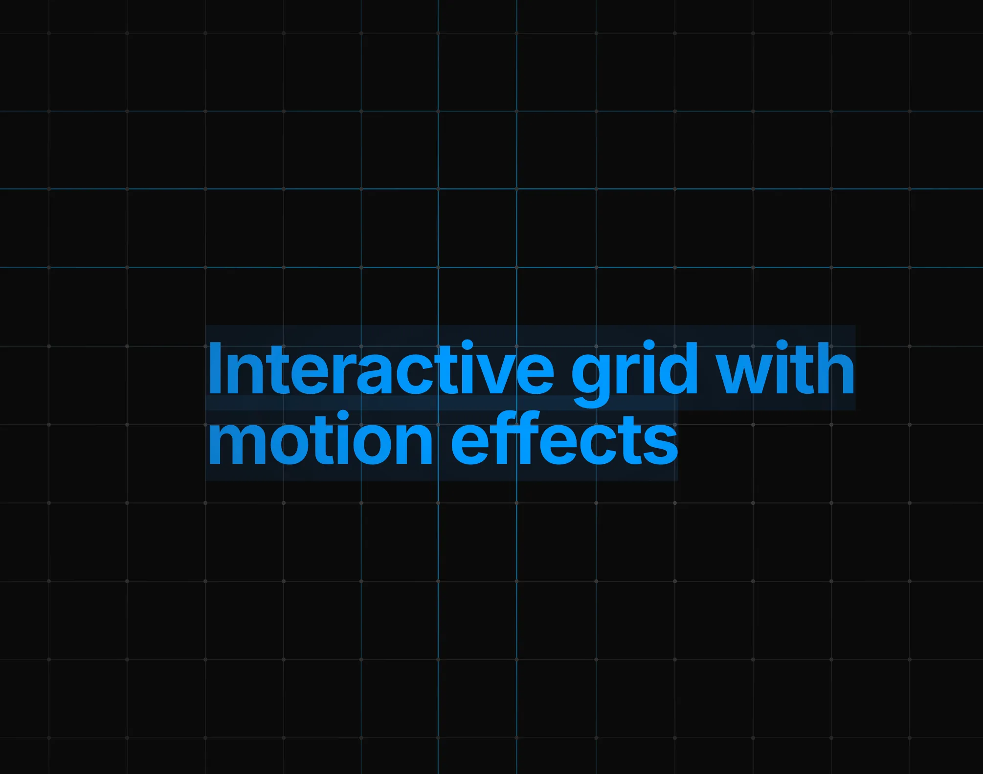
An interactive SVG grid background with line distortion and dot movement effects on mouse hover. Features performance-optimized animations using requestAnimationFrame, customizable highlight colors, and automatic dark mode support.
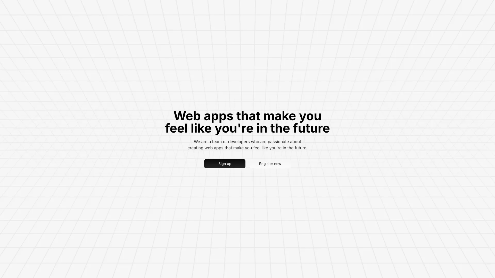
A 3D perspective grid pattern with rectangles rotated on the X-axis. Two layers create a symmetrical effect with masks fading in opposite directions.
Diagonal line pattern using an SVG pattern element with a linear mask that fades the center. Lightweight and resolution-independent.
Vertical strips with gradient fills and a noise texture overlay create a subtle layered background. Dynamically calculates strip count based on viewport width.
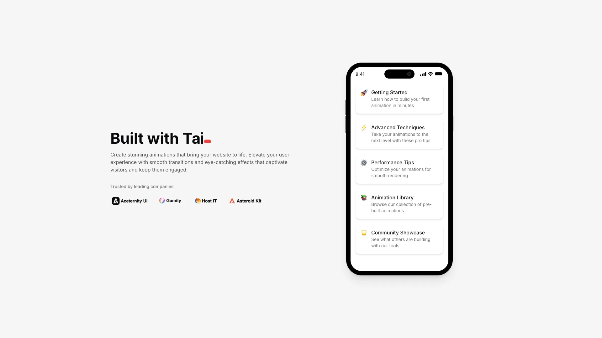
A typewriter-style text animation that types and deletes words with 3D flip effects. Characters rotate in with blur as they appear.
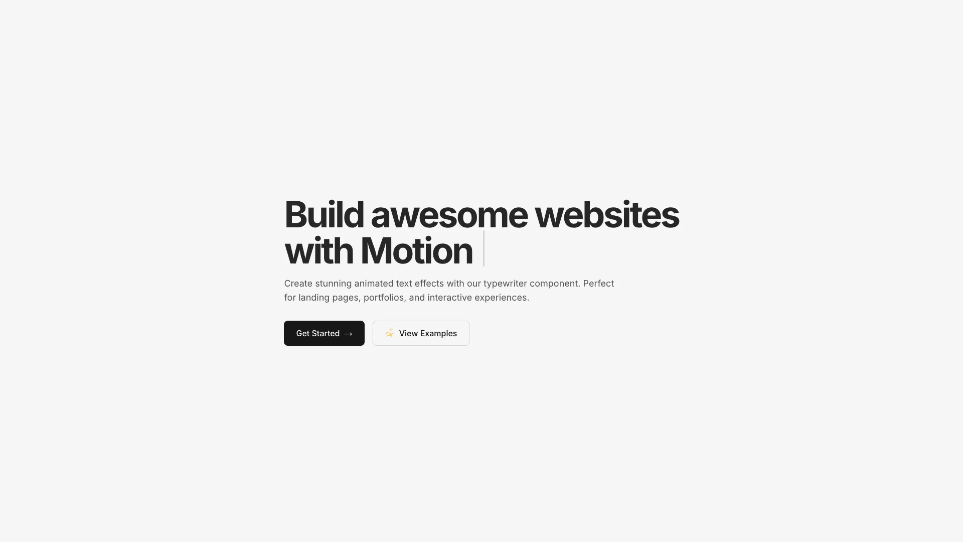
A classic typewriter text effect that types words character by character. Includes a blinking cursor and configurable typing and deletion speeds.
A word-by-word text reveal animation where each word fades in from blur. Uses viewport detection to trigger animations when content scrolls into view.

A typewriter effect with realistic mechanical keyboard sounds. Types words character by character with key down/up audio feedback, backspaces through text, and ends with a blinking cursor.
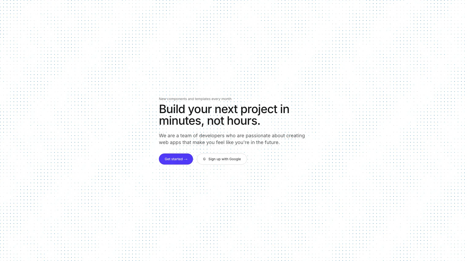
An interactive canvas shader with a grid of dots that distort when the mouse passes over. Dots have breathing animations and random glow pulses.
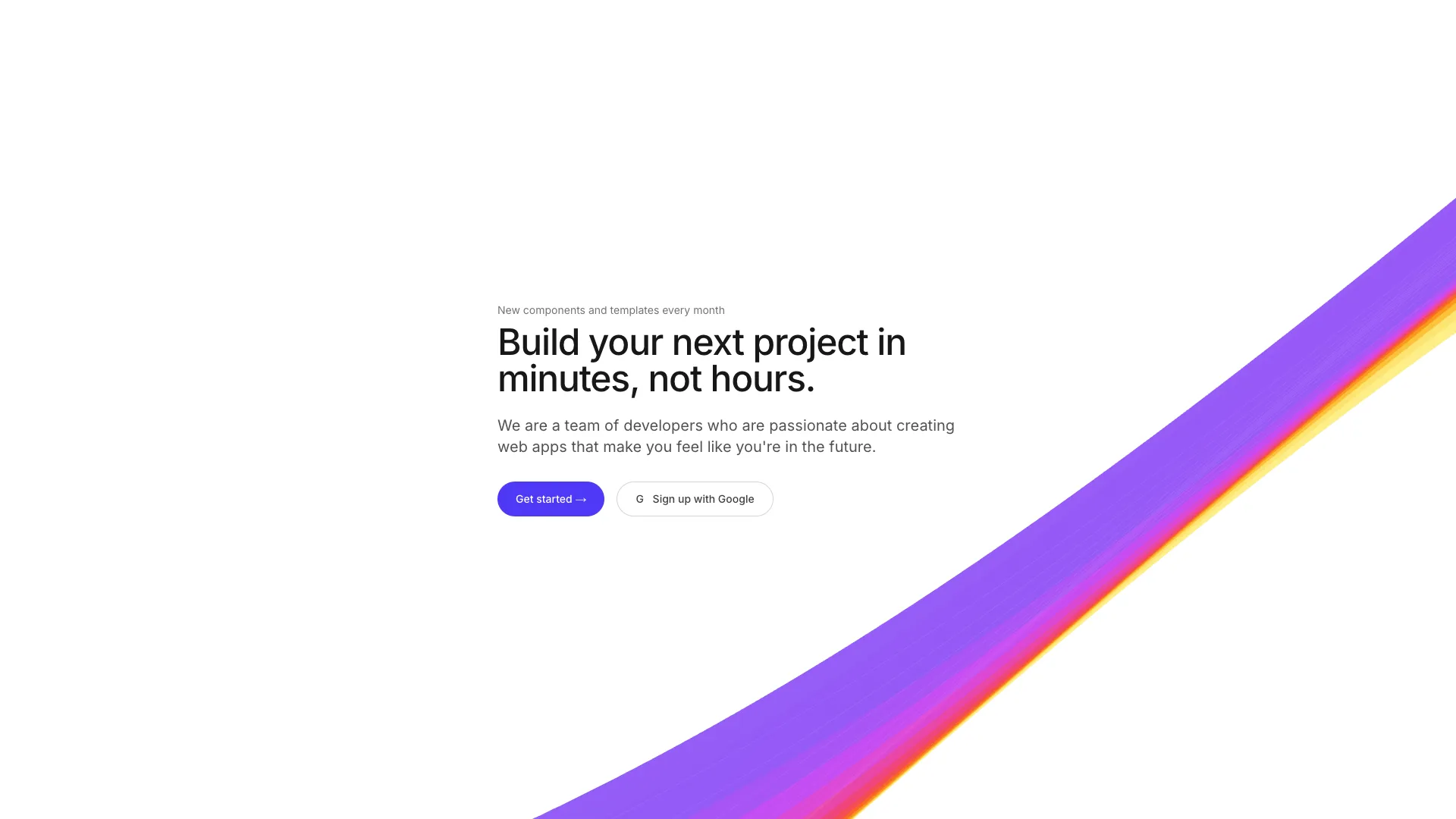
A canvas-based animated shader background with flowing gradient bands. Renders smooth wave-like lines with customizable colors, speed, and density.
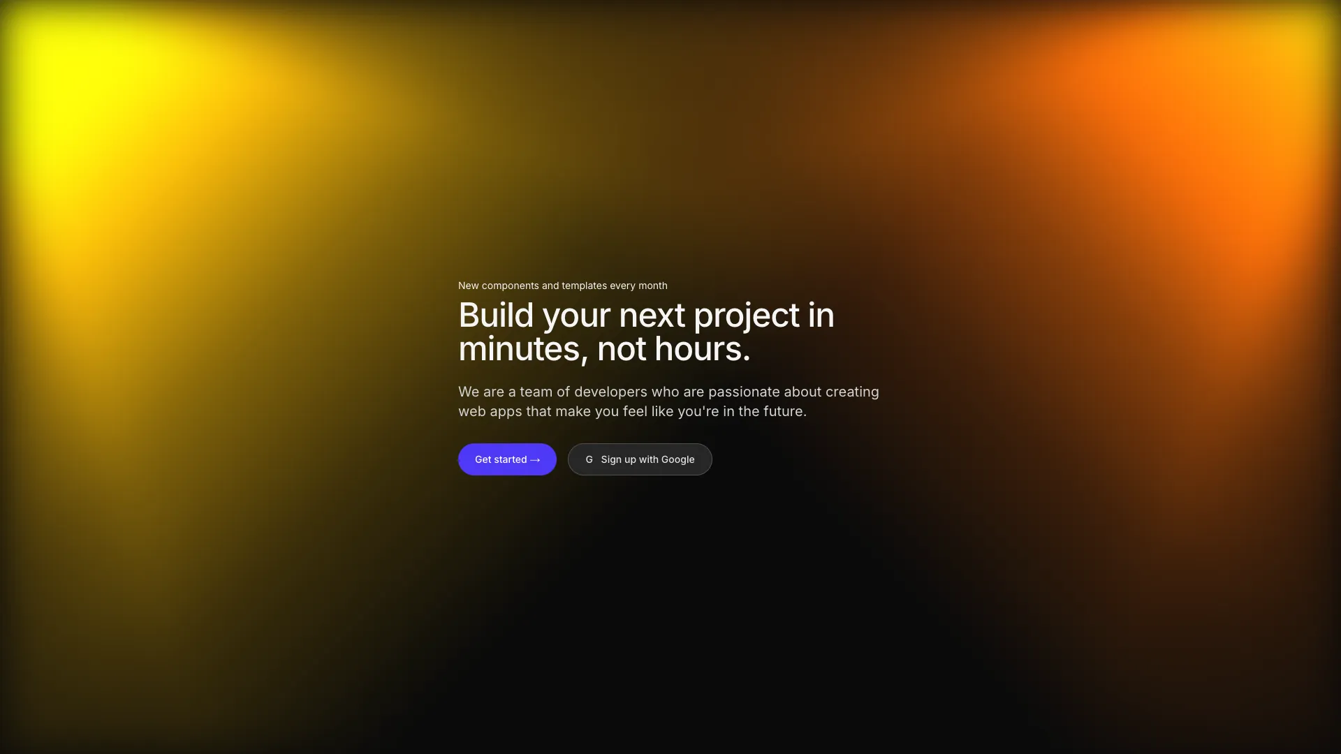
A canvas shader with configurable spotlight beams shining from corners or edges. Supports multiple spotlights with custom colors, positions, and animations.
An animated chat interface with message bubbles and avatars. Messages appear sequentially with staggered animations when the component comes into view.
An interactive folder illustration with files that fan out on hover. Includes animated pulse beams and a server component for file transfer visualization.
Animated multiplayer cursors with name tags drawing selection boxes over a code file. Simulates real-time collaboration with staggered cursor movements.
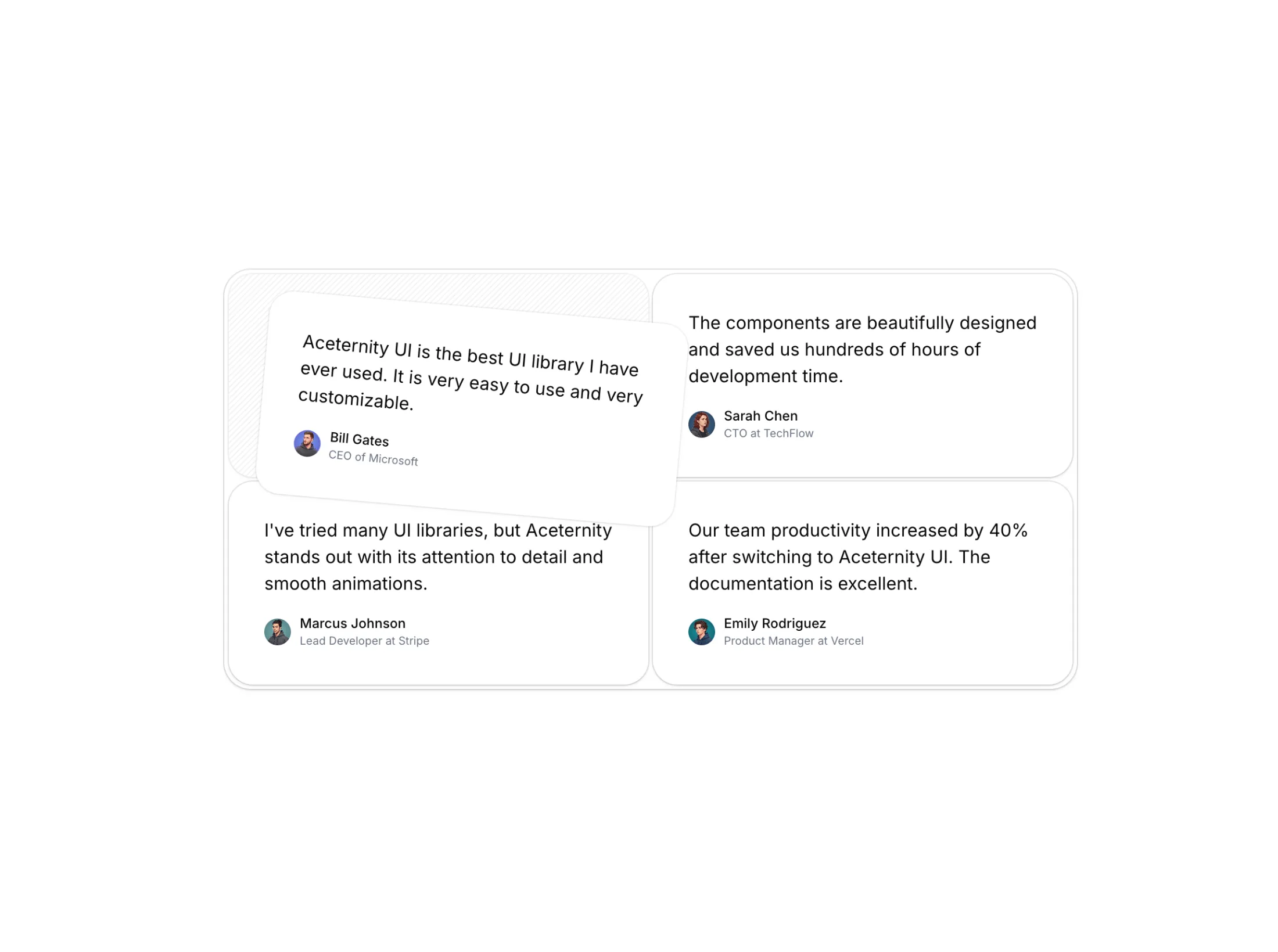
An interactive testimonial card grid with hover animations. Cards lift and rotate on hover, revealing a diagonal stripe pattern beneath each card.
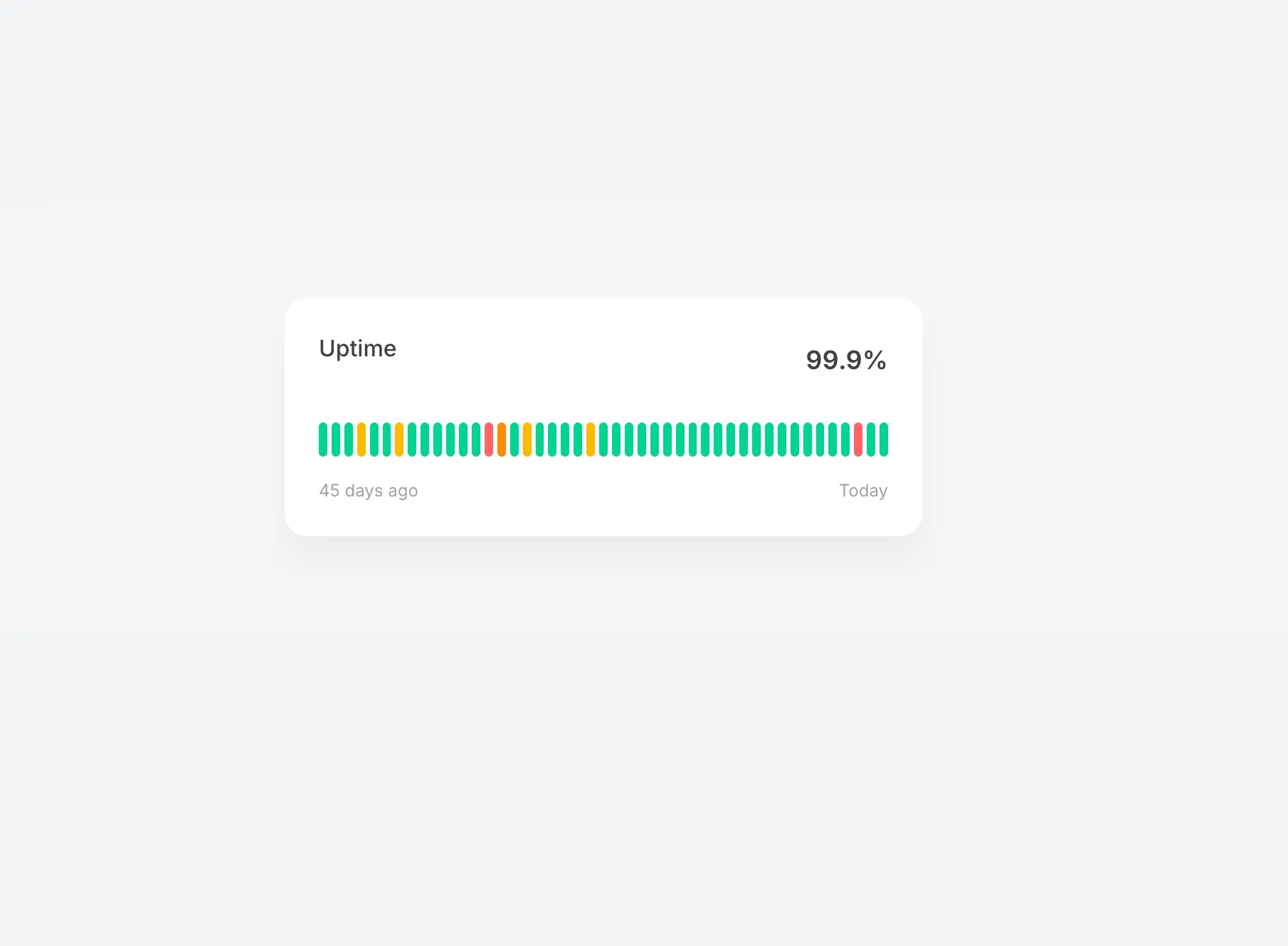
An interactive uptime status bar illustration with hover effects. Each bar represents a day's status and reveals detailed information on hover with smooth animations.
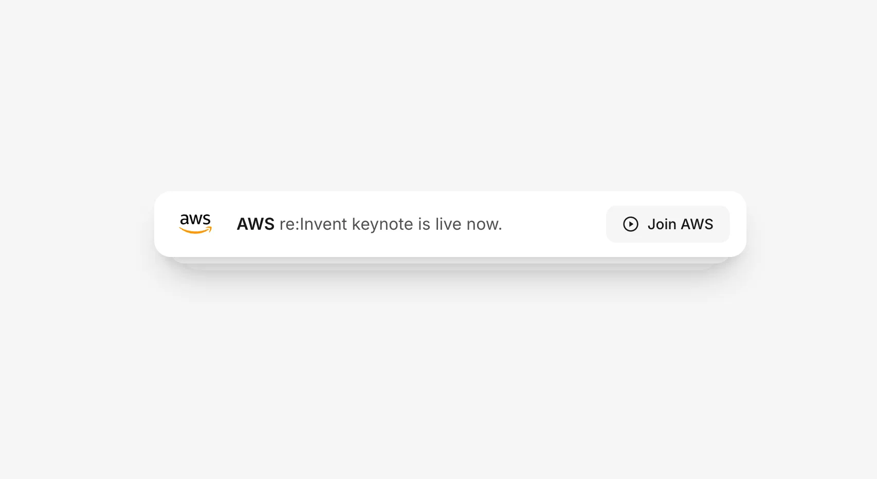
Stacked notification cards that rotate automatically every 3 seconds. Cards stack with depth effect and smooth spring animations using motion/react.
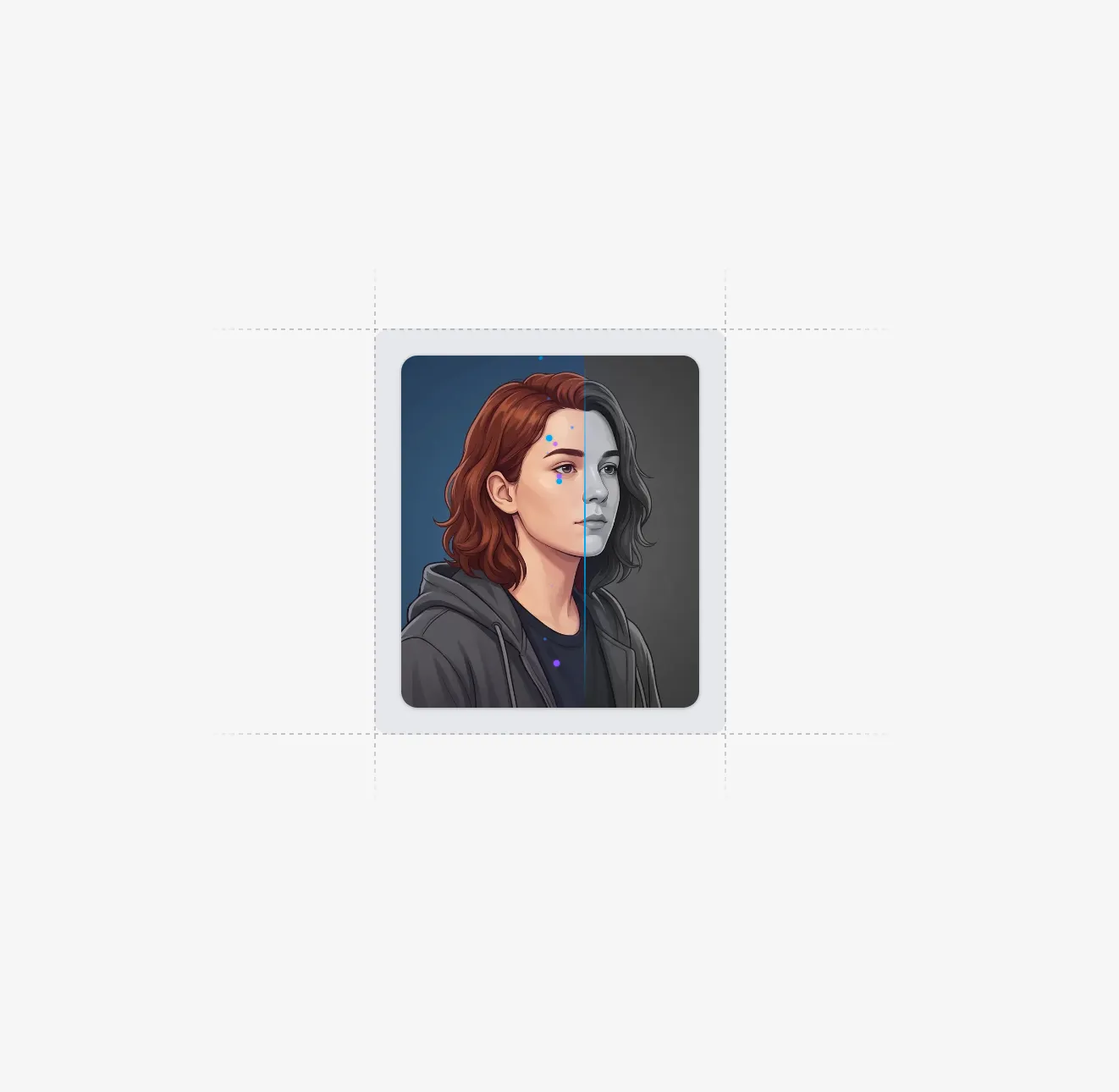
An animated image carousel that reveals colors with a scanning bar effect. Images start grayscale and transition to full color as a glowing bar sweeps across with trailing sparkles.
A minimal isometric box illustration with smooth hover animations. Features rounded corners on the top face and subtle dashed vertical lines for depth.
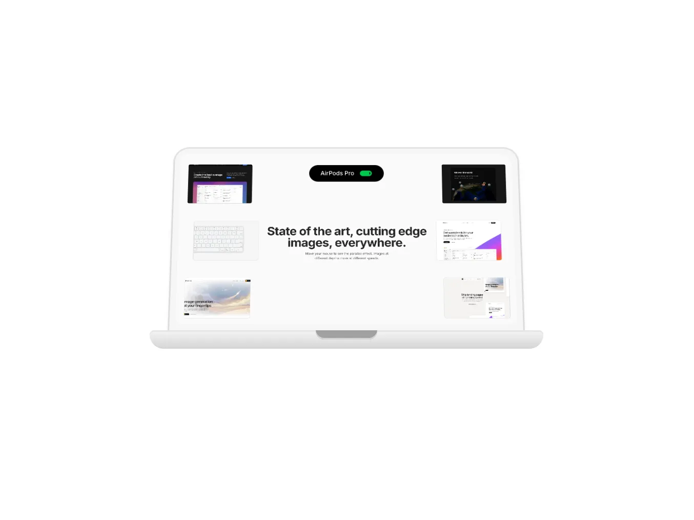
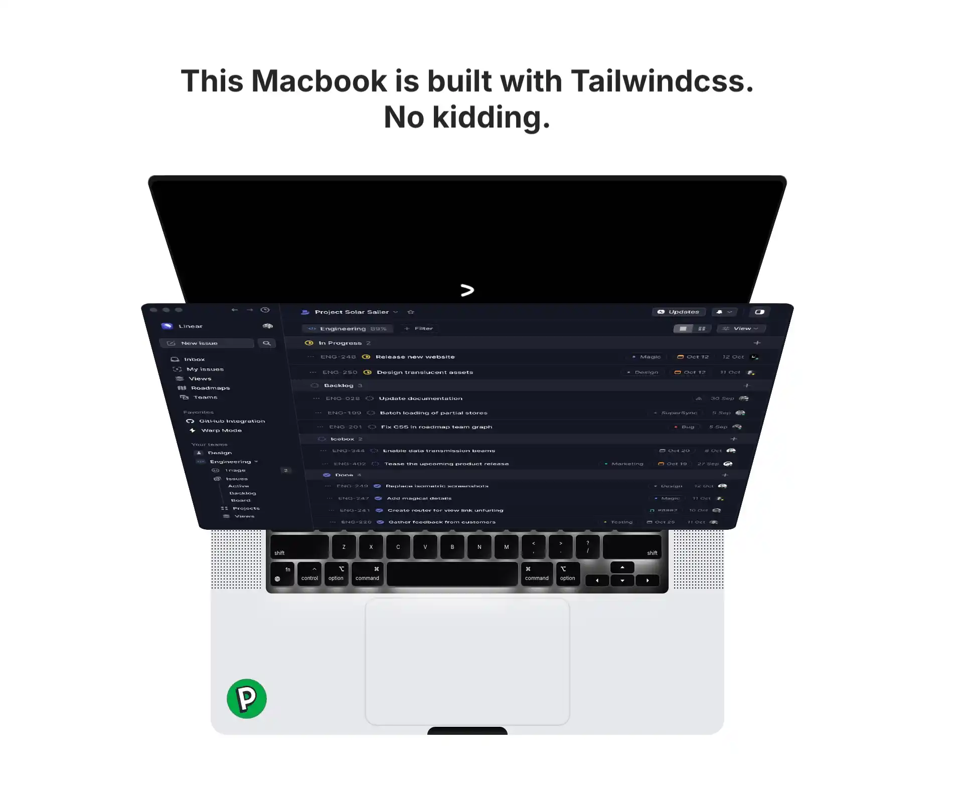
An interactive MacBook illustration with lid open animation and Dynamic Island. Features blur fade-in content, AirPods connection animation, and smooth spring physics.
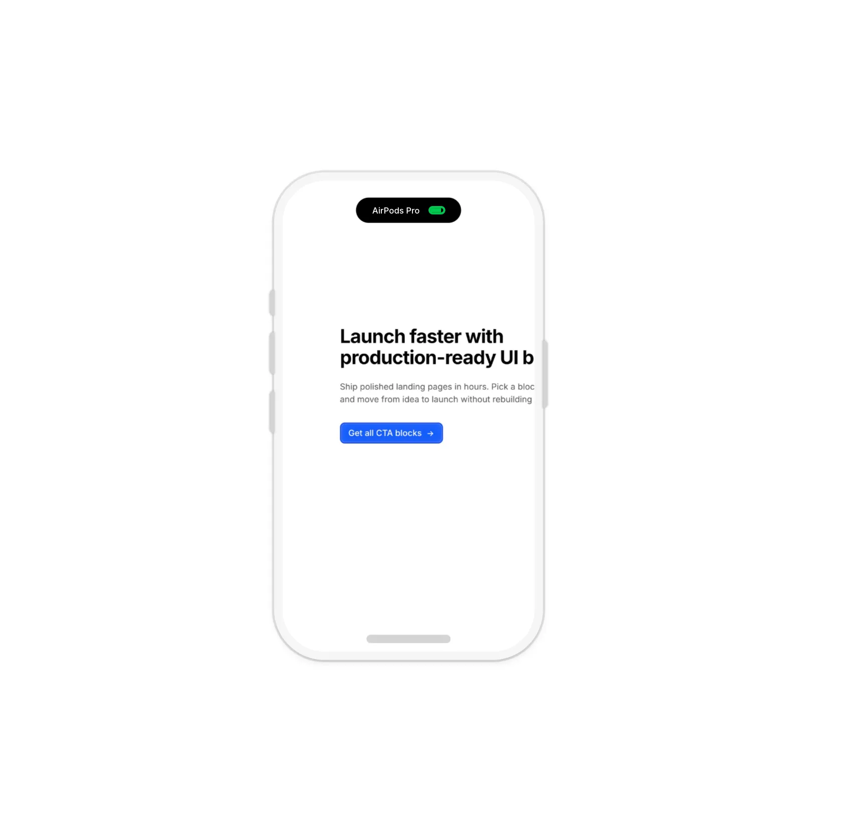
An interactive iPhone illustration with Dynamic Island animation. Features side buttons, blur fade-in content, AirPods connection sequence, and smooth spring physics.
An animated Dynamic Island component with customizable states. Features smooth spring animations cycling through idle, loading, and processed states with configurable text and timing.
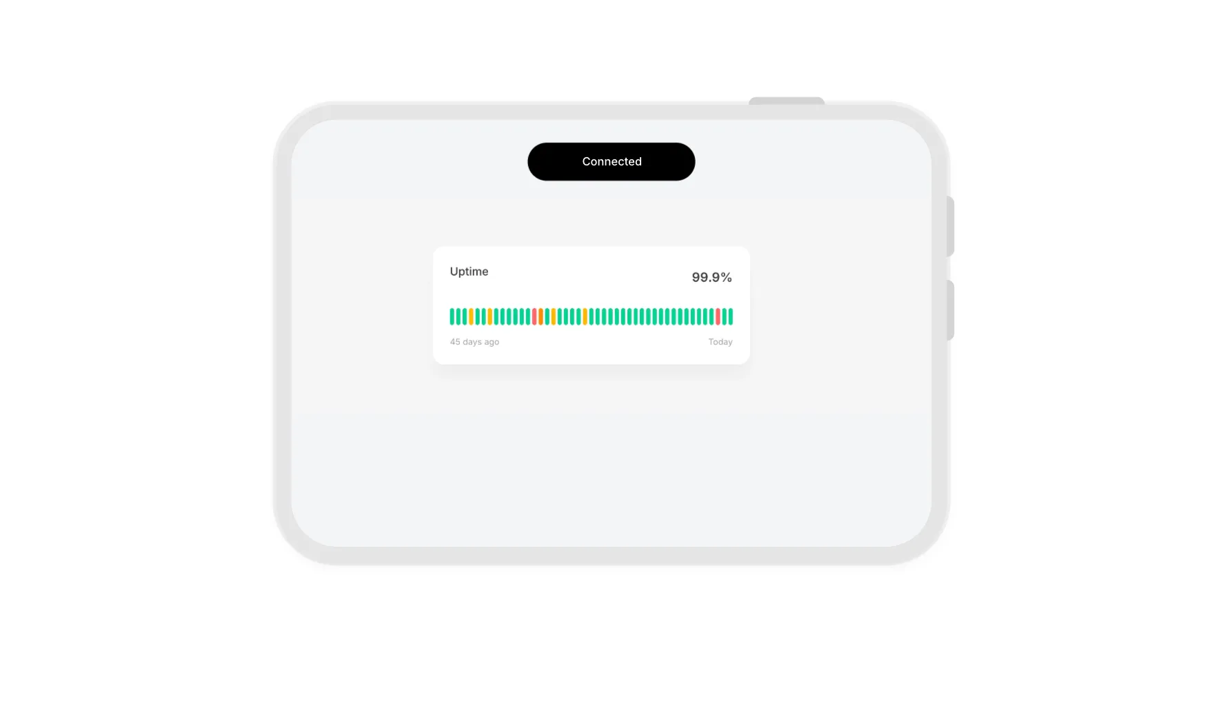
An interactive iPad illustration with Dynamic Island animation. Features volume buttons, power button, blur fade-in content, AirPods connection sequence, and smooth spring physics.
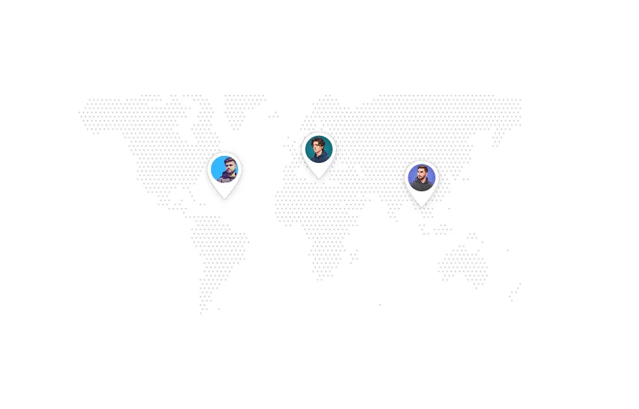
An interactive dotted world map with customizable location pins featuring user avatars. Uses Mercator projection for accurate positioning and supports dynamic pin placement via latitude/longitude coordinates.
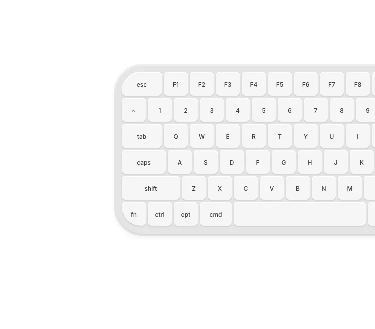
A compact Mac keyboard illustration with blue hover glow effects. Features size variants (sm, md, lg, xl) for flexible placement in cards, bento grids, and feature sections.
An animated beam path illustration featuring a glowing gradient beam that travels along a dotted SVG path. Perfect for showcasing data flow, connections, or visual transitions in feature sections and bento grids.
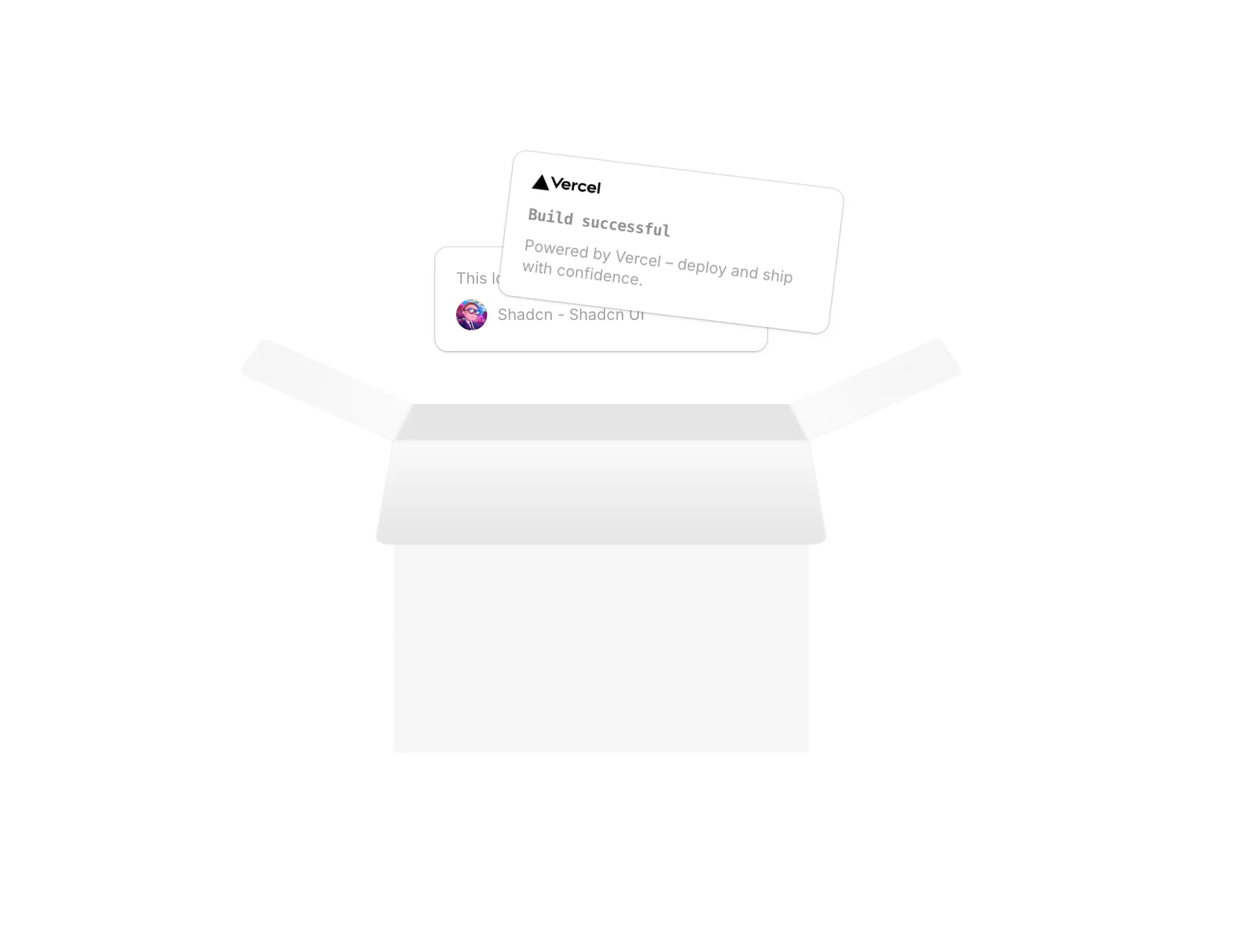
An interactive box illustration with popout cards that animate on hover. Features a Vercel deployment card and a testimonial card that pop out with spring physics.

A MacBook illustration with floating AI company icons that pop out on hover. Features staggered spring animations and 3D lid rotation.
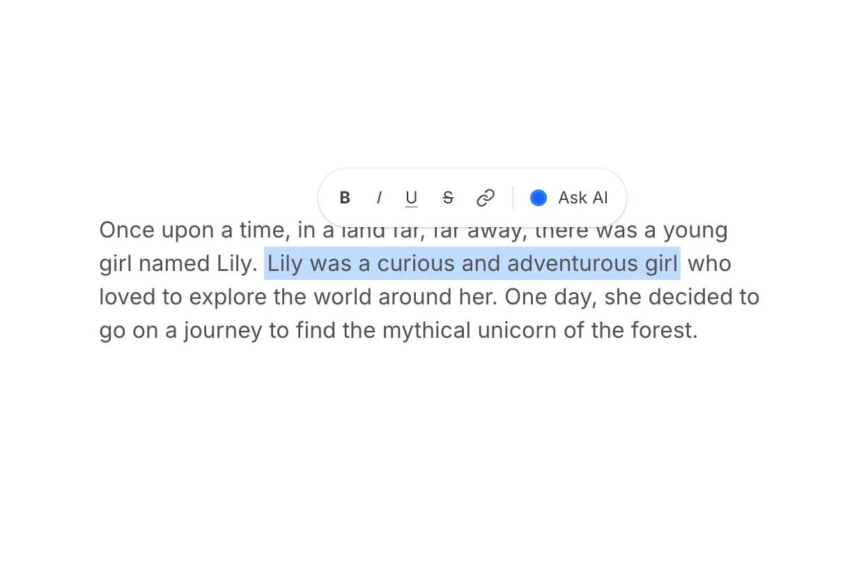
A paragraph snippet with an inline highlight wipe, floating rich-text style toolbar, and Ask AI chip—motion-led, good for AI editing or selection UX stories.
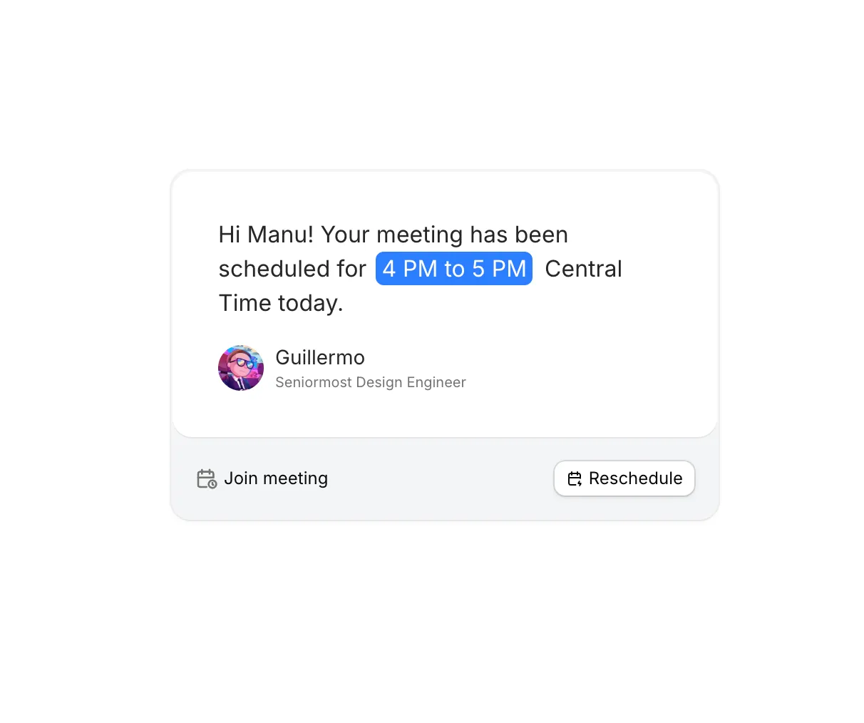
A compact meeting confirmation card with inline time highlight, speaker row, and join or reschedule actions—good for calendar and scheduling stories in hero or feature sections.
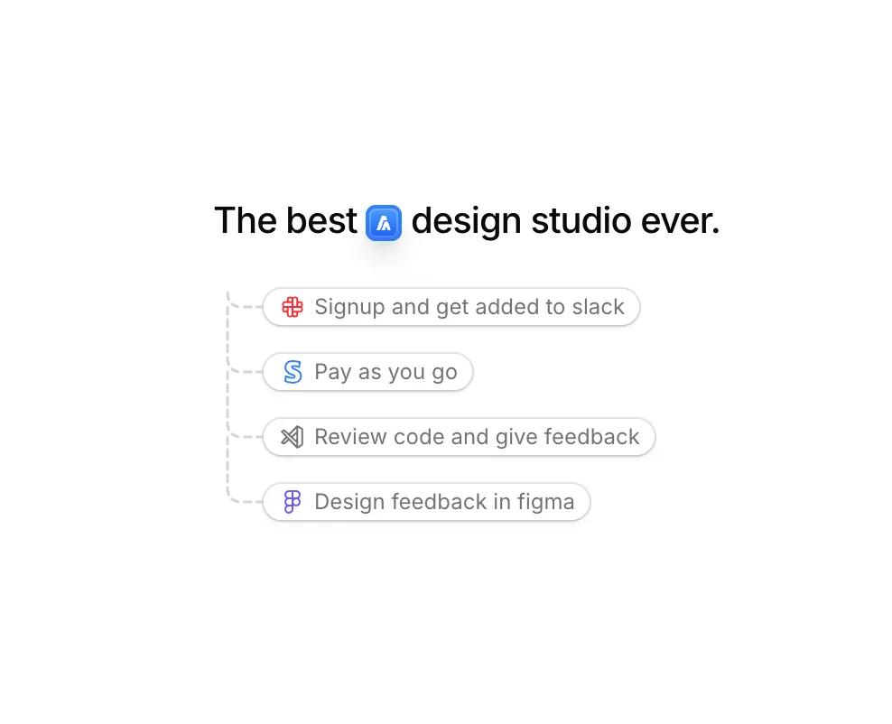
A compact marketing snippet: headline with an inline logo chip, gentle periodic motion, and a dashed curved connector branching into icon-led callouts.
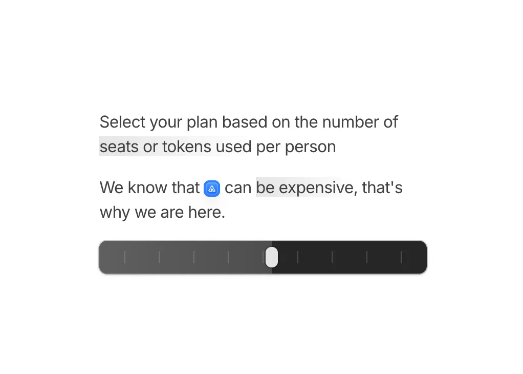
Short pricing copy with an inline brand chip, soft text highlights, and an interactive slider that shows a floating image preview while you drag across segments.
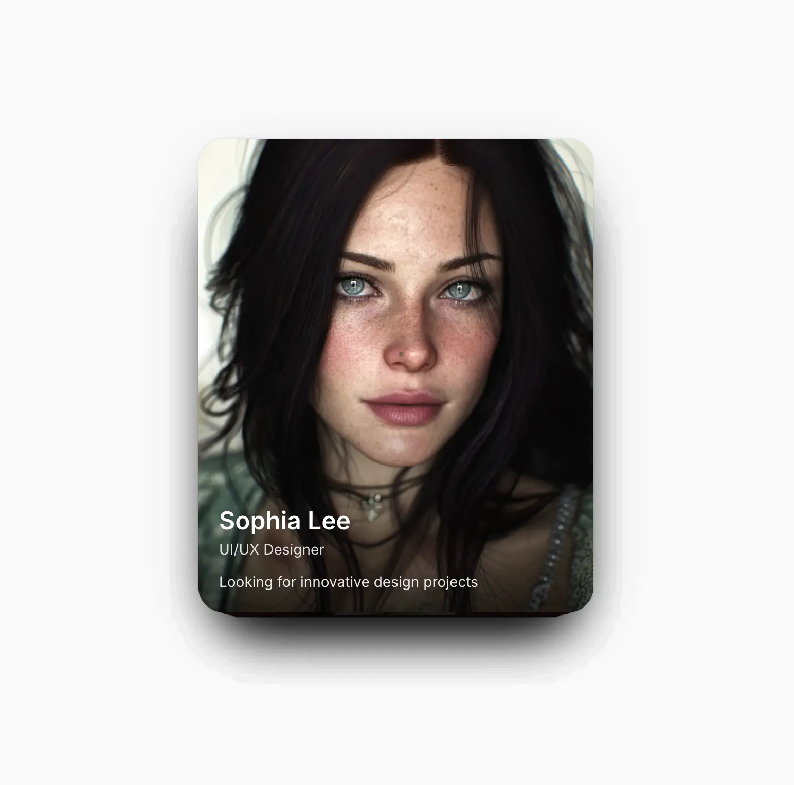
A swipeable stack of profile cards with horizontal drag, rotation tied to offset, and spring fling so dismissed cards cycle to the back of the deck.
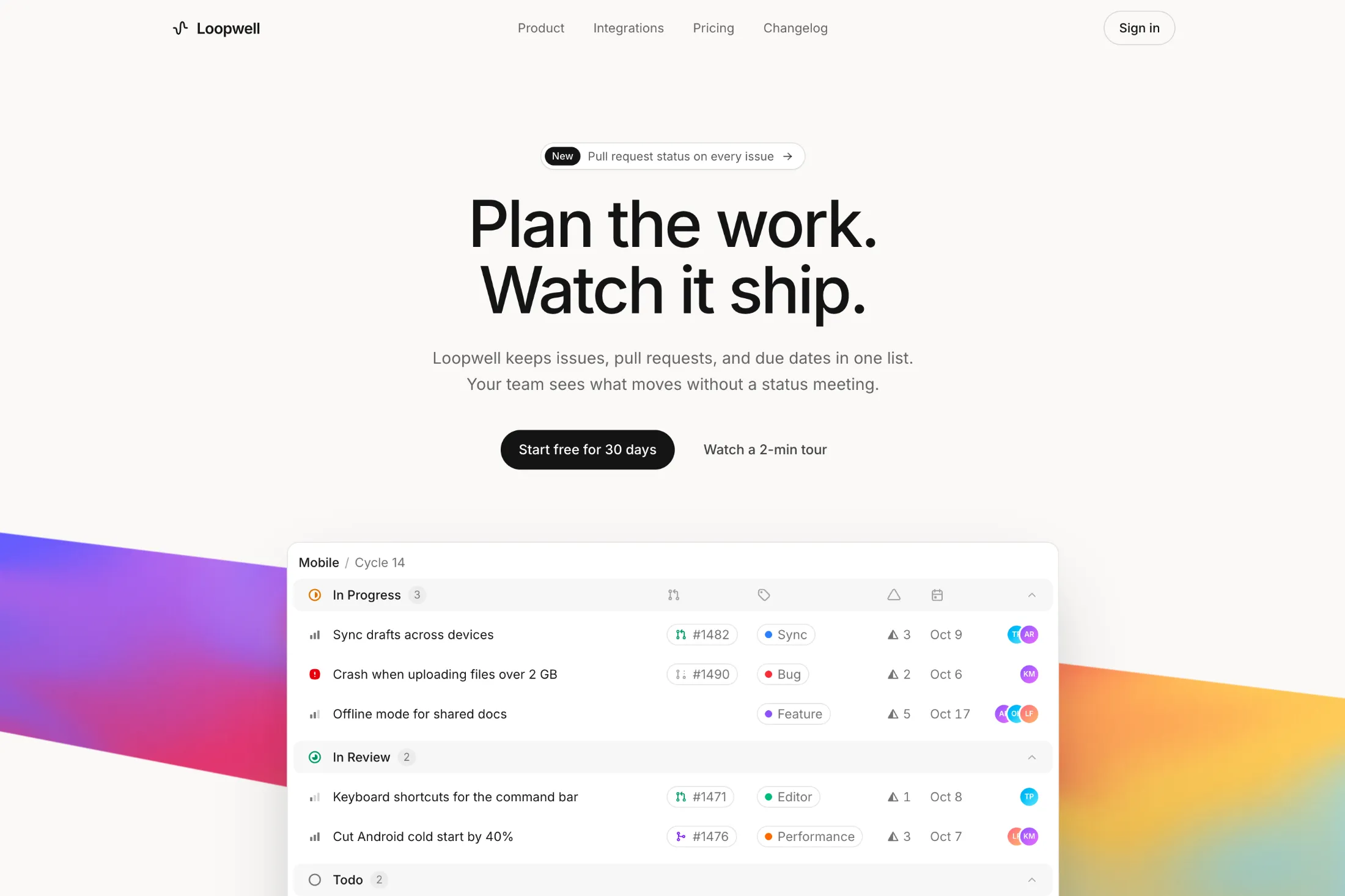
A hero with an animated WebGL ribbon gradient that sweeps behind a collapsible issue table. Works in light and dark mode.
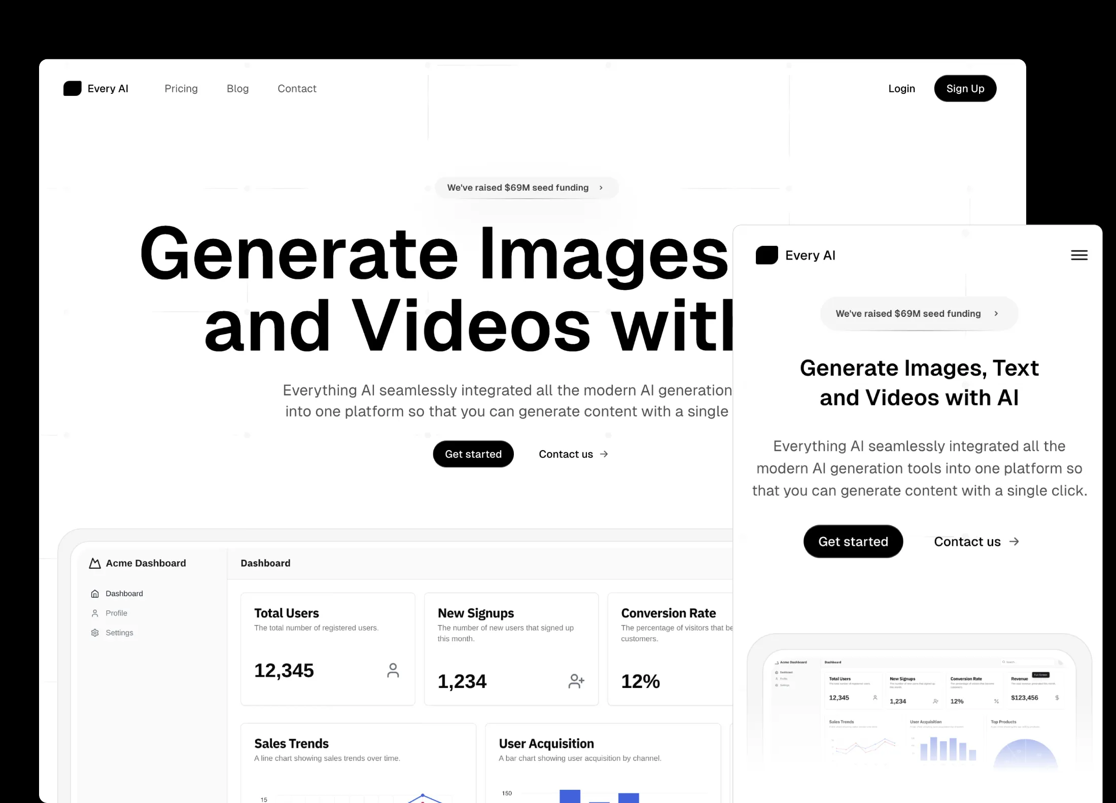
Never start from a blank slate again. Pull in Aceternity UI Pro templates and reshape layout, copy, and structure in chat.
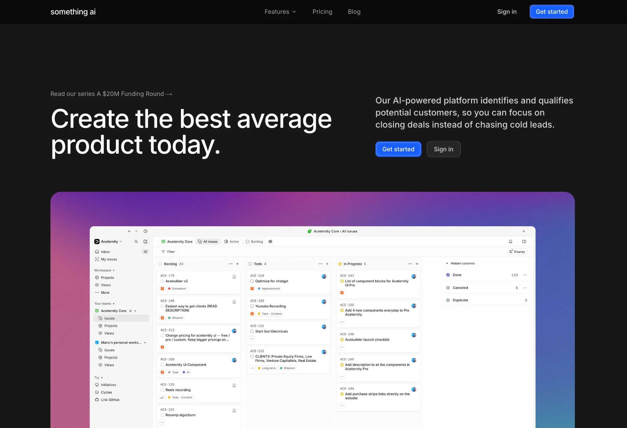

Drop in sections, cards, and other blocks, then tweak them in place without leaving the editor.
Point at a section, run a skill, get sharper layout and copy.
Point at a section, run a skill, and get sharper layout and copy decisions, not another wall of default Tailwind cards.

Plan your next alpine trip with guides, trails, and stays in one place.
Describe the image…
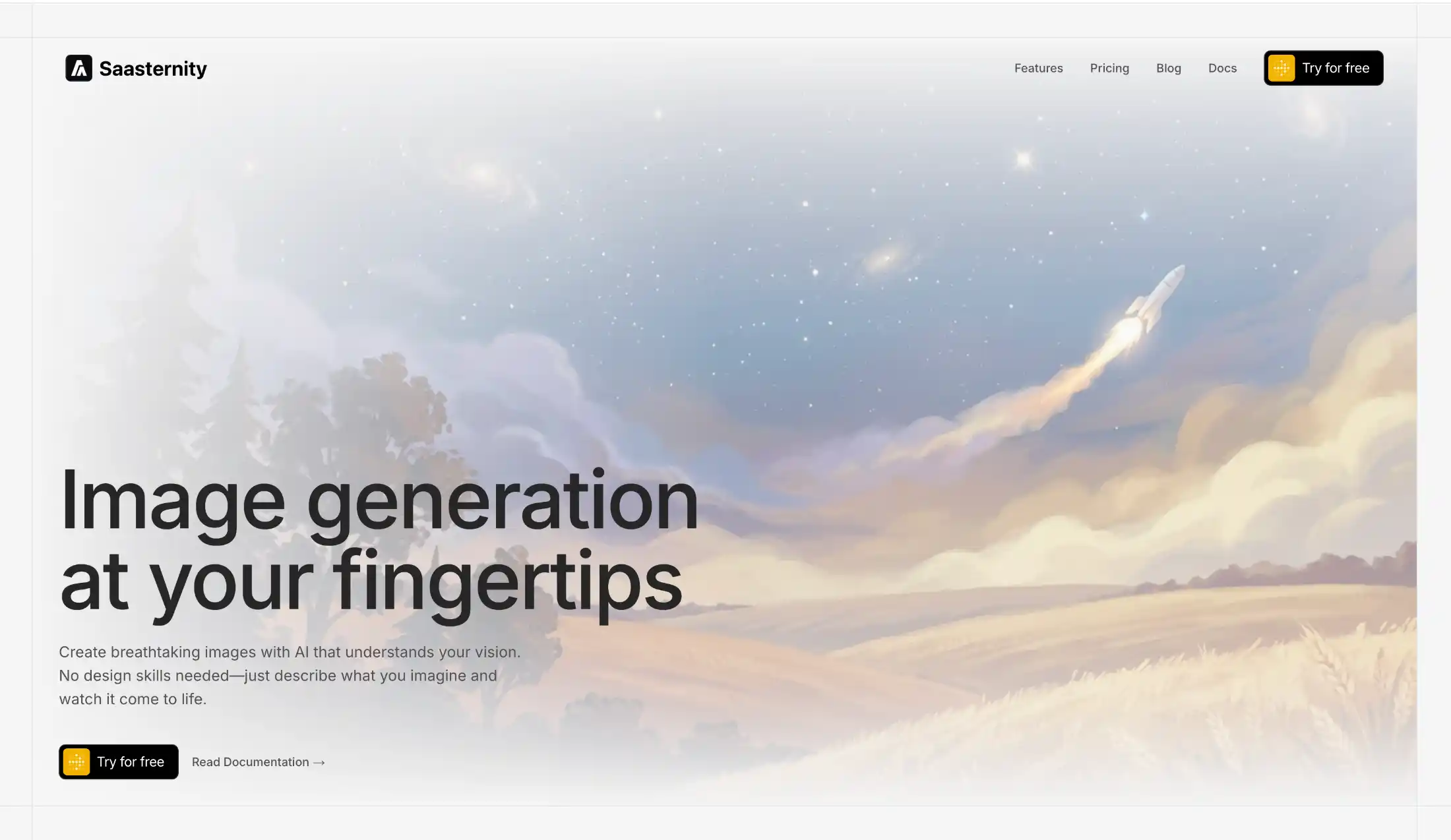
Generate a scene, apply it as a background, and keep building. No stock photo rabbit holes.
The same community that grew with Aceternity UI, now shipping full sites with an AI builder on top.
Quick answers about credits, code export, Aceternity Pro, and billing before you start building.
Credits are spent when the AI works for you, not just when you send a short message. Each turn can charge for the model response, tools it runs (reading and editing files, search, imports), image generation, screenshots, and related work. Heavier models and longer build sessions use more credits.
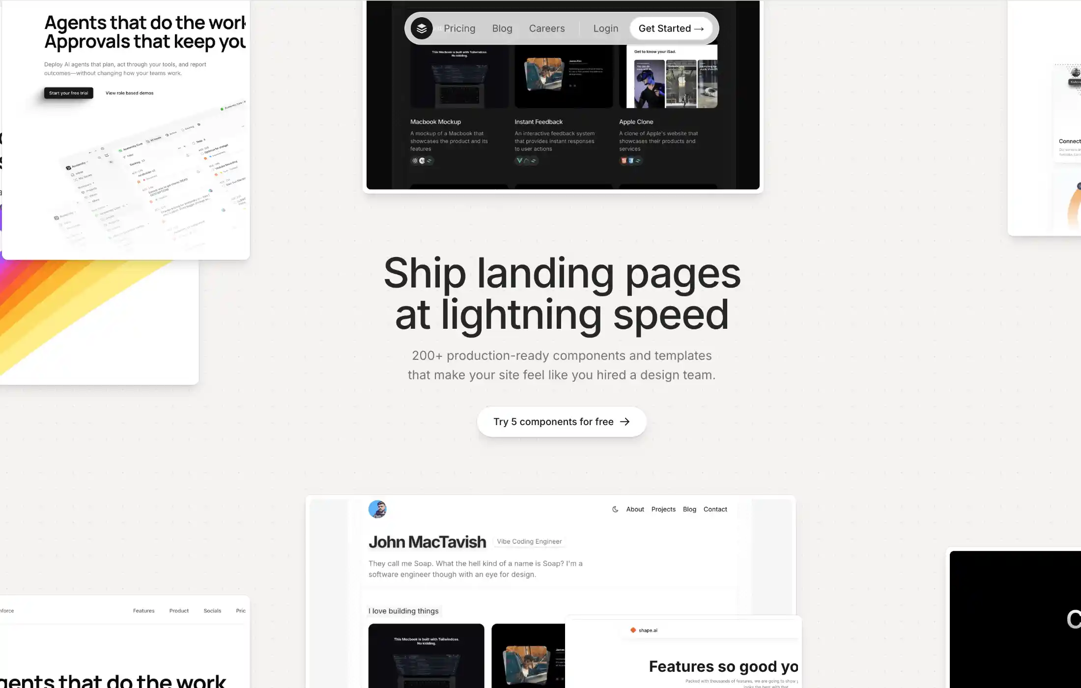
Ship polished landing pages in hours. Pick a block, customize it, and move from idea to launch without rebuilding layout primitives.
Start building