

How to create great-looking landing pages with AI
Why AI landing pages all look the same, and four ways to break out of the slop: design systems, skills, illustrations, and visual attachments.

Manu Arora
Founder, Aceternity
On this page▾
Building landing pages with AI is easy. Building ones that don't look like everyone else's is the hard part.
Here's what happens: you open a model, type a brief, and get a page back. Someone else opens the same model with a similar brief and gets almost the same page. Same hero layout. Same soft purple gradient. Same three feature cards with the same icon style. That's not a model failure. That's what you get when you use AI alone and never give it a taste of its own.
I've been doing this a lot. A few habits consistently push a page out of "looks like AI wrote it" territory. None of them are complicated. You just have to actually do them.
Pick a design system before you write a prompt
If you skip this step, the model invents one. And the one it invents is the average of every SaaS page it has ever seen.
You have two solid options.
Use a preset. shadcn presets are a good starting point. Pick one, stick to it, and tell the agent to follow those tokens for the whole site: colors, fonts, spacing, radii, padding, margins. One system. Everywhere.
Give it a reference. Open a site you already like (family.co, ui.aceternity.com, whatever you keep coming back to), paste the URL into your LLM, and ask it to extract the design tokens. Colors, type, spacing scale, border radii, the whole thing. Then tell it to build your page on that system.
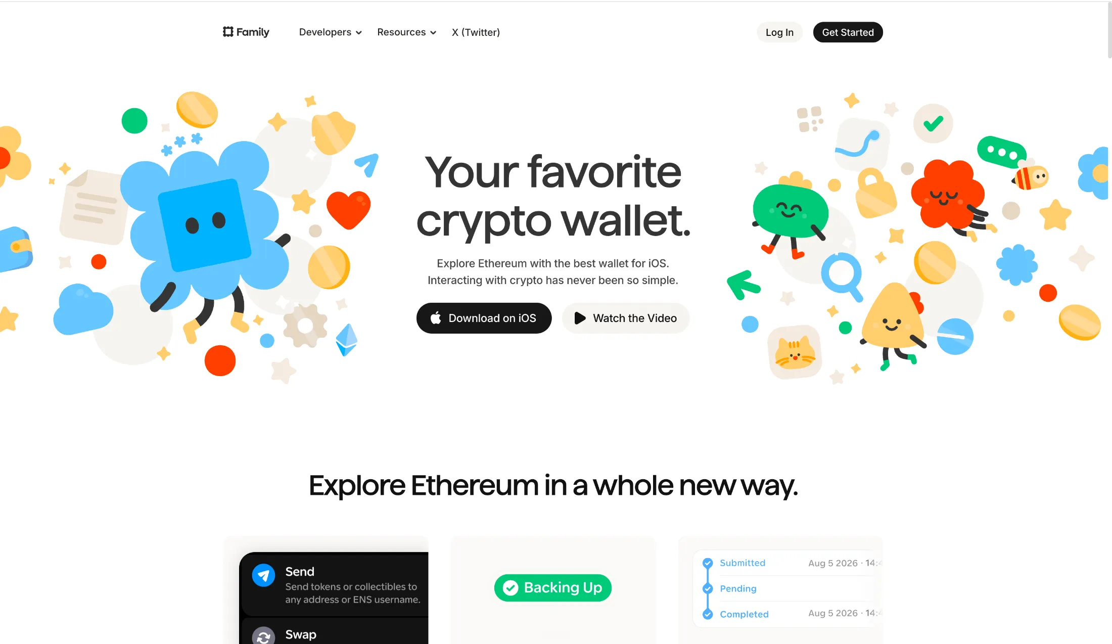
That second path is underrated. You are not asking the model to invent taste. You are asking it to copy a constraint set that already works, then apply it to your product. The page stops floating in "generic AI SaaS" and starts feeling like it belongs somewhere.
Use a skill, not raw model output
Faster, cheaper models are fine for this. Grok 4.5 (medium or high), Sonnet 5, Opus 5. Pick whichever you already like. The model matters less than what you wrap around it.
Raw prompting gets you competent layout. A skill gets you judgment: spacing that feels intentional, motion that isn't decorative noise, copy that doesn't sound like a product brief. I reach for these:
Load one (or a few) before you start the page. Especially for animation and micro-interactions: that is where unguided models go soft and generic. A skill that cares about interface feel will catch a lot of that before you do.
Put illustrations in your bento grids
This one is quieter but it matters a lot.
A bento grid that is only copy and icons is a wall of claims. The reader has to work to understand what each feature actually is. Illustrations do that work for them. They support the copy. They make the feature set scannable in a way text alone never will.
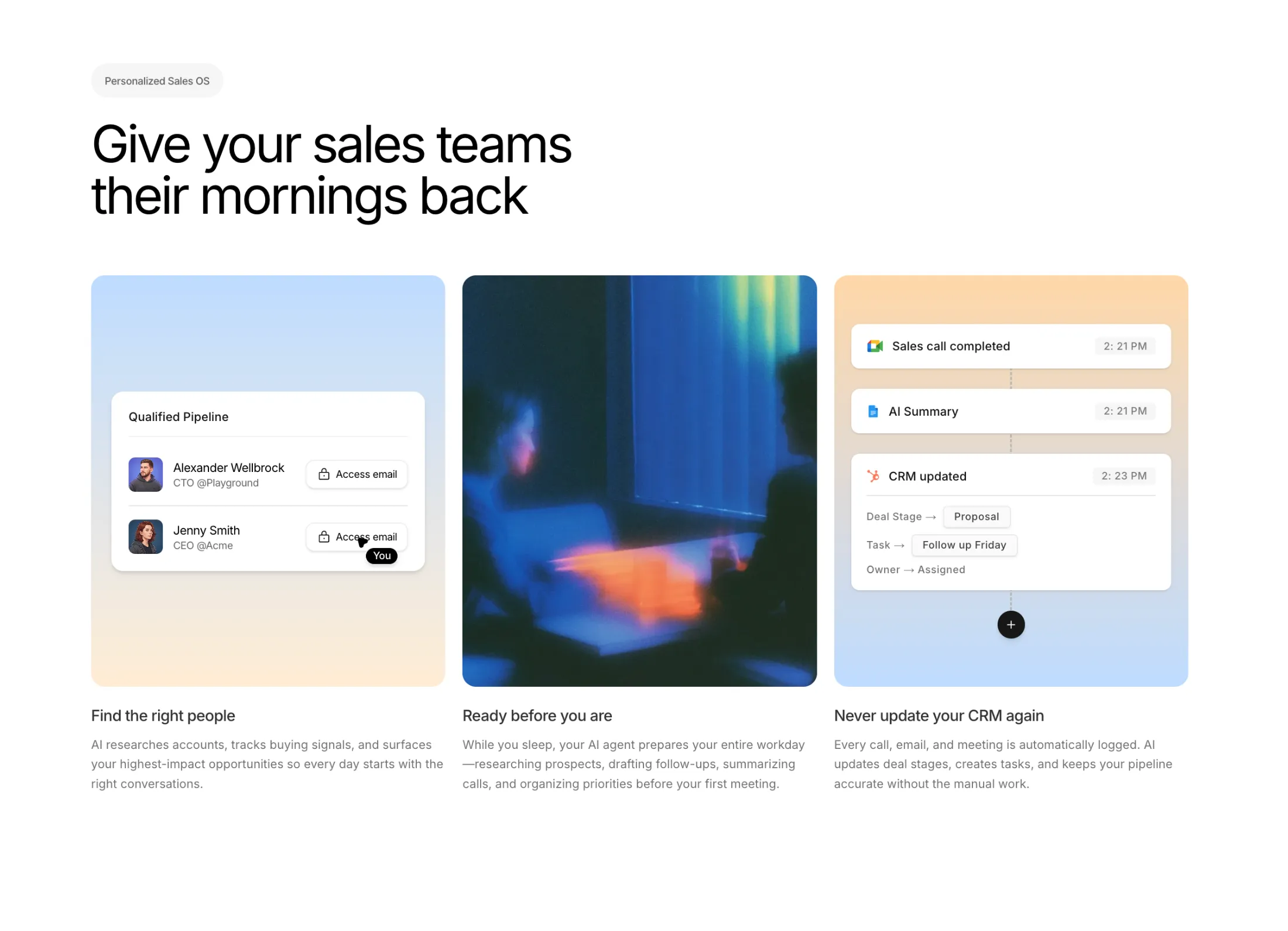
I am not talking about stock photos or random Midjourney vibes. I mean simple, specific visuals that explain the thing: a diagram of the workflow, a stylized UI fragment, a small scene that shows the outcome. Keep the writing clear and short. Let the illustration carry the rest.
If your page feels dense and "samey," check whether every cell in the grid is just a heading + paragraph + Lucide icon. That pattern is everywhere right now. Break it.
Attach screenshots for visual direction
Words are a weak way to describe layout. Screenshots are not.
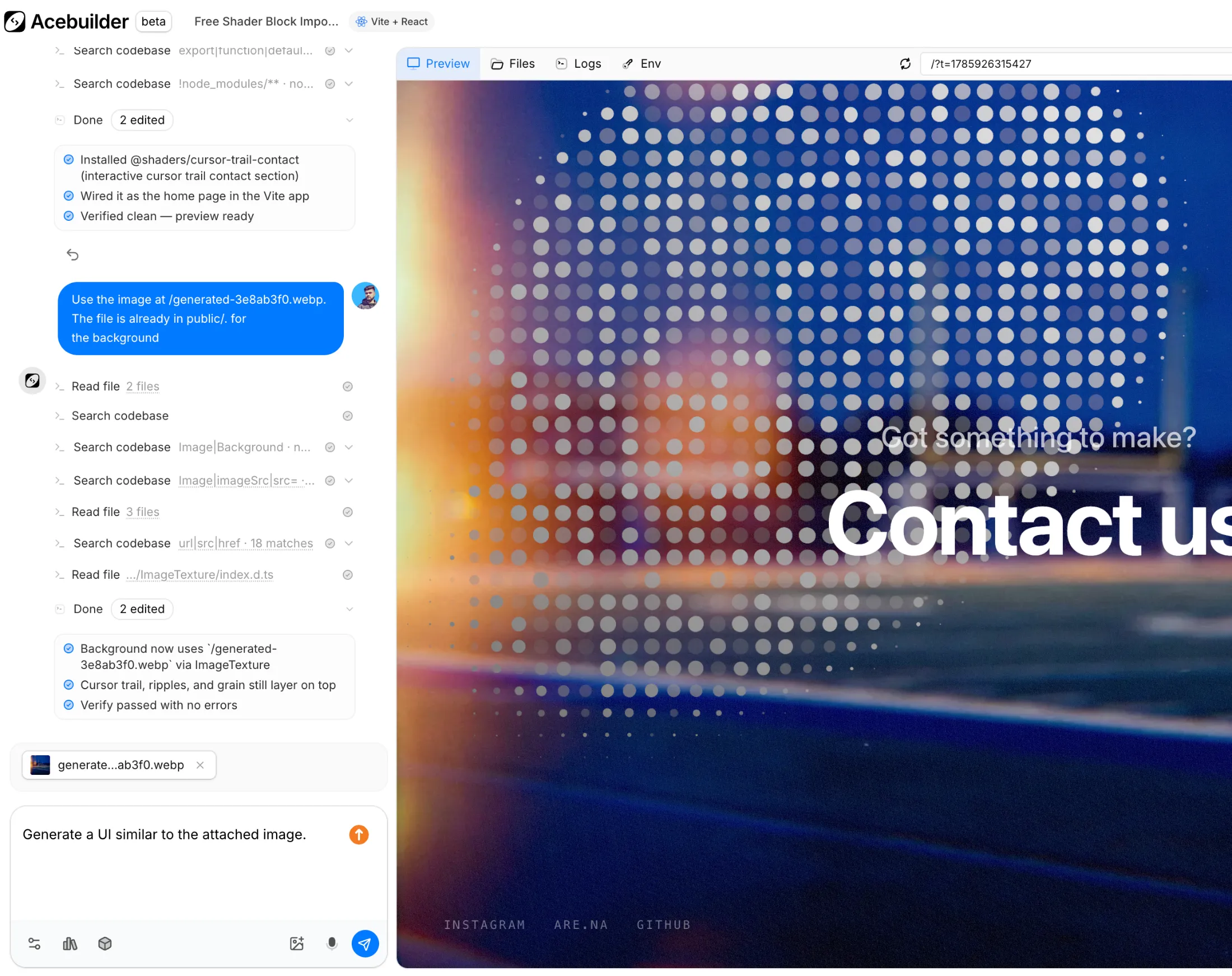
When you like how a section works on a site (Linear's homepage, Aceternity UI, whatever), take a screenshot, attach it, and ask for something in that direction. Be explicit that you want the feel, not a clone. "Same density and hierarchy, different composition and brand" is a useful line.
Skills help here too, but an attachment is often the difference between "nice page" and "oh, that's the vibe I meant." The model can see padding, type scale, and contrast in a way your prose description of those things never quite captures.
In Acebuilder you can drop those screenshots into chat, keep them in Assets so you're not digging through Downloads later, or generate the image you need with a preset when you don't have a reference yet. Same place either way.
Put it together
A prompt alone is not a design process. A design system gives the page a spine. A skill gives the model taste constraints. Illustrations make features land. Attachments close the gap between what you imagine and what you get.
Do those four things and you are already ahead of most AI landing pages, which is a low bar, but also a useful one. The goal is not "looks handmade." The goal is "looks like this product," not like the average of every product the model has seen.